Design with AI
Generate a new design based on this screen using your own content.
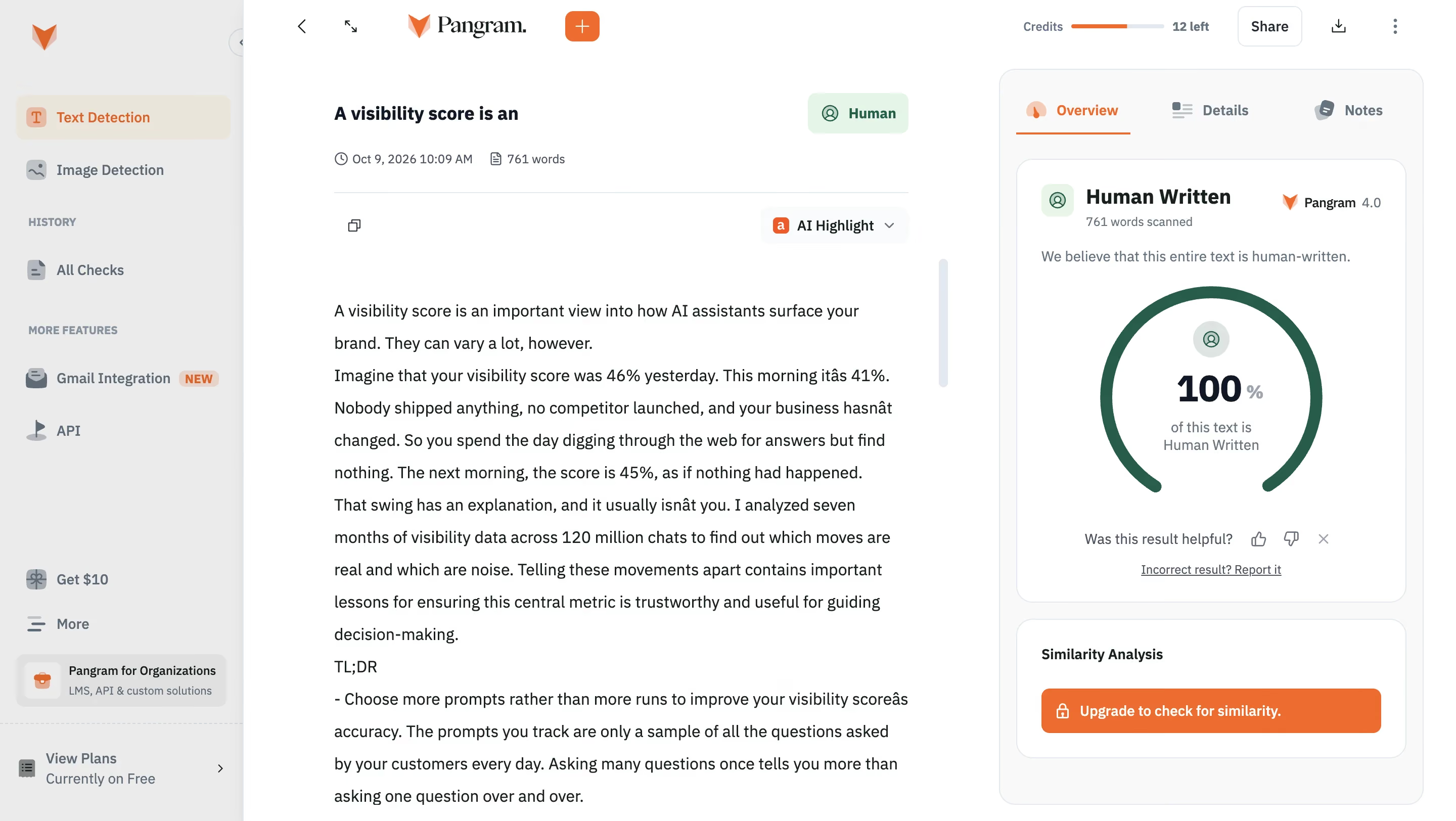
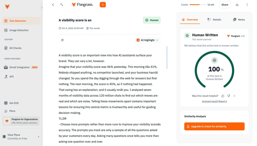
# Design from Reference: Pangram Text detection results
Create an original, high-fidelity visual design inspired by the reference. Prioritize composition, typography, colors, spacing, and component styling over technical implementation.
## Reference
- **Product:** Pangram
- **Category:** Details
- **Screenshot:** https://cdn.prod.website-files.com/5e9dc792e1210c5325f7ebbc/6aca261ea3a034e38b3ee6ef_6aca22f7ee7387dcb376d07f_cms-30ebe21d49cbf9c60347b48f.webp
Analyze the screenshot first. If inaccessible, request it rather than guessing.
## Content
{{content.instructions}}
{{content.data}}
Preserve essential messaging and factual accuracy. Adapt structure and copy length for visual balance; never invent product claims.
## Visual Design
### Overall aesthetic
- **Character:** Clean document-analysis workspace with a neutral navigation rail, readable text editor and prominent result dashboard.
### Page composition
- **Canvas:** 2880 × 1624 screenshot pixels; CSS estimates assume approximately 2× scale.
- **Structure:** Gray left sidebar, white central document pane and pale right results container. Top utilities include credits, sharing, download and overflow controls.
### Information hierarchy
- **Priority:** Document title/status precedes metadata and text. Right-side Overview tab presents a classification card and a large circular percentage gauge.
- **Secondary:** Feedback/report controls sit below the gauge; a separate similarity-analysis card contains a vivid upgrade action.
### Typography
- **Family:** Neutral sans-serif with a serif product wordmark; exact fonts are unverified.
- **Scale:** Estimated CSS document title 18px bold, body 16px with roughly 32px leading, result heading 20px and gauge value 36px.
### Colors & surfaces
- **Sampled palette:** White #FFFFFF; sidebar #EBEBEB; panel tint #F9F9F9; dark text #14201E; orange #FF6105; active sidebar tint #EBE4DA; border gray #E0E0E0.
- **Status:** Dark green gauge and pale green Human badge distinguish the captured classification.
### Components
- **Results:** Rounded bordered white cards inside a larger pale container; tab row with icons and orange underline.
- **Document:** Scrollable text region, small copy control and AI Highlight dropdown. Sidebar contains icon-led sections and a bottom plan block.
- **Geometry:** Estimated 16px outer/card radii, 24px padding and 44px orange action height.
### Visual rhythm
- **Spacing:** Broad margins around the document balance the denser results column. Fine rules separate metadata, tabs and navigation groups.
### Responsive
- **Guidance:** Mobile is not shown. Stack the results below the document and keep document/result navigation easy to switch.
### Adaptation guidance
- **Transfer:** Reuse the document-plus-analysis composition and clear result emphasis. Treat captured classification figures as example UI content, not evidence about new documents.
Use this context to reproduce the reference's visual language: layout, typography, colors, spacing, borders, radii, and distinctive elements. The screenshot takes priority if descriptions conflict.
## Direction
{{preferences.fidelityInstructions}}
## Output
{{output.instructions}}
Deliver a polished, cohesive design with precise alignment, hierarchy, and spacing. Produce the requested visual artifact, not just a description. If unsupported, explain the limitation.