Design with AI
Generate a new design based on this screen using your own content.
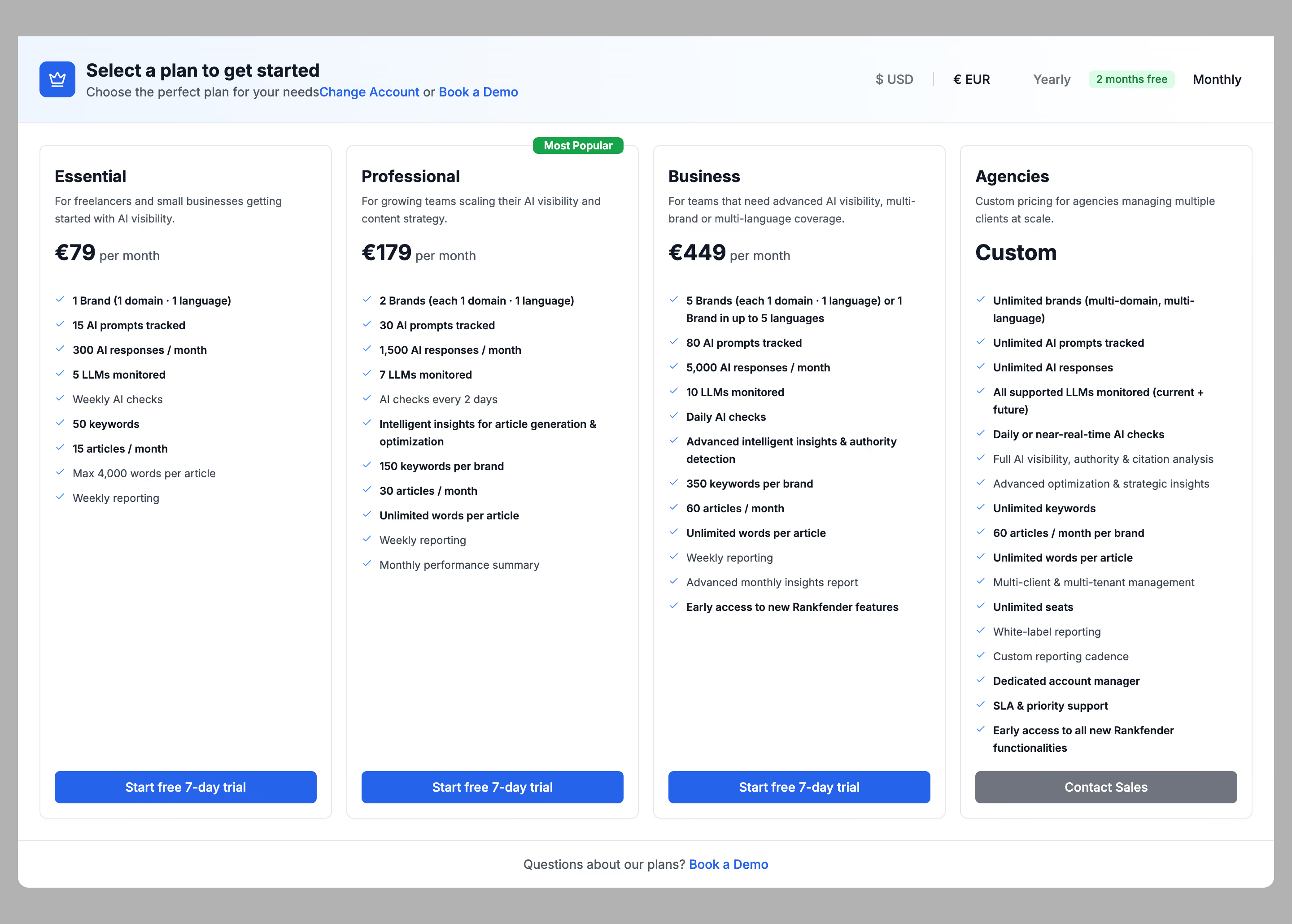
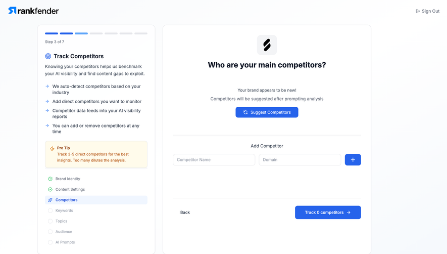
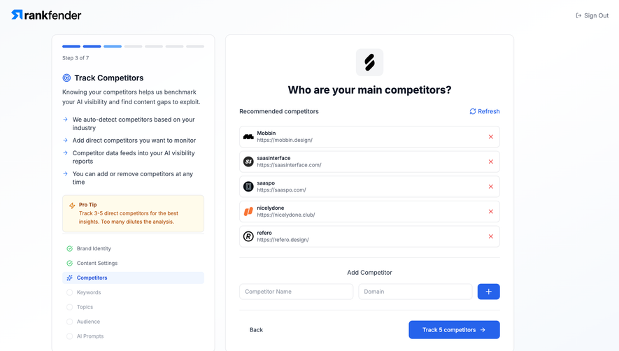
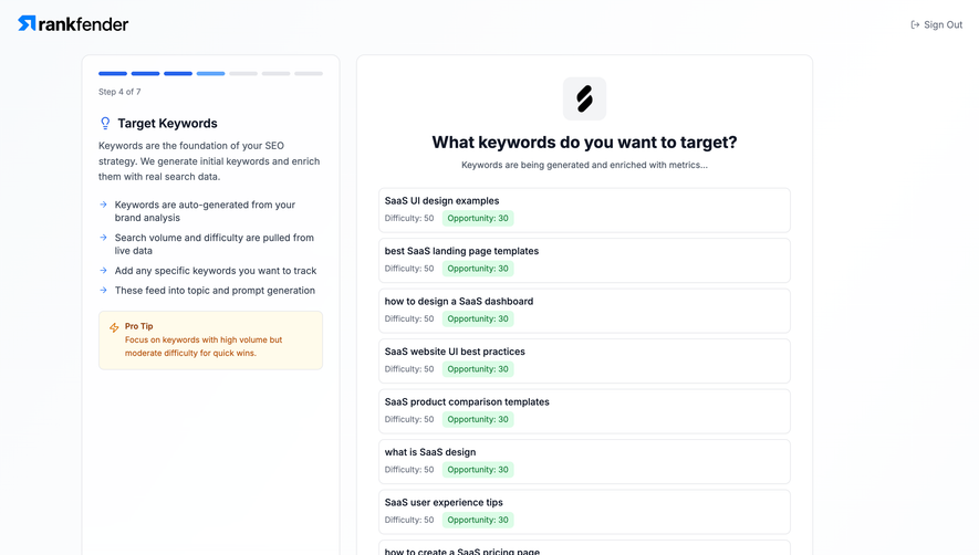
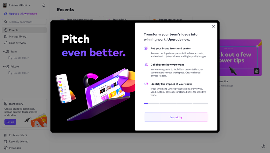
# Design from Reference: Rankfender Upgrading Paywall
Create an original, high-fidelity visual design inspired by the reference. Prioritize composition, typography, colors, spacing, and component styling over technical implementation.
## Reference
- **Product:** Rankfender
- **Category:** Upgrading
- **Screenshot:** https://cdn.prod.website-files.com/5e9dc792e1210c5325f7ebbc/6acc0f655d6cd572f289cb65_6acc0e4ff0977699c4cd229f_cms-101091836c1a54cc1cc940e4-v3.webp
Analyze the screenshot first. If inaccessible, request it rather than guessing.
## Content
{{content.instructions}}
{{content.data}}
Preserve essential messaging and factual accuracy. Adapt structure and copy length for visual balance; never invent product claims.
## Visual Design
### Overall aesthetic
- **Style:** Dense four-plan paywall with white cards, blue trial actions, and muted backdrop.
### Page composition
- **Canvas:** 2880 × 2060 image px; CSS estimates assume unverified 2×.
- **Dialog:** Nearly full-width, with pale top header, currency/billing controls, four plan columns, and bottom demo link.
### Information hierarchy
- **Primary:** Select a plan title and prices.
- **Recommended:** Professional marked Most Popular.
- **Actions:** Blue trial buttons aligned at card bottoms; gray Contact Sales for agency.
- **Comparison:** Checkmarked limits/features.
### Typography
- **Family:** Compact sans serif; exact identity unverified.
- **Header:** Approximately 22px CSS bold.
- **Plan names:** Approximately 18px bold.
- **Prices:** Approximately 26px bold.
- **Lists:** Approximately 12–14px with 22px line-height.
- **Precision:** Estimated under 2×.
### Colors & surfaces
- **Dialog/cards:** #FFFFFF.
- **Backdrop:** #B2B2B2.
- **Blue:** #2663EB.
- **Text:** #111827.
- **Borders:** #E6E7EB.
- **Muted action/text:** #70747E.
- **Precision:** Flat samples.
### Components
- **Cards:** Thin borders, small radii, equal heights.
- **Recommended marker:** Small green badge.
- **Toggles:** Text currency/year/month controls and green savings chip.
- **Buttons:** Full-width rectangles near bottom.
- **Footer:** Centered question and demo link.
### Visual rhythm
- **Density:** Long lists create substantial vertical content.
- **Alignment:** Prices, titles, and final actions repeat across columns.
- **Spacing:** Narrow regular gutters.
### Responsive
- **Observed:** Desktop only.
- **Recommendation:** Stack or horizontally scroll plans; keep billing controls and units clear.
### Adaptation guidance
- **Preserve:** Plan comparison and consistent action alignment.
- **Content:** Use current supplied prices/features, not screenshot values.
- **Behavior:** Billing switches and checkout unverified.
Use this context to reproduce the reference's visual language: layout, typography, colors, spacing, borders, radii, and distinctive elements. The screenshot takes priority if descriptions conflict.
## Direction
{{preferences.fidelityInstructions}}
## Output
{{output.instructions}}
Deliver a polished, cohesive design with precise alignment, hierarchy, and spacing. Produce the requested visual artifact, not just a description. If unsupported, explain the limitation.