
Thank you! Your submission has been received!
Oops! Something went wrong while submitting the form.
Get SaaSFrame Pro
Monthly
$18
Quarterly
$48
Yearly
$180
Upgrade to access this feature
Browse all screens & flows
Filter and search screens & flows
Access Figma files
Access mobile versions
Bookmark screens & flows
Join now

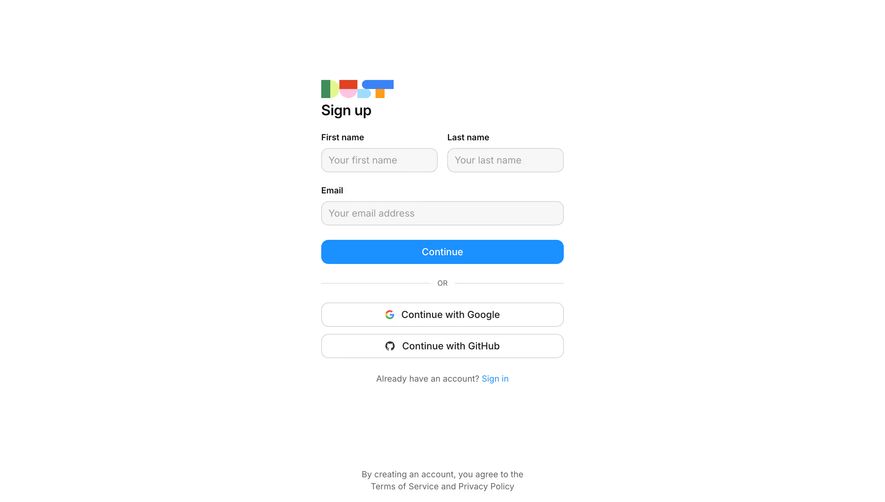
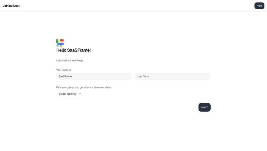
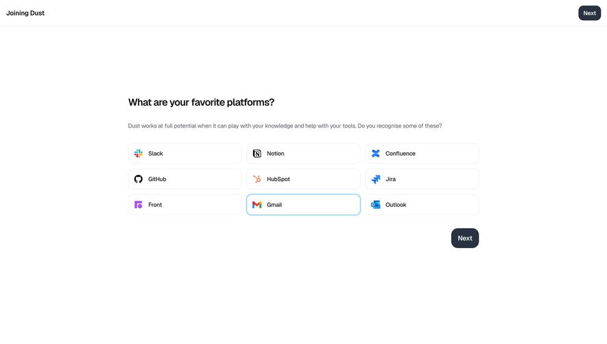
Dust Plans

Dust
Build custom AI Agents
Designed by
No items found.

Bookmark
Bookmark

Design with AI
Thank you! Your submission has been received!
Oops! Something went wrong while submitting the form.
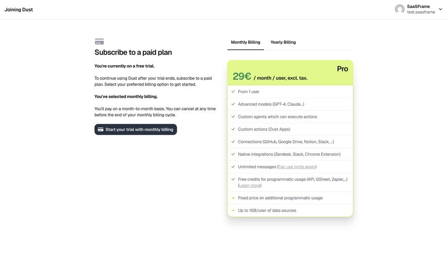
# Design from Reference: Dust Plans
Create an original, high-fidelity visual design inspired by the reference. Prioritize composition, typography, colors, spacing, and component styling over technical implementation.
## Reference
- **Product:** Dust
- **Category:** Plans
- **Screenshot:** https://cdn.prod.website-files.com/5e9dc792e1210c5325f7ebbc/69808621e66066722a2db88b_WIrIKkSc7gpTARtprxCptvgl8jBPzJbqwikJkZzqIw8.avif
Analyze the screenshot first. If inaccessible, request it rather than guessing.
## Content
{{content.instructions}}
{{content.data}}
Preserve essential messaging and factual accuracy. Adapt structure and copy length for visual balance; never invent product claims.
## Visual Design
### Overall aesthetic
- **Style:** Focused subscription-choice screen pairing explanatory copy with a single lime-accented plan card.
- **Character:** White canvas, charcoal primary action, pale lime pricing header, thin list rules, and restrained green checkmarks.
- **Surface treatment:** Most content is unboxed; the plan card uses a thin lime outline and soft drop shadow.
### Page composition
- **Capture and scale:** 2940 × 1664 image px. Estimated CSS dimensions assume a 2× capture, approximately 1470 × 832 CSS px; scale is unverified.
- **Header:** Thin full-width row with joining context left and compact account/avatar dropdown right.
- **Main container:** Centered two-column area around 850px wide, beginning well below the header.
- **Left column:** Small card icon, subscription heading, trial-status statement, explanatory paragraphs, monthly-billing statement, and dark payment/trial action.
- **Right column:** Monthly/Yearly Billing tabs above a single Pro card, approximately 414px wide.
- **Plan card:** Lime header with large price and billing qualifiers; Pro label aligned at upper right. Ten ruled feature/limit rows fill the white body.
### Information hierarchy
- **Task:** Subscribe to a paid plan identifies the screen’s purpose.
- **Trial context:** Bold trial status and selected-billing sentence distinguish state from explanatory paragraphs.
- **Main action:** Dark compact trial/billing button sits below the copy.
- **Plan summary:** Large price is paired with smaller month/user/tax qualifiers, followed by detailed entitlements.
- **Feature distinctions:** Green checks mark most rows; orange dash symbols distinguish the final two limit/usage statements.
### Typography
- **Family:** Neutral sans serif; exact family is unverified.
- **Heading:** Approximately 24px semibold with 30px line-height.
- **Price:** Approximately 34px bold; Pro label around 24px.
- **Body:** Approximately 14px with 20px line-height.
- **Tabs / emphasis:** Approximately 14px semibold.
- **Feature rows:** Approximately 14px regular in slate gray, with underlined secondary links.
- **Precision:** Font sizes, weights, and CSS scale are estimates inferred from pixels.
### Colors & surfaces
- **Canvas / card body:** Sampled #FFFFFF.
- **Lime accent:** Sampled #E2F78C in the plan header and border treatment.
- **Primary action:** Sampled #2A3241.
- **Primary text:** Sampled #111418.
- **Secondary text:** Sampled #545D6C.
- **Fine rules:** Sampled #EEEEEF.
- **Status icons:** Green checks and orange dashes create localized semantic accents.
- **Depth:** Soft gray shadow falls below the plan card without competing with the lime header.
### Components
- **Header identity:** Small circular avatar, two-line account label, and downward chevron, separated from content by a fine rule.
- **Tabs:** Two text tabs above a thin baseline; Monthly Billing has a dark underline.
- **Plan shell:** Approximately 414 × 516px, 16px radius, lime outline, and broad soft shadow.
- **Plan header:** Approximately 84px tall; price/billing copy aligns near the lower left and tier name near the upper right.
- **Feature rows:** About 41px minimum height with thin gray separators, small left symbols, and roughly 32px text inset.
- **Wrapped row:** Programmatic-credit explanation spans two lines and includes a muted underlined learn-more link.
- **Primary action:** Compact charcoal rounded rectangle around 270 × 36px, white card icon and label, about 10px radius.
- **State limits:** Monthly billing is shown; no yearly values, checkout, payment details, or confirmation state is visible.
### Visual rhythm
- **Column balance:** Short explanatory blocks left align against the taller feature card right.
- **Text grouping:** Bold state lines alternate with regular paragraphs, making the billing context easy to scan.
- **List rhythm:** Consistent row borders and check gutters organize dense plan information.
- **Whitespace:** Broad margins and a sparse header isolate the subscription decision.
### Responsive
- **Observed state:** Desktop only; mobile and tab-change behavior are unverified.
- **Layout recommendation:** Stack explanatory copy above the tabs/card on narrow screens.
- **Card recommendation:** Use full available width within 20–24px gutters and allow long feature lines to wrap.
- **Action recommendation:** Keep the billing action near its explanatory state and maintain a comfortable touch target.
- **Header recommendation:** Truncate or wrap account labels without hiding account access.
### Adaptation guidance
- **Preserve:** Two-column explanation/plan relationship, explicit billing selection, lime plan emphasis, and clear entitlement rows.
- **Starting geometry:** Approximately 850px content area, 414px plan width, 16px radius, 24px heading, and 14px body under the unverified 2× assumption.
- **Commercial fidelity:** Populate actual price, tax, trial, cancellation, and fair-use terms from supplied approved data; do not assume screenshot terms remain current.
- **State modeling:** Keep monthly/yearly selection consistent with displayed price and action text.
- **Implementation recommendation:** Provide accessible tabs, meaningful check/dash labels, visible focus, and a deliberate checkout flow rather than inferring one from the capture.
Use this context to reproduce the reference's visual language: layout, typography, colors, spacing, borders, radii, and distinctive elements. The screenshot takes priority if descriptions conflict.
## Direction
{{preferences.fidelityInstructions}}
## Output
{{output.instructions}}
Deliver a polished, cohesive design with precise alignment, hierarchy, and spacing. Produce the requested visual artifact, not just a description. If unsupported, explain the limitation.


Category
Patterns
Tech Stack


Added on
February 2, 2026
Similar screens
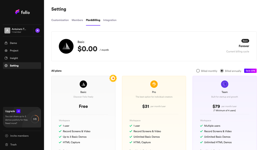


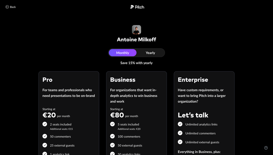

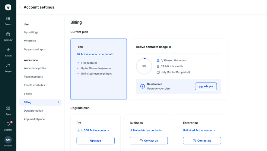

Upgrade to SaaSFrame Pro now to see similar examples.
Monthly
$18 /month
Billed $18 monthly
Browse all screens & flows
Filter and search screens & flows
Search text in screenshots
Access Figma files
Access mobile versions
Join now
Quarterly
$16 /month
Billed $48 quarterly
Browse all screens & flows
Filter and search screens & flows
Search text in screenshots
Access Figma files
Access mobile versions
Join now
Yearly
$15 /month
Billed $180 yearly
Browse all screens & flows
Filter and search screens & flows
Search text in screenshots
Access Figma files
Access mobile versions
Join now