Design with AI
Generate a new design based on this screen using your own content.
# Design from Reference: Huly Login
Create an original, high-fidelity visual design inspired by the reference. Prioritize composition, typography, colors, spacing, and component styling over technical implementation.
## Reference
- **Product:** Huly
- **Category:** Login
- **Screenshot:** https://cdn.prod.website-files.com/5e9dc792e1210c5325f7ebbc/6acc0f7fe540d8db93de5963_6acc0e5469a678314f62bf7b_cms-d31d311fb18d86bfc9cb0cc6-v3.webp
Analyze the screenshot first. If inaccessible, request it rather than guessing.
## Content
{{content.instructions}}
{{content.data}}
Preserve essential messaging and factual accuracy. Adapt structure and copy length for visual balance; never invent product claims.
## Visual Design
### Overall aesthetic
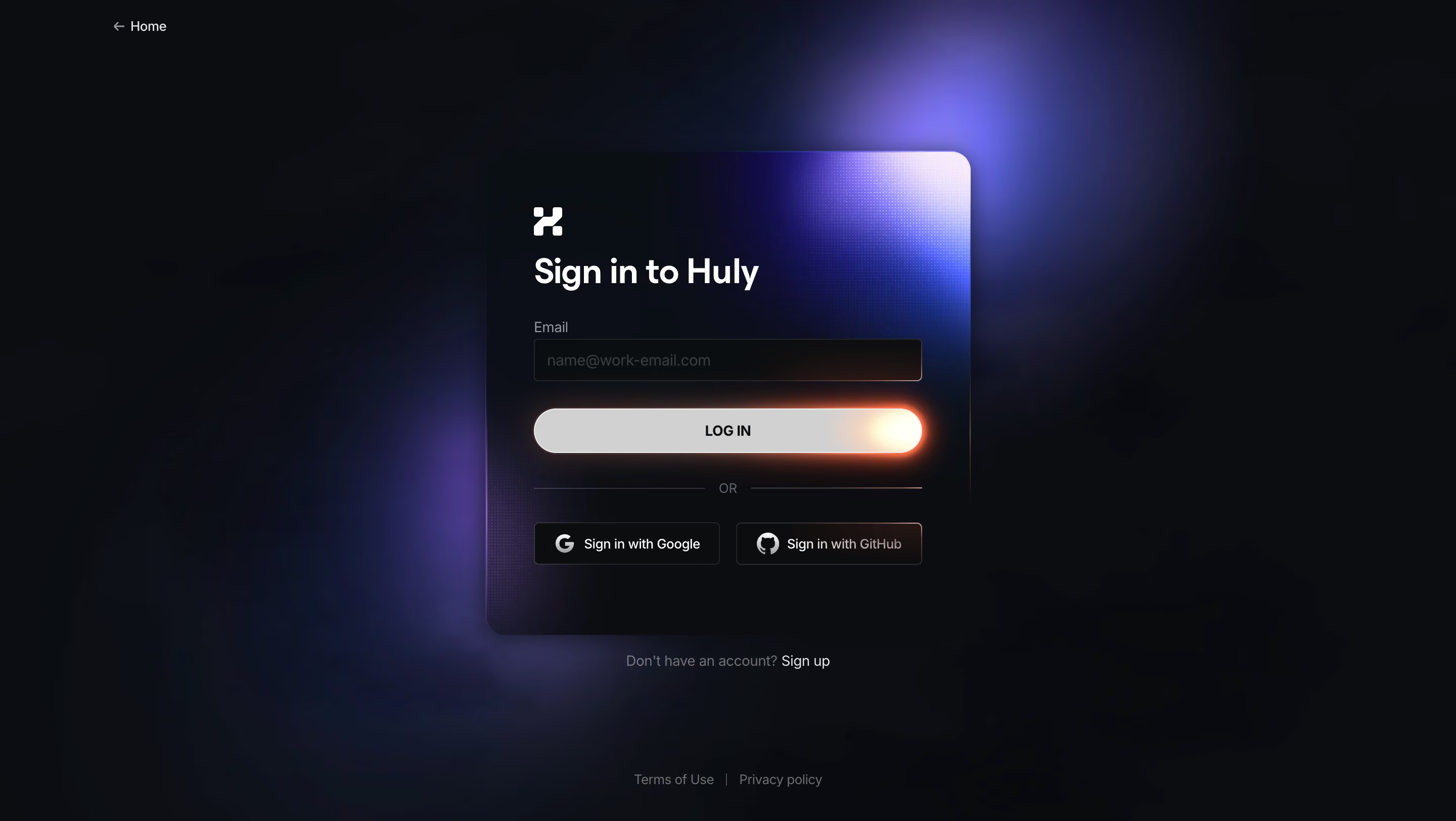
- **Style:** Dramatic dark authentication screen with purple-blue ambient light, a subtly textured card and a glowing white login pill.
- **Scale:** Source 2880 × 1624px; dimensions estimate a 1440px-wide CSS viewport at 2× capture scale.
### Page composition
- **Background:** Nearly black full-screen canvas with diffuse violet glows behind the centered form.
- **Card:** Approximately 480 × 480px dark panel with rounded corners, inset brand mark, heading, email field, login action and provider buttons.
- **Peripheral links:** Home sits upper left, signup below the card and terms/privacy near the bottom center.
### Information hierarchy
- **Primary route:** Sign in to Huly introduces a single email field and LOG IN action.
- **Alternatives:** An OR divider precedes Google and GitHub buttons side by side.
- **Secondary navigation:** Signup and legal links remain visually subordinate outside the card.
### Typography
- **Family:** Modern sans-serif; exact font identity is unverified.
- **Roles:** Estimated heading 32px bold, labels/body 14px, primary action 14px bold uppercase and provider text 13px.
- **Contrast:** White heading and brand mark dominate; labels and legal copy are subdued gray.
### Colors & surfaces
- **Sampled palette:** ICC-aware sRGB samples include near-black #0B0D11, #0A0B10, #0C0E13, #0B0D12 and #090A0F.
- **Lighting:** Purple/blue glows surround the card; warm orange-white light blooms from the login button's right edge.
- **Texture:** A fine dotted gradient highlights the card's upper-right corner, fading into its dark surface.
### Components
- **Email:** Approximately 384 × 42px dark field with thin outline, small corners and muted work-email placeholder.
- **Login pill:** Same width, around 44px high, pale fill and strong warm edge glow.
- **Provider buttons:** Two compact dark outlined rectangles with white provider icons, around 184px wide each.
- **Card treatment:** Roughly 20px corners, dark translucent-looking surface and soft shadow; no password or validation state is visible.
### Visual rhythm
- **Spacing:** A compact vertical form sequence is separated from provider actions by a thin-rule OR divider.
- **Balance:** The bright upper-right card corner and warm button edge create asymmetric highlights within an otherwise centered layout.
### Responsive
- **Recommended adaptation:** Only desktop is observed. Use fluid card width with 24px margins and stack provider buttons if labels become cramped.
- **Effects:** Keep text/input contrast readable when adapting glows and textures; retain clear Home and signup access.
### Adaptation guidance
- **Preserve:** Keep one clear email route, distinct provider alternatives and restrained luminous accents.
- **Adapt:** Use supported authentication methods and actual legal destinations. Do not infer a password or verification flow beyond the visible controls.
Use this context to reproduce the reference's visual language: layout, typography, colors, spacing, borders, radii, and distinctive elements. The screenshot takes priority if descriptions conflict.
## Direction
{{preferences.fidelityInstructions}}
## Output
{{output.instructions}}
Deliver a polished, cohesive design with precise alignment, hierarchy, and spacing. Produce the requested visual artifact, not just a description. If unsupported, explain the limitation.