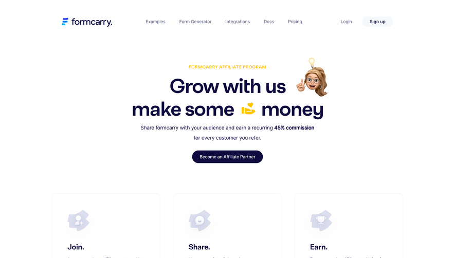
Generate a new design based on this screen using your own content.
Thank you! Your submission has been received!
Oops! Something went wrong while submitting the form.
# Design from Reference: Uvodo Affiliate Page
Create an original, high-fidelity visual design inspired by the reference. Prioritize composition, typography, colors, spacing, and component styling over technical implementation.
## Reference
- **Product:** Uvodo
- **Category:** Affiliate Page
- **Screenshot:** https://cdn.prod.website-files.com/5e9dc792e1210c5325f7ebbc/6acad66fd63d2caea65c63ea_6acad60011963fdadfb6ad14_cms-ddfd8150abe4c6a3d9036304.webp
Analyze the screenshot first. If inaccessible, request it rather than guessing.
## Content
{{content.instructions}}
{{content.data}}
Preserve essential messaging and factual accuracy. Adapt structure and copy length for visual balance; never invent product claims.
## Visual Design
Use this context to reproduce the reference's visual language: layout, typography, colors, spacing, borders, radii, and distinctive elements. The screenshot takes priority if descriptions conflict.
## Direction
{{preferences.fidelityInstructions}}
## Output
{{output.instructions}}
Deliver a polished, cohesive design with precise alignment, hierarchy, and spacing. Produce the requested visual artifact, not just a description. If unsupported, explain the limitation.
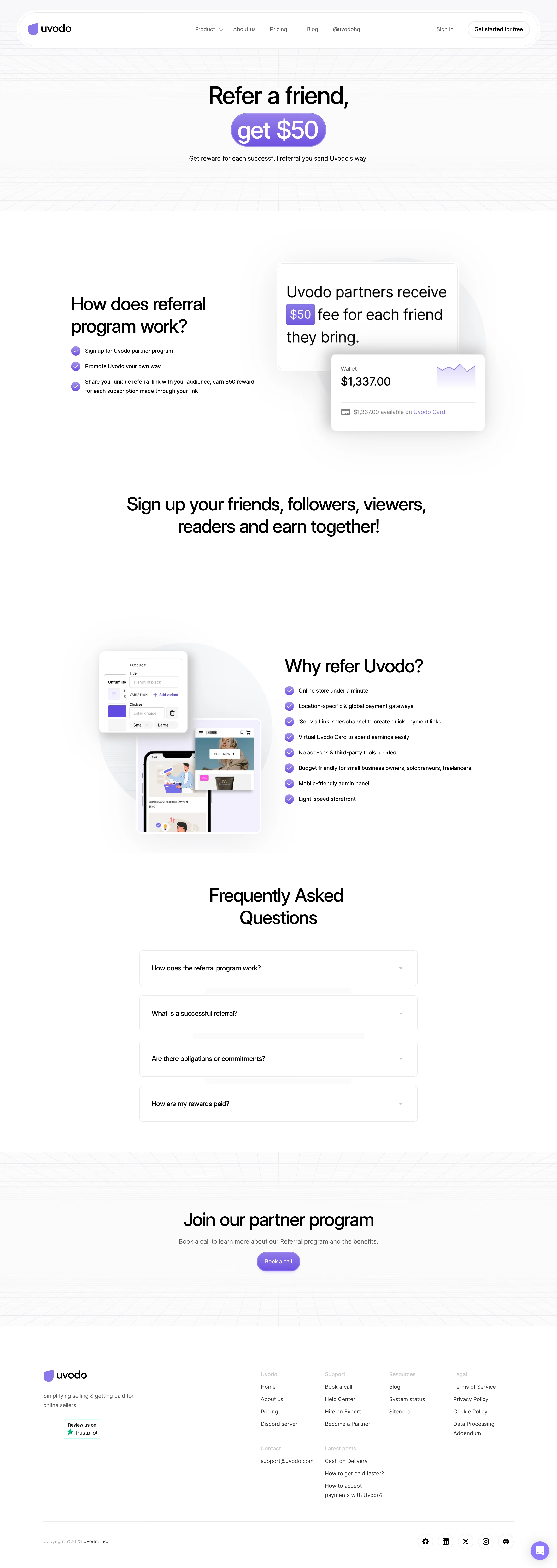
Uvodo’s Partner Program page embodies a clean, modern aesthetic with a sophisticated balance of whitespace and color. The design feels approachable yet professional, combining minimalism with energetic visual elements. Pops of a vibrant primary blue set against crisp whites and soft neutrals convey both trustworthiness and innovation, making the page inviting for SaaS audiences seeking partnership opportunities.
Layout and Structure
The page flows seamlessly from a high-impact hero section to well-spaced informational blocks. The hero is direct and compelling, featuring clear messaging and a prominent call to action. Below, content is organized into manageable sections—program benefits, how it works, earnings, and a vivid FAQ—each separated with ample padding and subtle background variations that guide the visitor’s eye. Strategic use of bullet points, card layouts, and iconography ensures the information hierarchy is both intuitive and visually digestible.
Visual Elements
Custom illustrations and playful iconography infuse personality without overwhelming. Animated elements, such as floating shapes or hover effects on buttons, add subtle interactivity. There are no heavy photographs—illustrations maintain a friendly, welcoming, and distinctly SaaS-specific look. The use of progressive disclosure (e.g., accordion-style FAQs) keeps the aesthetic tidy and the content accessible.
Color Palette and Typography
A bold blue takes center stage, frequently paired with calming greys and sporadic accent hues for buttons and highlights. Sharp, geometric sans-serif fonts offer clarity and modernity; headings command attention while body text ensures readability. Distinct font weights and sizes create a natural visual hierarchy, supporting quick scanning.
User Experience Patterns & Unique Design Choices
Navigation is streamlined with a sticky top bar guiding users to explore or join. Calls-to-action are visually prominent, using saturated colors and consistent button shapes to drive conversions. The registration and inquiry forms are frictionless, leveraging multi-step progress and minimal field count. The overall tone is energetic yet credible, harmonizing interactive delights with a sense of opportunity and reliability—perfect for inspiring SaaS web designers.