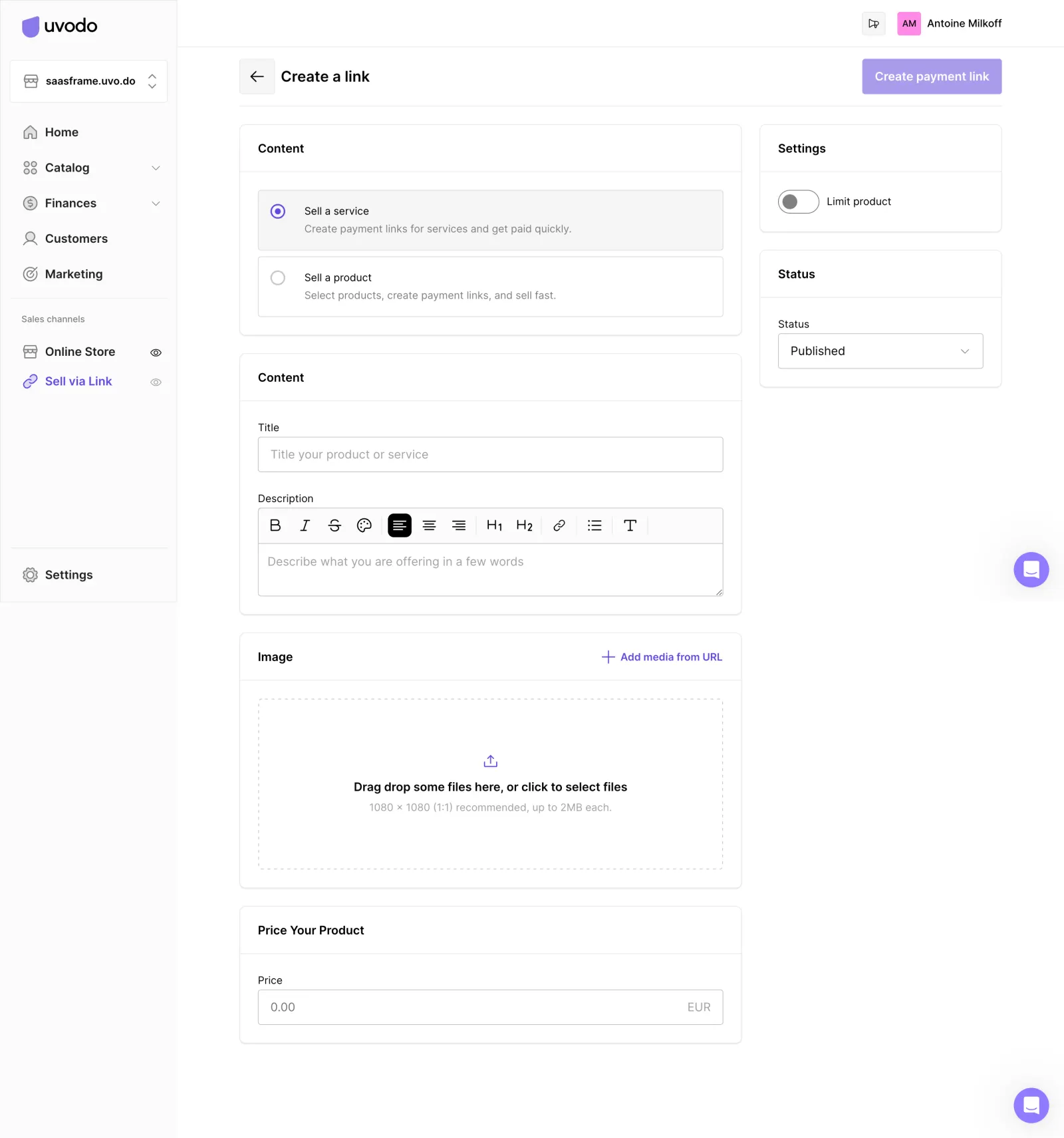
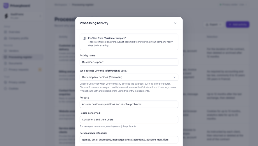
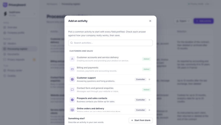
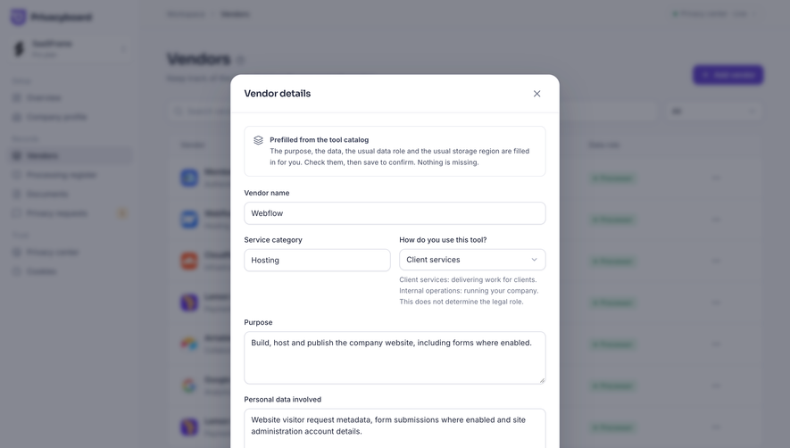
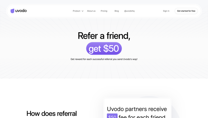
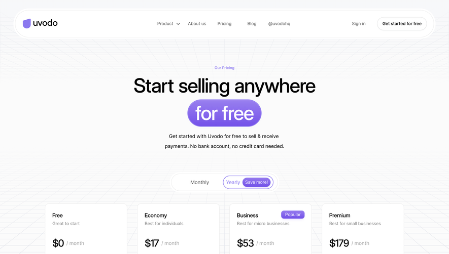
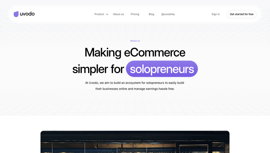
The page channels a crisp, modern minimalism that feels instantly professional and approachable. Spacious white backgrounds and subtle color accents create a sense of clarity and focus, while micro-interactions and understated shadows add a layer of sleek sophistication. The design feels deliberate and calm—perfect for SaaS creators who value both form and function.
Layout and Structure
The structure is laser-focused and intuitive, built around a single-page form flow. There’s no hero image or distracting content; users are guided through clear input sections, each logically grouped to minimize cognitive load. The sidebar navigation is slim and unobtrusive, making the main content area the hero, with plenty of room for each field and hint.
Visual Elements
Custom icons punctuate form sections for quick visual scanning, while gentle buttons and toggles guide the user’s actions. The absence of overbearing illustrations or complex visuals puts all attention on the user task, resulting in a focused workflow. Small touches, like soft hover effects and animated feedback, make each interaction feel smooth and premium.
Color Palette and Typography
A luminous blend of whites, cool grays, and a vivid accent blue define the core palette, ensuring both legibility and vibrancy. The typography features a geometric sans-serif—clean, readable, and subtly modern—establishing clear hierarchy using weight and scale for headings, labels, and CTA buttons.
User Experience Patterns
Smart inline validation, progressive disclosure for advanced options, and a sticky action bar at the bottom streamline interaction. Calls-to-action are placed precisely where users need them, minimizing friction while maximizing efficiency. The overall journey feels seamless and thoughtfully choreographed.
Unique or Notable Design Choices
Notably, the page goes beyond default form design with delightful micro-animations and encouragement messages at key points, fostering a sense of accomplishment. The reserved aesthetic, combined with subtle interactive cues, cultivates an atmosphere that’s quietly innovative and consistently user-centric.
Tone and Feel
Trustworthy and empowering, the design reassures users with its simplicity and polish. Its energetic undertones—carried by pops of blue and animated feedback—make the form experience feel less transactional and more like a guided setup that users can trust and enjoy.
 SaaSFrame