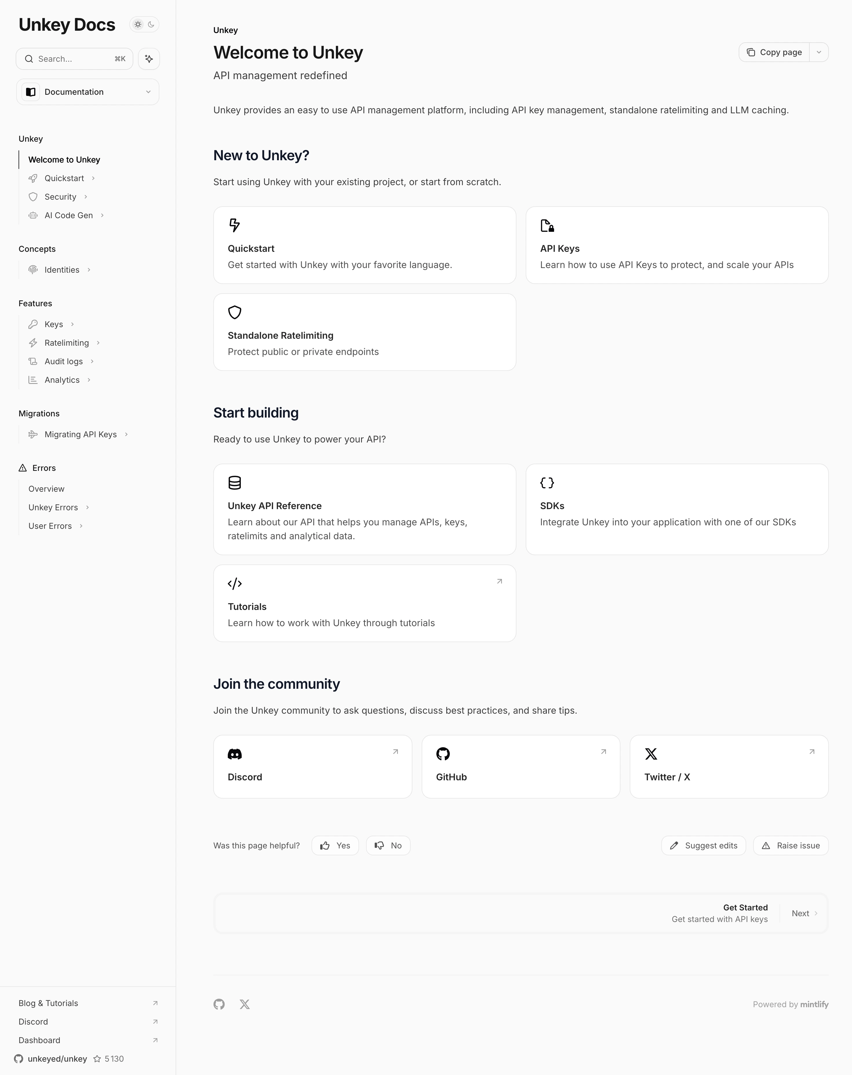


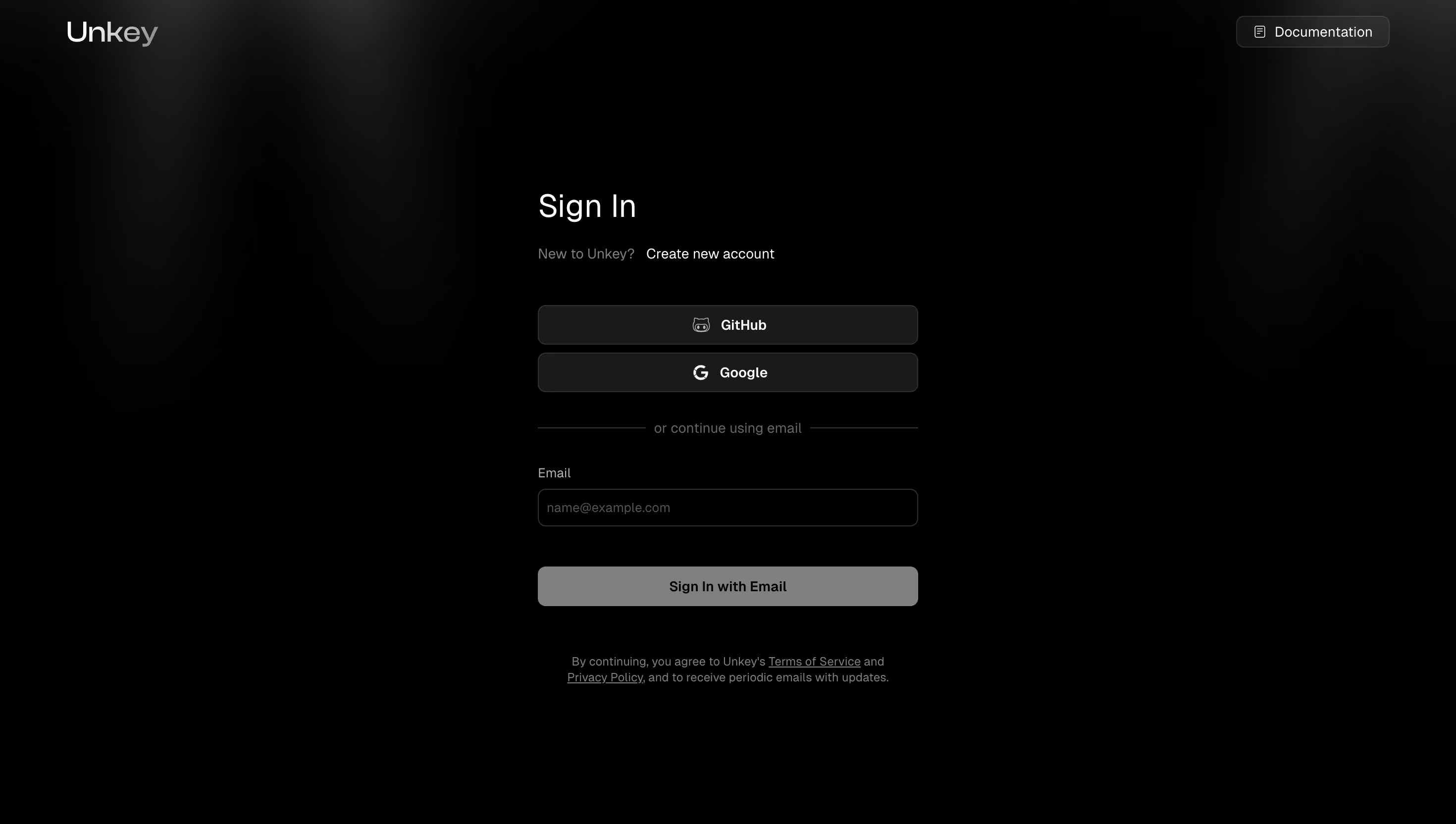
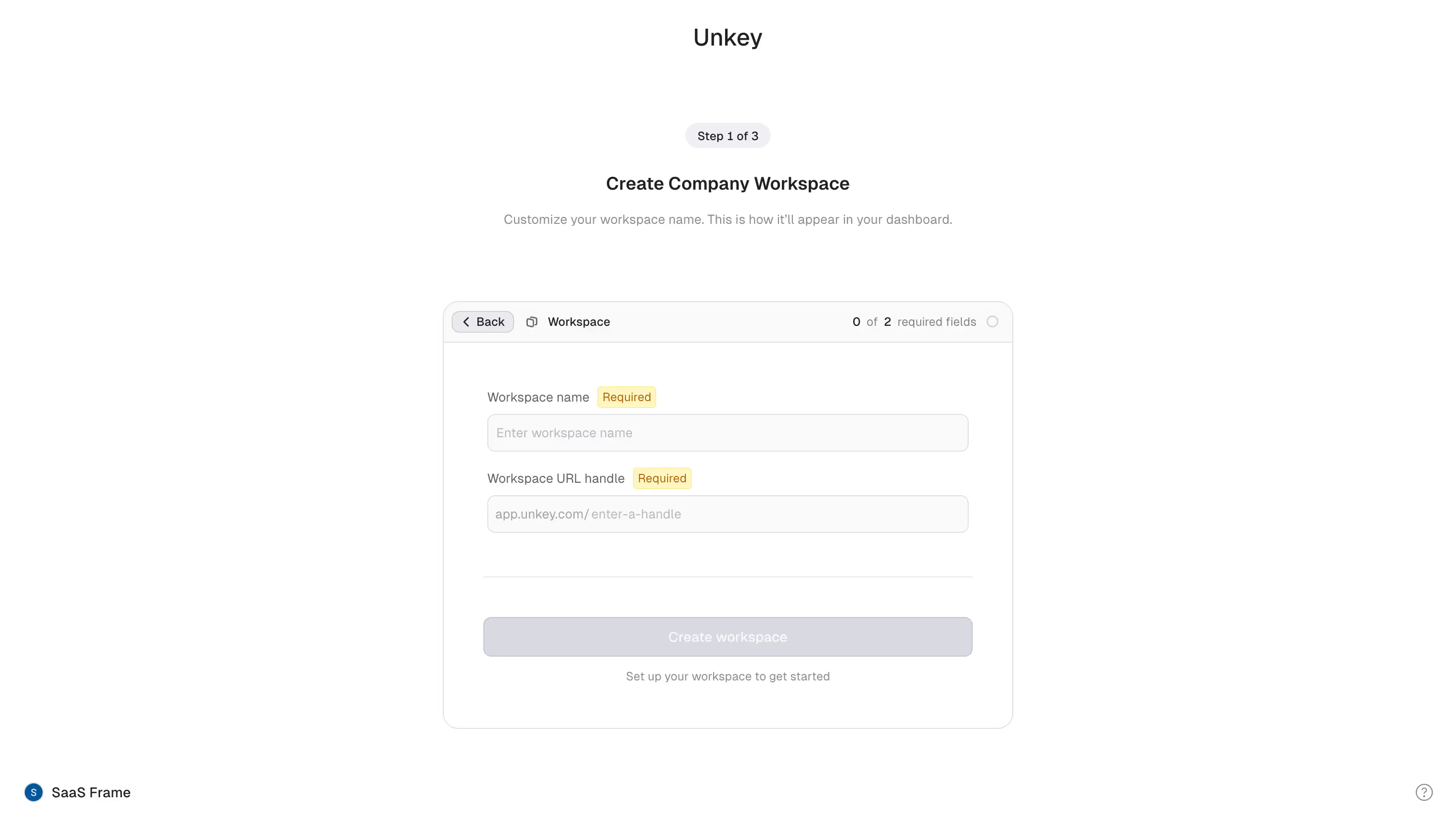
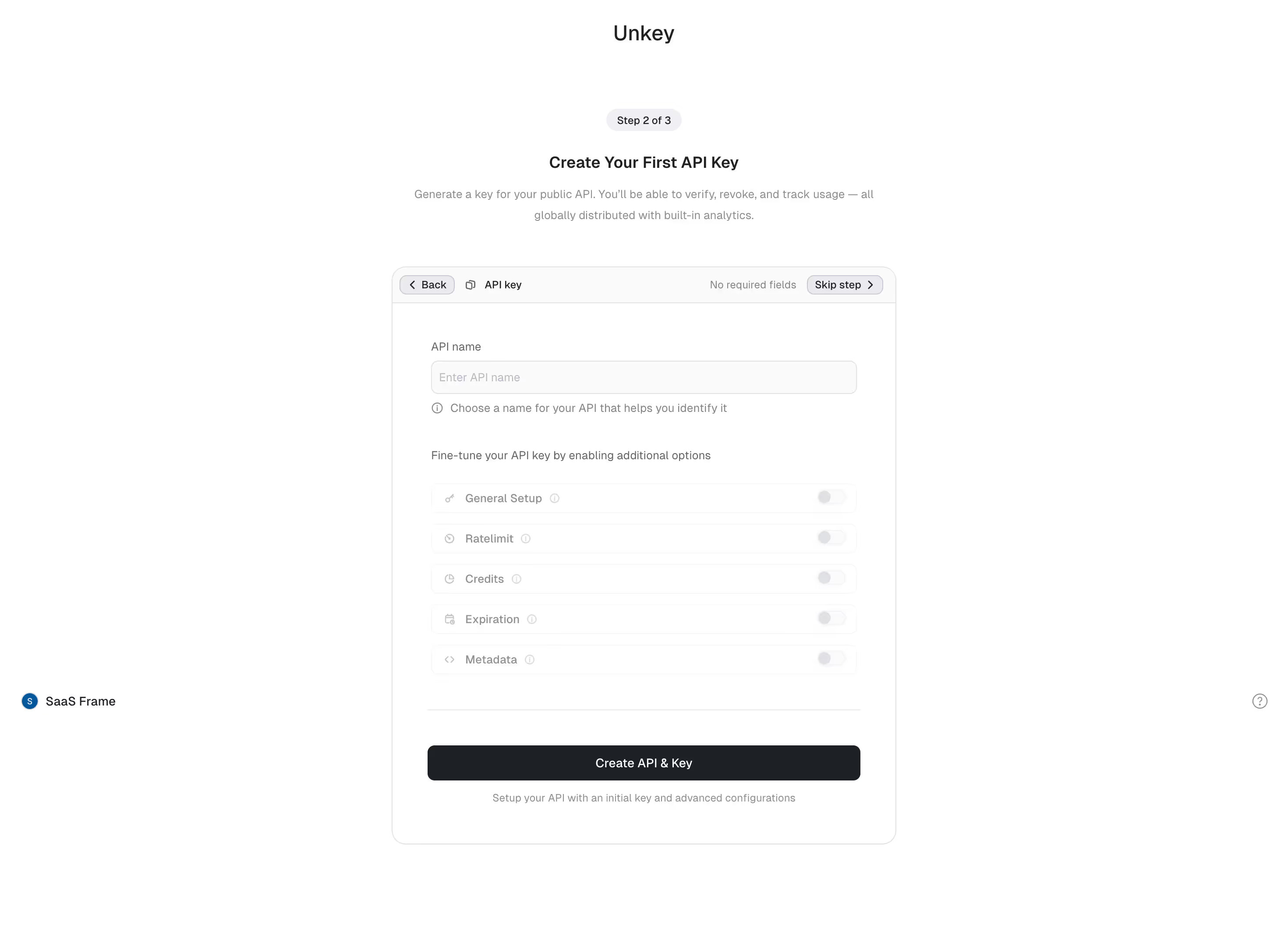
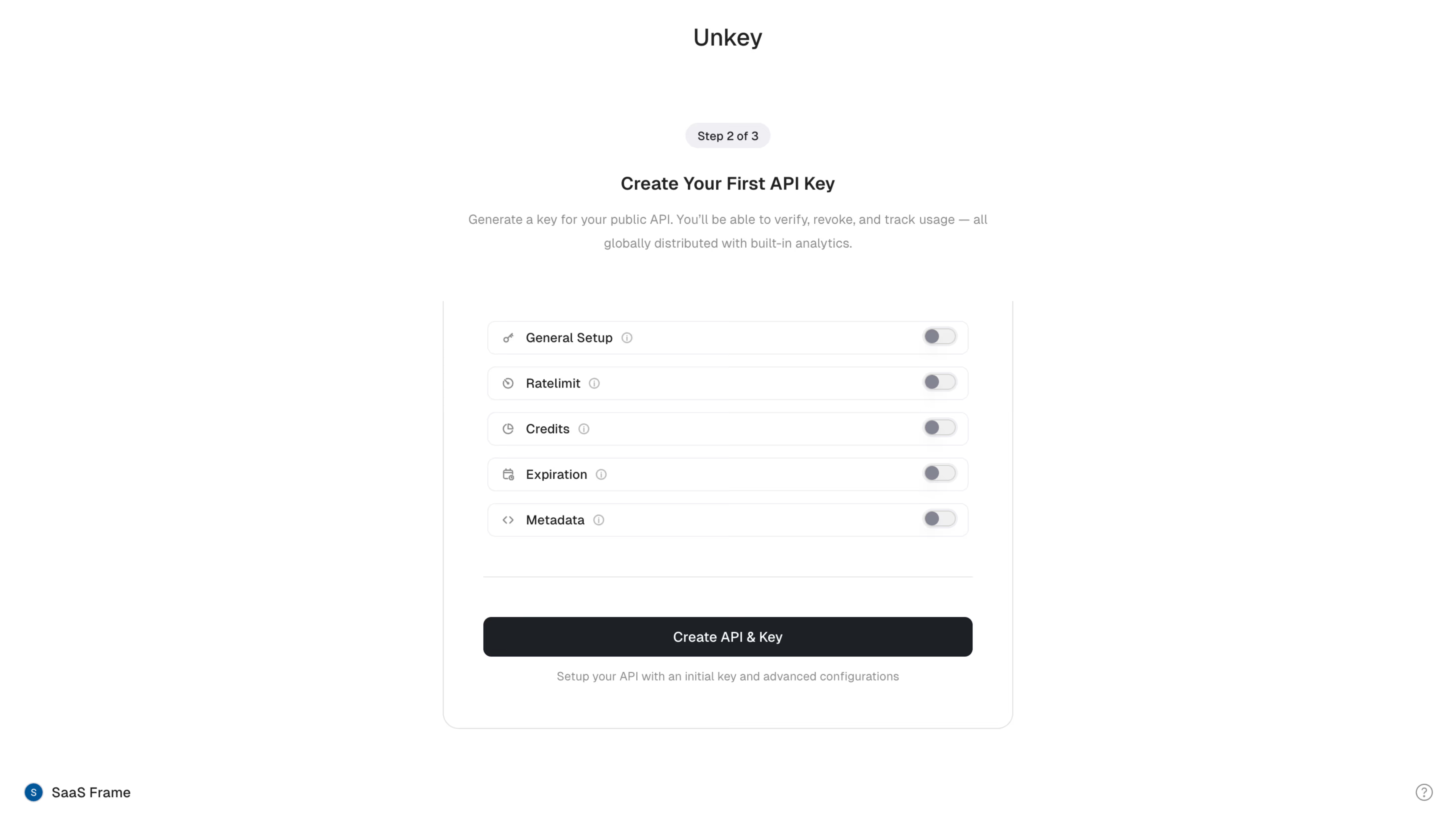

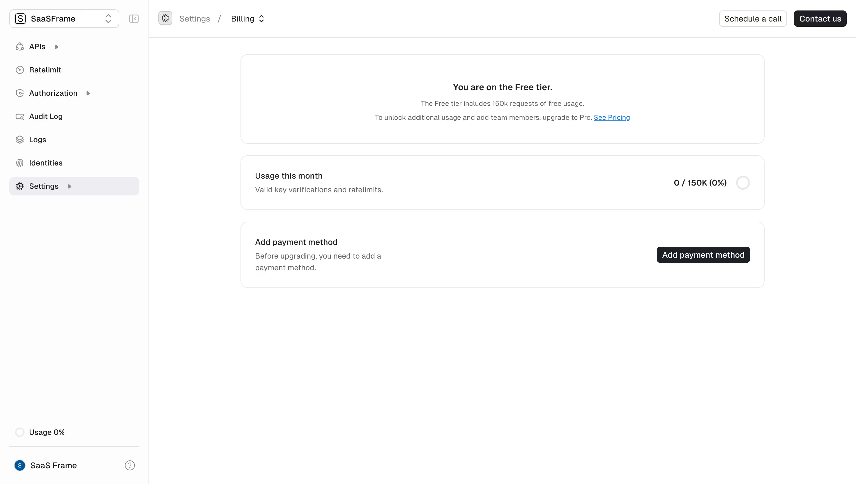
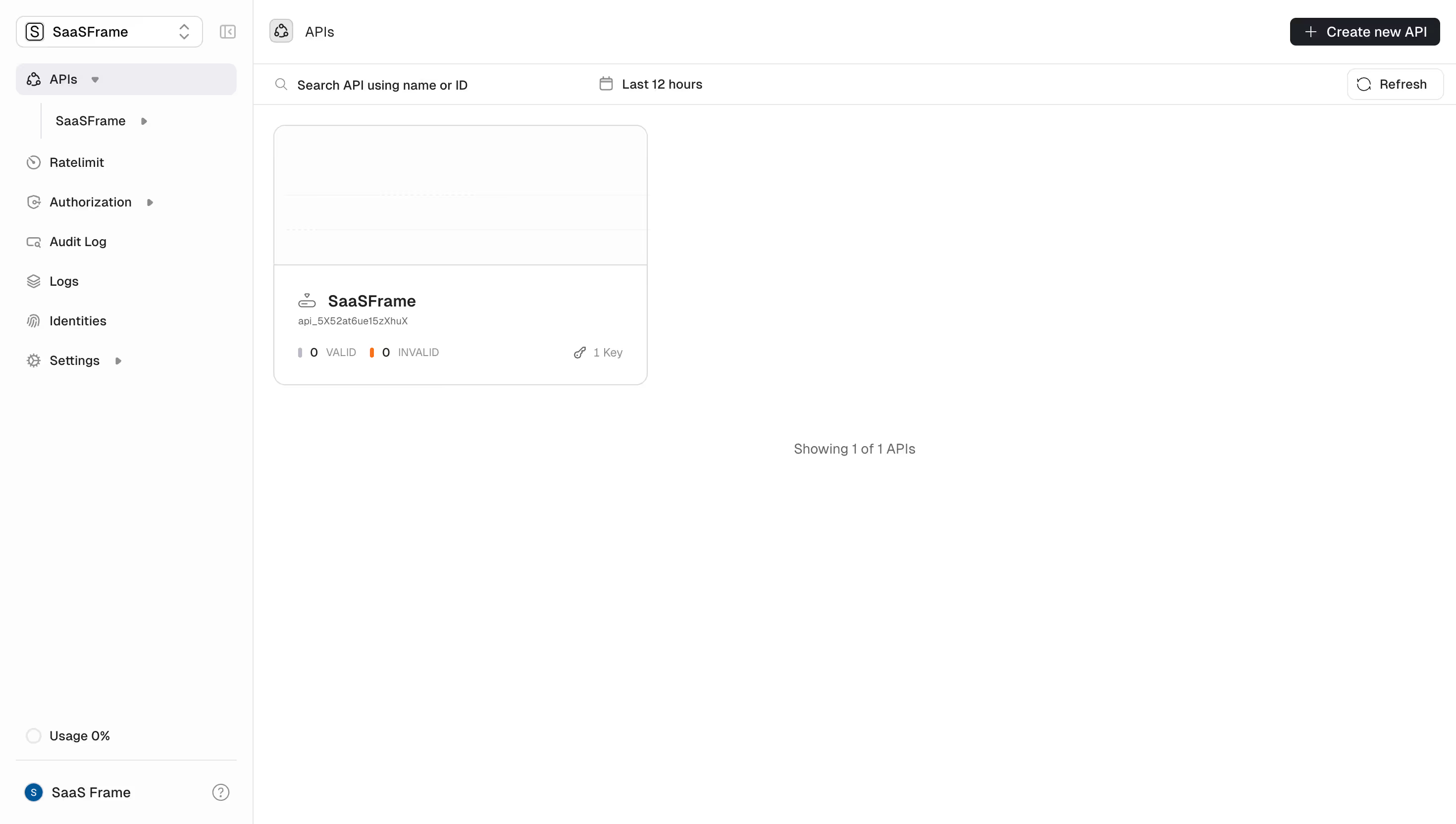
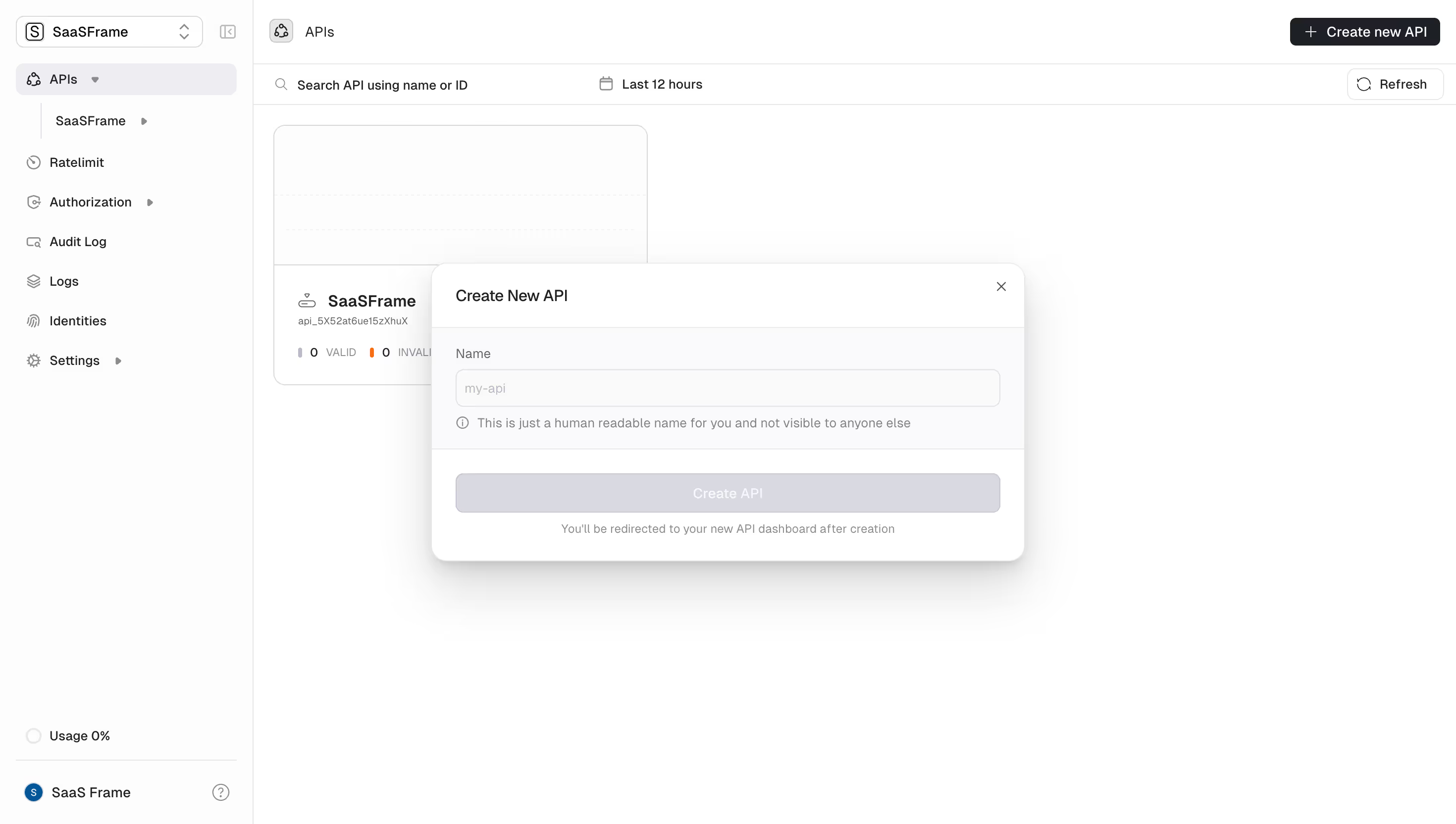
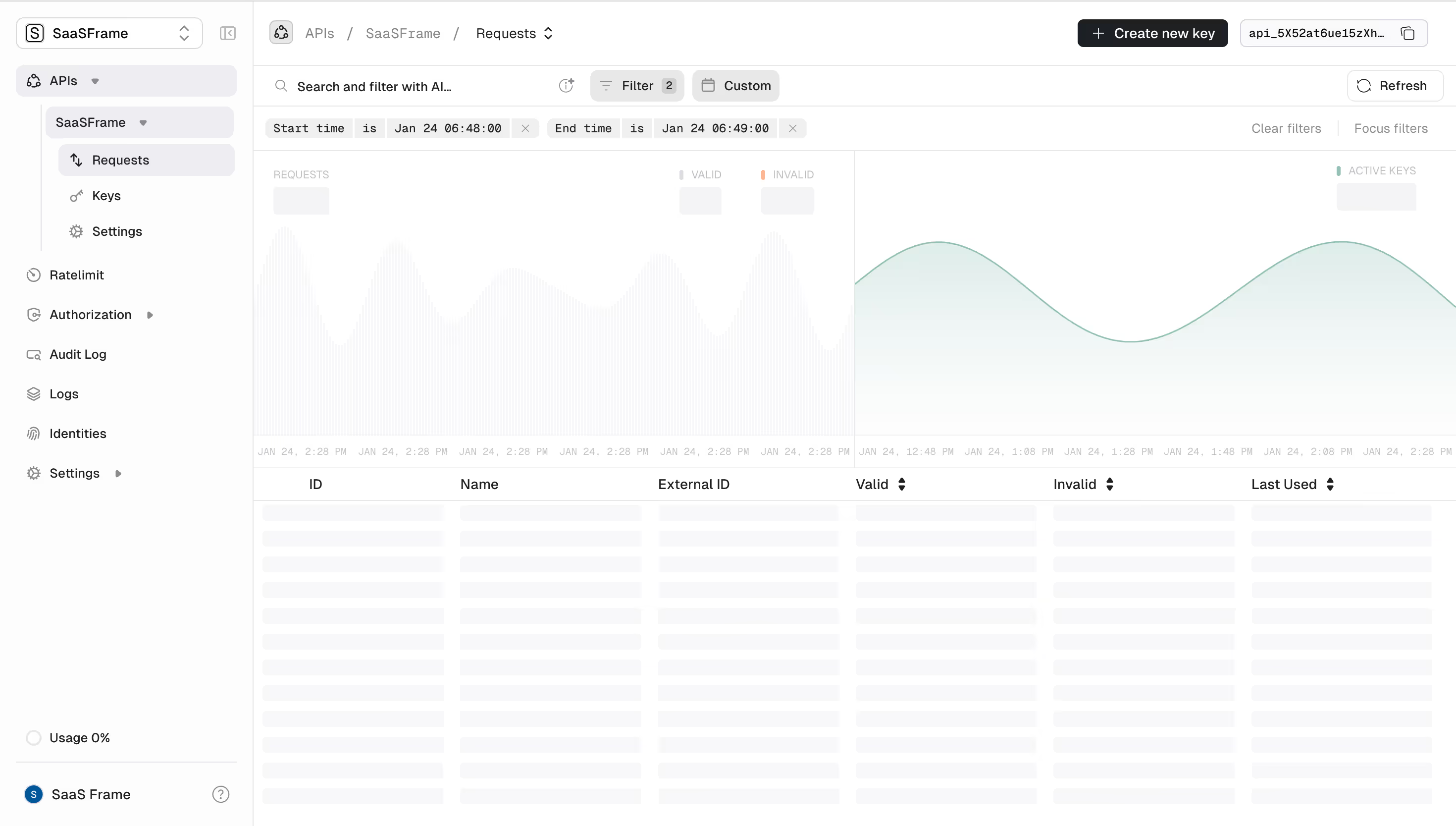
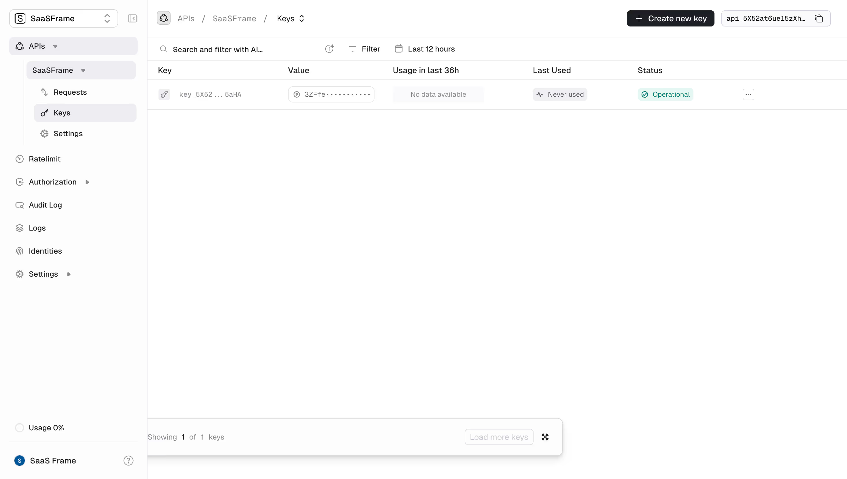

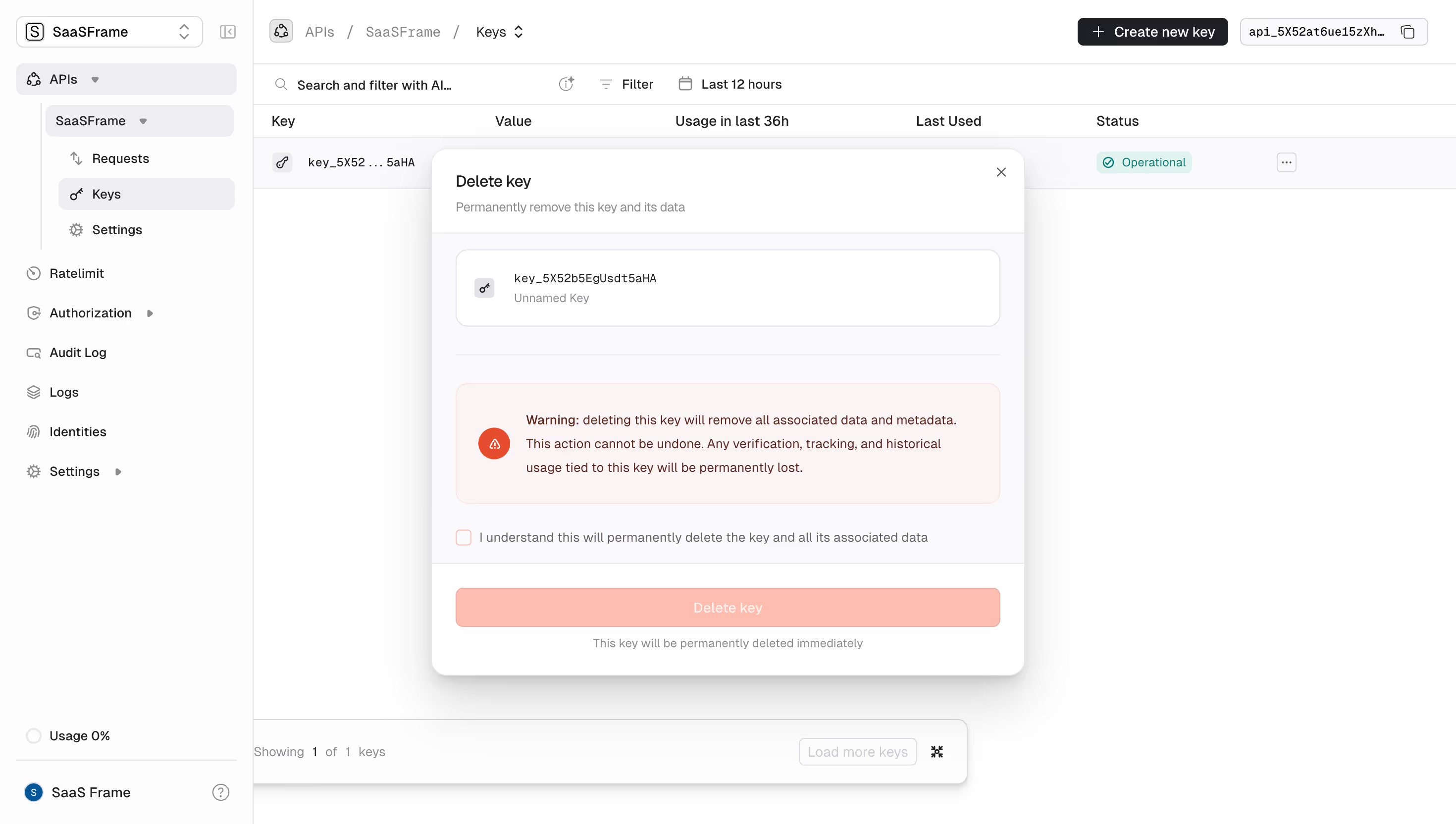
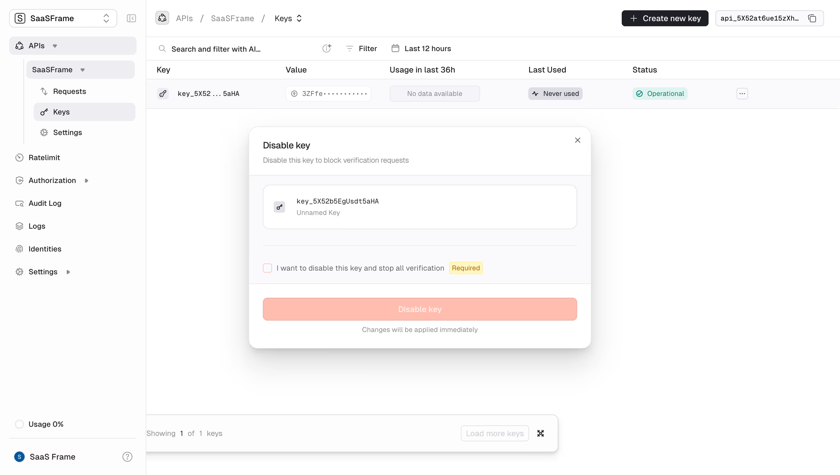




Unkey Design System
Source
\- Repo:
Stack \- Framework: Next.js (App Router) \- Styling: Tailwind CSS v3 \- Component library: Custom internal UI package (internal/ui) \- Language: TypeScript \- Deployment: Vercel / Unkey Deploy (self-hosted)
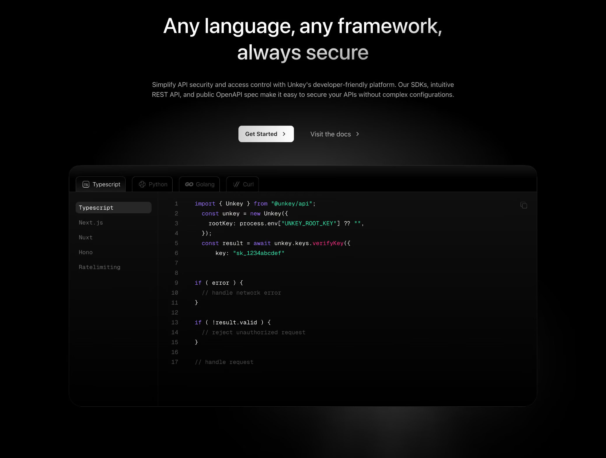
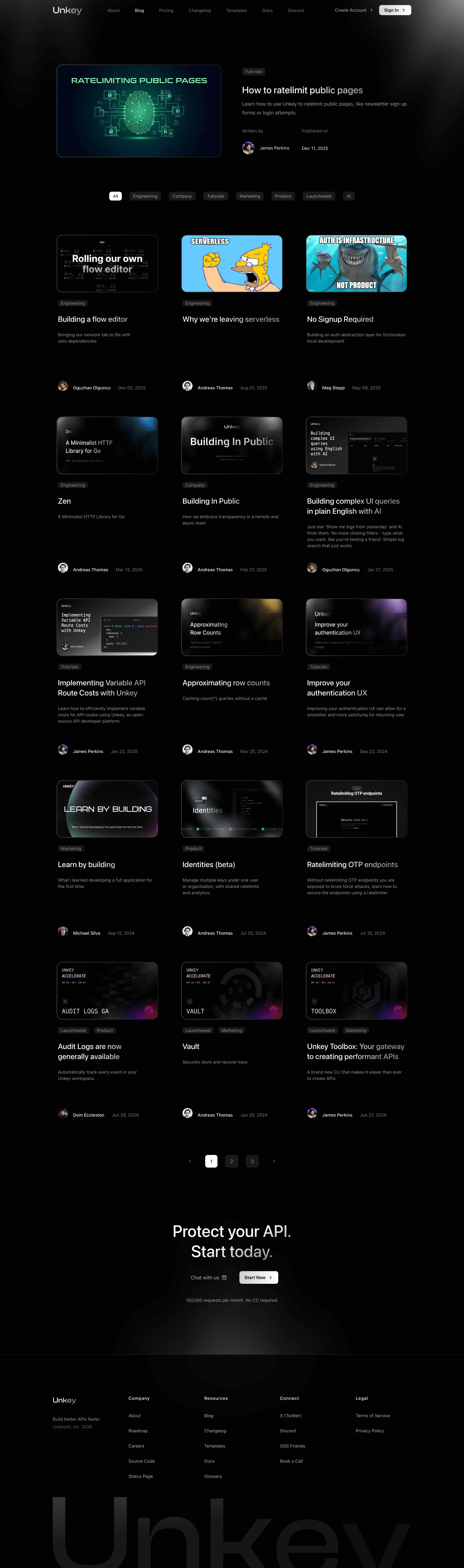
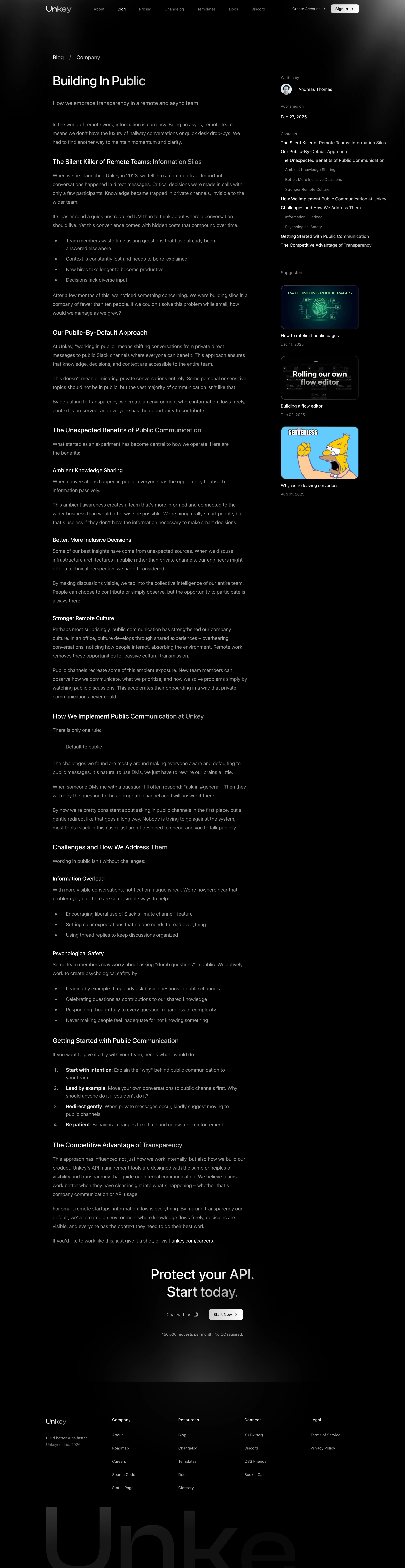
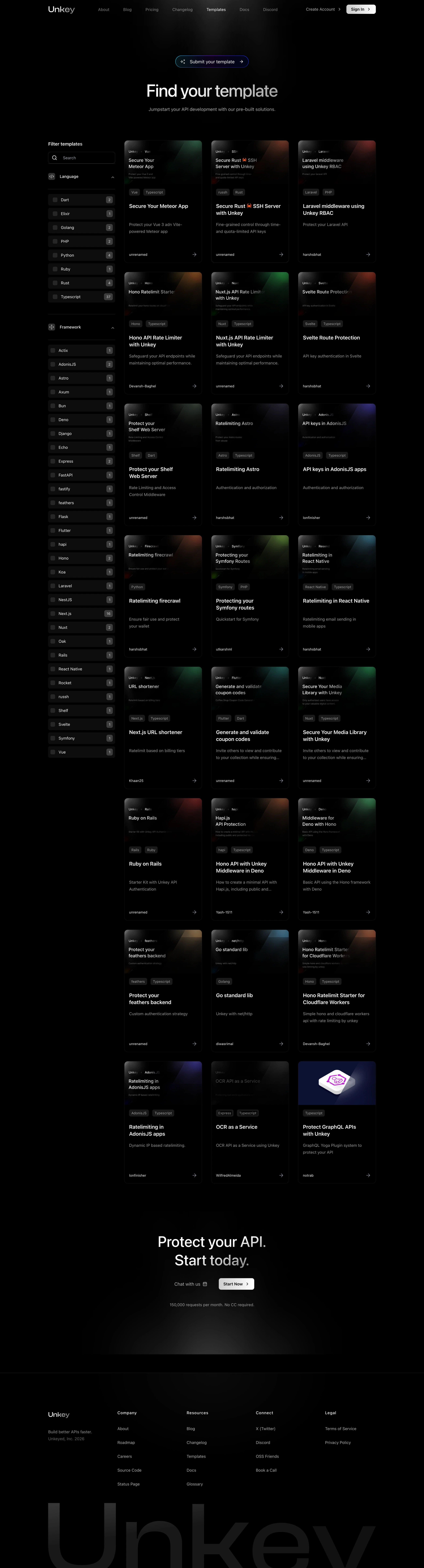
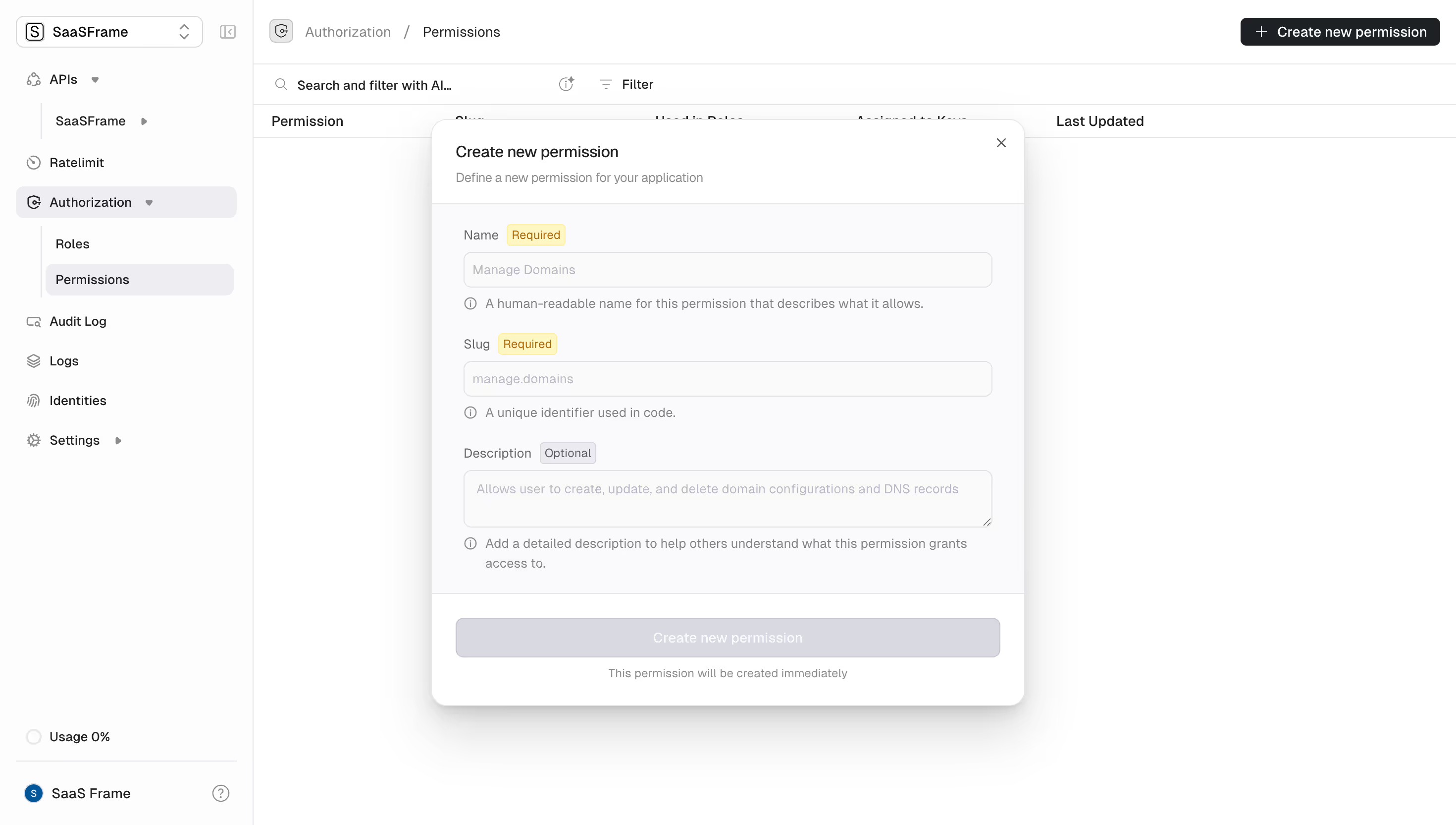
Color Philosophy Deep dark-first design system. The root background is near-black (#040406) — an almost pure black with a faint blue tint. The palette is monochromatic and developer-focused: dark surfaces, subtle gray midtones, and white text. A single accent color (white or off-white) drives CTAs. No vibrant hues; brand identity is expressed through restraint and precision.
Typography \- Font family: Geist (Vercel's open-source font) — sans-serif for UI, monospace variant for code blocks \- Scale: Tight type scale rooted in rem; large display headings (4xl–6xl) for hero sections, small utility text (xs–sm) for metadata \- Weight: Regular (400) for body, Semibold (600) for section labels, Bold (700) for hero headings \- Line height: Snug for headings (leading-tight), relaxed for body (leading-relaxed)
Spacing \- Base unit: 4px (Tailwind default) \- Section padding: py-24 to py-32 (96–128px) \- Container max-width: max-w-7xl (1280px) with px-4 sm:px-6 lg:px-8 \- Card gaps: gap-6 to gap-8 (24–32px)
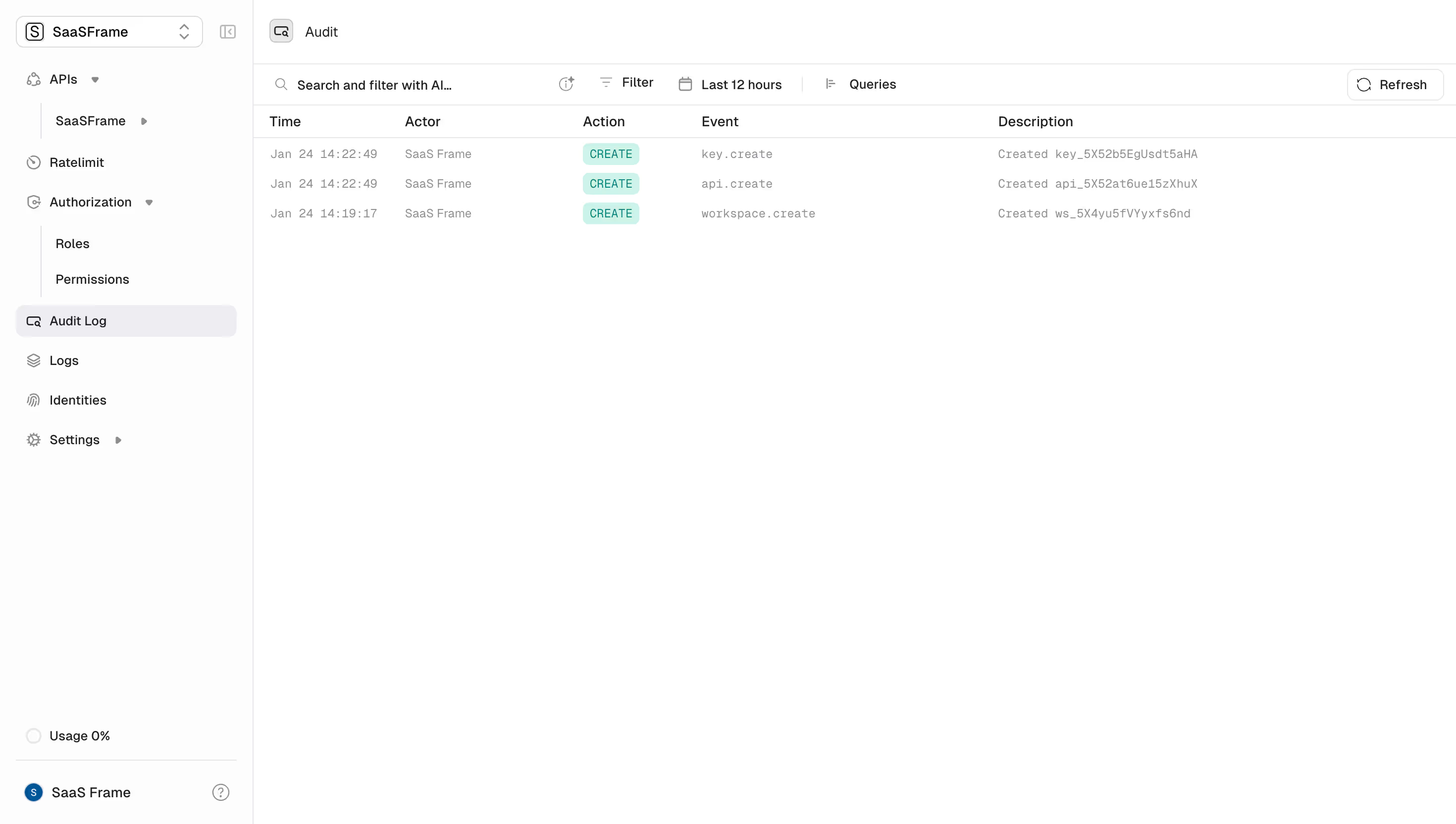
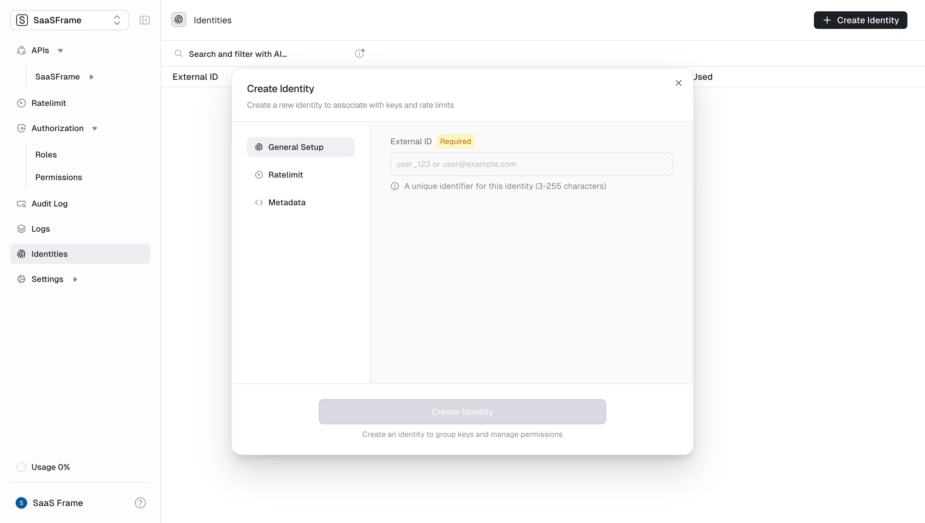
Component Defaults \- Buttons: Rounded-md (border-radius: 6px), solid white-on-dark primary, ghost/outline secondary \- Cards: Dark surface with subtle border (border border-white/10), no heavy shadows — depth via border opacity \- Badges: Small pill, uppercase tracking-wide text, muted border \- Navigation: Transparent sticky bar, border-bottom on scroll \- Code blocks: Monospace, dark bg (#0d0d0f), syntax-highlighted
Layout \- Single-column marketing layout with full-width hero sections \- Feature sections alternate image-left / content-right at lg: breakpoint \- Responsive grid: 1-col mobile → 2–3 col desktop \- Heavy use of negative space to communicate premium quality \- Dark mode is the only mode (no light-mode variant on marketing site)
/ Unkey Design System — CSS Custom Properties / / Source: Live site analysis (unkey.com) + open-source repo pattern /
:root { / ── Brand Background ── / --background: 4 4 6; / #040406 — near-black, site root / --background-subtle: 10 10 14; / #0a0a0e — card/section bg / --background-muted: 16 16 22; / #101016 — elevated surfaces / --background-emphasis: 22 22 30; / #16161e — hover/active states /
/ ── Foreground / Text ── / --foreground: 255 255 255; / #ffffff — primary text / --foreground-muted: 161 161 170; / #a1a1aa — secondary text (zinc-400) / --foreground-subtle: 113 113 122; / #71717a — disabled / placeholder / --foreground-inverted: 4 4 6; / #040406 — text on light surfaces /
/ ── Brand Accent ── / --accent: 255 255 255; / #ffffff — primary CTA (white on dark) / --accent-foreground: 4 4 6; / #040406 — text on accent bg / --accent-subtle: 255 255 255 / 0.08; / white/8 — ghost hover /
/ ── Borders ── / --border: 255 255 255 / 0.08; / white/8 — default border / --border-subtle: 255 255 255 / 0.05; / white/5 — very subtle divider / --border-emphasis: 255 255 255 / 0.15; / white/15 — hover/focus border / --border-input: 255 255 255 / 0.12; / white/12 — form inputs /
/ ── Semantic States ── / --success: 34 197 94; / #22c55e — green-500 / --warning: 234 179 8; / #eab308 — yellow-500 / --destructive: 239 68 68; / #ef4444 — red-500 / --info: 59 130 246; / #3b82f6 — blue-500 /
/ ── Ring / Focus ── / --ring: 255 255 255 / 0.3; --ring-offset: 4 4 6;
/ ── Typography ── / --font-sans: 'Geist', ui-sans-serif, system-ui, -apple-system, sans-serif; --font-mono: 'Geist Mono', ui-monospace, 'Cascadia Code', monospace; --font-size-xs: 0.75rem; / 12px / --font-size-sm: 0.875rem; / 14px / --font-size-base: 1rem; / 16px / --font-size-lg: 1.125rem; / 18px / --font-size-xl: 1.25rem; / 20px / --font-size-2xl: 1.5rem; / 24px / --font-size-3xl: 1.875rem; / 30px / --font-size-4xl: 2.25rem; / 36px / --font-size-5xl: 3rem; / 48px / --font-size-6xl: 3.75rem; / 60px /
/ ── Spacing ── / --spacing-1: 0.25rem; / 4px / --spacing-2: 0.5rem; / 8px / --spacing-3: 0.75rem; / 12px / --spacing-4: 1rem; / 16px / --spacing-6: 1.5rem; / 24px / --spacing-8: 2rem; / 32px / --spacing-12: 3rem; / 48px / --spacing-16: 4rem; / 64px / --spacing-24: 6rem; / 96px / --spacing-32: 8rem; / 128px /
/ ── Border Radius ── / --radius-sm: 0.25rem; / 4px — tags, badges / --radius-md: 0.375rem; / 6px — buttons, inputs / --radius-lg: 0.5rem; / 8px — cards / --radius-xl: 0.75rem; / 12px — modals, panels / --radius-full: 9999px; / pills /
/ ── Shadows ── / --shadow-sm: 0 1px 2px 0 rgb(0 0 0 / 0.4); --shadow-md: 0 4px 6px -1px rgb(0 0 0 / 0.5), 0 2px 4px -2px rgb(0 0 0 / 0.4); --shadow-lg: 0 10px 15px -3px rgb(0 0 0 / 0.6), 0 4px 6px -4px rgb(0 0 0 / 0.5); --shadow-glow: 0 0 40px -10px rgb(255 255 255 / 0.08); / subtle white glow on cards /
/ ── Layout ── / --container-max: 1280px; / max-w-7xl / --nav-height: 64px; }
/ No separate dark-mode block — Unkey is dark-only on the marketing site. The app (app.unkey.com) uses shadcn/ui conventions with .dark class. /
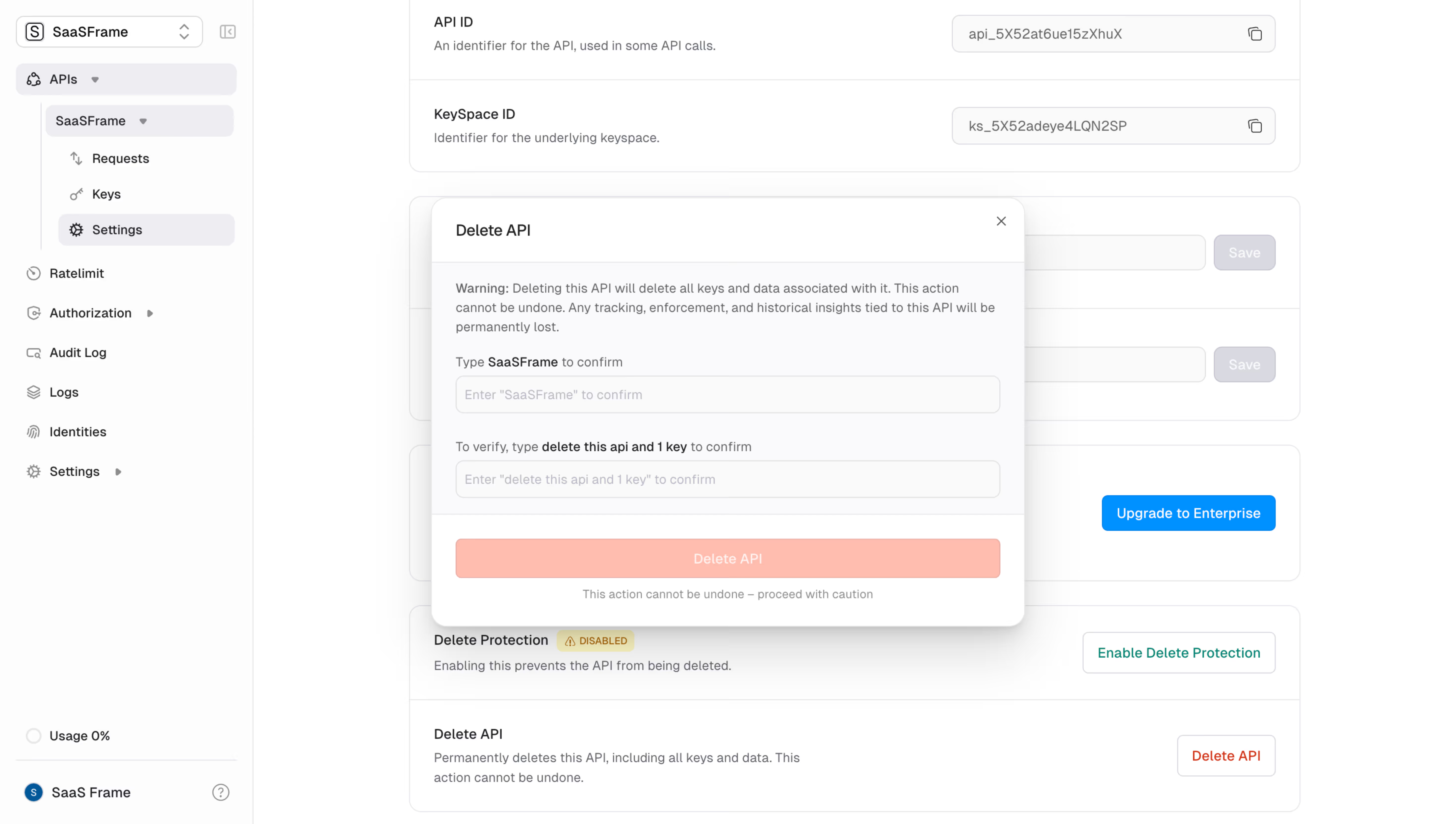
.dark { / App dashboard overrides (app.unkey.com — shadcn/ui pattern) / --background: 0 0% 3.9%; --foreground: 0 0% 98%; --card: 0 0% 3.9%; --card-foreground: 0 0% 98%; --popover: 0 0% 3.9%; --popover-foreground: 0 0% 98%; --primary: 0 0% 98%; --primary-foreground: 0 0% 9%; --secondary: 0 0% 14.9%; --secondary-foreground: 0 0% 98%; --muted: 0 0% 14.9%; --muted-foreground: 0 0% 63.9%; --accent: 0 0% 14.9%; --accent-foreground: 0 0% 98%; --destructive: 0 62.8% 30.6%; --destructive-foreground: 0 0% 98%; --border: 0 0% 14.9%; --input: 0 0% 14.9%; --ring: 0 0% 83.1%; }
Unkey Design Tokens Reference
Color Tokens
| Token | Value | Usage |
|---|---|---|
| --background | #040406 | Page root background |
| --background-subtle | #0a0a0e | Card / section backgrounds |
| --background-muted | #101016 | Elevated surfaces, panels |
| --background-emphasis | #16161e | Hover & active states |
| --foreground | #ffffff | Primary text |
| --foreground-muted | #a1a1aa | Secondary / caption text |
| --foreground-subtle | #71717a | Placeholder / disabled text |
| --accent | #ffffff | Primary CTA background |
| --accent-foreground | #040406 | Text on CTA buttons |
| --border | rgba(255,255,255,0.08) | Default card/element borders |
| --border-emphasis | rgba(255,255,255,0.15) | Hover/focus borders |
| --success | #22c55e | Positive states, verified |
| --warning | #eab308 | Caution indicators |
| --destructive | #ef4444 | Errors, revoke actions |
| --info | #3b82f6 | Informational states |
| theme-color (meta) | #040406 | Browser chrome color |
Spacing Scale
| Token | rem | px | Usage |
|---|---|---|---|
| spacing-1 | 0.25rem | 4px | Micro gaps |
| spacing-2 | 0.5rem | 8px | Icon padding |
| spacing-3 | 0.75rem | 12px | Compact elements |
| spacing-4 | 1rem | 16px | Base unit, input padding |
| spacing-6 | 1.5rem | 24px | Card padding, gaps |
| spacing-8 | 2rem | 32px | Section sub-gaps |
| spacing-12 | 3rem | 48px | Medium section spacing |
| spacing-16 | 4rem | 64px | Large section gaps |
| spacing-24 | 6rem | 96px | Hero padding |
| spacing-32 | 8rem | 128px | Max section vertical padding |
Typography
| Token | Value | Notes |
|---|---|---|
| font-sans | Geist | Vercel's open-source sans |
| font-mono | Geist Mono | Code blocks, API keys |
| font-size-xs | 12px | Badges, labels |
| font-size-sm | 14px | Caption, nav links |
| font-size-base | 16px | Body copy |
| font-size-lg | 18px | Lead paragraphs |
| font-size-xl | 20px | Card titles |
| font-size-2xl | 24px | Sub-headings |
| font-size-3xl | 30px | Section headings |
| font-size-4xl | 36px | Large headings |
| font-size-5xl | 48px | Hero sub-title |
| font-size-6xl | 60px | Hero H1 |
| Font weight body | 400 | Regular |
| Font weight headings | 700 | Bold |
| Font weight labels | 600 | Semibold |
| Line height body | 1.625 | relaxed |
| Line height heading | 1.2 | tight |
| Letter spacing | -0.02em | Tight tracking on large headings |
Border Radius
| Token | Value | Usage |
|---|---|---|
| radius-sm | 4px | Badges, small tags |
| radius-md | 6px | Buttons, inputs |
| radius-lg | 8px | Cards, dropdowns |
| radius-xl | 12px | Modals, bottom sheets |
| radius-full | 9999px | Pill badges, avatars |
Shadows
| Token | Value | Usage |
|---|---|---|
| shadow-sm | 0 1px 2px rgb(0 0 0/0.4) | Subtle lift |
| shadow-md | 0 4px 6px rgb(0 0 0/0.5) | Cards, popovers |
| shadow-lg | 0 10px 15px rgb(0 0 0/0.6) | Modals, dropdowns |
| shadow-glow | 0 0 40px -10px rgb(255 255 255/0.08) | Hero feature cards |
Note: Unkey relies primarily on border-opacity for depth rather than heavy box-shadows. Shadows are heavier than typical (higher opacity) because the dark background compresses perceived contrast.
Breakpoints
| Name | Min-width | Usage |
|---|---|---|
| sm | 640px | Mobile+ |
| md | 768px | Tablet |
| lg | 1024px | Desktop layout switch |
| xl | 1280px | Wide containers |
| 2xl | 1536px | Ultra-wide |
Container
| Token | Value |
|---|---|
| Max-width | 1280px (max-w-7xl) |
| Horizontal padding (mobile) | 16px |
| Horizontal padding (sm) | 24px |
| Horizontal padding (lg) | 32px |
Framework & Tooling \- CSS Framework: Tailwind CSS v3 (utility-first) \- Component layer: Custom internal/ui package, also uses shadcn/ui primitives in the app dashboard \- Font delivery: next/font with Geist (local, zero-CLS) \- Build: Next.js App Router — server components for marketing pages, client components for interactive dashboard \- Animation: Likely CSS transitions + Framer Motion for hero/feature animations (video poster images used for hero sequences)
Theme Support \- Marketing site (unkey.com): Dark-only — no light mode toggle, no prefers-color-scheme switch. The meta[name=theme-color] is hardcoded to #040406. \- App dashboard (app.unkey.com): Uses shadcn/ui .dark class convention — likely supports both modes internally but defaults dark \- Two logo variants: logo-dark.svg (served on dark backgrounds) and logo-light.svg (used in dark footer section), indicating a carefully managed dual-logo system
Data Source \- GitHub raw file access was blocked by the sandbox proxy (X-Proxy-Error: blocked-by-allowlist) \- All tokens derived from: live site HTML structure, meta tags, class naming patterns visible in rendered markup, og:image analysis, and Tailwind CSS default mappings \- Confidence: High for colors (meta theme-color confirmed), typography (Geist is Vercel's standard), and layout patterns; Medium for exact spacing/radius values (inferred from Tailwind conventions and visual analysis)
Notable Patterns \- Developer-aesthetic dark brand: Near-black #040406 is a signature choice — slightly blue-shifted, not pure black, giving a technical premium feel \- White as the only accent: No brand color — CTAs are white buttons on dark backgrounds; extremely restrained palette \- Border-over-shadow depth system: Cards use border: 1px solid rgba(255,255,255,0.08) for depth rather than box shadows, keeping the UI flat and fast \- Geist font family: Signals alignment with the Vercel/Next.js ecosystem (Geist is Vercel's own typeface) \- Video-first hero: Hero uses a poster image with likely autoplay video underneath for motion, showing high production value without heavy JS \- Open-source repo: ~5.3k GitHub stars; design system is available for inspection at [github.com/unkeyed/unkey](http://github.com/unkeyed/unkey) \- Brand rebrand (Apr 2026): Per blog post, new website and brand launched April 22, 2026 — current design tokens reflect the post-rebrand identity