Tabs
29
Organize dense information with SaaS Tab patterns. Learn how to switch between different product use cases, feature categories, or pricing versions without a page refresh.

Tabs divide related content into a small set of named views and make one view active at a time. In SaaS interfaces, they can organize settings, document context, notification categories, and alternative presentations of the same resource. Their main purpose is to let users switch between related panels while retaining a stable surrounding context.
The design challenge is deciding what belongs in the same tab set and what users might miss when content is hidden. Tabs work well when labels make the alternatives predictable and the selected state is unambiguous. They work less well when people need to compare every panel simultaneously or follow a required sequence. This guide analyzes captured tab groups in Cloudflare, Profound, and Zeda.io. It discusses visible organization and state, not unobserved loading, keyboard, or persistence behavior.
A tab set should have an understandable scope. It may organize several aspects of one settings area or different kinds of information beside a document. The parent heading and surrounding layout should help users predict what remains stable when a tab changes.
Do not use tabs merely to hide a long page. If sections form one explanation that users need to read in order, headings or an outline may be more appropriate. If choices lead to unrelated product areas, primary navigation may be clearer. If the options change a data view rather than select separate panels, a filter or segmented control may better describe the interaction.
Position alone does not define the pattern. A horizontal row near the top can be global navigation, local tabs, or action controls. Name the relationship before choosing the visual treatment. Compare Top Navigation and Sidebar Navigation when the choices connect broader product areas.
The Cloudflare Speed Settings capture has a sidebar identifying the broader product hierarchy and a page heading identifying the settings area. Within that page, a horizontal row contains Recommendations, Image Optimization, Content Optimization, and Protocol Optimization. Recommendations has a blue underline, and the content below describes site recommendations and related settings.
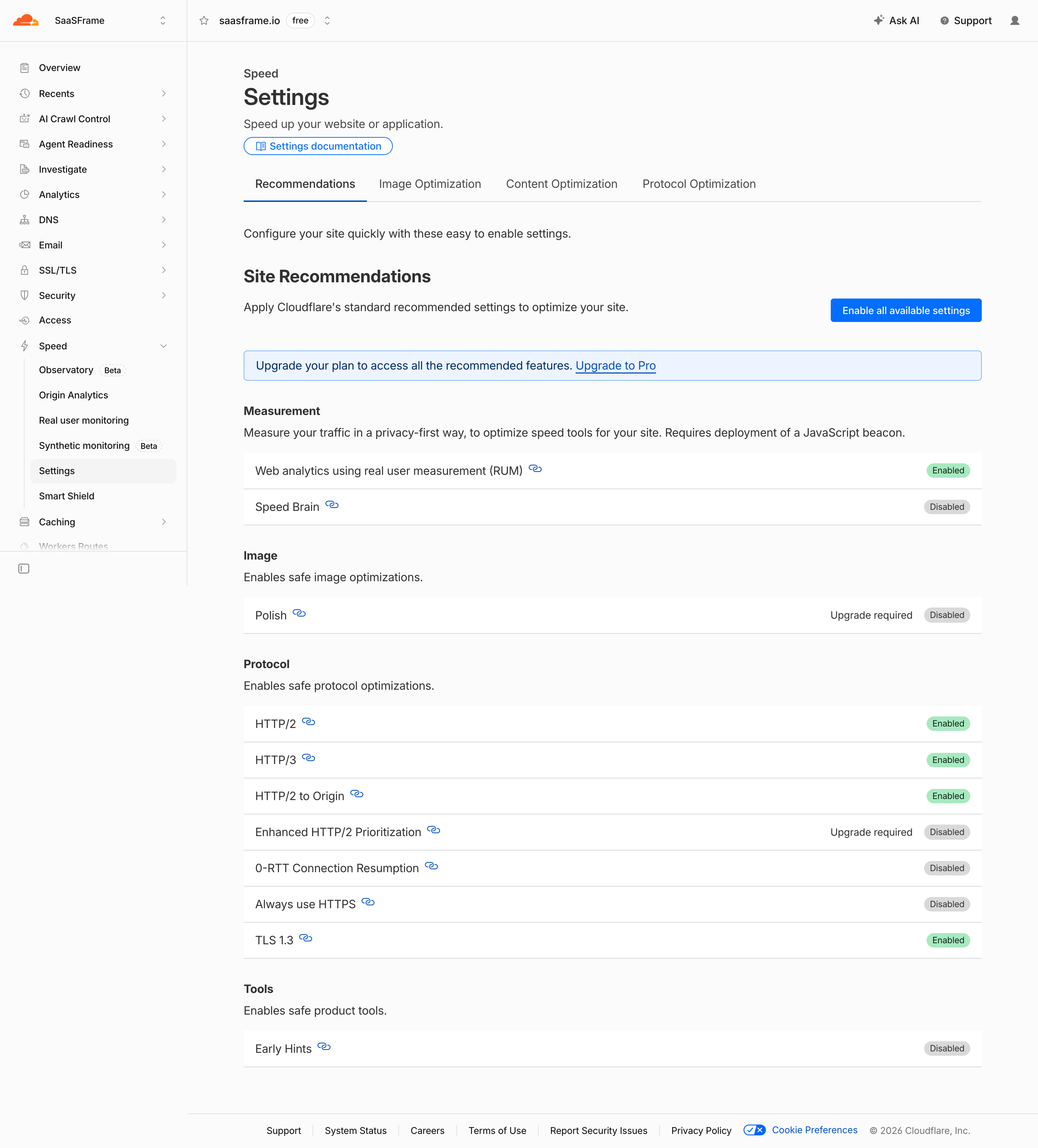
The important distinction is between section navigation and page-level alternatives. Settings remains selected in the sidebar while Recommendations is selected within the page. These states answer different questions: which product area is open and which view within that area is visible. Their placement makes that relationship easier to infer.
The labels also describe topics rather than vague ordinal positions. A person looking for image-related settings can predict which alternative to inspect. The screenshot does not reveal the content of the other tabs, so it cannot establish whether categories overlap or where a particular feature belongs.
When adapting this structure, review cross-category tasks. Users may need to configure several optimization areas as part of one goal. Tabs should preserve context between those steps and provide clear save behavior. If an action in one panel affects another, explain the dependency instead of assuming users will discover it by switching back and forth.
The Profound Content Brief capture contains two distinct horizontal groups. Above the document, Content Brief is selected beside a muted Final Draft choice. In the right panel, AEO, History, Workflow, and Inputs appear as tabs, with Workflow underlined. The displayed panel contains a workflow-progress summary and completed stages, while the document remains visible alongside it.
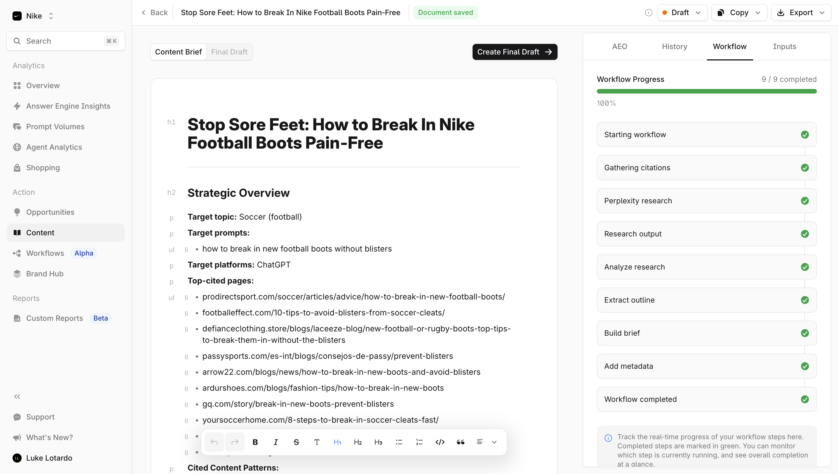
This layout illustrates the value of a local tab set. The side panel can expose workflow information without replacing the document under review. The two groups occupy separate regions and use different surrounding content, reducing the chance that users interpret them as one long hierarchy.
Multiple tab sets still create state combinations. A user can have one document view and one contextual panel selected at the same time. Decide what happens when the document stage changes: does the side panel remain on Workflow, reset, or show different information? Preserve the rule consistently and identify the new scope where necessary.
The muted Final Draft choice indicates a different visual state, but the capture alone does not establish whether it is disabled or merely unavailable in the current workflow. If a choice is unavailable, explain the relevant prerequisite and provide a route to fulfill it. A faded label should not be the only explanation for missing content.
The captured Zeda.io Notifications panel contains Important, All, and Archived tabs, with All selected by color and an underline. The body is empty and explains that the user has not received a notification yet. The same tab group remains visible despite the absence of items.
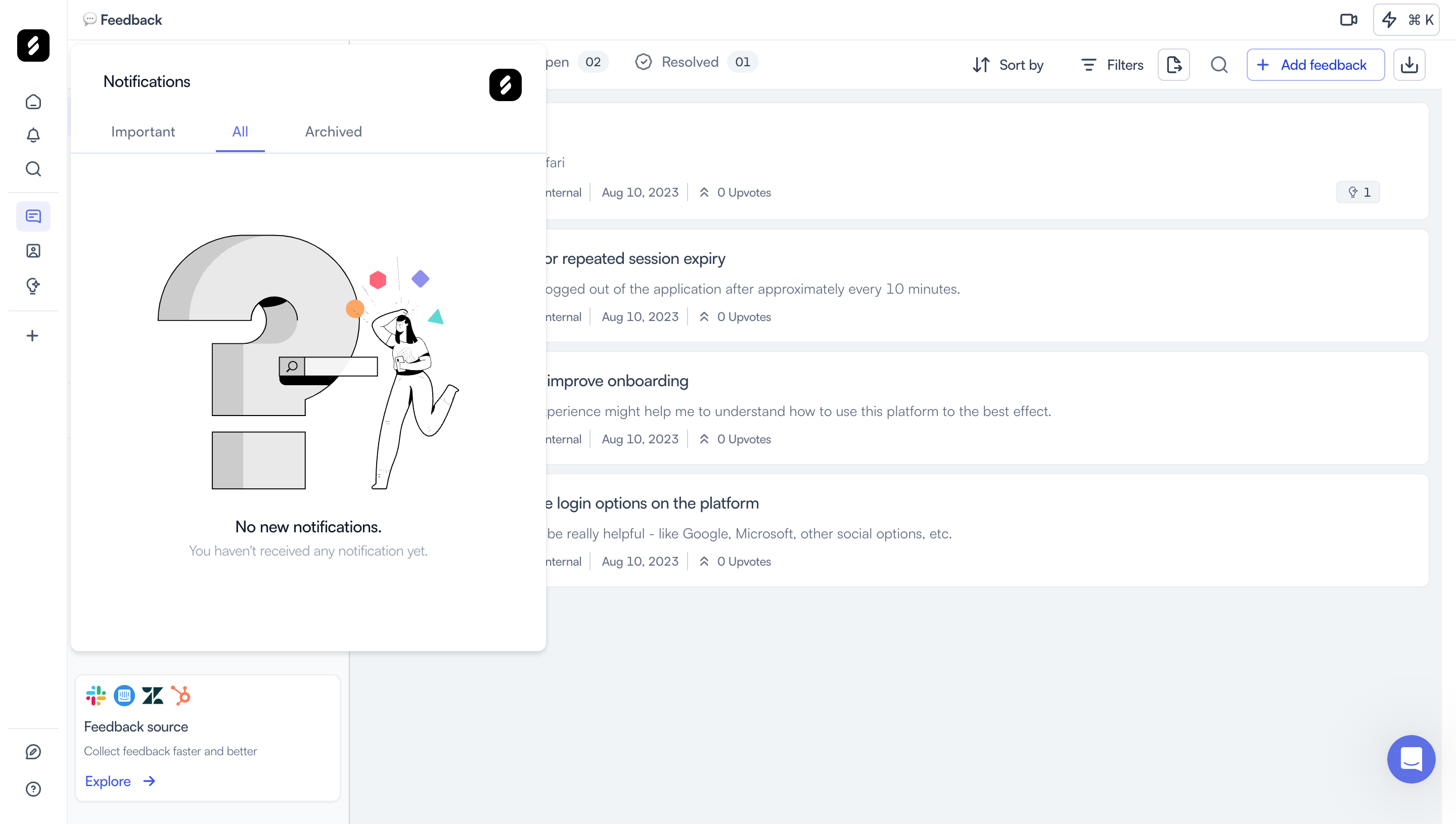
This is a category-based use of tabs: the alternatives organize different views of notifications. The labels imply relationships that the product must define. Important may be a subset of All, while Archived may represent a separate lifecycle state. Users need to understand whether switching categories changes only visibility or affects received items.
The empty body should remain specific to the selected view. No items in Important can mean something different from no items in All or Archived. If every tab shows the same generic message, users may have difficulty understanding whether a category is empty or the entire notification system has no content.
The capture shows a first-use absence, not how notifications behave when read or archived. See Notification Center for the state rules behind these views. Tabs expose those rules but do not replace their definition.
A tab label should identify the content behind it with a short, familiar phrase. Avoid generic names such as More when the panel contains an important area users need to find. Use parallel wording where the alternatives are comparable, and avoid mixing an action label with several destination nouns.
Check whether labels remain distinct as the product evolves. Overview can become an arbitrary catch-all when more tabs are added. Settings may be too broad within a page that is already a settings area. Test whether someone unfamiliar with the screen can choose the right tab for a realistic task.
Counts can add information, but define their meaning. A notification count might indicate all items, unread items, or items awaiting action. A project tab count might refer to records in the current filter or the entire resource. Do not let a badge communicate urgency without an understandable unit.
Long labels and translation need room. Prefer revising vague hierarchy over shrinking labels until they become unreadable. If many options no longer fit, reconsider whether a tab set remains the right structure.
Selected identifies the panel currently displayed. Focus identifies the control ready for keyboard input. Hover identifies a pointer position. Unavailable describes a choice that cannot currently be activated. These states should not share one ambiguous visual treatment.
Use a selected marker that remains understandable beyond color alone. The underlines visible in Cloudflare, Profound, and Zeda.io help connect the selected label to its panel. Ensure that the panel's heading or content also confirms the choice, particularly after scrolling.
If a panel requires permission, setup, or a plan capability, decide whether to show an unavailable tab with an explanation or omit it according to the product's access model. A visible option can help users learn what exists, but it should not create a dead end. Do not conceal the reason behind a disabled control users cannot inspect.
Tab changes should preserve the surrounding resource context. The more difficult question is panel state: unsaved edits, filters, selected rows, and scroll position. Decide which values persist and communicate any reset that matters.
For editable settings, define whether changes save immediately, on a panel-specific action, or through a shared Save control. If leaving a panel can discard edits, provide a clear warning or preserve a draft. Do not use tab switching as an invisible submission or cancellation action.
If each panel loads separately, distinguish loading from emptiness and failure. Preserve the selected tab while communicating its state. A failed fetch should not switch users to a different tab without explanation or imply that the panel contains no data.
When content needs background processing, avoid treating tab selection as evidence that the task is complete. A workflow panel may show progress; opening it does not advance the workflow. Keep navigation and operational state separate.
Users may arrive through a shared link to a particular view. Decide whether the selected tab is represented in the URL, restored from previous use, or always reset to a default. A meaningful direct link should identify both the resource and the relevant panel where possible.
Browser history also needs a deliberate rule. Does changing tabs add a history entry or simply update the current view? Either approach can fit a product, but the resulting Back behavior should be predictable. Avoid trapping users in a long sequence of incidental tab selections.
Set a default that supports the most common first task, while respecting a valid deep link. If a saved tab becomes unavailable because permissions change, explain the fallback. Do not silently display unrelated content under the previous tab's label.
W3C's tabs pattern guidance describes tab lists, selected tabs, associated panels, and keyboard interaction. Use it for an implemented tabbed interface, rather than applying tab semantics to every horizontal navigation row.
Choose manual or automatic activation according to how quickly panels can appear and what changing them does. Keyboard movement should not unexpectedly initiate a slow load or discard edits. Make the focus order and relationship between the selected control and its panel understandable.
Test screen reader labels, visible focus, selected state, and the route from the tab list into content. If several tab groups exist, distinguish their purposes. Profound's separate document and side-panel groups make this particularly relevant. The screenshots show visual selection but cannot establish implemented accessibility.
On narrow screens, labels may need horizontal scrolling, wrapping, or an alternative selector. Whichever presentation you choose, keep the current view identifiable and make additional options discoverable. A clipped final label should not be the only indication that more tabs exist.
Wrapping can create ambiguity about which underline belongs to which row. Horizontal scrolling can hide a selected tab off-screen. A dropdown can reduce space but also conceal alternatives. Test the tradeoff with realistic labels and tasks instead of assuming the desktop arrangement can simply shrink.
Review nested groups carefully. Multiple rows of tabs can become difficult to interpret on mobile. Preserve the hierarchy through headings and spacing, or simplify one layer into a different control. Do not let a smaller layout merge separate tab scopes into a single unexplained list.
Test finding a specific setting, switching away from an edited panel, opening a direct link, and reviewing a view with no content. Ask users what remains unchanged when they switch tabs. If they cannot identify the scope, the labels or hierarchy need revision before more panels are added.
Use tabs when views share a clear context and users benefit from switching without losing that context. Separate pages may be better for unrelated tasks, deep navigation, or content that requires a substantial independent workflow.
There is no universal number. Evaluate label length, relationship between panels, discoverability, and available width. If many alternatives are difficult to scan or fit, reconsider the hierarchy instead of shrinking every label.
Preserve them where practical and define save behavior clearly. If leaving a panel can discard work, explain that consequence before it happens. Switching views should not silently publish, save, or cancel an edit.
They can look similar but serve different roles. Tabs select related panels; filters constrain displayed data. Zeda.io's category views illustrate an overlap that still needs explicit state rules. Choose semantics and labels according to the implemented interaction.
Keep the selected view identifiable and explain why that panel has no content. Distinguish first use, a cleared category, active constraints, and a loading failure. Compare Empty State for those message and recovery decisions.
Compare Cloudflare's local settings views, Profound's contextual panels, and Zeda.io's notification categories to define the scope of your own tab groups. Reliable tabs make the alternatives predictable and preserve users' understanding of their work as they move between them.