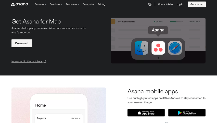
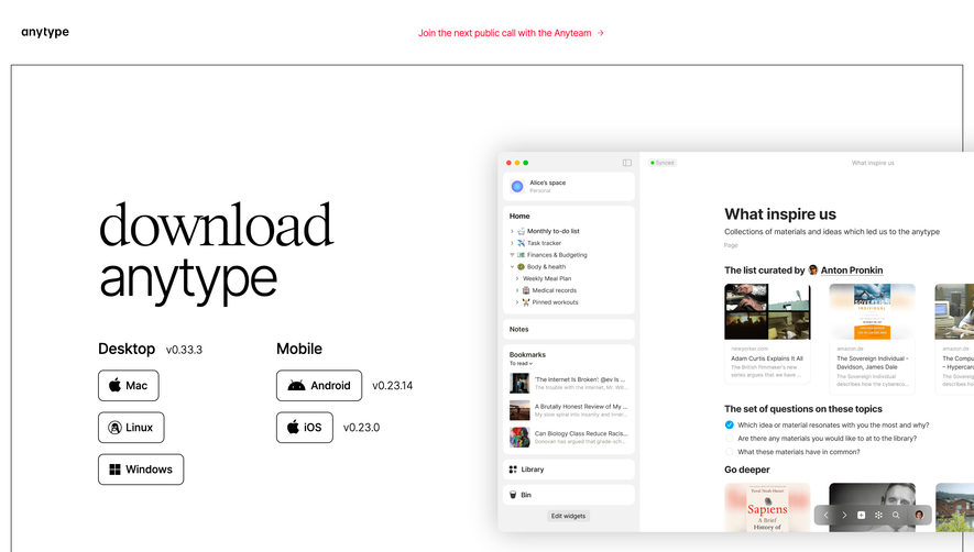
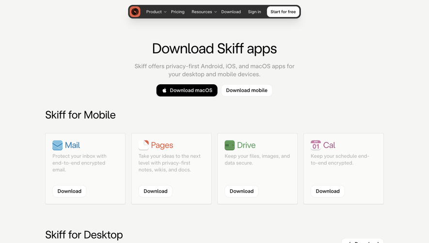
Generate a new design based on this screen using your own content.
Thank you! Your submission has been received!
Oops! Something went wrong while submitting the form.
# Design from Reference: Nord VPN Download Page
Create an original, high-fidelity visual design inspired by the reference. Prioritize composition, typography, colors, spacing, and component styling over technical implementation.
## Reference
- **Product:** Nord VPN
- **Category:** Download Page
- **Screenshot:** https://cdn.prod.website-files.com/5e9dc792e1210c5325f7ebbc/6acb6aefbf2e69a0c03b6c97_6acb6a20c8e486b2117928aa_cms-6d884a214a1c1925f2652413.webp
Analyze the screenshot first. If inaccessible, request it rather than guessing.
## Content
{{content.instructions}}
{{content.data}}
Preserve essential messaging and factual accuracy. Adapt structure and copy length for visual balance; never invent product claims.
## Visual Design
Use this context to reproduce the reference's visual language: layout, typography, colors, spacing, borders, radii, and distinctive elements. The screenshot takes priority if descriptions conflict.
## Direction
{{preferences.fidelityInstructions}}
## Output
{{output.instructions}}
Deliver a polished, cohesive design with precise alignment, hierarchy, and spacing. Produce the requested visual artifact, not just a description. If unsupported, explain the limitation.
NordVPN’s download page channels a sleek, professional tone through minimalist design. The aesthetic is tightly curated—crisp white backgrounds, gentle blue gradients, and subtle shadows evoke a sense of reliability and security. The visual language balances modern appeal with serious professionalism, reinforcing the brand’s trustworthiness.
Layout and Structure
The page uses a linear, vertically-scrolling layout. The hero section immediately introduces the product with a prominent call-to-action (CTA) button, followed by platform-specific download options in card-like containers. A brief features overview and trust signals are layered in as users scroll. The footer holds secondary navigation, trust badges, and legal links in a compact, unobtrusive format.
Visual Elements
Clarity reigns with clean, vector-style icons representing device platforms—each icon pops against its card for instant recognition. Soft, looping background animations in the hero subtly reinforce the theme of protection and fluid connectivity. Custom illustrations convey abstract security concepts while avoiding clutter. Screenshots are sparingly used, ensuring the focus stays on the download process.
Color Palette and Typography
Deep and light blues constitute the primary palette, paired with white for contrast and a few strategic pops of green for active CTA states. The typography is modern and geometric—highly legible headings (likely using a custom or Google Sans-style font) guide attention, while supporting text uses a lighter weight for easy reading and clear visual hierarchy.
User Experience Patterns & Unique Choices
Navigation is frictionless: sticky headers and smart in-page links let users jump to their desired platform. Download CTAs are duplicated for desktop and mobile, reducing search effort. Step-by-step microcopy and hover effects build interactivity. The entire flow is optimized for decision speed—everything needed is one scroll or click away, cultivating a feeling of streamlined, user-focused innovation.