Integrations
41
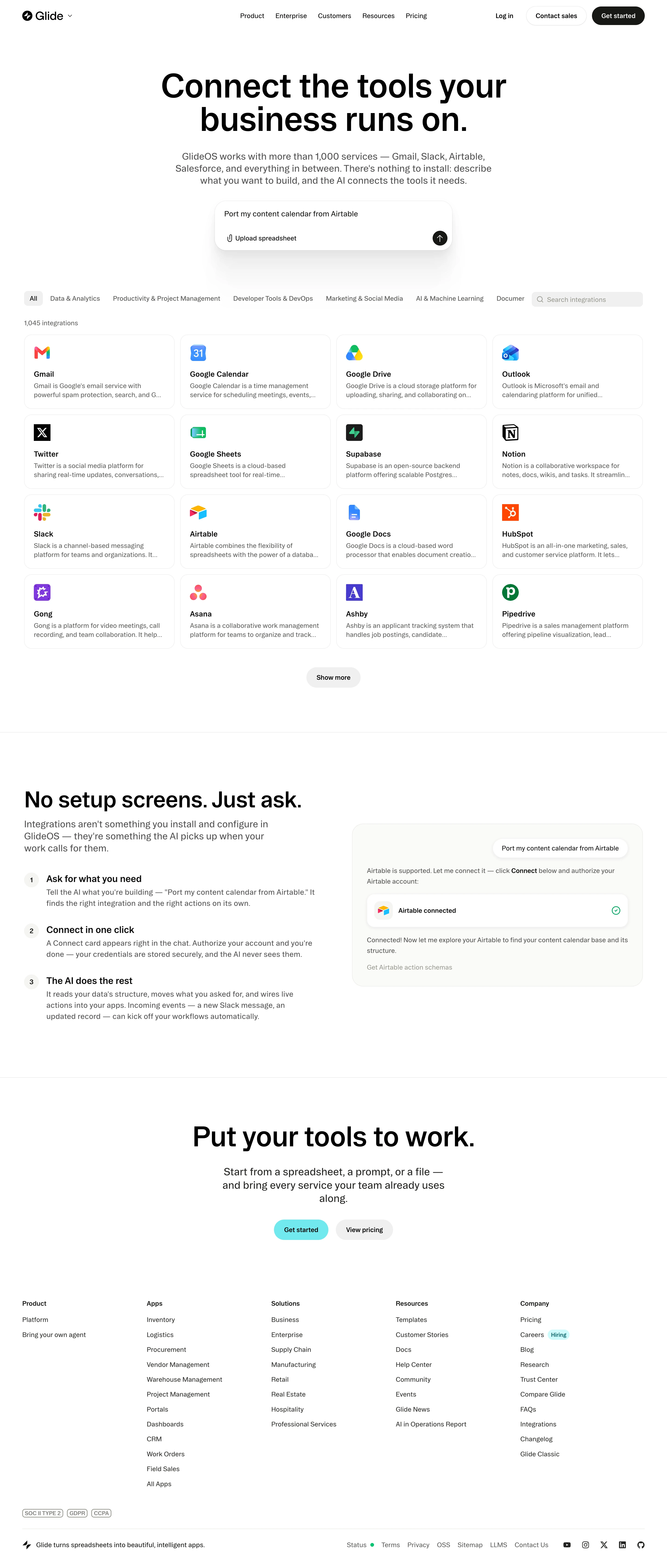
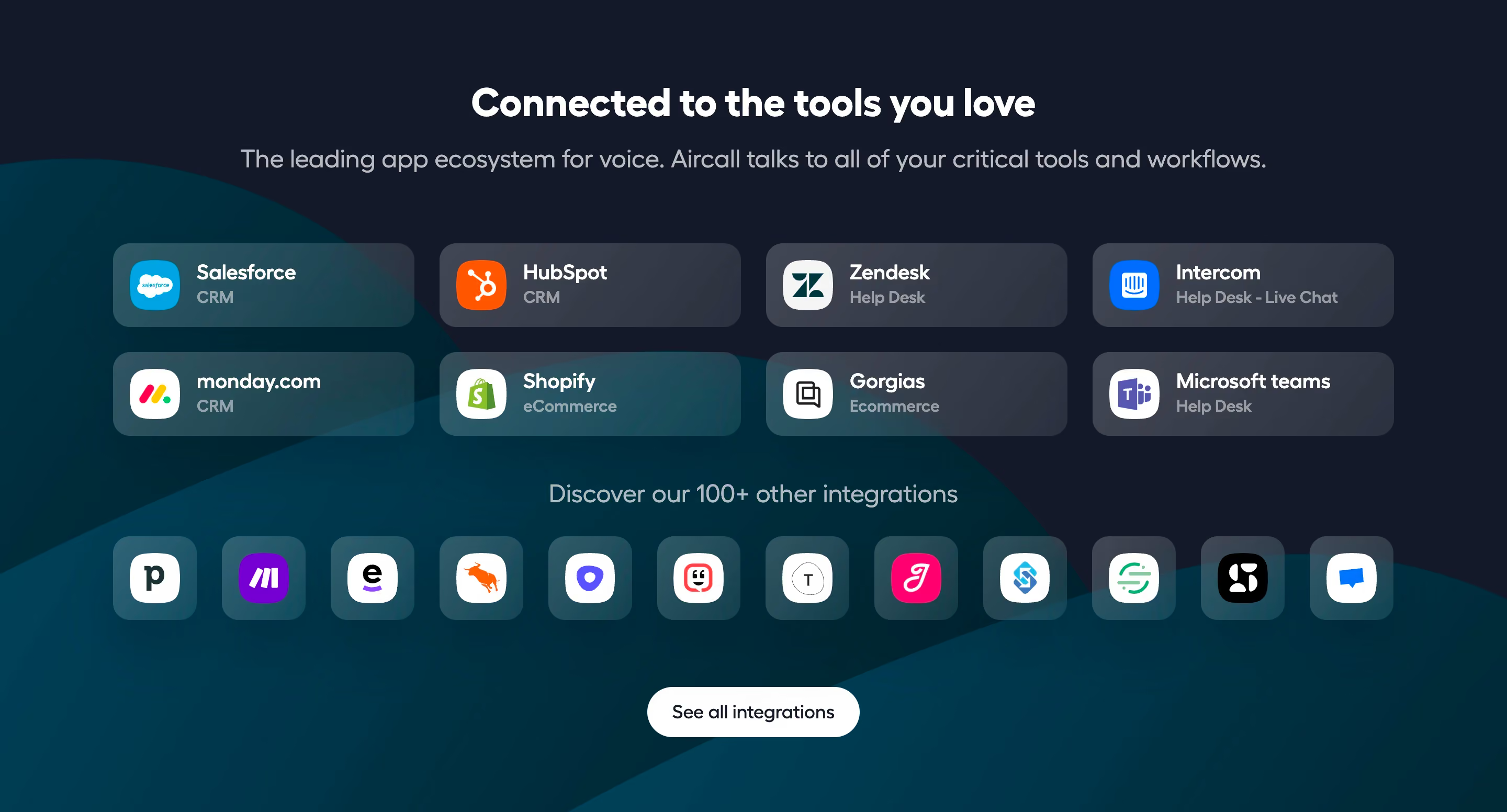
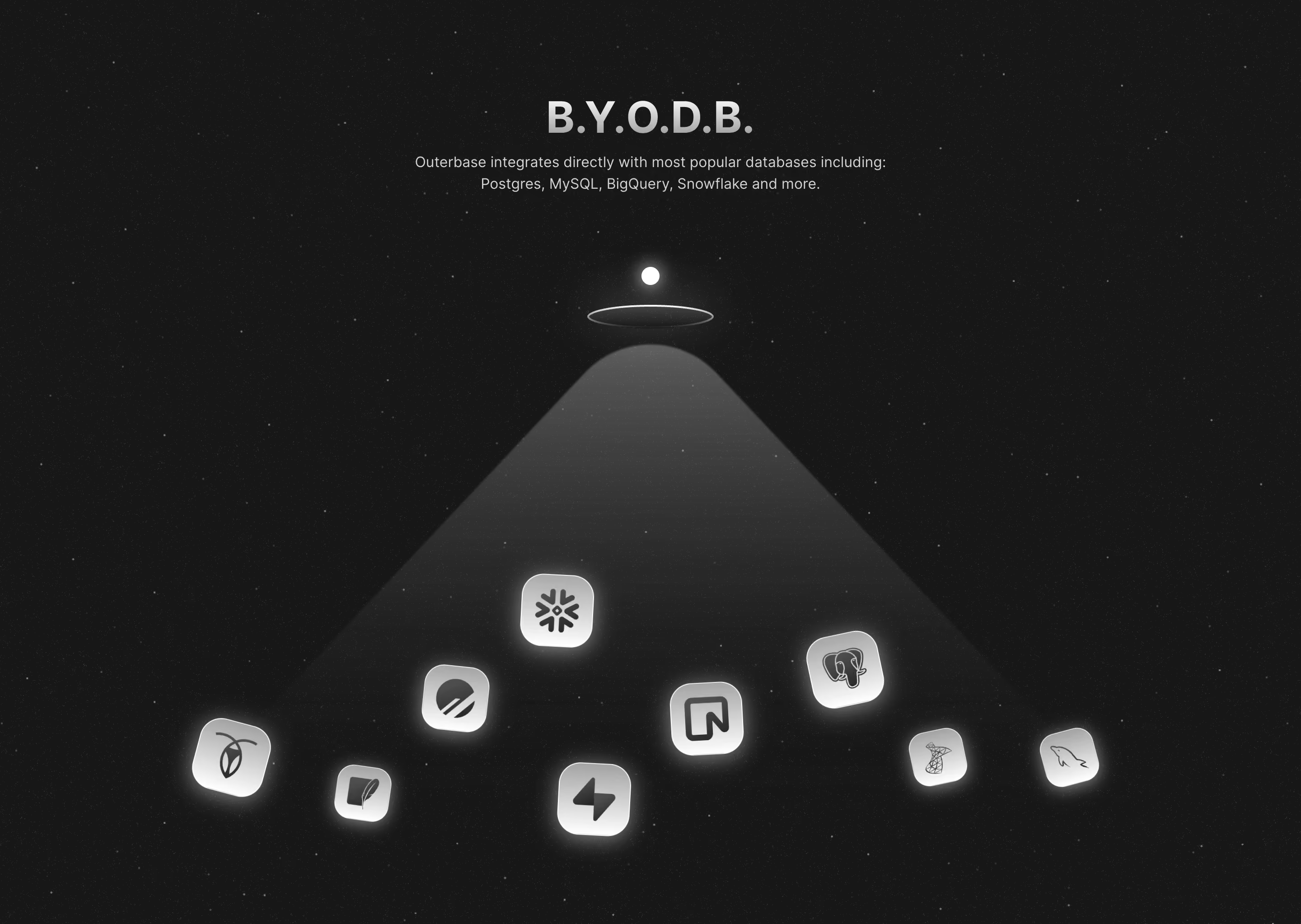
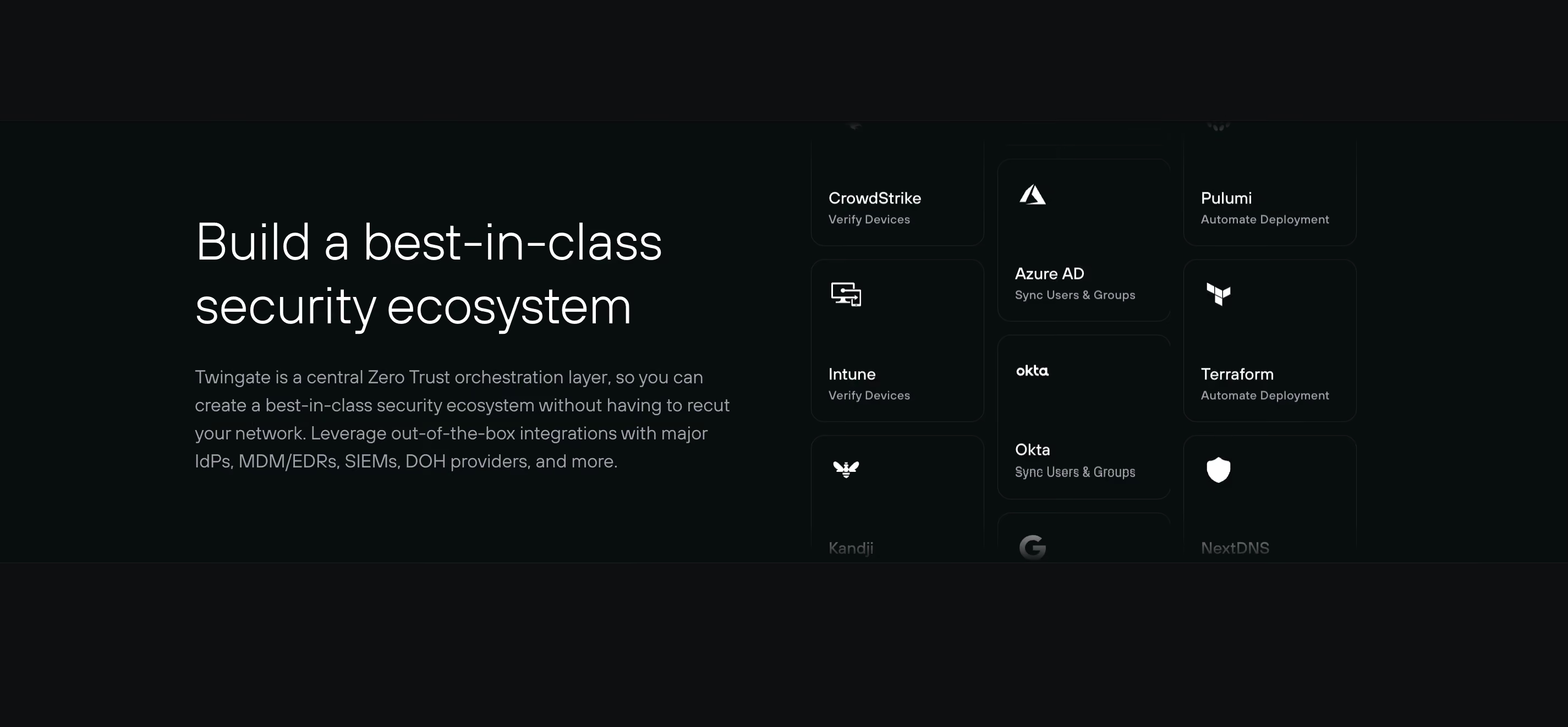
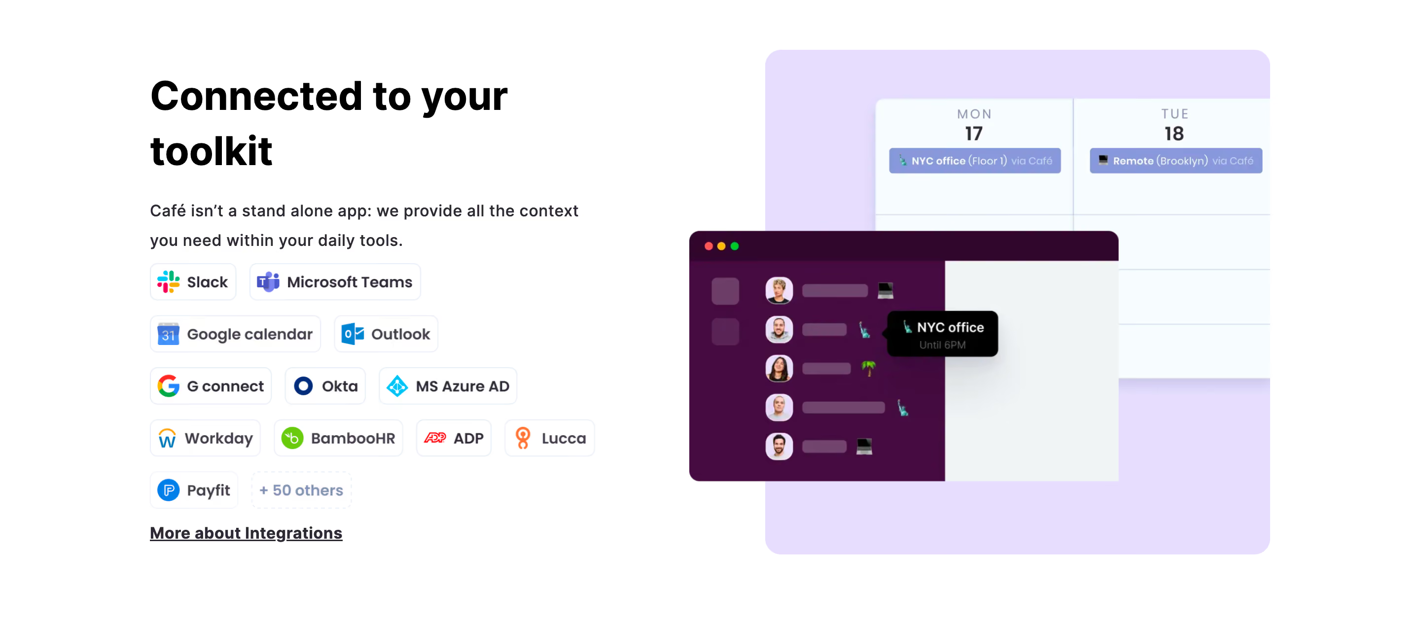
Highlight your ecosystem with SaaS Integration patterns. See how to use 'App Card' layouts and logo clusters to show how your software connects with the tools your customers already use.

An integrations section helps a SaaS visitor answer a practical question: will this product fit the tools and workflows they already use? A strong section does more than display recognizable logos. It explains the available connection routes, helps visitors verify a relevant app or platform, and points toward the details needed to evaluate the fit.
Cal.com and Mollie Payments illustrate two different structures. Cal.com uses a familiar-app composition with a single directory action. Mollie distinguishes prebuilt integrations, libraries, and custom builds. Both approaches can work, but they serve different stages of evaluation and need different supporting information.
People rarely evaluate integrations as an abstract feature. They want to know whether a specific calendar, commerce platform, communication tool, or internal system can participate in their workflow. Start by identifying those questions and the decisions they affect.
A homepage section can establish that an ecosystem exists and guide people to a directory. A dedicated integration page should explain what a particular connection does and what is required. Avoid making the homepage carry every detail, but ensure its promise leads to a destination where the visitor can verify the relevant information.
Be precise about the word integration. It can refer to a maintained native connector, a third-party extension, a library, an API-based custom build, or a workflow through another platform. These routes can all be useful, but they differ in setup and responsibility. A clear section begins by making those differences discoverable.

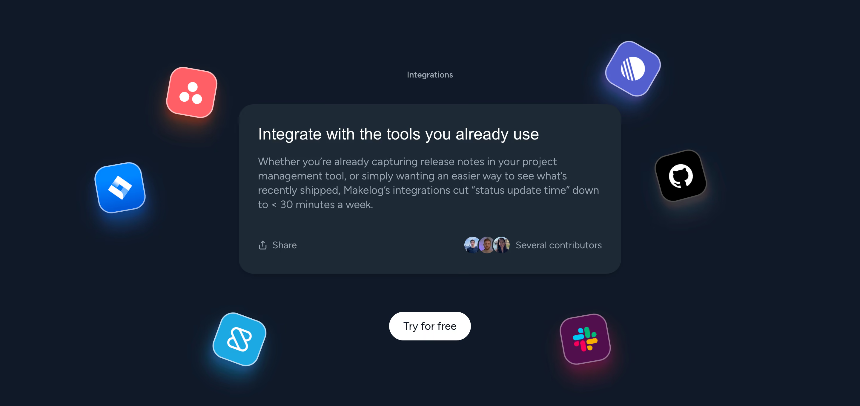
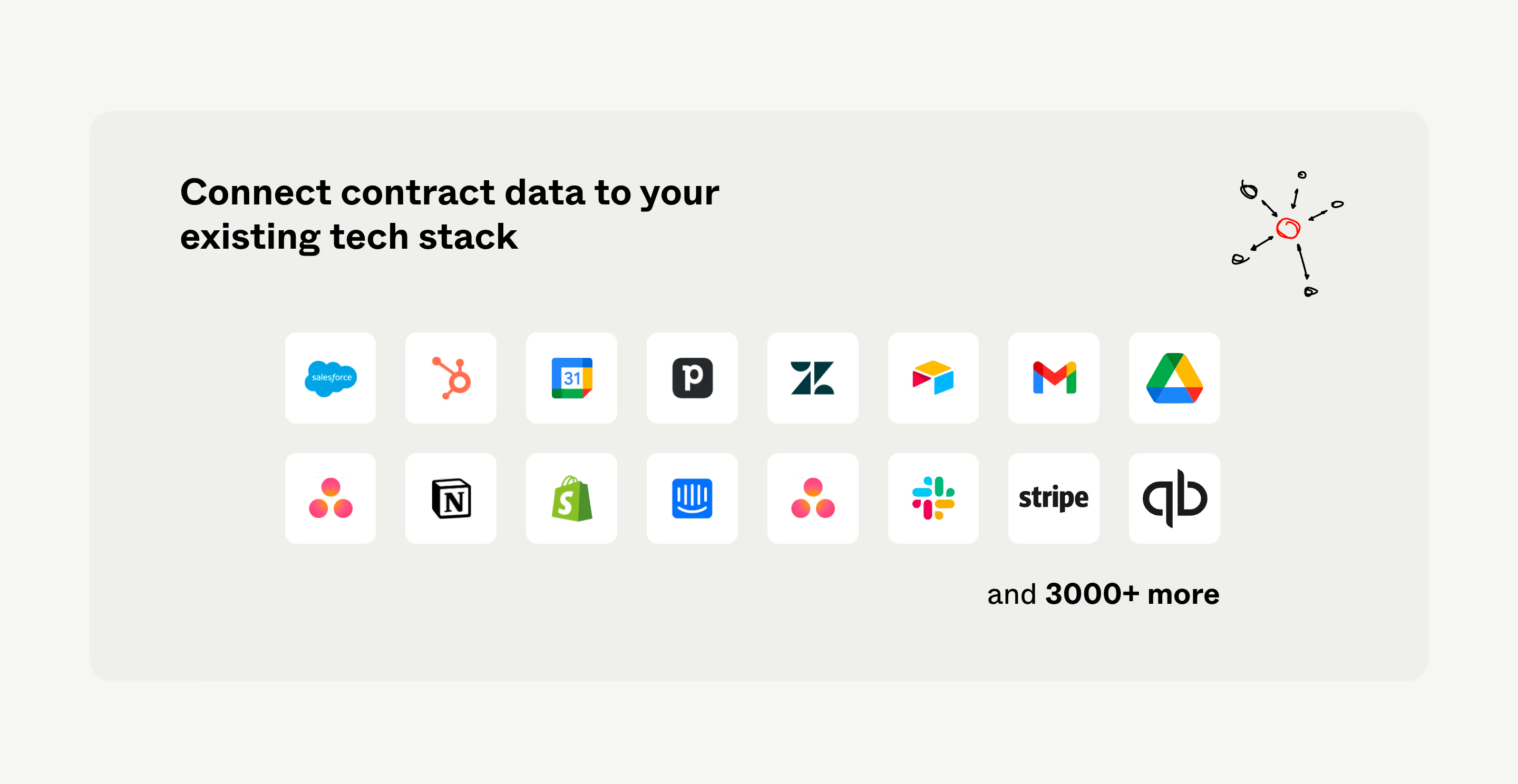
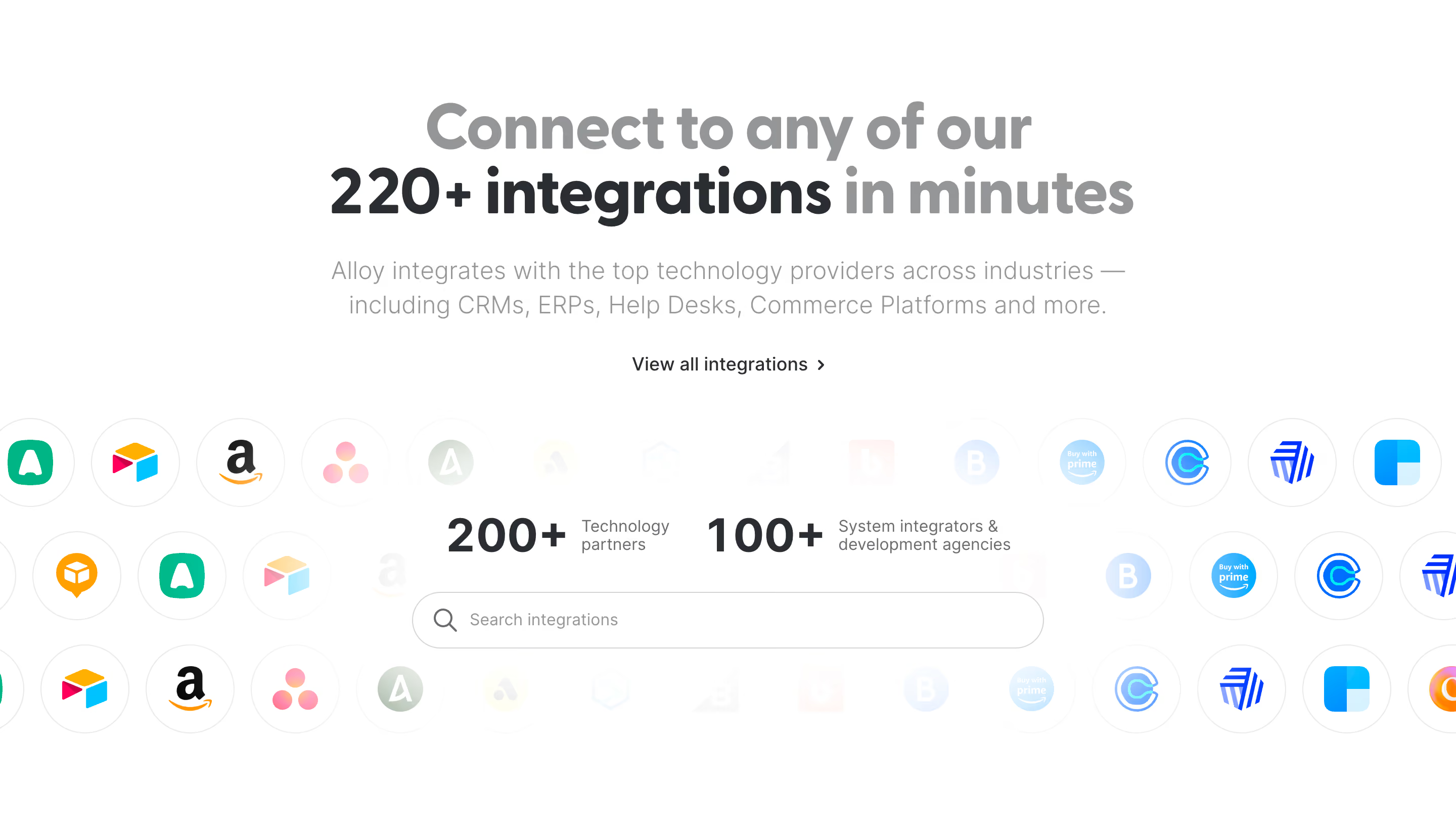
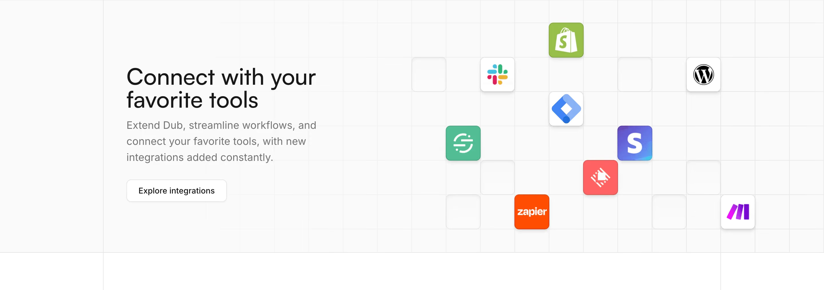
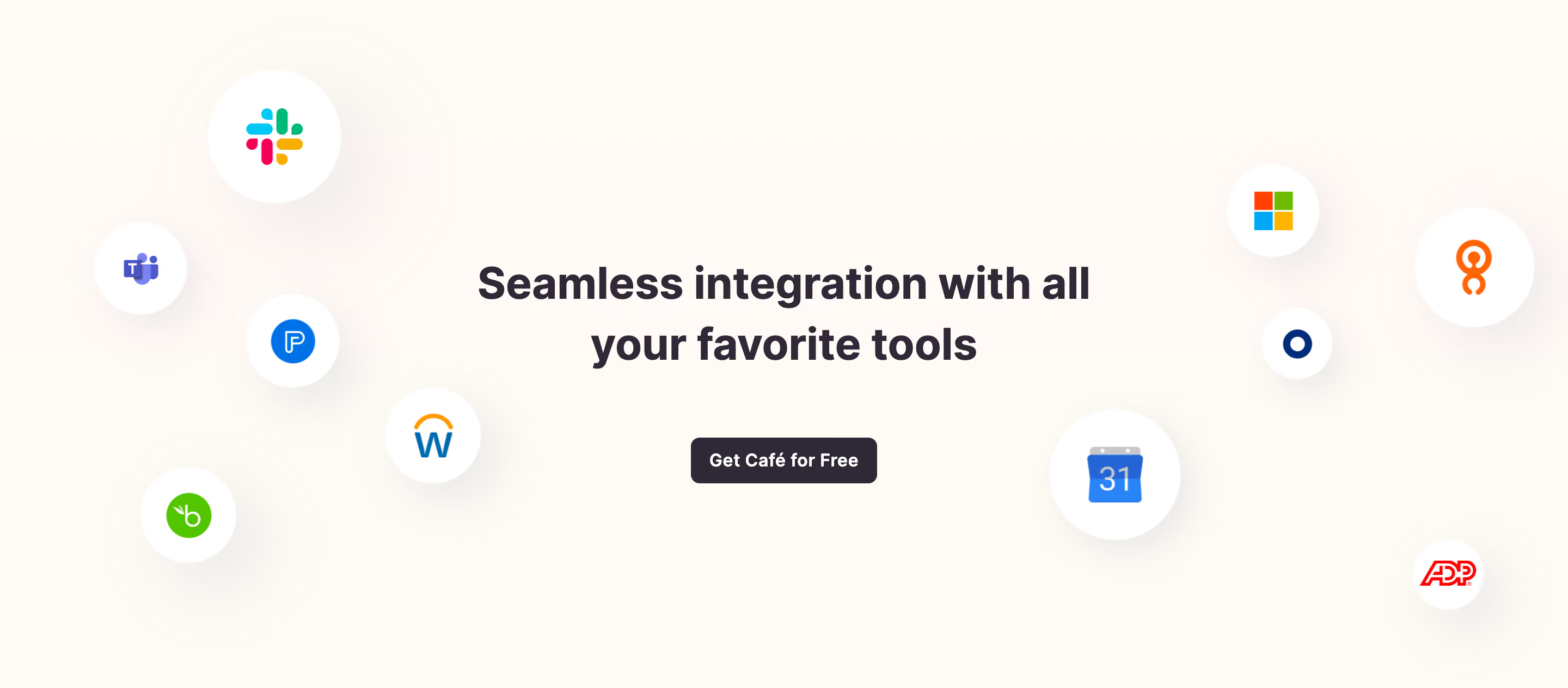
Cal.com surrounds its central message with app icons associated with a scheduling workflow, including communication and calendar tools. The icons create immediate recognition while the heading and supporting copy keep the focus on connecting existing tools. The Explore all apps action provides one clear next step.
This composition is useful for a broad overview because it does not require a visitor to read a long catalog before understanding the section's purpose. Its faded edges also keep the surrounding logos from competing equally with the central message.
The limitation is that a logo alone does not explain the connection's behavior. It does not establish which features are supported, whether data moves in one or both directions, or what setup is required. Treat the composition as an introduction, then give the directory enough detail to answer those practical questions.

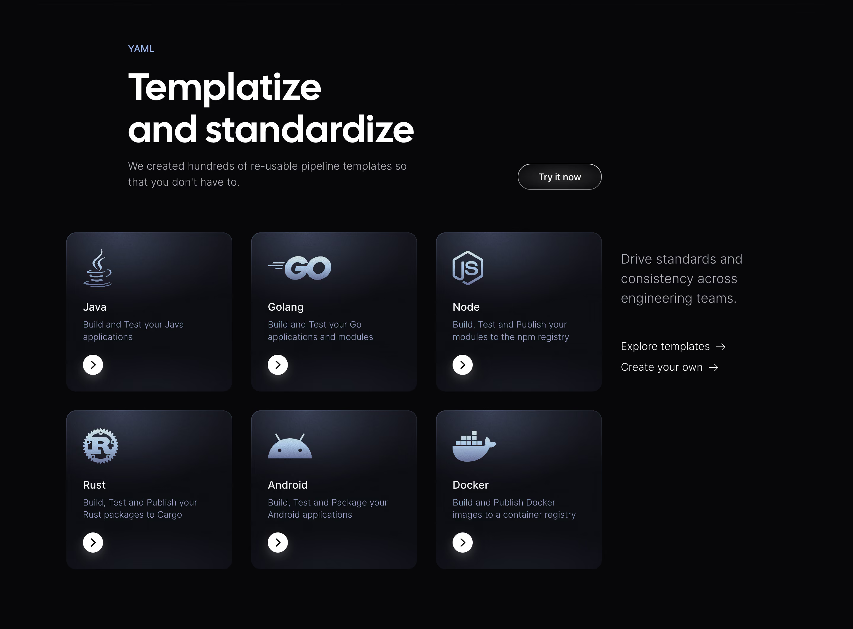
Mollie presents three cards: Prebuilt integrations, Ready to go libraries, and Your own custom build. Each has its own explanation and destination. The first route addresses an existing platform and ready-made plugin, the second addresses developers using libraries, and the third addresses a custom integration.
This structure helps visitors self-select according to their starting point. A business owner with a commerce platform can recognize a different path from a developer designing a custom system. The section does not pretend that every connection requires the same amount or kind of work.
Use this approach when your product has genuinely distinct implementation routes. Keep their labels parallel and explain the practical difference. If two routes lead to the same destination or describe the same capability, combine them rather than creating artificial choice. The point is to reduce uncertainty about the next step.
A useful integration description names an action or flow: checking availability, sending an event notification, importing a record, or initiating a transaction. It should help the visitor imagine the product's role in their existing workflow.
Keep the description accurate to the connection's scope. Supporting a calendar connection does not necessarily mean supporting every calendar feature. Supporting a commerce platform does not establish compatibility with every version, extension, or custom configuration. Summarize the relevant task and route people to maintained details about limitations.
For a directory, pair the app name with a short capability statement or category. That is more useful than a page of logos with no explanation. For a detailed integration page, include prerequisites and setup expectations alongside the outcome. These details help visitors decide whether the connection meets their need before they start configuring it.
The Cal.com section's directory action creates a clear expectation that visitors can explore the ecosystem. The destination should support both browsing and finding a known app. Search, recognizable categories, and readable names can help these two intents coexist.
Use categories tied to the workflow, such as calendars, communication, commerce, or analytics, when those groupings fit the product. A category labeled Popular can highlight common options, but it should not be the only way to discover a less prominent connector. Keep app names visible even when logos are familiar.
Handle no-result searches constructively. Explain whether the app is unavailable, may be reachable through another route, or can be requested. Do not replace a missing exact connector with an unrelated app that appears similar. Visitors need to understand the real option, including any custom work required.
Integration evaluation often includes questions about permissions, accounts, plan requirements, administrator involvement, and who maintains the connection. The homepage can remain concise, but the next destination should make these details easy to find.
Distinguish exploring a connection from installing it. An action labeled View integration should provide information; Connect should begin a setup process with a clear account context. If a visitor must leave the product to authorize another service, explain that transition at the point of action.
Keep availability language maintained. A connection that is announced, in beta, restricted, or no longer supported should not look identical to a broadly available option. Show useful labels where needed and give visitors a path to the current status. Do not infer present availability solely from a historical logo in a design capture.
A recognizable brand mark can shorten the time needed to identify an app, but it does not prove partnership, certification, or a particular level of support. Write copy that accurately describes the relationship and avoid suggesting a stronger endorsement than the product can establish.
Use consistent visual containers so differently shaped logos do not produce distracting variation. Cal.com's repeated rounded tiles create a uniform rhythm around the central message. Mollie's route cards use product and code imagery to distinguish approaches rather than relying on identical logo treatments for all three.
Do not add unrelated brands simply to make the ecosystem look larger. Choose examples that are relevant to the visitor and make the complete directory accessible. A smaller accurate collection with clear capabilities is more useful than an impressive-looking wall that sends visitors into uncertain setup paths.
Decorative logo fields can become visually busy on small screens. Keep the central explanation and directory action readable, and reduce surrounding decoration when necessary. If icons carry essential meaning, provide names or text alternatives; if they repeat information already available in the text, avoid creating redundant navigation stops.
For route cards such as Mollie's, preserve a sensible stacking order and distinct action labels. A keyboard user should be able to identify whether they are going to the integration directory, a library catalog, or developer tools. Avoid vague repeated links that become indistinguishable outside their visual context.
Test long app names, translated descriptions, zoomed text, and missing logos. Search controls need labels and clear result feedback. Filters should expose their selected state, and empty results should remain understandable. The directory must function as useful content even when the decorative composition is absent.
Consider what happens after the connection is established. A detailed integration destination can explain where users see its status, how they recognize that authorization needs renewal, and where they manage or remove the connection. These operational questions are different from the initial marketing promise, but they affect whether the integration is useful over time.
When several teams participate in setup, identify the relevant roles rather than assuming the person browsing can complete every step. A visitor may need an administrator's approval or access to another service's account. Explaining that dependency early helps them prepare. Keep the homepage focused on fit, while making the next page explicit about the practical handoff.
Also distinguish a connector's listing from a verified configuration for a particular customer. The presence of an app in a directory establishes an offered route, not that it will work with every custom environment. A clear detail page makes supported use understandable without overextending a broad ecosystem claim.
Measure the journey according to intent. A directory visit may indicate interest, while a completed setup shows a different outcome. Track where visitors encounter missing apps, unclear prerequisites, or failed configuration. Use those findings to improve the handoff rather than judging the section only by clicks on its largest button.
It can introduce a familiar ecosystem, but it rarely answers detailed compatibility questions. Pair it with a clear explanation and a directory or detail page that describes supported workflows, requirements, and available connection routes.
They can when both are relevant options for the audience. Label them distinctly and explain who each route suits. A custom build should not appear to be a ready-made connector, and its destination should support the developer evaluation it invites.
Give an accurate answer and explain any valid alternative, such as a maintained intermediary route or a custom integration. If visitors can request support, provide that path without implying availability. Clear limits help them make a practical decision.
Explore SaaS integrations section examples on SaaSFrame to compare app recognition, directory calls to action, connection routes, and setup expectations.