
Thank you! Your submission has been received!
Oops! Something went wrong while submitting the form.
Get SaaSFrame Pro
Monthly
$18
Quarterly
$48
Yearly
$180
Upgrade to access this feature
Browse all screens & flows
Filter and search screens & flows
Access Figma files
Access mobile versions
Bookmark screens & flows
Join now
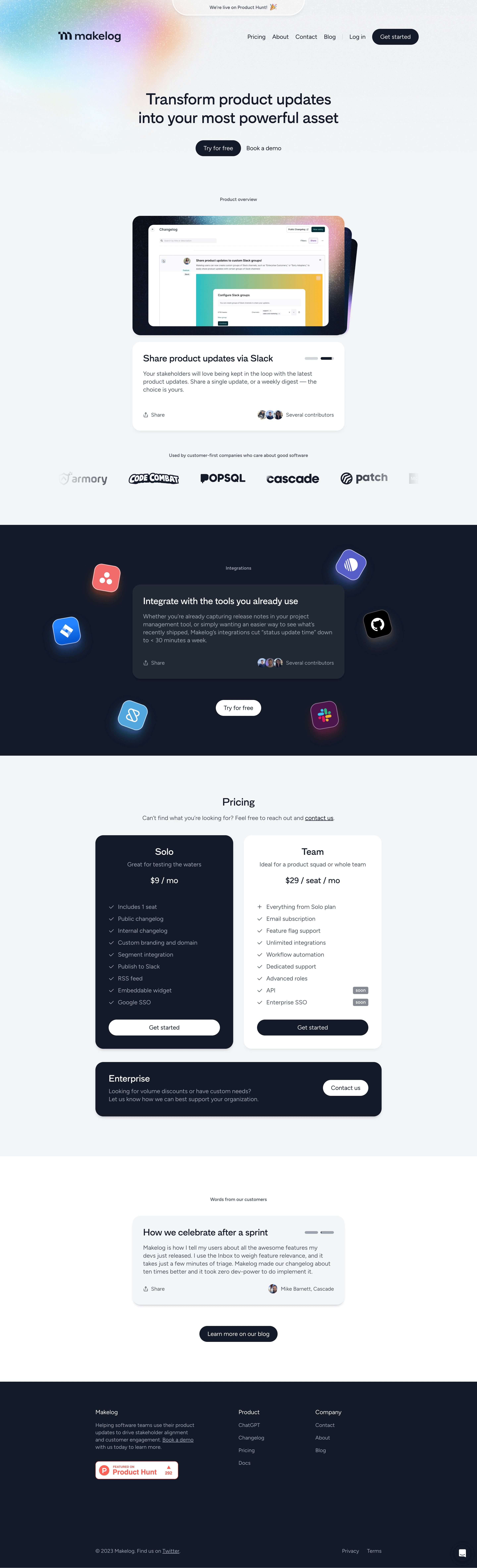

Makelog Landing Page

Makelog
Transform product updates into your most powerful asset
Designed by
No items found.

Bookmark
Bookmark

Design with AI
Thank you! Your submission has been received!
Oops! Something went wrong while submitting the form.
# Design from Reference: Makelog Landing Page
Create an original, high-fidelity visual design inspired by the reference. Prioritize composition, typography, colors, spacing, and component styling over technical implementation.
## Reference
- **Product:** Makelog
- **Category:** Landing Page
- **Screenshot:** https://cdn.prod.website-files.com/5e9dc792e1210c5325f7ebbc/6acb7260b10d21a746c479ba_6acb70fc4f32bb8f1823cd89_cms-cd5677412e592b282996d51f.webp
Analyze the screenshot first. If inaccessible, request it rather than guessing.
## Content
{{content.instructions}}
{{content.data}}
Preserve essential messaging and factual accuracy. Adapt structure and copy length for visual balance; never invent product claims.
## Visual Design
### Overall aesthetic
- **Character:** A product-update platform landing page uses pale gray surfaces, dark navy blocks, rounded editorial cards, pill actions, and grainy rainbow glows.
- **Visual metaphor:** Feature descriptions and testimonials resemble changelog entries, with Share controls, contributor avatars, and small progress-like marks.
- **Observed scale:** The source measures 2880 × 9458 pixels. CSS estimates assume a 2× capture, equivalent to a 1440-pixel-wide page; actual pixel ratio is unverified.
### Page composition
- **Announcement/header:** A small rounded launch announcement is centered at the top. Makelog branding sits left, with Pricing, About, Contact, Blog, Log in, and Get started at right.
- **Hero:** A centered two-line headline sits over a pale background with a diffuse rainbow/grain texture concentrated near the upper-left. Try for free and Book a demo form the action row.
- **Product overview:** A small caption introduces layered rounded screenshot panels. A white feature-description card beneath explains Slack sharing and includes a Share label, avatars, and contributor text.
- **Customer logos:** A centered caption and horizontal monochrome logo row follow the demonstration.
- **Integrations:** A full-width dark navy section contains a central dark card, floating tilted service-logo tiles, and a white Try for free pill below.
- **Pricing:** Two large side-by-side plan cards, one dark and one white, sit beneath a centered heading. A broad dark Enterprise panel follows.
- **Testimonial:** A white section contains a small caption, one pale card styled like a product update, and a dark blog-link pill.
- **Footer:** A dark navy region has brand description/launch badge at left, Product and Company link groups, lower legal/social text, and a small chat launcher.
### Information hierarchy
- **Hero statement:** The large two-line headline is the strongest opening text. Actions sit directly beneath without a long supporting paragraph.
- **Product evidence:** The screenshot and companion card explain a concrete sharing workflow before broader integration and pricing information.
- **Integration focus:** A central heading/paragraph is surrounded by recognizable service marks, keeping the message readable amid decoration.
- **Plan comparison:** Plan name, short audience description, price, feature list, and CTA repeat in both cards.
- **Enterprise fallback:** A wide contact panel handles custom needs separately from the two priced plans.
- **Testimonial role:** A quote-style card repeats the feature-card language, linking customer evidence to the product’s update format.
- **Historical scope:** Prices, included features, integration claims, launch counts, and testimonial results are captured historical content, not verified current offers or facts.
### Typography
- **Typeface appearance:** A rounded neutral sans-serif is used with moderate rather than extreme weight contrast. Exact family is unverified.
- **Hero title:** Approximately 46–50 CSS pixels, medium/semibold, with line-height around 56 pixels and centered wrapping.
- **Section headings:** Around 28–32 pixels. Feature-card titles and plan names are approximately 25–28 pixels.
- **Body copy:** Around 16–18 pixels with 23–25-pixel line-height, often in muted slate.
- **Price role:** Approximately 23–25 pixels, regular/medium weight, centered within plan cards.
- **Utility text:** Buttons, navigation, feature lists, and attribution use roughly 14–16 pixels. Small captions are about 12–14 pixels.
- **Alignment:** Hero and pricing introductions are centered; feature cards, feature lists, testimonial text, and footer groups are left aligned.
### Colors & surfaces
- **Measured pale base:** #F3F4F6 dominates the light page regions. #FFFFFF forms cards and inverse actions.
- **Measured dark:** #121A27 supplies the navy section/footer family; #202A34 contributes to the inset integration card.
- **Additional neutrals:** #F2F3F5, #F1F2F4, and #F0F1F3 appear in nearby pale surface detail.
- **Gradient accents:** Cyan, mint, lavender, pink, and peach blend into grainy glows around the hero and screenshot frames.
- **Text hierarchy:** Dark navy is primary on light surfaces; muted gray supports descriptions. Dark sections reverse to white and softer gray.
- **Depth:** Broad rounded cards have soft shadows. Layered screenshot panels and glowing service tiles add depth without a dense border system.
### Components
- **Launch pill:** A translucent pale rounded announcement has a fine white edge and short launch text.
- **Primary pills:** Dark navy filled controls use white text and fully rounded ends. In dark regions, the same shape reverses to white.
- **Layered product visual:** Rounded screenshot panels overlap with slight rotation/offset. The foremost panel shows a changelog and sharing configuration example.
- **Feature-description card:** A roughly 640-pixel-wide white card contains title, short paragraph, Share icon/text, contributor avatars, and a small two-part mark at upper right.
- **Logo row:** Monochrome customer marks form a horizontal strip with faded/clipped edges.
- **Integration tiles:** Tilted rounded squares with service logos float around the central card, each with a colored halo.
- **Integration card:** A dark inset rounded panel contains heading, paragraph, Share, and contributor avatars, matching the overview card structure.
- **Pricing cards:** Two roughly 415-pixel-wide panels have large corner radii, centered title/description/price, left-aligned feature lists, and full-width pill CTAs near the bottom.
- **Feature states:** Checkmarks and a plus symbol precede list items. Small Soon badges annotate selected team features.
- **Enterprise panel:** A full-width dark rounded rectangle pairs left-aligned title/copy with a white Contact us pill at right.
- **Testimonial card:** A pale rounded panel contains a title, paragraph, Share, and small author avatar/attribution.
- **Footer badge:** A white/red Product Hunt badge sits beneath the brand description. Its count is captured example state.
- **Chat:** A small dark circular launcher with a white message symbol sits near the lower-right edge.
- **Unshown states:** Alternate overview slides, sharing behavior, signup, billing, integration setup, and chat content are not visible.
### Visual rhythm
- **Centered modules:** Hero, overview visual/card, integration card, pricing, and testimonial share a central axis.
- **Large intervals:** Generous whitespace separates major groups; small section captions create quiet transitions.
- **Light/dark alternation:** Pale hero, dark integrations, pale pricing, white testimonial, and dark footer create clear narrative stages.
- **Repeated card grammar:** Rounded rectangles, share labels, avatars, and pill actions unify features and testimonials.
- **Pricing symmetry:** Equal card widths and aligned CTA baselines support comparison despite different feature text.
- **Decorative restraint:** Grain and glows sit behind content or around assets, leaving text areas relatively calm.
### Responsive
- **Evidence limit:** Only a desktop landing page is captured. Mobile and fixed-element behavior are unverified.
- **Recommended header:** Collapse link navigation while retaining a clear signup action.
- **Recommended hero/demo:** Reduce heading size and scale screenshots proportionally; offer focused images if small UI text becomes unreadable.
- **Recommended integrations:** Reposition or reduce floating tiles so they do not overlap the central message.
- **Recommended pricing:** Stack plan cards and the enterprise action, preserving feature and price hierarchy.
- **Recommended footer:** Stack groups and allow legal links to wrap with comfortable touch spacing.
### Adaptation guidance
- **Preserve the product metaphor:** Style selected marketing modules like update entries, but keep actual page actions semantically clear.
- **Use reusable cards:** Standardize title/body/share/avatar layout, rounded corners, shadows, and dark/light variants.
- **Validate commercial content:** Confirm prices, seat rules, included features, coming-soon labels, and launch badges before reuse.
- **Keep artwork separate:** Treat screenshots and service tiles as demonstration assets rather than live integration state.
- **Implement accessible interaction:** Provide clear focus, labeled links/buttons, meaningful image alternatives, and real form/billing feedback.
- **Build from measured neutrals:** Pale gray, white, navy, and controlled gradient accents provide the core visual system.
Use this context to reproduce the reference's visual language: layout, typography, colors, spacing, borders, radii, and distinctive elements. The screenshot takes priority if descriptions conflict.
## Direction
{{preferences.fidelityInstructions}}
## Output
{{output.instructions}}
Deliver a polished, cohesive design with precise alignment, hierarchy, and spacing. Produce the requested visual artifact, not just a description. If unsupported, explain the limitation.


Category
Tech Stack
No items found.
Added on
April 20, 2023
Similar screens



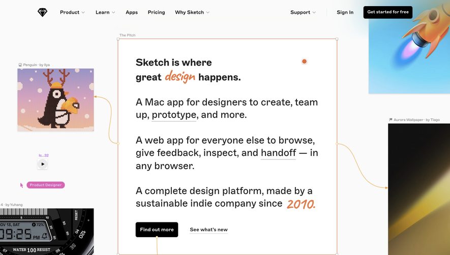

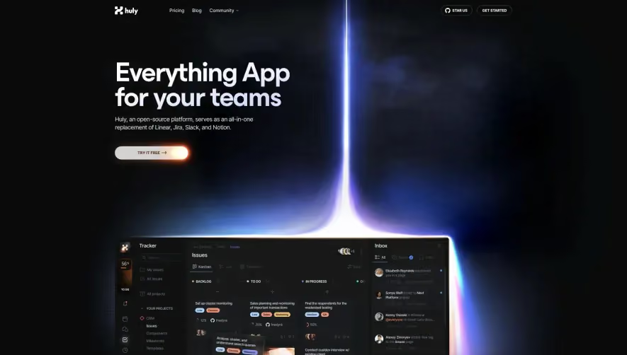

Upgrade to SaaSFrame Pro now to see similar examples.
Monthly
$18 /month
Billed $18 monthly
Browse all screens & flows
Filter and search screens & flows
Search text in screenshots
Access Figma files
Access mobile versions
Join now
Quarterly
$16 /month
Billed $48 quarterly
Browse all screens & flows
Filter and search screens & flows
Search text in screenshots
Access Figma files
Access mobile versions
Join now
Yearly
$15 /month
Billed $180 yearly
Browse all screens & flows
Filter and search screens & flows
Search text in screenshots
Access Figma files
Access mobile versions
Join now