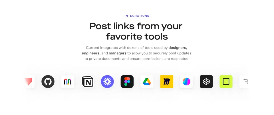
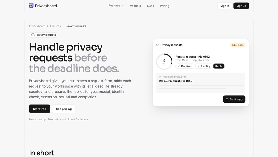
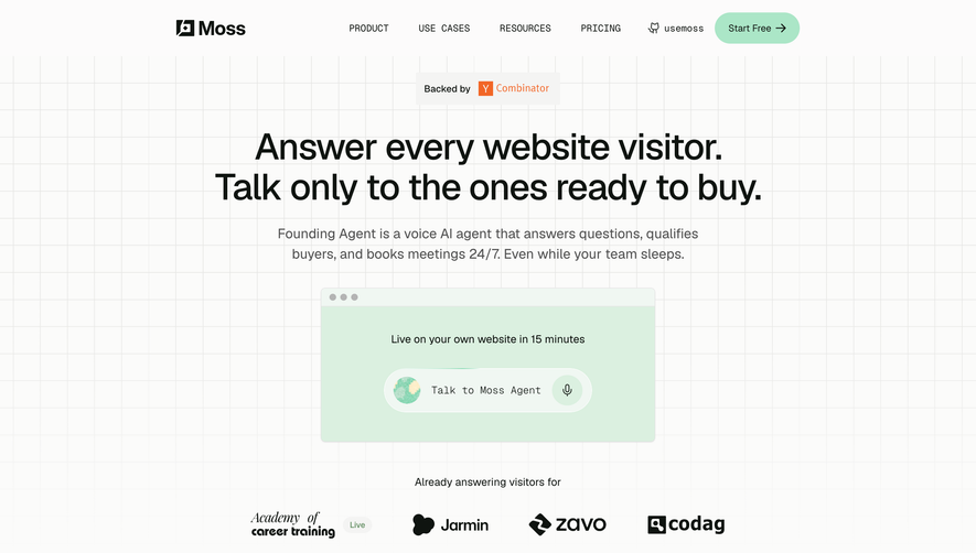
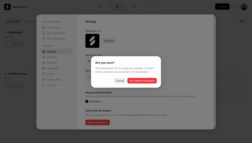
Current.so’s Features page radiates a slick, ultra-modern minimalism crafted for forward-thinking SaaS brands. The interface balances crisp whitespace with bold, saturated accent colors, producing a clean yet energetic presentation. Sleek gradients and rounded card elements inject a sense of innovation and approachability without overwhelming the content.
Layout and Structure
The structure guides users through a thoughtfully layered flow: a captivating hero section with concise messaging establishes the product’s value. Below, a vertically stacked features showcase uses modular cards and subtle hover effects for interactivity. The layout is intentionally uncluttered, emphasizing readability and easy scanning; secondary sections, like FAQs and the sticky contact CTA, enhance clarity and encourage action without distraction.
Visual Elements
Distinctive illustrations and animated icons punctuate each feature, blending playful visuals with functional clarity. Soft shadows, micro-interactions, and subtle background animations create dynamism and help essential elements pop. There are no stock-like images—every graphic feels custom, reinforcing brand cohesiveness and personality.
Color Palette and Typography
A vibrant palette centers on rich purples, blues, and gradients for highlights, contrasted against a calm off-white backdrop. Typography features a crisp sans-serif with ample weight variations, establishing a clear hierarchy between headers, subheads, and body content, ensuring crucial messages stand out at a glance.
User Experience Patterns & Notable Details
Navigation remains sticky and minimal, with frequent, well-placed CTAs. The page leverages smooth scroll transitions and animated reveals to guide users’ attention, making exploration intuitive and engaging. The prominent use of interactive feature cards, animated cues, and a concise, action-focused tone combines to create a digital experience that feels both expert and inviting—ideal for SaaS inspiration.
 SaaSFrame