Generate a new design based on this screen using your own content.
Thank you! Your submission has been received!
Oops! Something went wrong while submitting the form.
# Design from Reference: Pitch Download Page
Create an original, high-fidelity visual design inspired by the reference. Prioritize composition, typography, colors, spacing, and component styling over technical implementation.
## Reference
- **Product:** Pitch
- **Category:** Download Page
- **Screenshot:** https://cdn.prod.website-files.com/5e9dc792e1210c5325f7ebbc/6acb6de30e8221f1308364ce_6acb6bc60e8221f13082928d_cms-423576f979a4d04219afe2d3.webp
Analyze the screenshot first. If inaccessible, request it rather than guessing.
## Content
{{content.instructions}}
{{content.data}}
Preserve essential messaging and factual accuracy. Adapt structure and copy length for visual balance; never invent product claims.
## Visual Design
Use this context to reproduce the reference's visual language: layout, typography, colors, spacing, borders, radii, and distinctive elements. The screenshot takes priority if descriptions conflict.
## Direction
{{preferences.fidelityInstructions}}
## Output
{{output.instructions}}
Deliver a polished, cohesive design with precise alignment, hierarchy, and spacing. Produce the requested visual artifact, not just a description. If unsupported, explain the limitation.
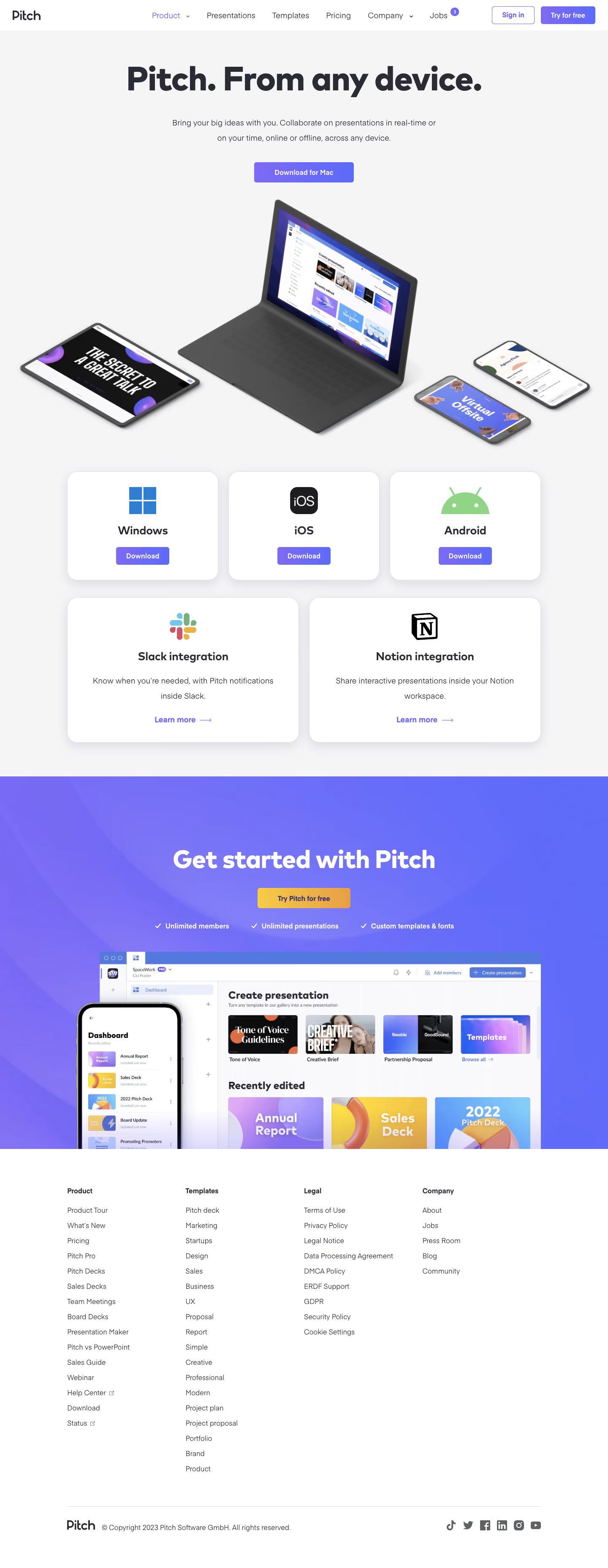
Pitch’s download page exemplifies modern SaaS minimalism with an energetic, editorial edge. The interface balances ample white space and soft shadows with bold, gradient-infused accents—creating a vibrant, yet professional atmosphere. The style is approachable, blending playful color details with clean lines to maintain a sense of trust and innovation.
Layout and Structure
The page unfolds in a purposeful, single-column format: a concise hero section with product branding and key downloads, followed by a visually separated feature grid. Instead of busy footers or testimonial carousels, the focus remains on immediate action (downloading the app), streamlining the user’s journey. Secondary navigation remains sticky and non-intrusive.
Visual Elements
Dynamic illustrations and subtle animated product previews dominate the visuals, replacing traditional screenshots. Playful iconography punctuates download cards, while soft, looping UI animations preview the product in context, conveying interactivity and sophistication without overwhelming the visitor.
Color Palette and Typography
A lively palette pairs deep purples and rich blues with pops of magenta and teal gradients. The default sans-serif font appears geometric and contemporary, supporting clarity with distinct weights for headings, body, and labels. Hierarchy is strong: oversized headings direct focus, while small details echo the product’s design DNA.
User Experience Patterns
CTAs are prominent and high contrast, with clear primary actions—each OS-specific download button is easy to spot. Navigation is frictionless: minimal menu options and quick scrolling cues keep eyes centered on the goal. Microinteractions (like hover states) subtly reinforce interactivity and modernity.
Unique or Notable Design Choices
Pitch’s use of live interface snippets and branded gradients creates an energetic, on-brand experience. The absence of distractions—the focus on just what’s needed—showcases how confidence and careful reduction can guide users swiftly to action. The playful but polished mood feels both welcoming and distinctly forward-thinking.