Overall Style & Aesthetic
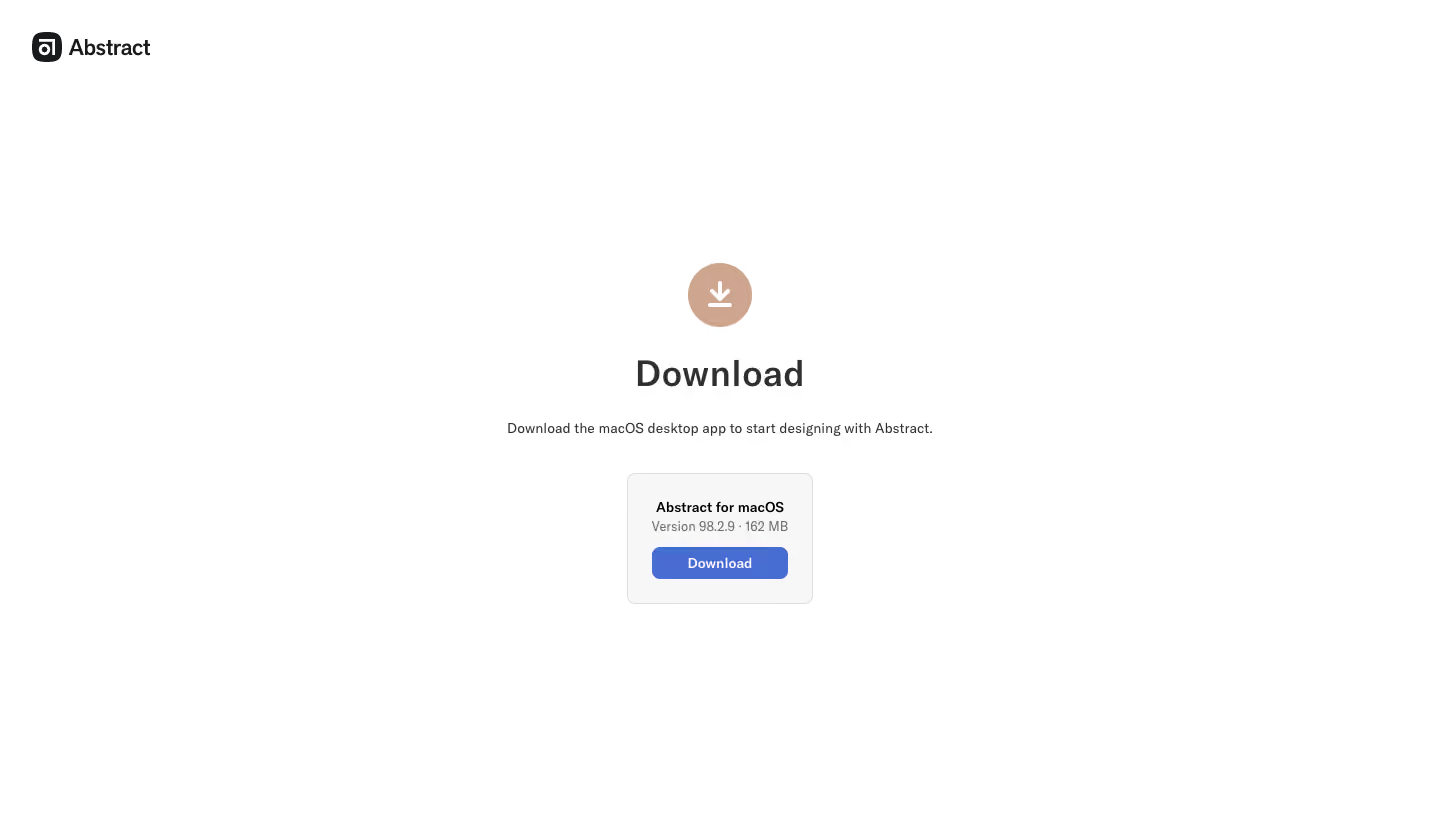
Abstract’s download page artfully combines a modern, minimalist approach with a professional, trustworthy tone. By leveraging abundant whitespace and subtle hues, the aesthetic feels calm yet sophisticated. There’s an immediate sense of focus, channeling user attention directly to core actions without unnecessary distraction. Layout & Structure
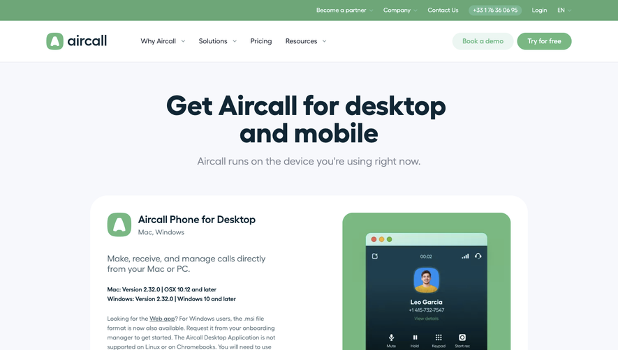
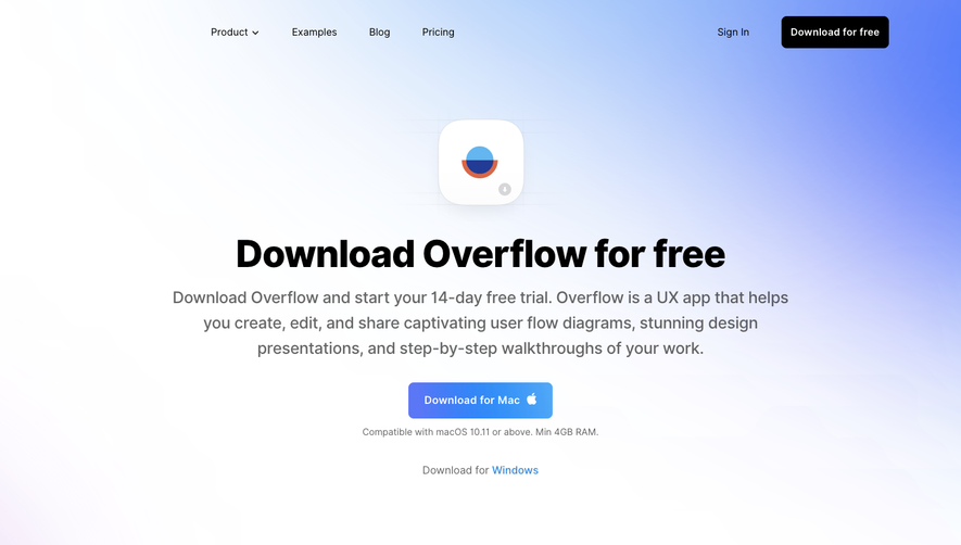
The page structure is clean and linear. At the top, a simple hero section prioritizes the download action, with a large, impossible-to-miss button. There are no extensive features lists or testimonials; instead, the layout opts for clarity and brevity—keeping the user’s journey frictionless and straightforward. Essential information, like system requirements, is unobtrusively accessible. Visual Elements
Illustrations and icons are minimal yet meaningful—think crisp vector graphics that reinforce brand identity without overwhelming the user. The logo and callout visuals provide visual anchors, while ample margins ensure the interface never feels cramped. Color Palette & Typography
The restrained color palette features deep indigos, gentle grays, and pops of a signature blue, establishing hierarchy and guiding the eye. Typography is contemporary, relying on geometric sans-serif fonts for headings and content. Size, weight, and spacing changes foster seamless readability and emphasize calls to action. User Experience Patterns
Navigation is pared down to essentials; users are never distracted from the goal—downloading the product. The primary CTA button dominates the viewport, reinforced with a sticky positioning and clear microcopy. No forms or hurdles block the process. Unique or Notable Design Choices
Notably, Abstract avoids noise—there’s elegance in what’s left out, keeping visitors laser-focused. The download process stands front and center. The page radiates polish, reliability, and quiet confidence, making it a strong reference for SaaS teams who value clarity, professionalism, and user-first design.