 SaaSFrame
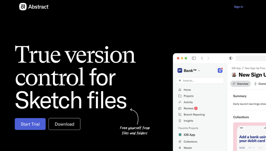
 Cloudflare
 Webflow
 Wordpress
Websites 7
All websites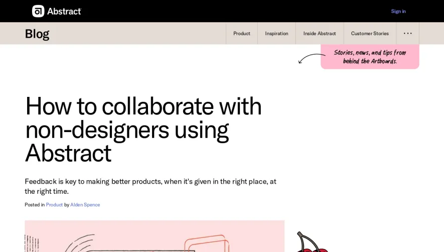

Index of all 7 Abstract websites examples
Products 13
All products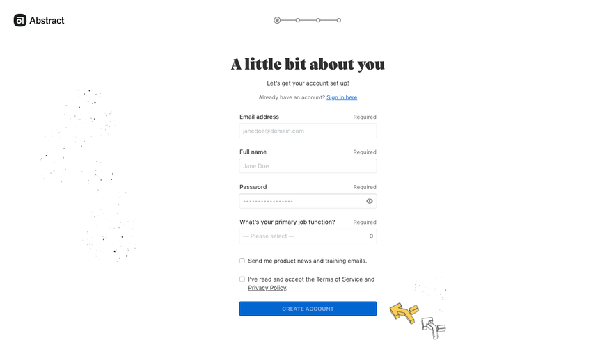
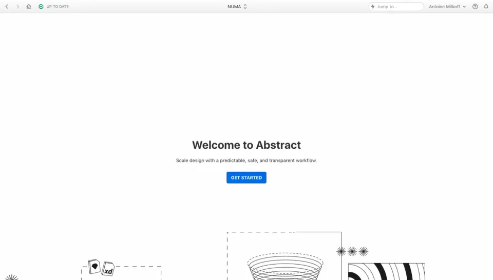
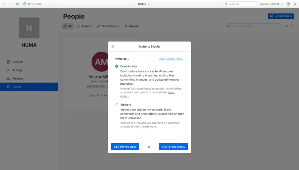
Flows 3
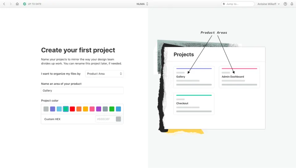
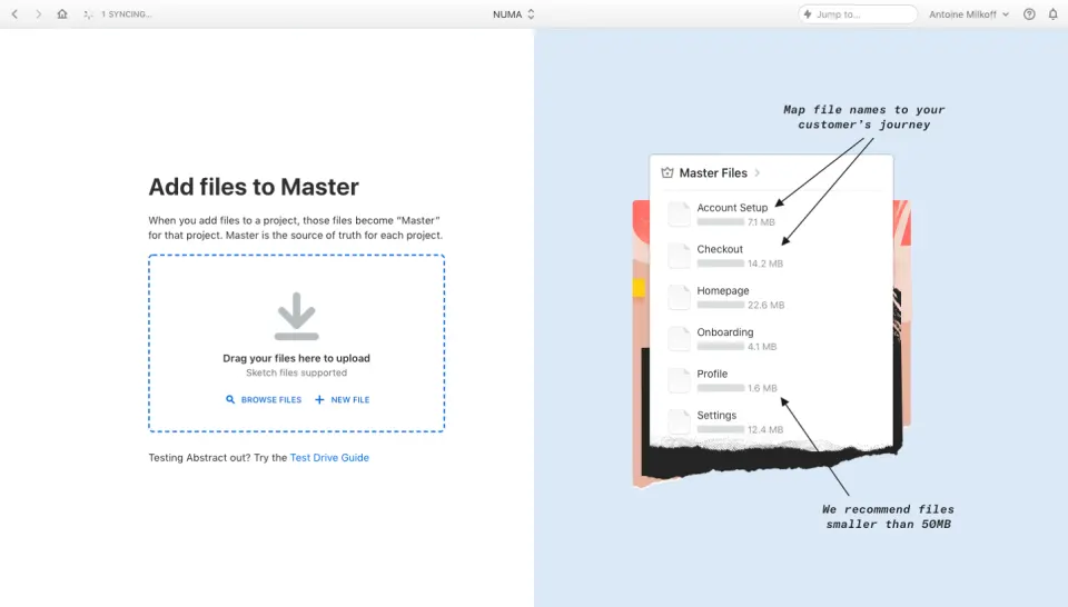
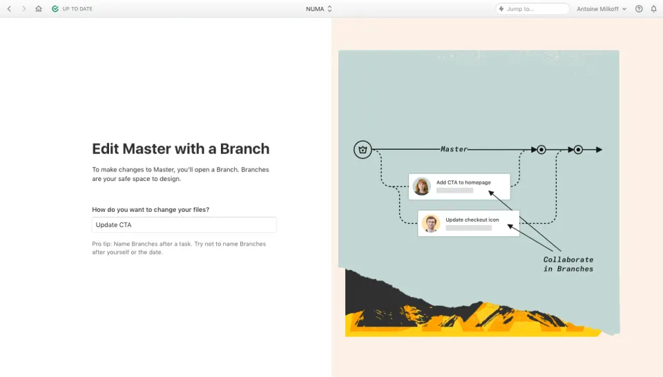
 Abstract User Onboarding
4 screens
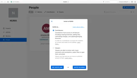
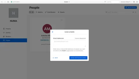
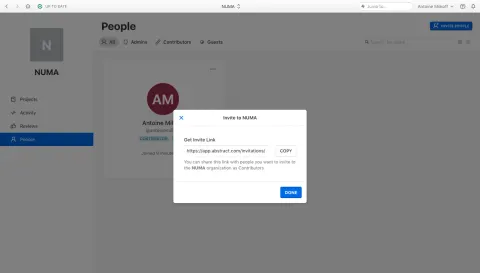
Design reference
Abstract — design reference
Source: https://www.abstract.com/. Extracted 2026-10-14. Scope: public marketing website CSS; declared styles, not computed browser values. This is an observed inventory, not an official internal design system.
Typography
font-family: var(--font-std)— selectorbodyfont-family: var(--font-head)— selector.u-titlefont-size: 1.125em— selector.wp-block-button**linkfont-size: 16px— selectorbodyfont-size: 1.625rem— selector.splash-page**content .u-titlefont-size: 2.6875rem— selector.splash-page**content .u-titlefont-size: 2rem— selector.splash-page**content .u-titlefont-size: 2.8125rem— selector.splash-page**content .u-titlefont-size: 1.125rem— selector.simple-content**text-hldfont-weight: 400— selectorbodyfont-weight: normal— selector.u-titlefont-weight: 600 !important— selector.cky-preference-header .cky-preference-titleline-height: 1.2— selectorbodyline-height: 2.17— selector.site-footer-navs ul a .textline-height: 1.86— selector.site-footer-navs ul a .textline-height: 1.75 !important— selector.cky-preference-header .cky-preference-titleline-height: 100%— selector.cky-btn-close::beforeline-height: 2 !important— selector.cky-notice-des pline-height: 2.17 !important— selector.cky-notice-des pletter-spacing: normal— selectorbodyletter-spacing: -0.32px— selector.splash-page**content .u-titleletter-spacing: -0.45px— selector.splash-page**content .u-titleletter-spacing: -0.43px— selector.splash-page**content .u-titleletter-spacing: .48px— selector.site-footer-navs ul a .textletter-spacing: .56px— selector.site-footer-navs ul a .textletter-spacing: .72px— selector.p404**title,.p404**content
Colors and surfaces
color: #fff— selector.wp-block-button**linkcolor: var(--c-soft-black)— selectorbodycolor: var(--c-soft-beige)— selector.splash-page**content .u-titlecolor: var(--c-accent)— selector.mobile-nav>.mobile-nav**item.current_page_item a .textbackground-color: #32373c— selector.wp-block-button**linkbackground-color: var(--c-beige)— selectorbodybackground-color: rgba(0,0,0,0)— selector.u-btn-hld .u-btnbackground-color: var(--c-white)— selector.news-listing-filters-hld .news-listing-filters**item a .text::beforebackground-color: var(--brand-primary-30)— selector.cky-btn-close
Components and layout
border-radius: 9999px— selector.wp-block-button**linkborder-radius: 2px !important— selector.cky-btn-closeborder-radius: 0 !important— selector.cky-btn-closebox-shadow: none— selector.wp-block-button**linkmax-width: 20rem— selector.simple-content**text-hldmax-width: 32.0625rem— selector.simple-content**text-hldmax-width: 41.125rem— selector.simple-content**text-hldmax-width: 14.125rem— selector.p404**title,.p404**contentmax-width: none— selector.p404**title,.p404**contentpadding: calc(.667em + 2px) calc(1.333em + 2px)— selector.wp-block-button**linkpadding: 0 1.5625rem— selector.simple-content**text-hldpadding: 2.125rem 2.5rem 0— selector.simple-content**text-hldpadding: 10px— selector.u-btn-hld .u-btnpadding: 100px 50px 40px— selector.mobile-nav-bodypadding: 10px 15px— selector.news-listing-filters-hld .news-listing-filters**item apadding: 2px 25px !important— selector.cky-btngap: 0.5em— selector:where(.is-layout-flex)gap: 20px— selector.site-footer-navs ulgap: 1rem— selector.socialsgap: .6875rem— selector.socialstransition: all .6s ease— selector.splash-page**logo-containertransition: all 1.2s ease— selector.loading-page .splash-page**logo-containertransition: opacity .8s ease .2s— selector.home.is-animate .simple-content**text-hldtransition: opacity .2s— selector.mobile-nav-backgroundtransition: transform .5s— selector.mobile-nav-bodytransition: opacity 1s— selector.site-footer-navs ul a .text::aftertransition: all .3s ease— selector.p404\_\_btntransition: scale .4s ease-in-out !important— selector.cky-btn-close
Responsive rules
only screen and (min-width: 768px)
only screen and (min-width: 1024px)
only screen and (width: 1024px)and (height: 768px)
only screen and (width: 1024px)and (height: 1366px)
only screen and (width: 1366px)and (height: 1024px)
only screen and (min-width: 400px)
only screen and (min-width: 1680px)
only screen and (min-width: 1280px)
only screen and (height: 1366px)and (width: 1024px)
only screen and (min-width: 1365px)
only screen and (min-height: 800px)and (max-height: 1023px)and (max-width: 1023px)
only screen and (max-width: 1366px)
only screen and (max-width: 1279px)
only screen and (max-width: 767px)