Design with AI
Generate a new design based on this screen using your own content.
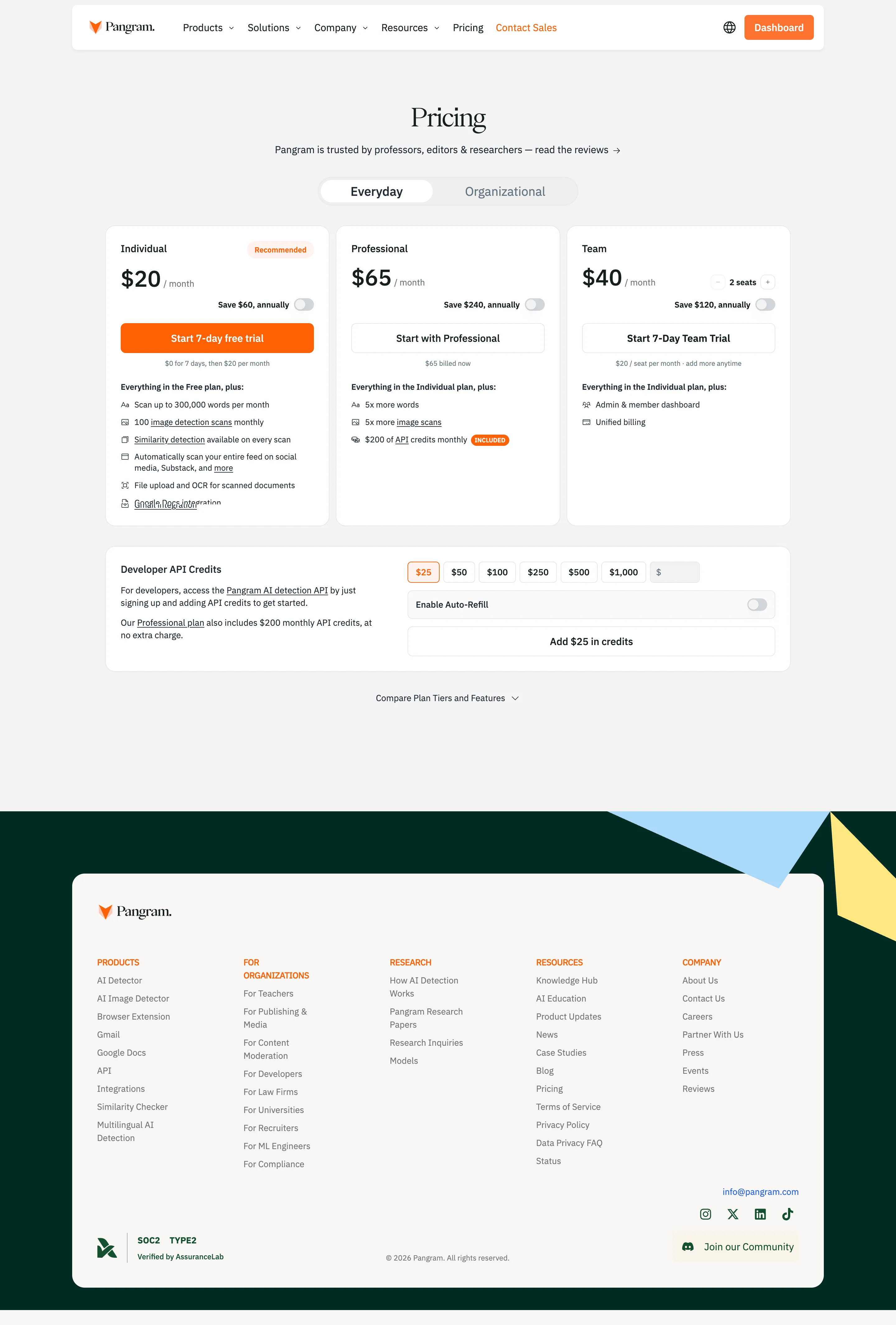
# Design from Reference: Pangram Pricing Page
Create an original, high-fidelity visual design inspired by the reference. Prioritize composition, typography, colors, spacing, and component styling over technical implementation.
## Reference
- **Product:** Pangram
- **Category:** Pricing Page
- **Screenshot:** https://cdn.prod.website-files.com/5e9dc792e1210c5325f7ebbc/6acc14bafae7d56f2395a6a0_screencapture-pangram-pricing-2026-10-12-00_58_56.png
Analyze the screenshot first. If inaccessible, request it rather than guessing.
## Content
{{content.instructions}}
{{content.data}}
Preserve essential messaging and factual accuracy. Adapt structure and copy length for visual balance; never invent product claims.
## Visual Design
### Overall aesthetic
- **Style:** A restrained pricing page mixing serif brand/display typography, compact sans serif plan details, orange conversion accents, and a dark-green footer backdrop.
- **Character:** Practical and comparison-focused, with rounded white panels and explicit API-credit purchasing below the main plans.
### Page composition
- **Capture and scale:** 2880 × 4256 screenshot pixels, consistent with estimated 2× capture. Following sizes are estimated CSS pixels.
- **Opening:** A white rounded navigation bar floats on pale gray. Centered Pricing title and review line precede an Everyday/Organizational segmented control.
- **Plans:** Three equal white cards present Individual, Professional, and Team, with annual-saving toggles, actions, explanatory notes, and feature lists. Team includes a seat stepper.
- **Credits/footer:** A wide API-credit panel pairs explanation left with amount chips, refill toggle, and purchase action right. A comparison disclosure follows. The footer is a large cream rounded panel on dark green with geometric blue/yellow accents, five link groups, compliance mark, social/community controls, and copyright.
### Information hierarchy
- **Comparison:** Prices and actions dominate cards; inheritance statements and small icon-led lists support the decision.
- **Primary action:** Individual has the orange filled trial button and recommended badge; other plan actions are outlined.
- **Separate purchase:** API credits form a distinct developer path beneath subscription plans.
### Typography
- **Family:** Serif display/wordmark and neutral sans serif interface; exact identities unverified.
- **Roles:** Pricing title around 44 px CSS regular; prices 36 px semibold; plan names 16 px bold.
- **Details:** Feature text roughly 13–14 px with 20 px leading; notes 11–12 px. Segmented labels about 20 px.
### Colors & surfaces
- **Foundation:** Sampled sRGB #F3F3F3 defines the page, #FFFFFF cards, and warm #F8F7F5 the footer panel.
- **Brand:** Sampled dark green #012B24 defines the footer field and primary ink reference; orange #FF6105 defines main conversion accents.
- **Decoration:** Sampled sky blue #A9D8F9 and yellow #FFE782 form footer geometry.
### Components
- **Cards:** Thin pale borders, roughly 16 px radii, and consistent inner padding. Prices/actions align across cards.
- **Controls:** Small annual toggles and team seat stepper sit above wide actions. Credit amount chips include one orange-outlined selected amount and custom entry.
- **Footer:** Large rounded cream container holds compact orange group labels and muted gray links; a compliance badge and community action anchor the lower corners.
### Visual rhythm
- **Spacing:** Keep approximately 12 px card gaps, 30 px between plans/credits, and substantial whitespace before footer.
- **Alignment:** Use a centered roughly 1100 px content width and stable action/feature baselines.
### Responsive
- **Observed state:** Desktop only; organizational/comparison content is collapsed or unseen.
- **Recommended reflow:** Stack plans and credit controls, wrap amount chips, and collapse footer columns with readable labels.
### Adaptation guidance
- **Preserve:** Retain serif/sans contrast, orange primary emphasis, API-credit purchase structure, and dark-green framed footer.
- **Adapt:** Use real plan terms, seat logic, credit options, and compliance evidence.
- **Avoid:** Do not copy reference prices or infer unseen plan/comparison states.
Use this context to reproduce the reference's visual language: layout, typography, colors, spacing, borders, radii, and distinctive elements. The screenshot takes priority if descriptions conflict.
## Direction
{{preferences.fidelityInstructions}}
## Output
{{output.instructions}}
Deliver a polished, cohesive design with precise alignment, hierarchy, and spacing. Produce the requested visual artifact, not just a description. If unsupported, explain the limitation.