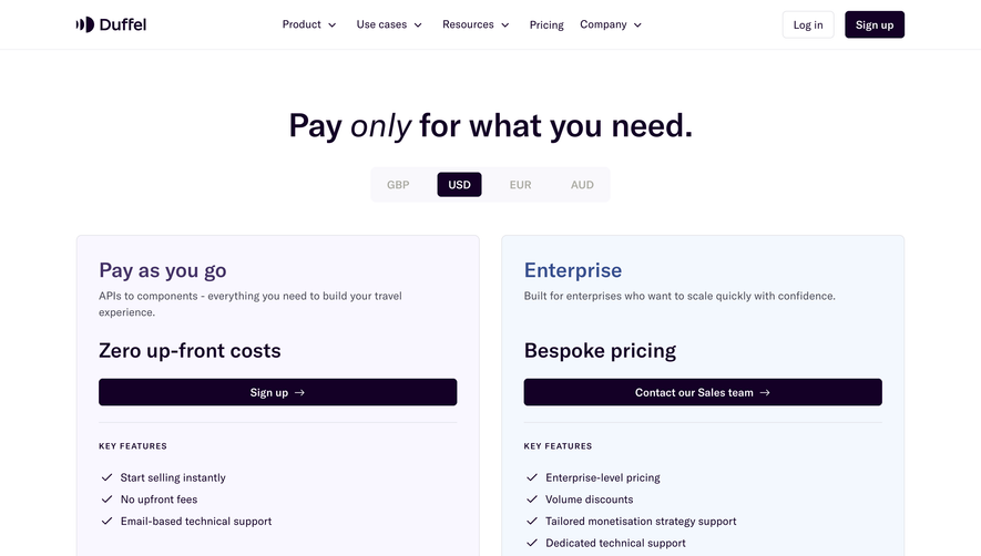
Generate a new design based on this screen using your own content.
Thank you! Your submission has been received!
Oops! Something went wrong while submitting the form.
# Design from Reference: Payhawk Pricing Page
Create an original, high-fidelity visual design inspired by the reference. Prioritize composition, typography, colors, spacing, and component styling over technical implementation.
## Reference
- **Product:** Payhawk
- **Category:** Pricing Page
- **Screenshot:** https://cdn.prod.website-files.com/5e9dc792e1210c5325f7ebbc/668835f5bb41570075563a6c_G-oY_rA2wl6fVAWuhUcgJWBC0LvlvPwuukZK-cAkyaA.webp
Analyze the screenshot first. If inaccessible, request it rather than guessing.
## Content
{{content.instructions}}
{{content.data}}
Preserve essential messaging and factual accuracy. Adapt structure and copy length for visual balance; never invent product claims.
## Visual Design
Use this context to reproduce the reference's visual language: layout, typography, colors, spacing, borders, radii, and distinctive elements. The screenshot takes priority if descriptions conflict.
## Direction
{{preferences.fidelityInstructions}}
## Output
{{output.instructions}}
Deliver a polished, cohesive design with precise alignment, hierarchy, and spacing. Produce the requested visual artifact, not just a description. If unsupported, explain the limitation.
Payhawk’s pricing page exemplifies a sleek, contemporary aesthetic. The design is minimal yet authoritative—balancing ample white space with blocks of vibrant accent color, it communicates professionalism and modernity without overwhelming the visitor. Consistent use of clean lines and refined alignment further enhances a sense of trust and clarity.
Layout and Structure
The structure is intuitive: a concise hero area introduces the page’s purpose, leading straight to a well-organized pricing table that effortlessly compares plans side by side. Secondary sections below reinforce product benefits, showcase integrations with recognizable logos, present a carousel of customer testimonials, and, finally, round off with a compact, information-rich footer.
Visual Elements
Custom, geometric illustrations and distinctive icons convey product features with clarity and personality, while subtle animations enliven scroll interactions (like highlights or gentle fades). The judicious use of business-focused lifestyle photography humanizes the offering, striking a balance between corporate and approachable.
Color Palette and Typography
A restrained palette—anchored by deep navy, energetic teal, and vivid accent greens—sets a bold, memorable tone. Strong typographic hierarchy leverages a sophisticated sans-serif for headlines and clean body text, directing focus without feeling heavy-handed.
User Experience Patterns
Sticky navigation ensures users always have access to CTA buttons and plan selection. Clear, repeatable CTAs (“Get started,” “Contact Sales”) guide users, while transparent plan details and no-nonsense toggle switches for monthly/yearly viewing reduce friction. Microinteractions (like hovering over tables) enliven the experience.
Unique or Notable Design Choices
Standout elements include prominent, persistent CTAs and the use of dynamic overlays to highlight plan differences. The tone is energetic yet stable—instilling confidence in a complex, innovative solution that remains easily accessible to prospective buyers.