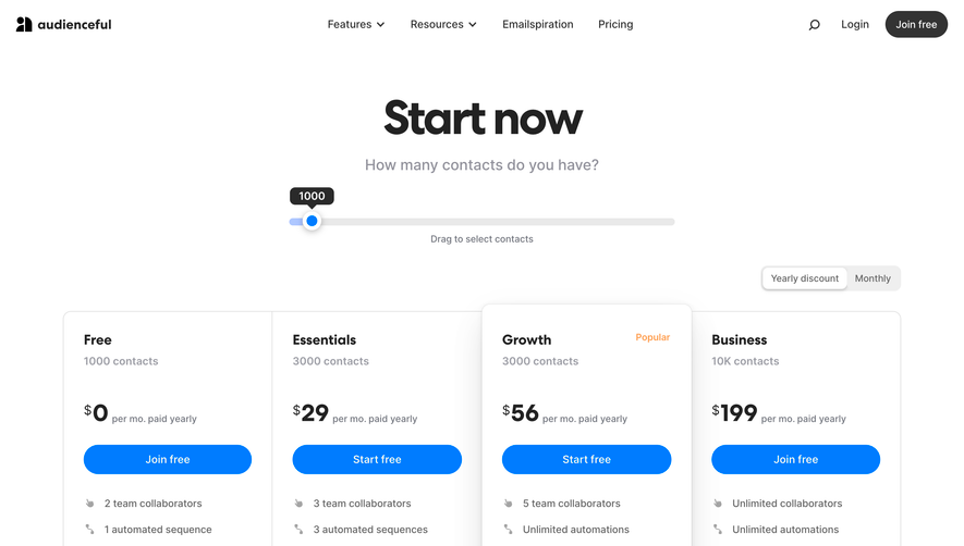
1. The page has a header section which contains the navigation menu, a sign-in button, and a button to create a new account. 2. The next section contains a large banner image with the headline "Choose Your Plan" and a "Get Started" button. 3. The pricing plans are displayed in a grid format with three columns: Features, Free, and Premium. The grid also includes a fourth column labeled "Pro," which is only visible when the user hovers over the Free or Premium options. 4. Each row in the grid lists the features that are available in the Free or Premium plans, including the number of subscribers, email sends per month, automation workflows, landing pages, and integrations. 5. The pricing for each plan is clearly displayed with an option to choose either monthly or annual billing. 6. A "compare plans" button is located at the bottom of the grid, which opens a new page with a more detailed side-by-side comparison of the plans. 7. A section with customer testimonials follows the pricing grid. Each testimonial shows a customer's name, photo, and a brief quote about their experience using MailerLite. 8. A final section provides additional information about MailerLite's features, including email marketing, automation, landing pages, pop-ups, forms, and integrations. 9. The footer section is located at the bottom of the page and includes links to the company's social media profiles and legal information, such as the terms of service and privacy policy.


MailerLite Pricing Page

MailerLite
Create Email Marketing Your Way
Designed by
No items found.
Category
Patterns
No items found.
Tech Stack
Added on
July 11, 2020