 SaaSFrame


 Cloudflare
 Vue.js
Websites 7
All websites
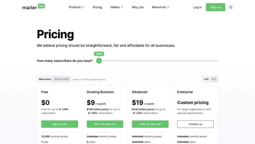
Index of all 7 MailerLite websites examples
Design reference
MailerLite — design reference
Source: https://www.mailerlite.com/. Extracted 2026-10-14. Scope: public marketing website CSS; declared styles, not computed browser values. This is an observed inventory, not an official internal design system.
Typography
font-size: 100%— selectorbutton,input,optgroup,select,textareafont-size: 2.25rem— selectorh1,.h1font-size: 3rem— selectorh1,.h1font-size: 4rem— selectorh1,.h1font-size: 1.875rem— selectorh2,.h2font-size: 1.5rem— selectorh3,.h3font-weight: 700— selectorh1,.h1font-weight: 600— selectorh5,.h5font-weight: 500!important— selectorbutton.type-white-link,a.type-white-linkfont-weight: 400— selector.bfcm25-title spanline-height: 1— selectorh1,.h1line-height: 1.25— selectorh2,.h2line-height: 1.25rem— selector.text h5line-height: 1rem— selectorbutton.size-xs,a.size-xsline-height: 1.6— selector.code-samples pre[class_=language-],.code-samples code[class_=language-]line-height: 2rem— selector.blog .intro pline-height: 4rem— selector.blog .intro p:first-child:first-letterletter-spacing: -.025em— selectorh1,.h1letter-spacing: .025em— selectorbutton.type-return,a.type-return
Colors and surfaces
color: #9de7c3— selector.lite-description acolor: #6f6f6f— selector.lite-description p:first-childcolor: #000— selector.lite-description li p:first-childcolor: rgb(7 155 84 / var(--tw-text-opacity))— selector.text a:hovercolor: rgb(255 255 255 / var(--tw-text-opacity))— selector.dark .text a:hovercolor: rgb(0 0 0 / var(--tw-text-opacity))— selectorbutton.type-white,a.type-whitecolor: rgb(255 255 255 / var(--tw-text-opacity))!important— selectorbutton.type-white-link,a.type-white-linkbackground-color: transparent— selectorbutton,[type=button],[type=reset],[type=submit]background-color: rgb(0 0 0 / var(--tw-bg-opacity))— selectorbutton.type-black,a.type-blackbackground-color: rgb(38 38 38 / var(--tw-bg-opacity))— selectorbutton.type-black:hover,a.type-black:hoverbackground-color: rgb(255 255 255 / var(--tw-bg-opacity))— selectorbutton.type-white,a.type-whitebackground-color: rgb(209 213 219 / var(--tw-bg-opacity))— selectorbutton.type-white:hover,a.type-white:hoverbackground-color: rgb(9 194 105 / var(--tw-bg-opacity))— selectorbutton.type-primary,a.type-primarybackground-color: rgb(7 155 84 / var(--tw-bg-opacity))— selectorbutton.type-primary:hover,a.type-primary:hoverbackground-color: var(--btn-hover-color)!important— selectorbutton.type-custom-color:hover,a.type-custom-color:hover
Components and layout
border-radius: .375rem— selectorbutton.type-black,a.type-blackborder-radius: 0— selector.code-samples**panel pre[class\*=language-]border-radius: .25rem— selector.blog prebox-shadow: var(--tw-ring-offset-shadow, 0 0 #0000),var(--tw-ring-shadow, 0 0 #0000),var(--tw-shadow)— selectorbutton:focus,a:focusmax-width: 1536px— selector.containermax-width: 640px— selector.containermax-width: 768px— selector.containermax-width: 1024px— selector.containermax-width: 1280px— selector.containerpadding: 0— selectorbutton,input,optgroup,select,textareapadding: .5rem 1rem— selectorbutton.size-xs,a.size-xspadding: .75rem 1.5rem— selectorbutton.size-small,a.size-smallpadding: 1rem 2rem— selectorbutton.size-large,a.size-largepadding: 1rem 3.5rem 1rem 1rem— selector.code-samples**panel pre[class\*=language-]padding: 1rem 1.5rem— selector.blog prepadding: 1em— selectorpre code.hljsgap: .25rem— selector.code-samples**tabsgap: 1rem— selector.code-samples**linksgap: .5rem— selector.code-samples\_\_linkgap: 4rem— selector.gap-16gap: 3rem— selector.gap-12gap: 2.5rem— selector.gap-10gap: .625rem— selector.gap-2.5gap: 2rem— selector.gap-8
Responsive rules
(min-width: 768px)
(min-width: 1024px)
(min-width: 1280px)
(max-width: 768px)
(min-width: 640px)
(forced-colors: active)
(max-width: 1024px)
(min-width: 1536px)
(prefers-reduced-motion: no-preference)