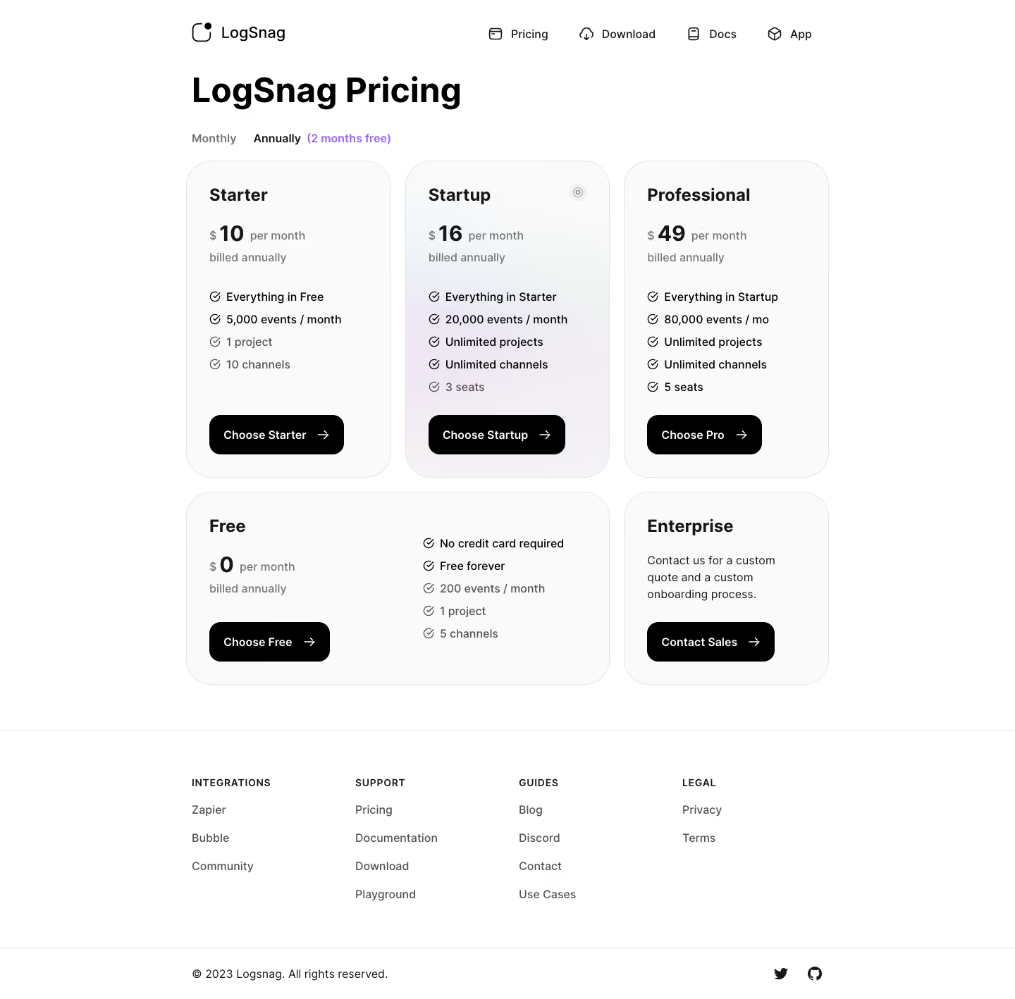
Overall Style and Aesthetic
LogSnag’s pricing page exudes a clean, modern minimalism that’s simultaneously professional and inviting. Crisp white backgrounds maximize negative space, letting vibrant accent colors draw attention to critical elements without visual clutter. The aesthetic is understated yet confident, bolstered by thoughtful UI details that establish trust and reliability—key for SaaS products. Layout and Structure
The page structure is highly intuitive and frictionless. The hero section introduces the pricing with a short, direct headline, immediately followed by a side-by-side comparison of plans. Each plan is distinctly separated, making evaluation effortless. Strategic use of concise feature lists and toggle options (such as monthly/annual billing) enhance decision-making. Below, a simple FAQ section preempts common questions, and a compact footer delivers secondary links without distracting from primary CTAs. Visual Elements
Custom, playful illustrations infuse personality and approachability, balancing the site’s overall professionalism. Sleek iconography underscores each plan feature—colored highlights serve as subtle guides for the eye. Light, micro-animations on toggles and buttons provide interactive feedback for a polished touch, while the prominent CTAs are visually anchored to stand out at a glance. Color Palette and Typography
The color palette combines crisp whites with deep, midnight blues and bright indigo accents, conveying maturity and modernity. Primary CTAs pop in electric blue, contrasted by soft, neutral grays for supporting details. Typography delivers hierarchy through clear, readable sans-serif fonts—headlines are bold and inviting, while body text remains highly legible and unobtrusive. User Experience Patterns and Unique Choices
Effortless horizontal navigation, sticky elements, and a billing cycle toggle simplify exploration. The transparent, up-front display of pricing with no hidden caveats builds credibility. Notable is the absence of heavy text, replaced with concise bullets and interactive plan selectors—keeping cognitive load low and conversion high, embodying the SaaS mantra of “show, don’t tell.”