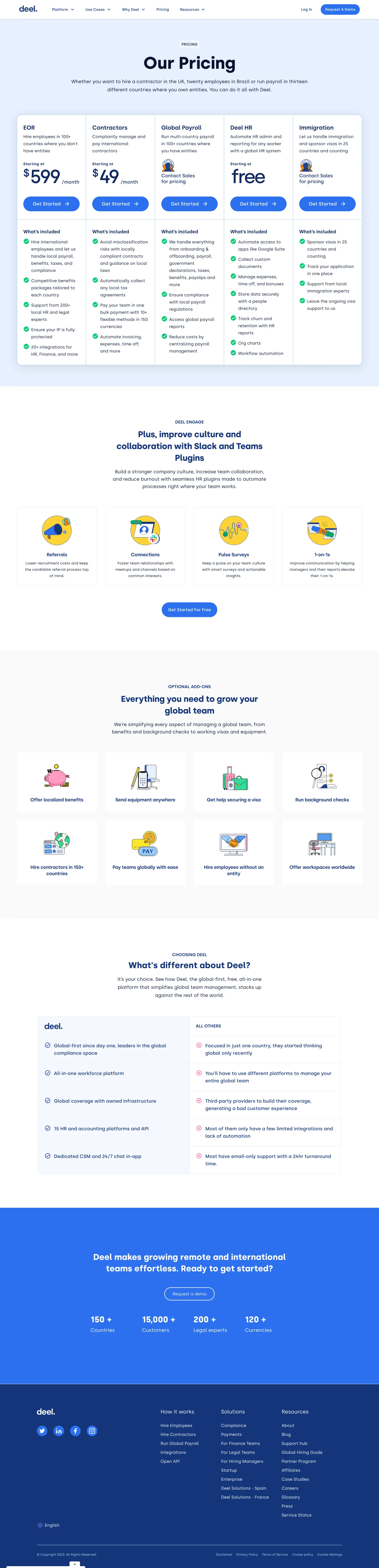
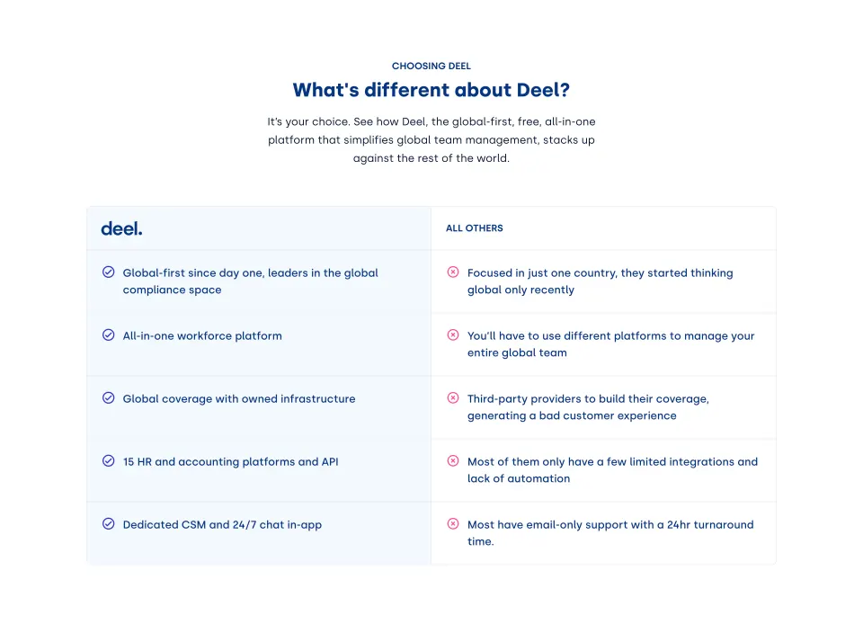
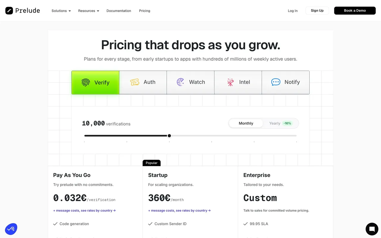
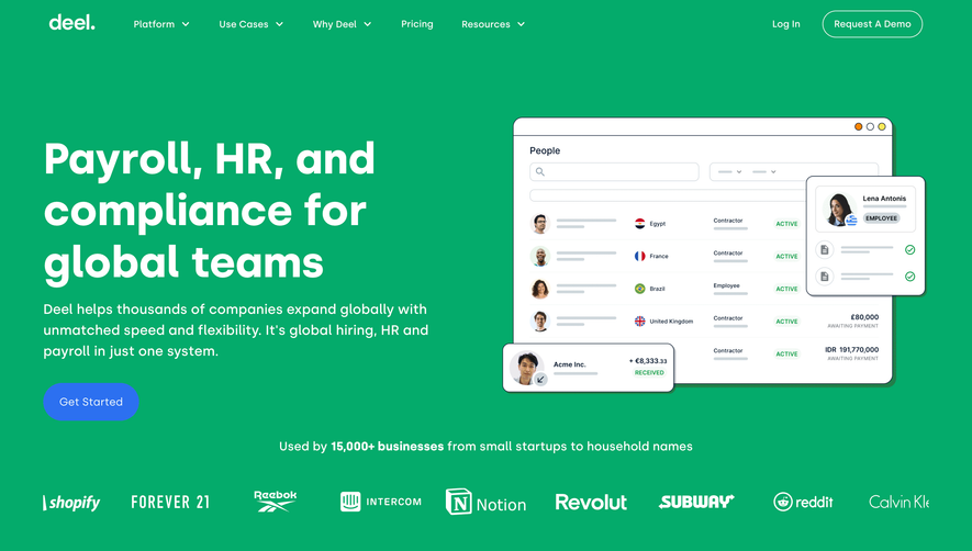
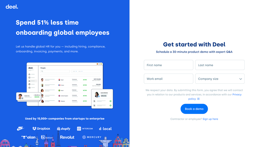
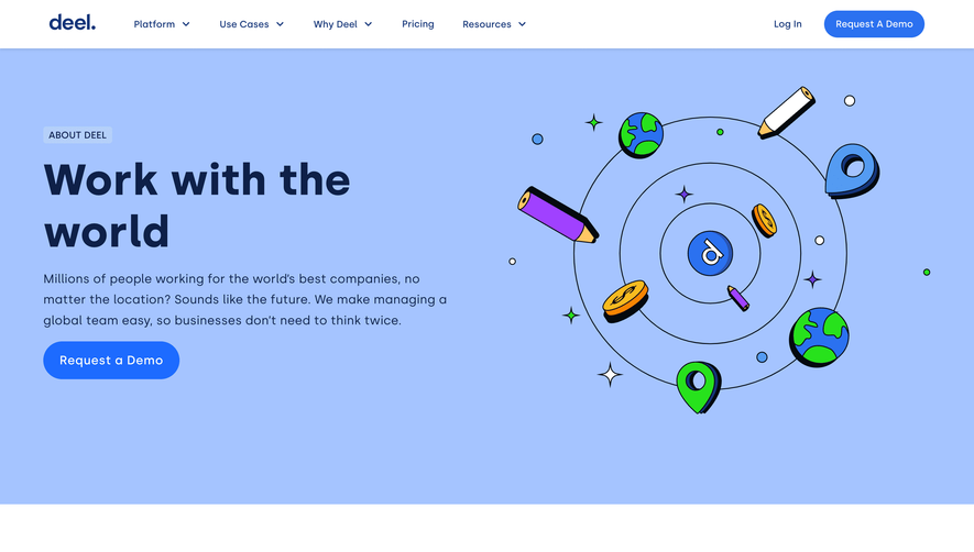
Deel’s pricing page embraces a clean, modern aesthetic with a minimalist approach that feels both professional and approachable. The use of abundant white space, soft rounded corners, and subtle gradients creates an inviting yet sophisticated atmosphere perfect for B2B audiences. The design signals trustworthiness and innovation without visual clutter, maintaining focus on essential content.
Layout and Structure
The page follows a logical, scrolling “story” structure. It opens with a clear hero section that summarizes Deel’s value proposition and provides an immediate pricing overview. Below, pricing tiers are elegantly displayed in separate cards with all-inclusive features grouped for easy comparison. Sticky navigation and tabbed interactions streamline exploration, while concise FAQs and customer recognition elements reinforce credibility further down. A broad, content-rich footer provides easy access to resources and support.
Visual Elements
Crisp two-tone illustrations, thoughtful iconography, and the occasional animated accent (such as dynamic toggles) keep the experience lively without overwhelming the user. Logo clusters from trusted customers lend social proof, while interactive pricing modules and international currency toggles showcase product flexibility.
Color Palette and Typography
The palette is dominated by whites and airy grays, punctuated with Deel’s signature blue and vibrant accent hues. Typography is clean and contemporary, using sans-serif typefaces in clear hierarchy—large bold headers, medium emphasis subheaders, and legible body text—delivering easy scanability and emphasis where needed.
User Experience Patterns
Persistent navigation, sticky CTAs, and frictionless plan selectors make for a smooth journey. Pricing cards react on hover, and toggling between billing frequency is seamless. FAQ accordions and in-context helper modals foster clarity. The experience is efficient and reassuring, culminating in prominent “Get Started” CTAs.
Unique or Notable Design Choices
Key standouts include multi-currency toggles tailored for Deel’s global audience and modular, interactive plan breakdowns that update dynamically based on selection. This user-centric customization reinforces Deel’s international and scalable nature, setting the design apart as thoughtfully engineered and globally relevant.
 SaaSFrame