 SaaSFrame

 Builder.io
 Vercel
 Wordpress
Websites 9
All websites
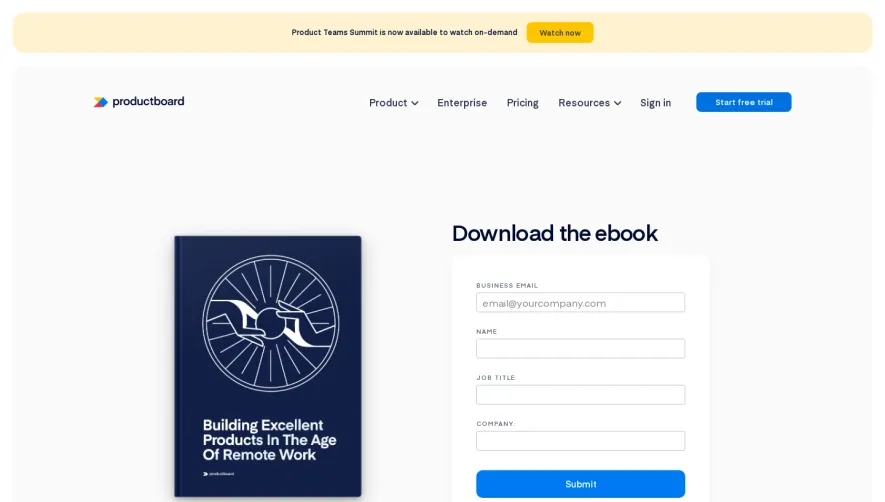

Products 8
All products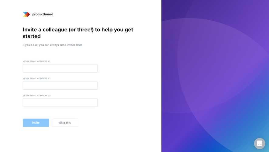
Index of all 8 ProductBoard products examples
Flows 2
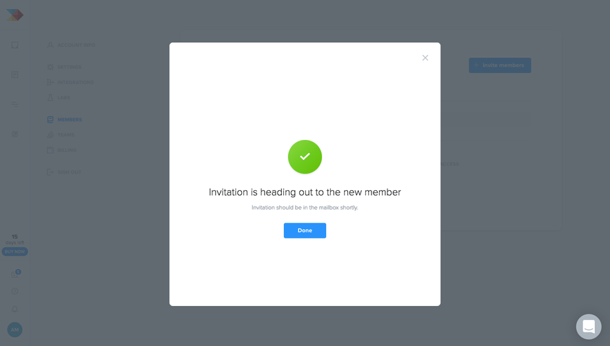
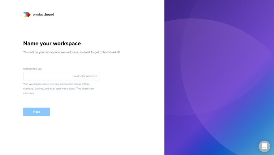
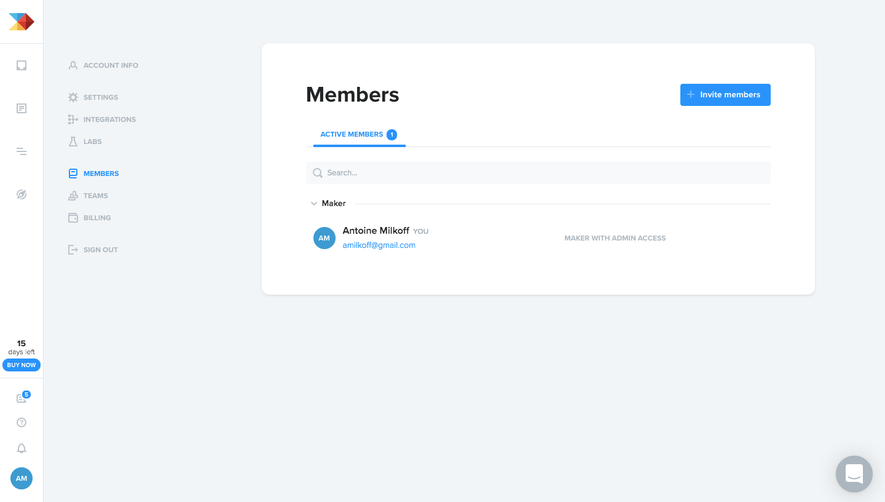
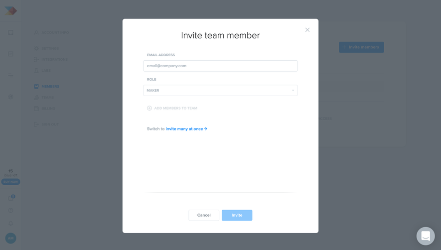
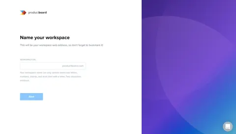
 ProductBoard Invite Team Members
3 screens


Website sections 7






DESIGN.md 131 lines
The design system ProductBoard ships, measured on productboard.com on Nov 18, 2026, in the open DESIGN.md format. Drop it in your repo so Claude Code, Cursor or Codex build in the style of ProductBoard.
99/100ConsistentConsistency of what ships
Colors 4
- primary
#000000 - surface
#FFFFFF - on-surface
#000000 - outline
#000000
Typography 9
- eina
- eina
- eina
- eina
- eina
- eina
- eina
- eina
- eina
Shapes and components
- sm
8px - md
12px - lg
20px - full
9999px
Want the same for your product? Generate a DESIGN.md from any website, free.
CSS inventory
ProductBoard — design reference
Source: https://www.productboard.com/. Extracted 2026-10-14. Scope: public marketing website CSS; declared styles, not computed browser values. This is an observed inventory, not an official internal design system.
Typography
font-size: 100%— selectorbutton,input,optgroup,select,textareafont-size: 1.375rem— selector.text-2xlfont-size: .6rem— selector.text-[.6rem]font-size: .8rem— selector.text-[.8rem]font-size: 10px— selector.text-[10px]font-size: 15px— selector.text-[15px]line-height: 1.5— selector.text-2xlline-height: 1— selector.text-display-lgline-height: 1.19— selector.text-display-mdline-height: 1.4— selector.text-display-newsletterline-height: 1.2— selector.text-display-smline-height: 1.3— selector.text-display-xsline-height: 1.55— selector.text-lg
Colors and surfaces
color: rgb(0 0 0/var(--tw-text-opacity,1))— selector.text-blackcolor: var(--blue-500)— selector.text-pb-blue-300color: var(--blue-600)— selector.text-pb-blue-400,.text-pb-blue-450color: var(--blue-950)— selector.text-pb-blue-700color: var(--green-600)— selector.text-pb-greencolor: rgb(250 250 251/var(--tw-text-opacity,1))— selector.text-pb-grey-100color: rgb(71 80 89/var(--tw-text-opacity,1))— selector.text-pb-grey-1100background-color: initial— selectorbutton,input:where([type=button]),input:where([type=reset]),input:where([type=submit])
Components and layout
border-radius: var(--radius-md, 12px)— selector.caTgBHborder-radius: 16px— selector.caTgBH::afterborder-radius: var(--radius-sm, 8px)— selector.ffgHpDborder-radius: var(--radius-lg, 20px)— selector.dlzqnHborder-radius: 0px— selector.fsfoBcborder-radius: var(--radius-md, 12px)!important— selector.icwgVj >divborder-radius: 0— selector.dJGQurborder-radius: 100%— selector.bHeiZgbox-shadow: var(--tw-ring-offset-shadow,0 0 #0000),var(--tw-ring-shadow,0 0 #0000),var(--tw-shadow)— selector.shadow-[0_0.3125rem_0.625rem\_#eee],.shadow-customerCardShadowbox-shadow: 0 5px 20px 0 rgba(63,71,79,.161)— selector.boxshadow-cardmax-width: 71rem— selector.containermax-width: 640px— selector.containermax-width: 768px— selector.containermax-width: 1024px— selector.containermax-width: 1280px— selector.containermax-width: 1536px— selector.containerpadding: 0 6.125rem— selector.container--indent-100padding: 0— selectorbutton,input,optgroup,select,textareagap: var(--spacing-xs, 0.25rem)— selector.cbxaaW [data-heading-with-eyebrow]gap: var(--spacing-xl)— selector.btn-cta-wrappertransition: all 300ms— selector.caTgBHtransition: --gradient-ai-color-1 0.3s,--gradient-ai-color-2 0.3s,all 0.3s— selector.caTgBHtransition: all 0.3s ease-in-out— selector.caTgBH::aftertransition: color 0.2s ease-in-out— selector.dSQQEqtransition: color 0.2s ease-in-out,text-decoration-color 0.2s ease-in-out— selector.dSQQEq spantransition: opacity 0.3s ease-in-out— selector.eFzjfwtransition: all 0.2s ease-in-out— selector.bHeiZgtransition: color 0.2s ease-in-out,transform 0.4s ease-in-out— selector.hhmXuw
Responsive rules
screen and (min-width: 768px)
screen and (min-width: 1024px)
screen and (min-width: 1440px)
screen and (max-width:1023px)
(prefers-reduced-motion:reduce)
(min-width: 768px)
(min-width: 1024px)
only screen and (max-width:1439px)
only screen and (max-width:320px)
only screen and (max-width:767px)
(min-width:768px)
(min-width:1024px)
(min-width:1440px)
(min-width:2560px)
screen and (min-width:80em)
screen and (max-width:80.5em)
screen and (max-width:80em)
screen and (max-width:64em)
screen and (max-width:48em)
screen and (max-width:37.5em)
(min-width:640px)
(min-width:1280px)
(min-width:1536px)