
Thank you! Your submission has been received!
Oops! Something went wrong while submitting the form.
Get SaaSFrame Pro
Monthly
$18
Quarterly
$48
Yearly
$180
Upgrade to access this feature
Browse all screens & flows
Filter and search screens & flows
Access Figma files
Access mobile versions
Bookmark screens & flows
Join now


Heap Demo Request

Heap
The New Standard in Product Analytics
Designed by
No items found.

Bookmark
Bookmark

Design with AI
Thank you! Your submission has been received!
Oops! Something went wrong while submitting the form.
# Design from Reference: Heap Demo Request
Create an original, high-fidelity visual design inspired by the reference. Prioritize composition, typography, colors, spacing, and component styling over technical implementation.
## Reference
- **Product:** Heap
- **Category:** Demo Request
- **Screenshot:** https://cdn.prod.website-files.com/5e9dc792e1210c5325f7ebbc/62ec9c7abf75bb7bf5ce6cce_1659623079117-screenshot-device-05b167419daf90aa85d58a2f85c32259-1659603863360.webp
Analyze the screenshot first. If inaccessible, request it rather than guessing.
## Content
{{content.instructions}}
{{content.data}}
Preserve essential messaging and factual accuracy. Adapt structure and copy length for visual balance; never invent product claims.
## Visual Design
### Overall aesthetic
- **Character:** A demo-request page combines oversized black typography, a narrow underlined form, a saturated amber customer-logo band, and a deep navy footer.
- **Tone:** The composition is bold and editorial, with flat surfaces, thin dividing lines, and minimal card decoration.
- **Observed scale:** The source measures 1504 × 3068 pixels. Sizes below refer to approximate image pixels; original CSS width and capture ratio are unverified.
### Page composition
- **Announcement/header:** A dark navy announcement strip precedes a pale navigation bar with Heap branding, product links, Log In, and an outlined Free Trial pill.
- **Main split:** The upper section uses a broad left content area and a narrower right form, separated by a thin vertical dark rule.
- **Left message:** A very large three-line question occupies the top. Far below, a short introduction and three benefit bullets form a second text group.
- **Right form:** Request Demo appears above six underlined text fields, two underlined selectors, and a small gradient pill action.
- **Trust band:** A full-width amber region contains a centered two-line claim and ten monochrome customer logos in two rows.
- **Testimonial:** A white section contains a centered company mark, large quote, circular portrait, and small uppercase attribution. Thin colored diagonal lines enter from the left.
- **Footer:** A deep navy block pairs a large slogan/demo action at left with four columns of grouped links. Legal links sit lower down, with a white cookie notice overlapping the lower-right region.
### Information hierarchy
- **Hero dominance:** The large question is the strongest text and frames the value of a personalized demo.
- **Form task:** The right-side heading and evenly repeated field labels establish a separate, focused input path.
- **Benefits:** Three bullets use bold introductory phrases followed by regular explanation.
- **Trust escalation:** The amber logo region provides broad social proof; the following single testimonial offers a more specific narrative.
- **Closing conversion:** A green Request Demo action repeats in the footer.
- **Claim scope:** Customer count, product benefits, testimonial percentage, and weekly-demo wording are historical marketing content, not verified current facts or outcomes.
- **State limit:** The form is empty; no submission or registration has occurred in the captured state.
### Typography
- **Typeface appearance:** A clean modern sans-serif is used, with open forms and relatively light display weight. Exact family is unverified.
- **Hero heading:** Approximately 68–72 image pixels, regular/medium weight, with line-height around 70–74 pixels.
- **Form heading:** Around 24–26 pixels, regular. Field labels are much smaller, around 13–14 pixels.
- **Benefit copy:** Around 15–16 pixels with spacious vertical separation between bullets.
- **Trust heading:** Approximately 44–48 pixels, medium, centered across a broad width.
- **Testimonial:** Around 30–34 pixels, medium, with compact two-line wrapping; attribution uses small uppercase tracking.
- **Footer:** Slogan is approximately 46–50 pixels. Links and group labels use compact 13–15-pixel roles.
### Colors & surfaces
- **Measured base:** #FFFFFF dominates content areas; #F6F5F8 supplies the pale navigation family.
- **Measured navy:** #100942 forms the announcement/footer regions, with nearby #100940 also sampled.
- **Measured amber:** #FFBB35 supplies the large customer-proof band.
- **Measured text:** #111111 appears in strong dark typography.
- **Action accents:** The main form action uses a green-to-light-blue gradient; the footer action is mint green. Footer group headings use a related green accent.
- **Flat structure:** The page has no enclosing form card or input boxes. Thin rules define fields and the split column.
- **Cookie surface:** A white rectangular notice contrasts strongly with the navy footer and uses dark purple text.
### Components
- **Announcement strip:** Centered small text includes a green emphasized registration link.
- **Navigation:** Compact dropdown labels and an outlined pill action sit on a pale horizontal bar.
- **Text fields:** First name, last name, job title, work email, phone, and company are presented as labels above long gray underline rules.
- **Selectors:** Employee count and country show a default prompt and small downward chevron, using the same underline style.
- **Submit pill:** A small rounded gradient button contains uppercase Request Demo text.
- **Logo grid:** Ten customer marks are arranged in two evenly spaced rows of five, using black artwork over amber.
- **Testimonial block:** Company logo, centered quote, portrait, and attribution form a vertical stack with generous whitespace.
- **Decorative lines:** Thin multicolor rays extend from a small left-side junction across the testimonial’s white background.
- **Footer action:** A mint pill sits beneath the large left slogan. Link groups cover platform, use cases, product rationale/resources, and company/support.
- **Cookie notice:** A compact white box contains explanatory text, a close symbol, and an underlined Cookie Policy link.
- **Unshown states:** Field focus, validation, dropdown contents, sending, confirmation, and cookie preferences are not visible.
### Visual rhythm
- **Asymmetric top:** The broad headline area contrasts with the tall narrow form.
- **Intentional whitespace:** A large blank gap separates the headline from the lower benefit list.
- **Field cadence:** Underline rules and labels repeat at regular vertical intervals.
- **Strong color blocks:** White form, amber proof, white testimonial, and navy footer create clear large-scale sections.
- **Centered proof:** Logos and testimonial use centered layouts after the left/right hero split.
- **Dense ending:** Footer links compress information while keeping broad column spacing.
### Responsive
- **Evidence limit:** Only a desktop page is captured. Mobile layout and fixed notice behavior are unverified.
- **Recommended stacking:** Place message/benefits above the form and remove the vertical divider on narrow screens.
- **Recommended fields:** Keep visible labels, fluid underline widths, accessible select controls, and adequate touch areas.
- **Recommended logo grid:** Wrap logos into fewer columns while preserving balanced visual sizes.
- **Recommended testimonial/footer:** Reduce display text size, stack footer groups, and keep the cookie notice dismissible without covering core actions.
- **Recommended accessibility:** Provide clear focus, error messages, input types, and status feedback beyond the sparse default appearance.
### Adaptation guidance
- **Preserve the conversion story:** Pair a concise value proposition and benefits with an explicit demo form, then reinforce with approved trust evidence.
- **Specify form behavior:** Define required fields, validation, selector choices, submission, and confirmation from actual requirements.
- **Use claims responsibly:** Replace captured counts, percentages, and testimonial content with approved current material.
- **Retain visual contrast:** White, amber, navy, and mint actions provide a strong structure without additional cards.
- **Use semantic navigation:** Make links, dropdowns, and cookie controls accessible and keyboard operable.
- **Keep personal assets approved:** Use authorized portraits, customer marks, and sample data when recreating the page.
Use this context to reproduce the reference's visual language: layout, typography, colors, spacing, borders, radii, and distinctive elements. The screenshot takes priority if descriptions conflict.
## Direction
{{preferences.fidelityInstructions}}
## Output
{{output.instructions}}
Deliver a polished, cohesive design with precise alignment, hierarchy, and spacing. Produce the requested visual artifact, not just a description. If unsupported, explain the limitation.


Category
Patterns
No items found.
Tech Stack



Added on
May 4, 2020
Similar screens
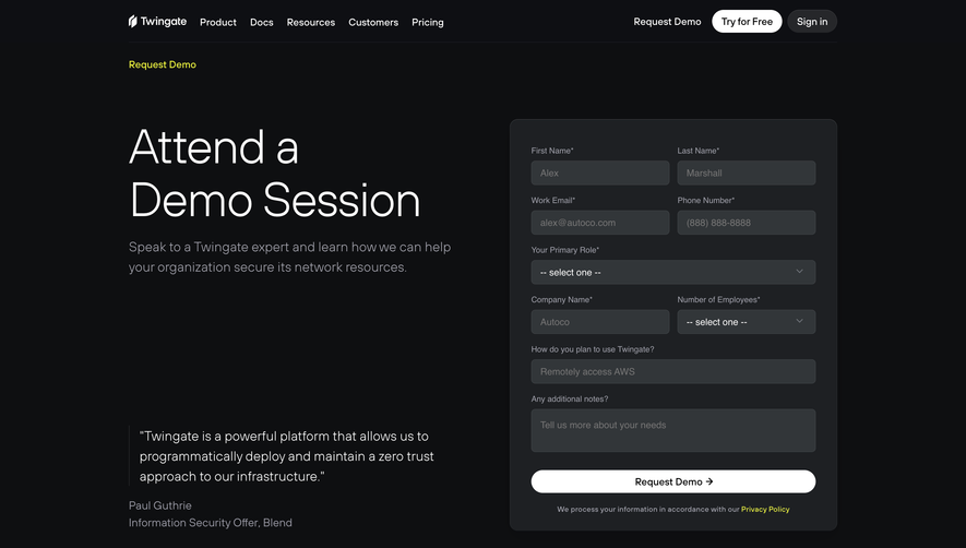


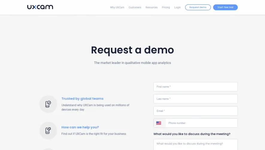



Upgrade to SaaSFrame Pro now to see similar examples.
Monthly
$18 /month
Billed $18 monthly
Browse all screens & flows
Filter and search screens & flows
Search text in screenshots
Access Figma files
Access mobile versions
Join now
Quarterly
$16 /month
Billed $48 quarterly
Browse all screens & flows
Filter and search screens & flows
Search text in screenshots
Access Figma files
Access mobile versions
Join now
Yearly
$15 /month
Billed $180 yearly
Browse all screens & flows
Filter and search screens & flows
Search text in screenshots
Access Figma files
Access mobile versions
Join now