Design with AI
Generate a new design based on this screen using your own content.
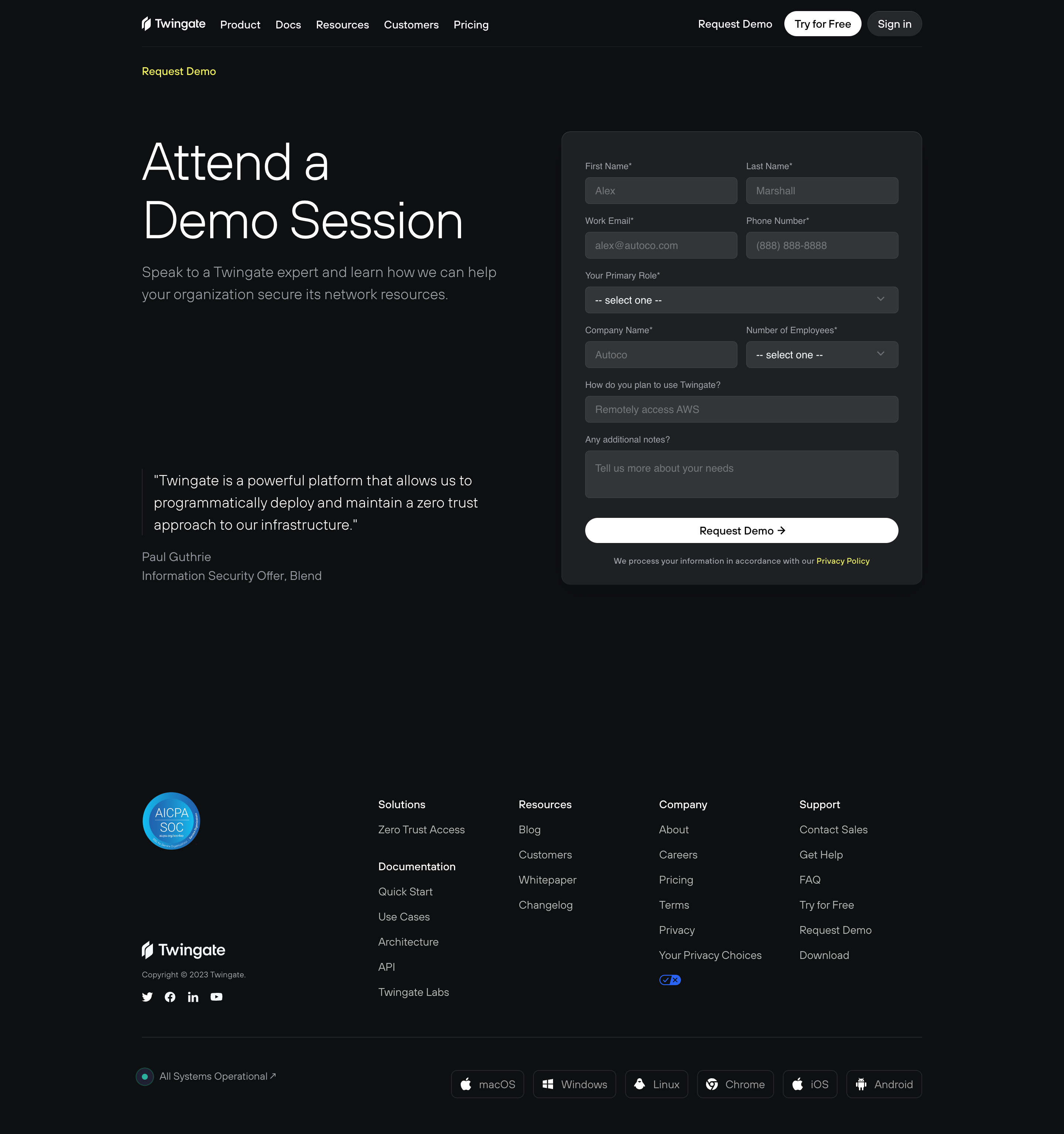
# Design from Reference: Twingate Demo Request
Create an original, high-fidelity visual design inspired by the reference. Prioritize composition, typography, colors, spacing, and component styling over technical implementation.
## Reference
- **Product:** Twingate
- **Category:** Demo Request
- **Screenshot:** https://cdn.prod.website-files.com/5e9dc792e1210c5325f7ebbc/6acb6ae8bf2e69a0c03b6bdb_6acb6a0fb206c0d3f8f24fcd_cms-5ab5b28c8ec593db22232d00.webp
Analyze the screenshot first. If inaccessible, request it rather than guessing.
## Content
{{content.instructions}}
{{content.data}}
Preserve essential messaging and factual accuracy. Adapt structure and copy length for visual balance; never invent product claims.
## Visual Design
### Overall aesthetic
- **Style:** Dark demo-request page with thin display typography, charcoal form card, and white pill submit.
### Page composition
- **Canvas:** 2880 × 3070 image px; CSS estimates assume an unverified 2× capture.
- **Container:** Approximately 1050 CSS px wide.
- **Hero:** Large heading and explanation left; demo form right.
- **Proof:** Short testimonial beneath left copy.
- **Footer:** Security mark, link columns, social icons, status, and platform badges.
### Information hierarchy
- **Primary:** Attend a Demo Session heading and request form.
- **Form order:** Identity/contact, role, company/size, use case, notes, submit.
- **Trust:** Testimonial and security badge support the request.
### Typography
- **Family:** Neutral sans serif; exact family unverified.
- **Hero:** Approximately 64 CSS px, light weight, line-height 76px.
- **Body:** Approximately 18px with 28px line-height.
- **Form labels:** Approximately 12px; inputs 14px.
- **Footer:** Approximately 14px.
- **Precision:** Values and assumed 2× scale are estimates.
### Colors & surfaces
- **Canvas:** #0E0F11.
- **Form:** #1E2023.
- **Inputs:** #323639.
- **Primary text/submit:** #FFFFFF.
- **Muted text:** #A1A1AB.
- **Borders:** Approximately #464A4D.
- **Accent:** Small vivid yellow eyebrow/privacy link; exact token unverified.
- **Precision:** Screenshot samples.
### Components
- **Form card:** Approximately 490 × 615 CSS px, 12px radius, 32px padding.
- **Fields:** Paired identity/company rows, full-width selects, and textarea.
- **Submit:** Full-width white pill with dark label and arrow.
- **Navigation:** White Try for Free pill and dark Sign in pill.
- **Footer badges:** Outlined platform rectangles.
### Visual rhythm
- **Spacing:** Large hero margins and broad gap before footer.
- **Alignment:** Form controls share width; paired rows evenly split.
- **Contrast:** Bright submit is the dominant interactive element.
### Responsive
- **Observed:** Desktop only.
- **Recommendation:** Stack hero/form, make paired fields single-column, and wrap footer groups.
- **Form:** Maintain readable labels and touch target sizes.
### Adaptation guidance
- **Preserve:** Clear demo request, concise supporting proof, dark form hierarchy.
- **Content:** Use supplied fields and authorized testimonial.
- **Privacy:** Do not reproduce example contact data.
- **Behavior:** Submission/validation unverified.
Use this context to reproduce the reference's visual language: layout, typography, colors, spacing, borders, radii, and distinctive elements. The screenshot takes priority if descriptions conflict.
## Direction
{{preferences.fidelityInstructions}}
## Output
{{output.instructions}}
Deliver a polished, cohesive design with precise alignment, hierarchy, and spacing. Produce the requested visual artifact, not just a description. If unsupported, explain the limitation.