Prompt 1,005 words Copy
# Design from Reference: UXCam Demo Request

Create an original, high-fidelity visual design inspired by the reference. Prioritize composition, typography, colors, spacing, and component styling over technical implementation.

## Reference

- **Product:** UXCam
- **Category:** Demo Request
- **Screenshot:** attached to this message (also available at https://media.saasframe.io/o/2d4e8abf5fe17cd94e26.webp)
- **Source:** https://uxcam.com/request-a-demo

Analyze the attached screenshot first. If no image is attached, open the screenshot link; if neither is accessible, ask for it rather than guessing.

## Visual Design Context

### Overall aesthetic

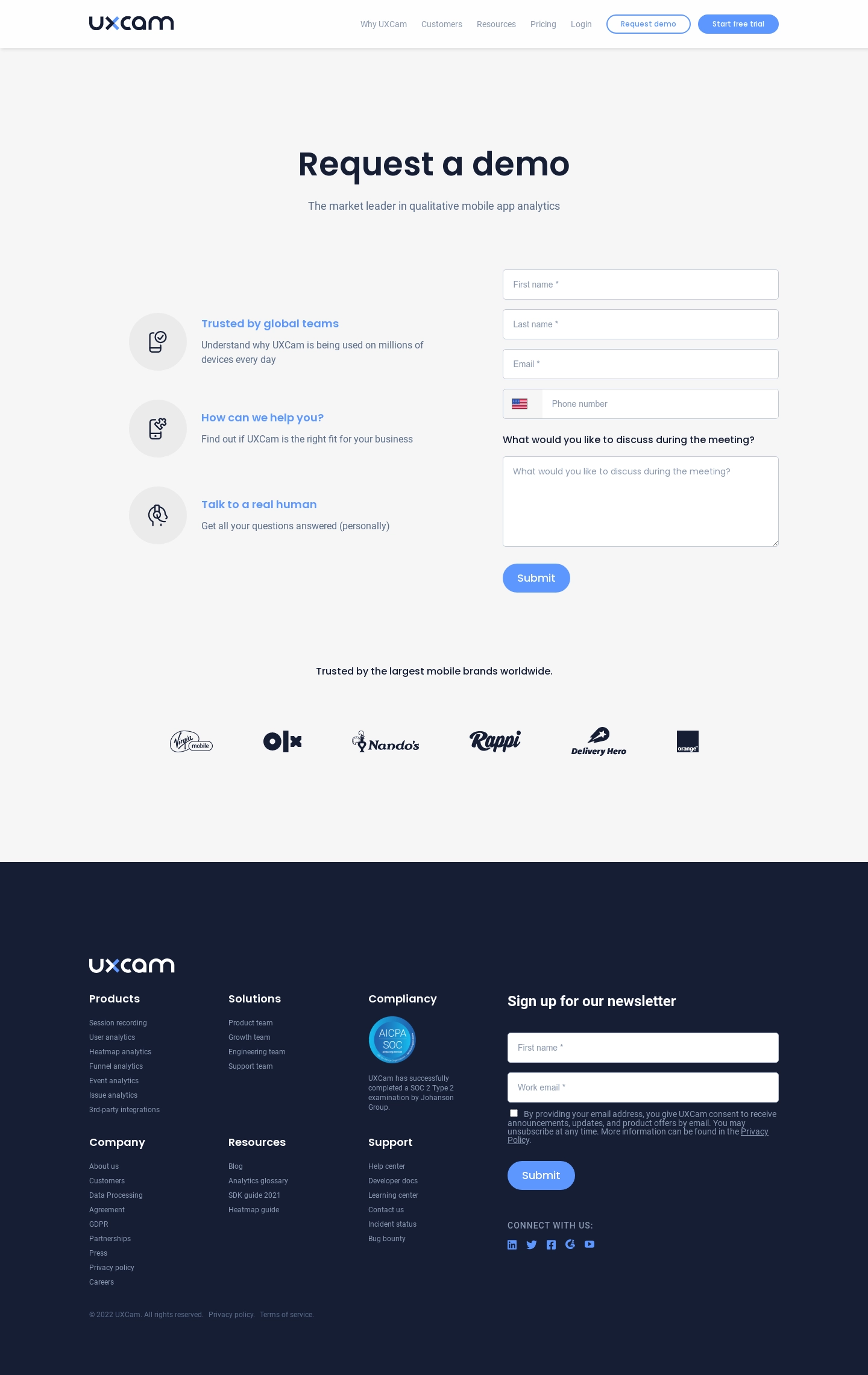
- **Style:** A restrained demo-request landing page with navy typography, soft blue pill actions, pale-gray background, and a dark information-rich footer.
- **Character:** Clear and service-oriented, balancing a compact form with three reassuring icon-led reasons to speak with the team.

### Page composition

- **Capture and scale:** The screenshot is 1440 × 2281 pixels. Approximate dimensions below refer to screenshot pixels; CSS scale is unverified.
- **Header:** A white navigation bar places the UXCam logo left and compact links, outlined demo, and filled trial actions right.
- **Main area:** A centered large heading and subtitle precede a two-column region: three reassurance items left and a roughly 460 px-wide form right.
- **Proof and footer:** A centered trust statement and six monochrome customer logos follow. The lower navy footer combines link groups, compliance badge/copy, newsletter form, social icons, and legal copy.

### Information hierarchy

- **Primary task:** The heading introduces demo booking; the form is the main conversion element.
- **Reassurance:** Three blue headings with circular line-icon backgrounds explain credibility, fit, and human assistance.
- **Secondary content:** Customer logos reinforce trust before the footer. The footer newsletter remains a distinct secondary form.

### Typography

- **Family:** A rounded contemporary sans serif is visible; exact identity is unverified.
- **Display:** The main heading is approximately 52–56 px bold with compact line-height.
- **Body and form:** Subtitles, reassurance descriptions, and field text are around 16 px with 24 px line-height. Reassurance headings are approximately 18 px bold.
- **Footer:** Group labels are around 18 px semibold, newsletter title approximately 24 px, and link/legal text roughly 12–14 px.

### Colors & surfaces

- **Foundation:** Sampled sRGB #F6F6F6 defines the main surface, #FFFFFF the header and fields, and #EBEBEB the icon circles.
- **Navy:** Sampled #161E34 defines the footer and provides the main heading/brand ink reference.
- **Action:** Sampled blue #5D97FE supports primary actions and reassurance headings. Pale blue-gray labels remain quieter.
- **Footer contrast:** White headings and muted blue-gray copy sit on navy, with blue social marks and actions.

### Components

- **Form fields:** Four stacked single-line fields capture names, email, and phone. Inputs are approximately 50 px high, with fine gray borders and 4–5 px radii. Phone includes a separate flag segment.
- **Discussion field:** A visible label precedes a roughly 150 px-high textarea with placeholder text and a resize grip.
- **Primary action:** A compact blue Submit pill, approximately 48 px high, aligns with the form's left edge.
- **Reassurance icons:** Three large pale circular disks contain simple navy line illustrations, aligned beside title/description stacks.
- **Newsletter:** Two white fields, a small consent checkbox with dense explanatory copy, and a blue Submit action occupy the footer's right side. The compliance badge sits in a separate column.

### Visual rhythm

- **Spacing:** Use roughly 90–120 px between title and form region, 16–18 px field gaps, and approximately 45–50 px between reassurance items.
- **Proof row:** Give the logo strip generous vertical space and distribute marks evenly without enclosing cards.
- **Footer density:** The large dark footer supports more compact spacing than the main conversion region, while retaining clear group separation.

### Responsive

- **Observed state:** Only desktop is visible.
- **Recommended reflow:** Stack reassurance and form, wrap the customer logos, and collapse footer groups into a readable single/two-column sequence.
- **Form usability:** Keep inputs full width with 20–24 px side gutters, and preserve legible consent copy instead of shrinking it to fit.

### Adaptation guidance

- **Preserve:** Retain the centered demo introduction, reassurance/form split, soft blue actions, trust strip, and distinct navy footer.
- **Adapt:** Use authentic demo questions, customer marks, compliance material, and consent wording supplied for the new product.
- **Avoid:** Do not copy leadership claims or customer/compliance evidence without support. Keep the demo form visually primary over newsletter signup.

## Content

**Instructions:**

Generate realistic example content that fits the selected design reference.

Create appropriate headlines, descriptions, labels, buttons, and supporting copy based on the type of interface being designed.

If a product or business description is provided, use it to guide the content.

Otherwise, invent a plausible fictional SaaS product appropriate for the reference.

Keep the content concise, coherent, and visually balanced.

Do not present fictional statistics, customer names, or testimonials as verified facts.

## Design Direction

**Instructions:**

Use the reference screenshot as the main source of visual inspiration rather than a strict layout template.

Preserve its most distinctive design characteristics, such as typography, visual rhythm, color relationships, component treatments, and overall aesthetic.

Feel free to modify section arrangements, proportions, spacing, and individual components to better suit my content.

Introduce original design decisions where they improve usability, composition, or brand consistency.

The result should clearly reflect the reference's visual language without looking like a direct reproduction.

Follow the visual identity of the reference design.

Use its typography, color palette, component styling, and overall aesthetic as the primary design direction.

Do not introduce an unrelated visual identity.

## Output

**Instructions:**

Generate a high-fidelity visual mockup of the requested interface.

Present the design as a polished, realistic website or product UI screenshot.

Prioritize visual composition, typography, spacing, colors, alignment, and component details.

Use the available image-generation or visual-design capabilities.

Do not replace the mockup with source code, a written design specification, or a textual description.

If direct visual generation is unavailable, clearly explain the limitation.

## Constraints

- Use the actual screenshot as the primary visual reference.
- Preserve essential messaging and factual accuracy.
- Prioritize visual quality and consistency.
- Do not invent unsupported product claims.
- Adapt structure and copy length for visual balance.
Reference image Attach it to your message: assistants can’t open image links. Open in ChatGPT ↗ Open in Claude ↗
Build it in Lovable ↗ v0 ↗ Figma Make ↗
Opening a tool copies the screenshot so you can paste it with your prompt.
 SaaSFrame