Clean Contact Page That Actually Feels Inviting
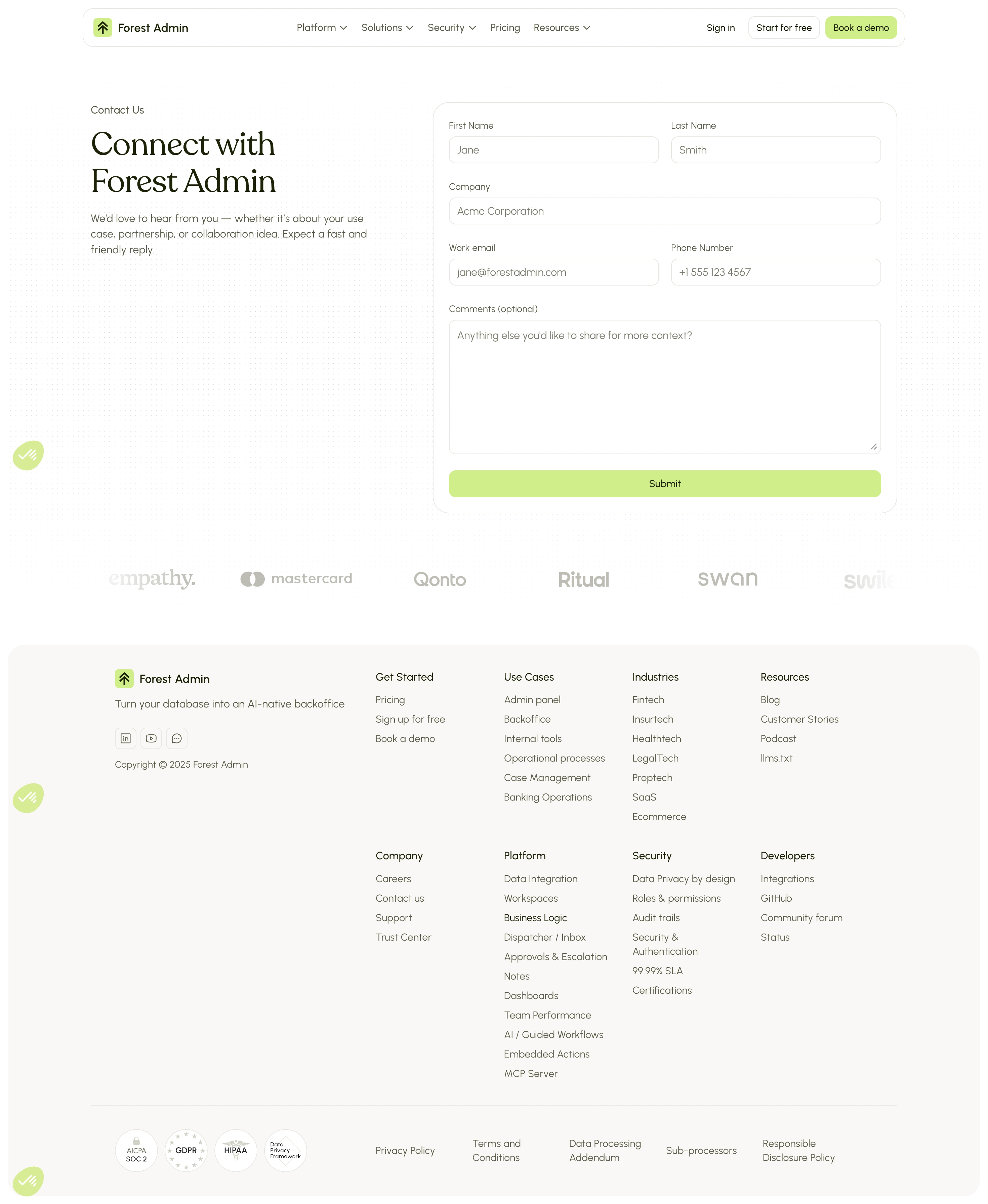
First thing you notice is how much breathing room everything gets. The left side keeps it simple with a bold serif heading "Connect with Forest Admin" and a short, warm subline. No fluff. The form sits right there on the right, ready to go. No scrolling to find it.
Soft but Intentional Color Choices
The palette is almost entirely white and warm neutrals, with that muted olive-green accent on the Submit button. It's subtle but it works. The green pops just enough without screaming. Those little circular green icons floating in the bottom-left corners add a quiet branded touch. The logo strip below the fold (Mastercard, Qonto, Ritual, Swan) builds trust without being loud about it.
Typography Does the Heavy Lifting
The serif heading paired with clean sans-serif body text creates a solid contrast. Form labels are small and understated. Nothing competes for attention. The footer is dense but well-organized into clear columns. One standout detail: the form fields use realistic placeholder text like "
[email protected]" which makes the whole thing feel more human and less templated.