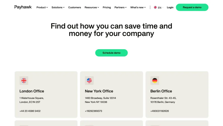
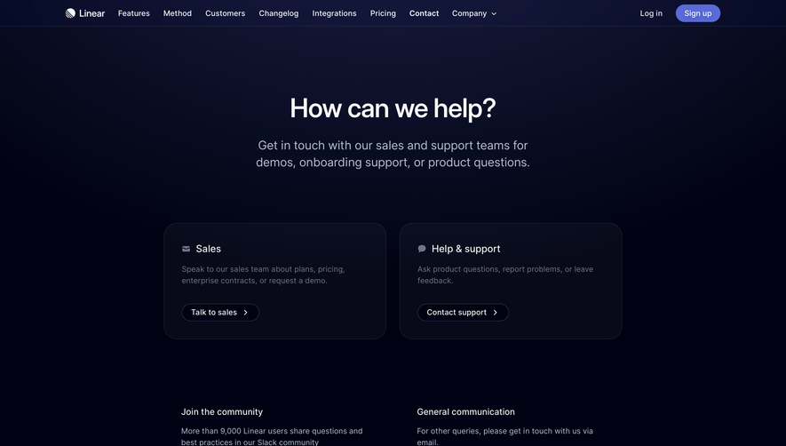
Generate a new design based on this screen using your own content.
Thank you! Your submission has been received!
Oops! Something went wrong while submitting the form.
# Design from Reference: Searchable Contact Page
Create an original, high-fidelity visual design inspired by the reference. Prioritize composition, typography, colors, spacing, and component styling over technical implementation.
## Reference
- **Product:** Searchable
- **Category:** Contact Page
- **Screenshot:** https://cdn.prod.website-files.com/5e9dc792e1210c5325f7ebbc/6acad399c2028efdec71ae6d_6acad1185af75170c4bbfbc2_cms-bf07998e79bd59ac56293c7f.webp
Analyze the screenshot first. If inaccessible, request it rather than guessing.
## Content
{{content.instructions}}
{{content.data}}
Preserve essential messaging and factual accuracy. Adapt structure and copy length for visual balance; never invent product claims.
## Visual Design
Use this context to reproduce the reference's visual language: layout, typography, colors, spacing, borders, radii, and distinctive elements. The screenshot takes priority if descriptions conflict.
## Direction
{{preferences.fidelityInstructions}}
## Output
{{output.instructions}}
Deliver a polished, cohesive design with precise alignment, hierarchy, and spacing. Produce the requested visual artifact, not just a description. If unsupported, explain the limitation.
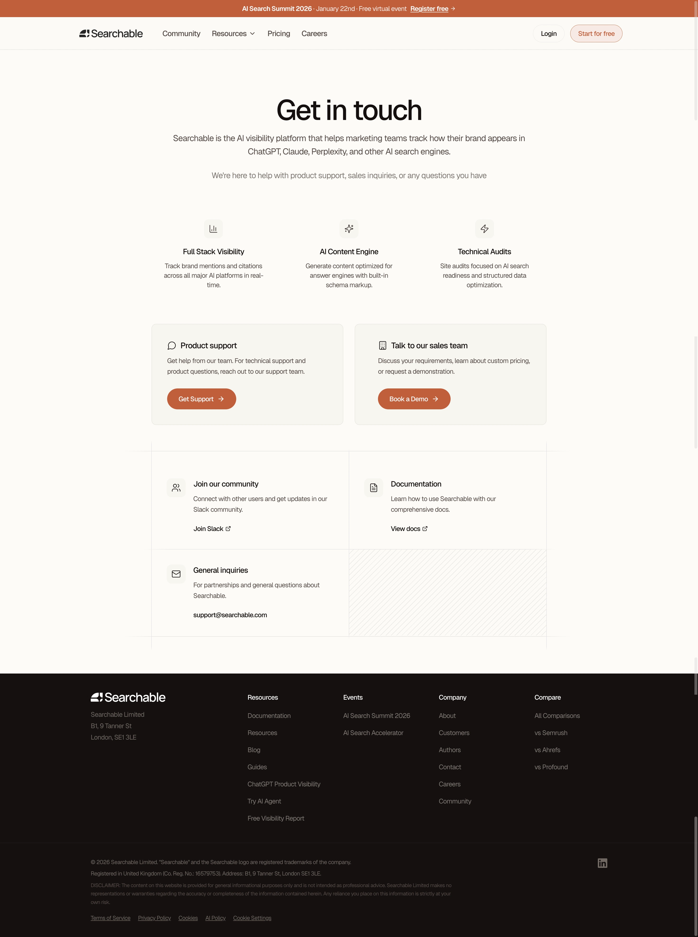
The burnt copper and deep brown header combo sets this apart from the sea of blue-and-white SaaS pages. Searchable's contact page feels grounded and approachable without sacrificing professionalism. Those terracotta CTA buttons pop hard against the neutral background.
Clean Hierarchy, No Guesswork
The page flows naturally. Big bold "Get in touch" headline, a clear subtitle explaining what Searchable does, then three icon-backed feature columns. Below that, two card sections split support from sales with obvious paths. Product support gets "Get Support," sales gets "Book a Demo." Simple. The secondary resources section at the bottom with community, docs, and general inquiries catches the stragglers who need something less transactional.
Typography Doing the Heavy Lifting
The serif headline paired with clean sans-serif body text creates a subtle contrast that feels intentional. Font weights are well managed throughout. Nothing screams for attention, everything just sits right. The footer is dense but organized into logical columns. One small thing worth noting: the consistent use of small icons beside section headers adds just enough visual texture without cluttering anything up.