Overall Style and Aesthetic
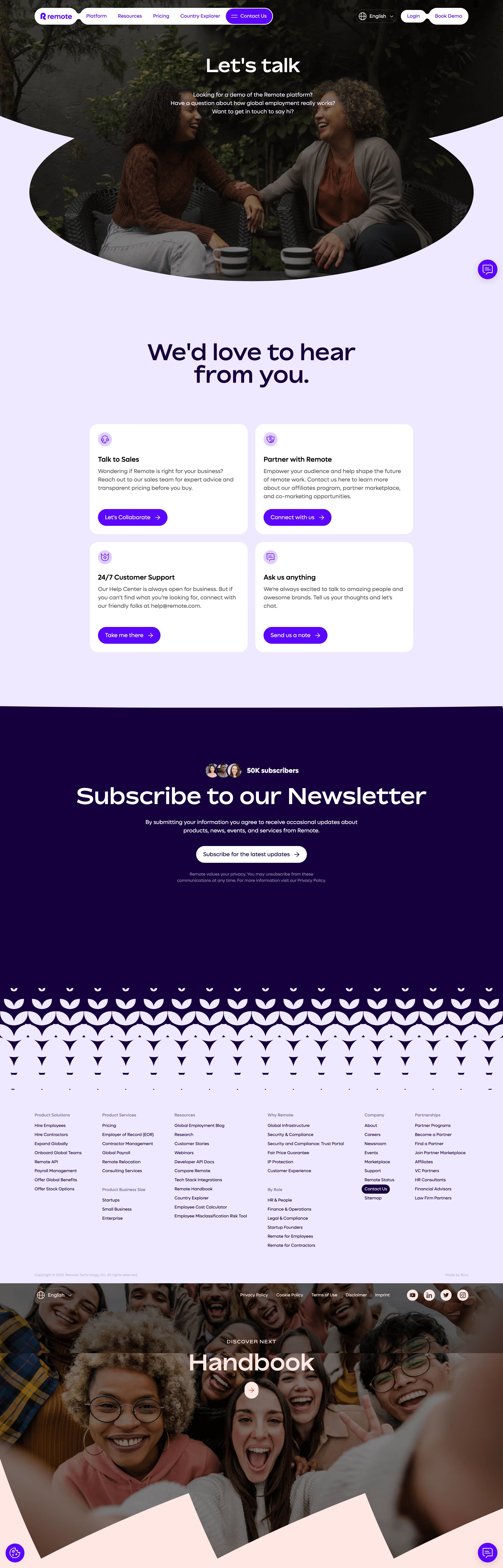
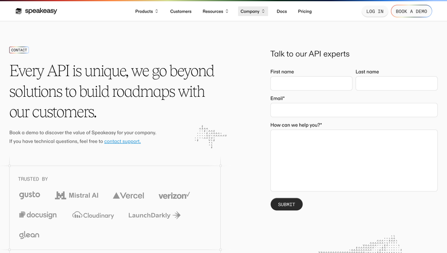
Remote’s Contact Us page exemplifies modern minimalism fused with a dash of approachable professionalism. Clean lines, generous white space, and judiciously applied pops of brand color create a calming yet confident visual experience—instantly communicating trust and accessibility. Layout and Structure
The page flows intuitively: a succinct hero section introduces the value of reaching out, immediately reassuring visitors. The central focus is a well-designed contact form, supported by quick links for common inquiries and global office information. There’s no visual clutter—each element is purposeful, contributing to a frictionless user journey. Visual Elements
Subtle, on-brand illustrations soften the corporate tone, incorporating remote work motifs and globally diverse characters. Simple, animated icons mark different ways to connect, while occasional micro-animations add gentle dynamism without distracting from core content. There are no intrusive stock photos or superfluous visuals; every graphical element is both decorative and informative. Color Palette and Typography
A sophisticated palette—anchored by deep blue accents, muted purples, and crisp white backgrounds—evokes dependability and forward-thinking innovation. The typography is clean and modern, pairing bold headings in geometric sans-serif with legible, friendly body text. Hierarchy is crystal-clear, ensuring effortless skimming and focus. User Experience Patterns
Sticky navigation and clear CTAs (“Submit,” “Find an Office”) guide users seamlessly. Forms are minimal yet comprehensive, with ample spacing and smart autofill cues. Help sections anticipate user needs, providing alternate support channels, while interactive elements reward engagement with subtle but delightful feedback. Unique or Notable Design Choices
Remote’s design stands out for its balance of warmth and professionalism—using illustrations to humanize global team interactions, and for its unwavering clarity in form design. The result is a page that not only looks inviting but anticipates user intent, embodying a tone that is reassuring, inclusive, and quietly innovative.