Generate a new design based on this screen using your own content.
Thank you! Your submission has been received!
Oops! Something went wrong while submitting the form.
# Design from Reference: ParityDeals Contact Page
Create an original, high-fidelity visual design inspired by the reference. Prioritize composition, typography, colors, spacing, and component styling over technical implementation.
## Reference
- **Product:** ParityDeals
- **Category:** Contact Page
- **Screenshot:** https://cdn.prod.website-files.com/5e9dc792e1210c5325f7ebbc/6acbcc49e13ab9df8f05320a_6acad1474d0bf53dfa2e8469_cms-80d65e0203f390ab916d7c64.webp
Analyze the screenshot first. If inaccessible, request it rather than guessing.
## Content
{{content.instructions}}
{{content.data}}
Preserve essential messaging and factual accuracy. Adapt structure and copy length for visual balance; never invent product claims.
## Visual Design
Use this context to reproduce the reference's visual language: layout, typography, colors, spacing, borders, radii, and distinctive elements. The screenshot takes priority if descriptions conflict.
## Direction
{{preferences.fidelityInstructions}}
## Output
{{output.instructions}}
Deliver a polished, cohesive design with precise alignment, hierarchy, and spacing. Produce the requested visual artifact, not just a description. If unsupported, explain the limitation.
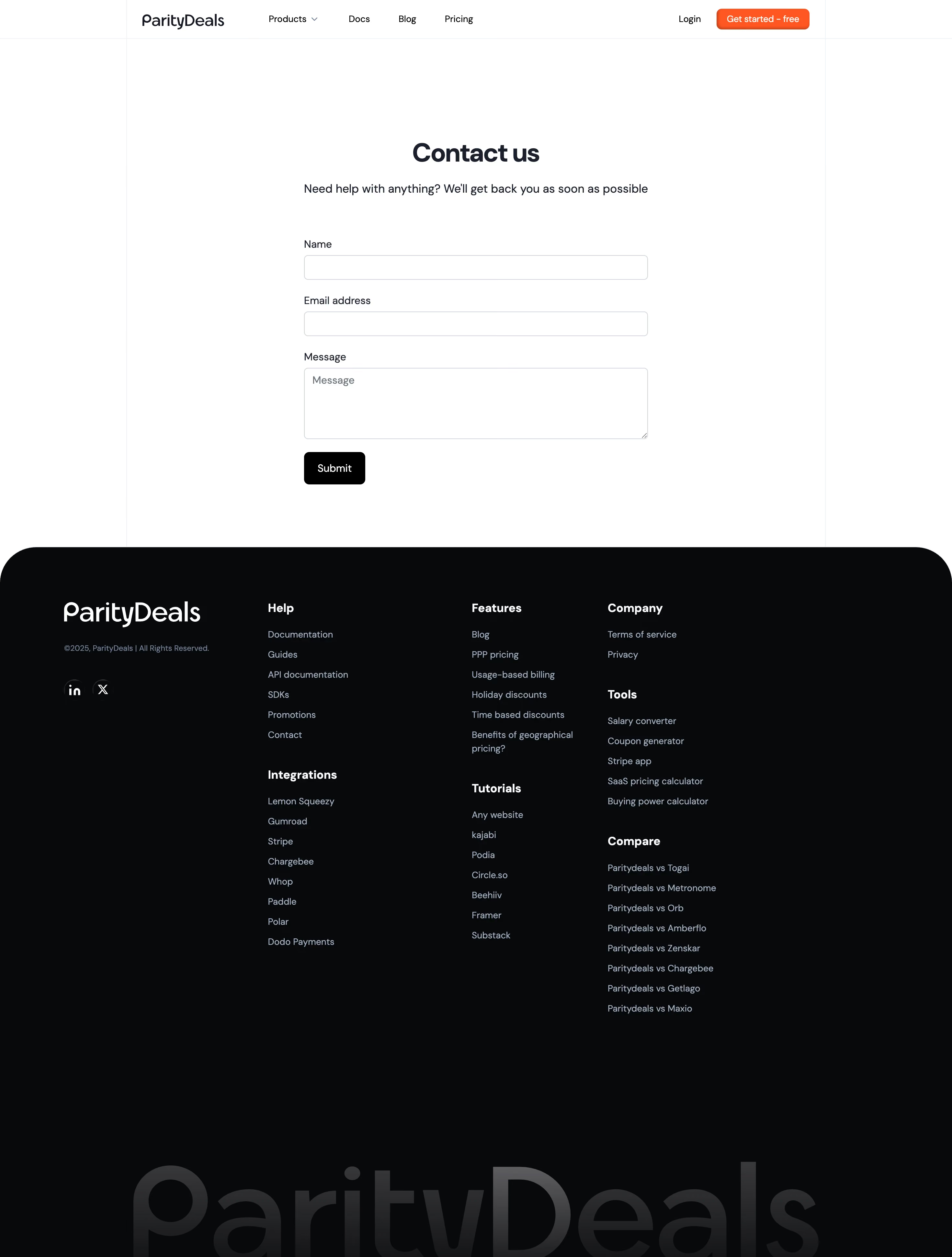
ParityDeals keeps this contact page dead simple and it works. The form sits centered with generous whitespace around it, making the whole thing feel breathable. Three fields: Name, Email, Message. No fluff. The dark submit button has just enough weight to draw your eye without screaming.
Typography That Stays Out of the Way
The headline "Contact us" is bold serif-style, which contrasts well with the lighter sans-serif body text underneath. That subline "Need help with anything?" feels human and approachable. Field labels are small but readable. Nothing fancy, nothing broken.
Footer That Actually Organizes Well
The dark footer is where things get interesting. Four clear columns with logical groupings: Help, Features, Tutorials, Company/Tools/Compare. The orange "Get started - free" CTA in the nav provides the only real color accent on the entire page, which makes it pop hard against the otherwise monochrome palette.
What Makes It Stand Out
That giant watermarked "ParityDeals" text at the very bottom is a bold branding move. Subtle but confident. The whole page proves you don't need complexity to build trust.