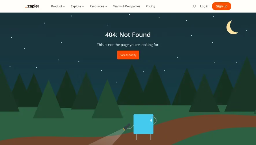
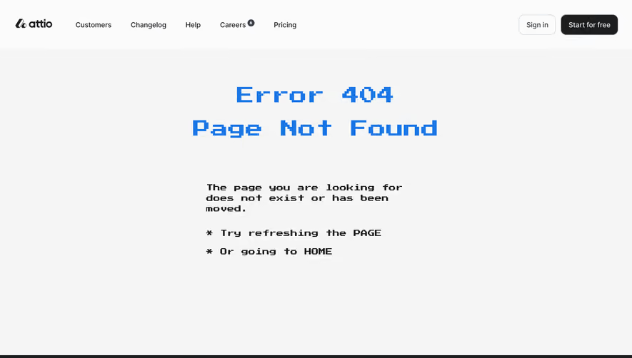
Generate a new design based on this screen using your own content.
Thank you! Your submission has been received!
Oops! Something went wrong while submitting the form.
# Design from Reference: Copperx 404 Page
Create an original, high-fidelity visual design inspired by the reference. Prioritize composition, typography, colors, spacing, and component styling over technical implementation.
## Reference
- **Product:** Copperx
- **Category:** 404 Page
- **Screenshot:** https://cdn.prod.website-files.com/5e9dc792e1210c5325f7ebbc/6acad84cb3daa04f5427637d_6acad7d10c49d10a7abe7ea3_cms-309db7800ef0955b1d79319e.webp
Analyze the screenshot first. If inaccessible, request it rather than guessing.
## Content
{{content.instructions}}
{{content.data}}
Preserve essential messaging and factual accuracy. Adapt structure and copy length for visual balance; never invent product claims.
## Visual Design
Use this context to reproduce the reference's visual language: layout, typography, colors, spacing, borders, radii, and distinctive elements. The screenshot takes priority if descriptions conflict.
## Direction
{{preferences.fidelityInstructions}}
## Output
{{output.instructions}}
Deliver a polished, cohesive design with precise alignment, hierarchy, and spacing. Produce the requested visual artifact, not just a description. If unsupported, explain the limitation.
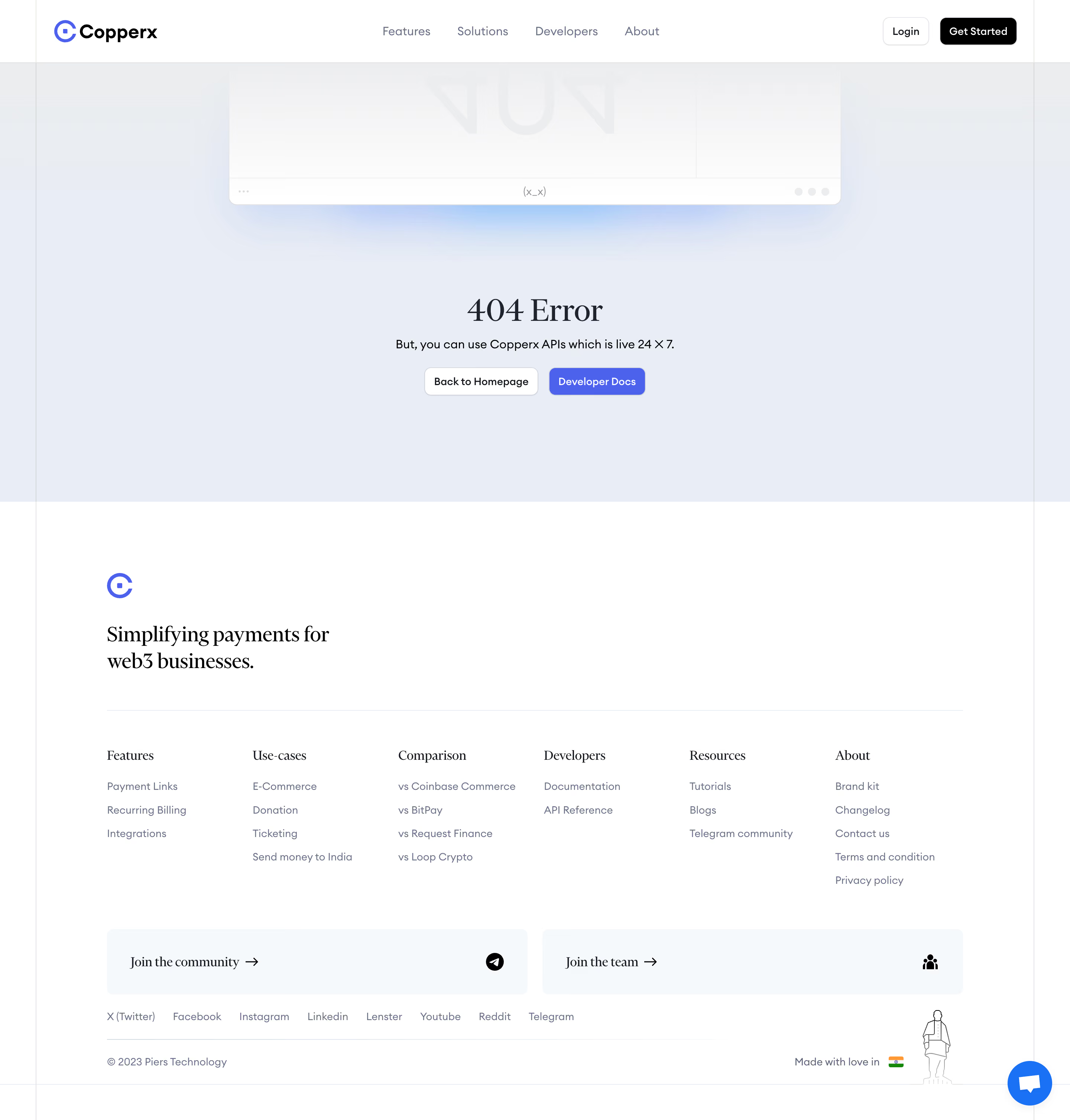
Copperx’s 404 page embraces a modern, minimalist aesthetic with a subtle tech edge. The palette leans heavily on expressive blues and electric purples set against a deep, dark background, creating a sense of professionalism while still feeling inviting and energetic.
Layout and Structure
The layout is clean and straightforward, centering the visual focus on a striking hero illustration with ample breathing room. Navigation remains persistent at the top, ensuring users can easily browse elsewhere. The key content—an attention-grabbing "404" message, brief explanation, and primary call-to-action (Back to Home)—is purposefully organized for swift comprehension and action.
Visual Elements
A standout, futuristic 3D illustration serves as both visual anchor and playful metaphor for the missing page—instantly memorable, with glossy gradients and subtle light effects that tie into the SaaS/fintech brand vibe. There’s no clutter: icons, photography, or other visuals are intentionally omitted to keep focus sharp and page purpose clear.
Color Palette and Typography
Blending deep navy, lavender, and azure gradients, the color scheme evokes both trust and cutting-edge innovation. The typography is clean and geometric, with prominent, high-contrast headline text ("404") for easy scanning, and supporting text in lighter weights to maintain visual hierarchy.
User Experience Patterns and Notable Choices
Persistent navigation offers seamless escape routes, while the single CTA is unmistakable and intuitive. The page’s simplicity reduces frustration for lost users while its delightful visual punch ensures the 404 experience reinforces brand personality, rather than detracting from it.
Tone and Feel
The page projects confidence, innovation, and approachability—a polished tone that says “we care about every interaction” and transforms a moment of error into a touchpoint of delight.