Generate a new design based on this screen using your own content.
Thank you! Your submission has been received!
Oops! Something went wrong while submitting the form.
# Design from Reference: Threads 404 Page
Create an original, high-fidelity visual design inspired by the reference. Prioritize composition, typography, colors, spacing, and component styling over technical implementation.
## Reference
- **Product:** Threads
- **Category:** 404 Page
- **Screenshot:** https://cdn.prod.website-files.com/5e9dc792e1210c5325f7ebbc/6acadb6a494a081980ea072a_6acada85678eb13f3bc0e8a1_cms-8a107725fe8abca2c24163a8.webp
Analyze the screenshot first. If inaccessible, request it rather than guessing.
## Content
{{content.instructions}}
{{content.data}}
Preserve essential messaging and factual accuracy. Adapt structure and copy length for visual balance; never invent product claims.
## Visual Design
Use this context to reproduce the reference's visual language: layout, typography, colors, spacing, borders, radii, and distinctive elements. The screenshot takes priority if descriptions conflict.
## Direction
{{preferences.fidelityInstructions}}
## Output
{{output.instructions}}
Deliver a polished, cohesive design with precise alignment, hierarchy, and spacing. Produce the requested visual artifact, not just a description. If unsupported, explain the limitation.
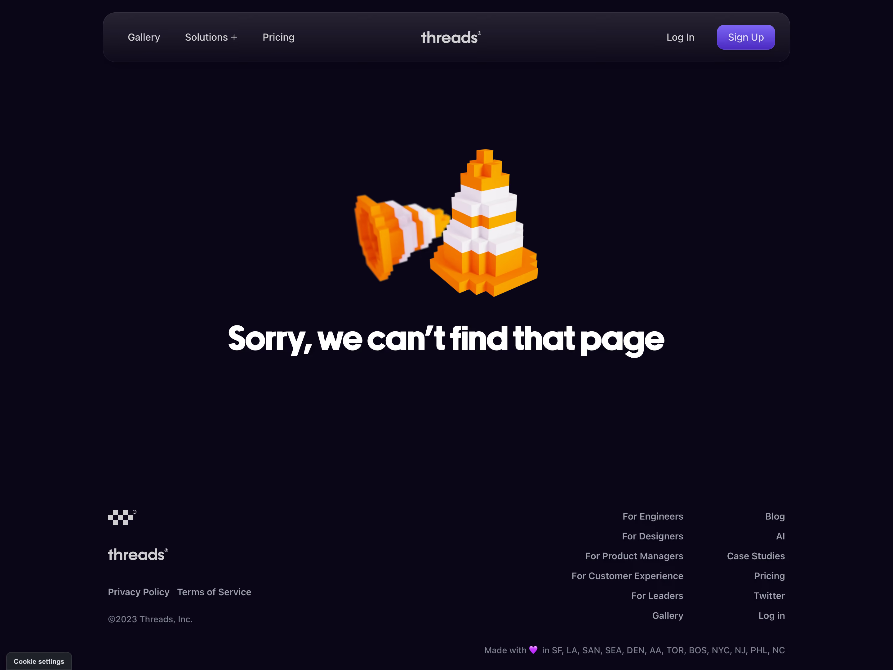
Threads’ 404 page embraces a crisp, modern minimalist aesthetic with playful undertones. Generous white space cultivates a sense of calm, while the refined interface exudes confidence and professionalism—the lighthearted theme softens an otherwise disappointing user interaction.
Layout and Structure
The composition is hero-centric: a large, central illustration immediately draws the eye, flanked subtly by concise messaging and a clear call to action. All primary action remains above the fold, eliminating unnecessary clutter and ensuring users feel anchored despite landing on an error page. Peripheral elements are minimal, with the global navigation subtly included for quick context and recovery.
Visual Elements
A bold, custom illustration features charming, original artwork—an anthropomorphic folder character alluding to the missing content, radiating approachability. Gentle animations breathe personality into the scene, making the error moment memorable rather than frustrating. No heavy photography or videos compete for attention; every visual element is purposeful.
Color Palette and Typography
Threads deploys a neutral-light background punctuated by a few accent colors—muted blues and soft purples—that highlight actions and illustration details. Typography is clean, sans-serif, and tightly curated for readability; headings command presence, while supporting text is understated yet clear, establishing a seamless content hierarchy.
User Experience Patterns
A prominent, inviting CTA (“Back to Home”) is instantly available, reducing friction for redirected users. The navigation menu is anchored at the top, offering pathways back into core site areas. No extraneous forms or noisy elements disrupt the flow, putting user needs first.
Unique or Notable Design Choices
The blend of playful animation with a reassuring tone distinguishes this 404 page: what is typically a dead end becomes a moment of brand delight. Rather than apologizing blandly, the page transforms a navigation mistake into a positive, memorable micro-experience—balancing approachability with SaaS-level professionalism.