Overall Style and Aesthetic
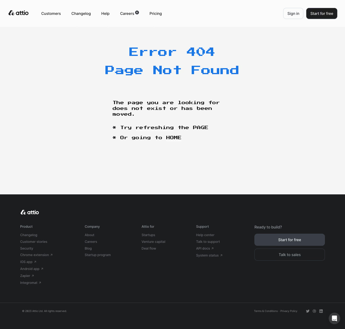
Attio’s 404 page embodies a minimalist, modern approach with a subtly playful edge. It leverages ample white space and crisp lines, exuding a fresh, uncluttered elegance. The interface feels clean and airy, immediately inviting users to focus on the core message without any distractions. Layout and Structure
The single-column layout centers all attention on the witty illustration and clear messaging. The hero area dominates, with concise copy and a prominent call-to-action guiding visitors back to the homepage. There’s no excess—no feature lists, testimonials, or pricing tables—just a streamlined flow serving the page’s purpose. Visual Elements
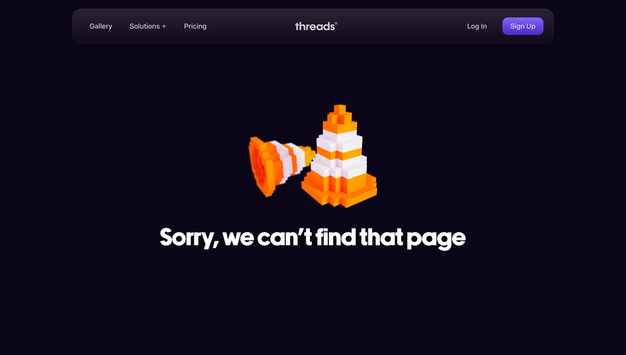
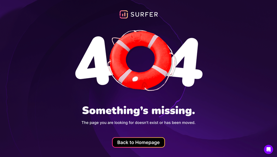
A standout animated illustration injects personality, depicting a playful scene that resonates with the brand’s approachable image. The animation balances whimsy with professionalism, making the error feel less disruptive. Simple, line-based iconography and smooth, friendly curves reinforce the approachable vibe. Color Palette and Typography
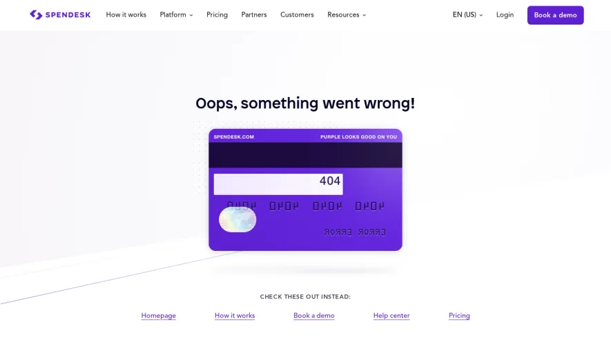
A cool, muted palette—anchored by soft blues, gentle purples, and a hint of accent pink—creates a calm, trustworthy backdrop. Typography is modern and geometric, with distinct hierarchy: a bold, welcoming headline draws the eye, supported by succinct, lighter body text. User Experience Patterns
Navigation is ultra-clear, with a single, visually prominent CTA button guiding users home. The page eliminates cognitive overload by focusing communication and action flow. Responsive design ensures the illustration and elements remain centered and visually balanced at all screen sizes. Unique or Notable Design Choices
What truly stands out is how the error experience is elevated into a branded moment: the animated scene adds brand warmth, turning a potential frustration into a memorable, delightful encounter. The overall tone feels both innovative and human-centric—hallmarks of standout SaaS design.