Overall Style and Aesthetic
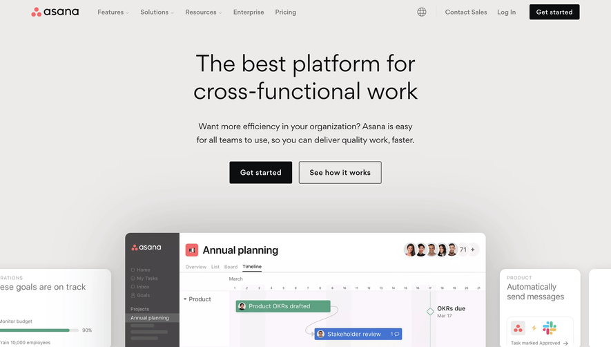
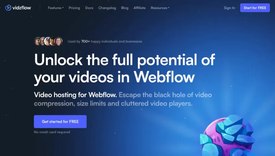
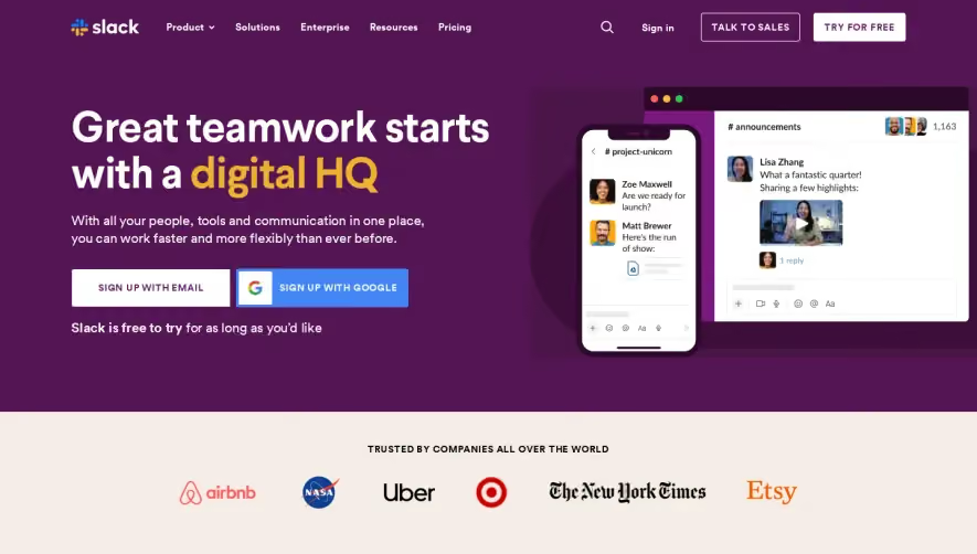
Burb’s homepage delivers a crisp, modern, and professional feel, blending minimalism with sophisticated whimsy. Generous white space and clean lines emphasize focus, while clever pops of color and playful illustrations add just enough personality to keep the vibe approachable and engaging. Layout and Structure
The site uses a classic SaaS framework, starting with an impactful hero section that pairs concise, benefit-driven messaging with a vibrant visual. Scrolling reveals a rhythmic alternation of feature explanations (each with its own illustration), authentic testimonials with user avatars, and a streamlined pricing grid. The logical progression creates a seamless narrative flow, culminating in a friendly, trust-boosting footer. Visual Elements
Striking vector illustrations and custom iconography are woven throughout, reinforcing product utility while conveying a sense of fun. Subtle micro-animations, like hover effects and eye-catching onboarding GIFs, engage users without distraction. Authentic customer photos in testimonials enhance credibility and relatability. Color Palette and Typography
A restrained, predominantly white and slate-gray background forms the canvas, punctuated by signature electric blues, mint greens, and salmon accents. This lively palette guides the eye to CTAs and key information. Typography leans on geometric sans-serifs for headlines—bold, structured, and highly readable—while lighter body text maintains clarity and comfort. User Experience Patterns
Navigation is sticky, concise, and intuitively organized with a priority CTA button for immediate signup. CTAs are distinctive yet inviting. Forms are frictionless with generous padding. Scroll-based animations and section reveals maintain momentum and highlight important content. Unique or Notable Design Choices
Burb stands out with its seamless blend of personality and professionalism: product features are humanized through storytelling illustrations and testimonials feel organically nestled rather than tacked on. Every interaction—whether hovering or scrolling—feels purposeful, guiding visitors naturally from curiosity to conversion. The overall tone is trustworthy, progressive, and user-first.