SaaSFrame
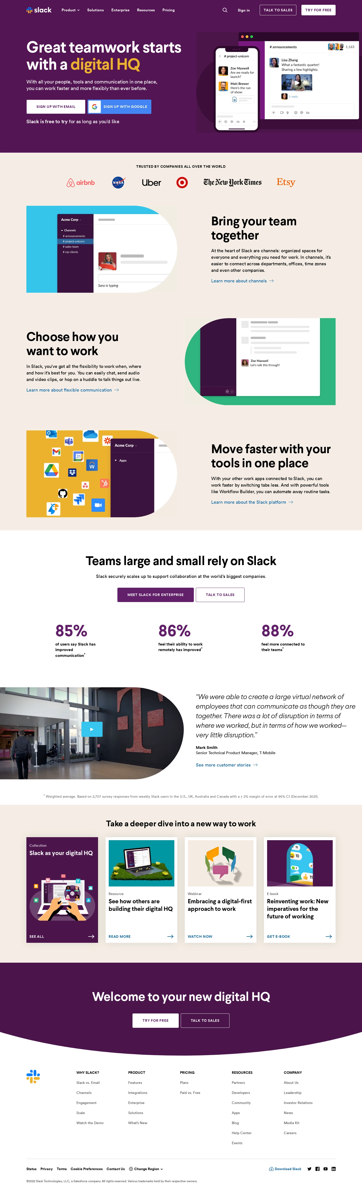
1. Hero Section: The Slack homepage starts with a hero section that includes a prominent headline, a brief description of what the product does, and a CTA button for users to get started with Slack. A background video serves as visual reinforcement of the product’s capabilities. 2. Features Section: The features section follows the hero section and is divided into three sub-sections describing different features of the product, such as how easy it is to search through old messages, the ability to use Slack on a variety of devices, and integrations with other popular tools. The features are each accompanied by supporting visuals and icons. 3. Use Cases/Success Stories: This section highlights the different use cases and success stories of customers who have used Slack. These cases show how the product can improve productivity and collaboration in various settings like financial institutions, media companies, and startups. This section is also divided into sub-sections. 4. Pricing: The page has a section that describes the different pricing options available to customers. This includes a free version of Slack as well as several paid tiers for organizations with different needs. 5. CTAs: Throughout the page, there are several CTAs urging visitors to sign up for Slack, including in a sticky header. 6. Footer: The bottom of the page contains links to additional resources, including the company blog, different languages and regions, and technical support. There are also links to follow Slack on social media platforms, a privacy policy, and terms of service.