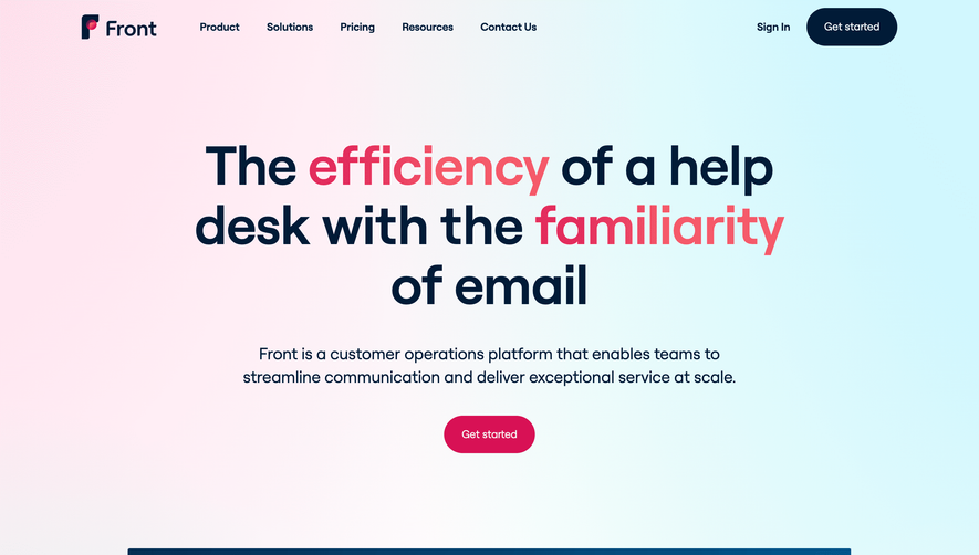
Generate a new design based on this screen using your own content.
Thank you! Your submission has been received!
Oops! Something went wrong while submitting the form.
# Design from Reference: Vidzflow Landing Page
Create an original, high-fidelity visual design inspired by the reference. Prioritize composition, typography, colors, spacing, and component styling over technical implementation.
## Reference
- **Product:** Vidzflow
- **Category:** Landing Page
- **Screenshot:** https://cdn.prod.website-files.com/5e9dc792e1210c5325f7ebbc/652400a486167581e31d4cc5_sC8p-YU-eJcVUr1DTcPIrioNxjdcqX6oUcxdanAaw58.webp
Analyze the screenshot first. If inaccessible, request it rather than guessing.
## Content
{{content.instructions}}
{{content.data}}
Preserve essential messaging and factual accuracy. Adapt structure and copy length for visual balance; never invent product claims.
## Visual Design
Use this context to reproduce the reference's visual language: layout, typography, colors, spacing, borders, radii, and distinctive elements. The screenshot takes priority if descriptions conflict.
## Direction
{{preferences.fidelityInstructions}}
## Output
{{output.instructions}}
Deliver a polished, cohesive design with precise alignment, hierarchy, and spacing. Produce the requested visual artifact, not just a description. If unsupported, explain the limitation.
Vidzflow’s homepage exudes a modern, technology-forward vibe with a minimalist visual identity. The design avoids clutter, focusing on clarity and space, which immediately elevates the sense of trust and innovation. A clean canvas is punctuated by subtle gradients and vibrant accents, bringing energy without overwhelming the eye.
Layout and Structure
The website embraces a time-tested SaaS layout flow: a commanding hero section with a concise value proposition and a bold call-to-action, followed by feature highlights that leverage whitespace and crisp dividing lines for readability. Additional sections include real user testimonials showcased with avatars, a straightforward pricing table, and an information-rich footer, creating a well-balanced user journey from initial intrigue to conversion.
Visual Elements
The hero area employs sleek, looping product animations to instantly illustrate the platform’s capabilities. Throughout, custom icons and vector illustrations add a playful yet professional edge. Strategic use of motion—such as subtle hover effects and animated section entrances—keeps the experience dynamic and engaging, while product screenshots offer necessary clarity.
Color Palette and Typography
A sophisticated mix of dark backgrounds, vivid blues, and bright accent hues creates strong visual hierarchy and modernity. The typography pairs a geometric, high-legibility sans-serif for headlines with a lighter font-weight for supporting text, guiding the viewer’s attention seamlessly from highlight to detail.
User Experience Patterns and Unique Choices
Navigation is streamlined, with a sticky header and prominent, actionable buttons at every scroll depth. Scroll-triggered interactions and micro-animations provide delightful feedback. Noteworthy: the judicious use of moving product previews in the hero instantly orients visitors. The overall tone radiates reliability, creative thinking, and user-centric innovation—an ideal SaaS aspiration.