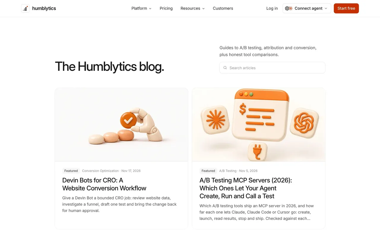
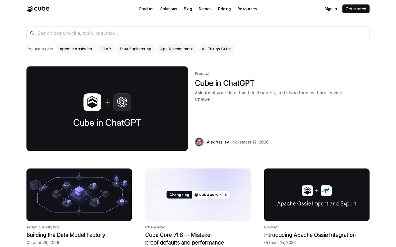
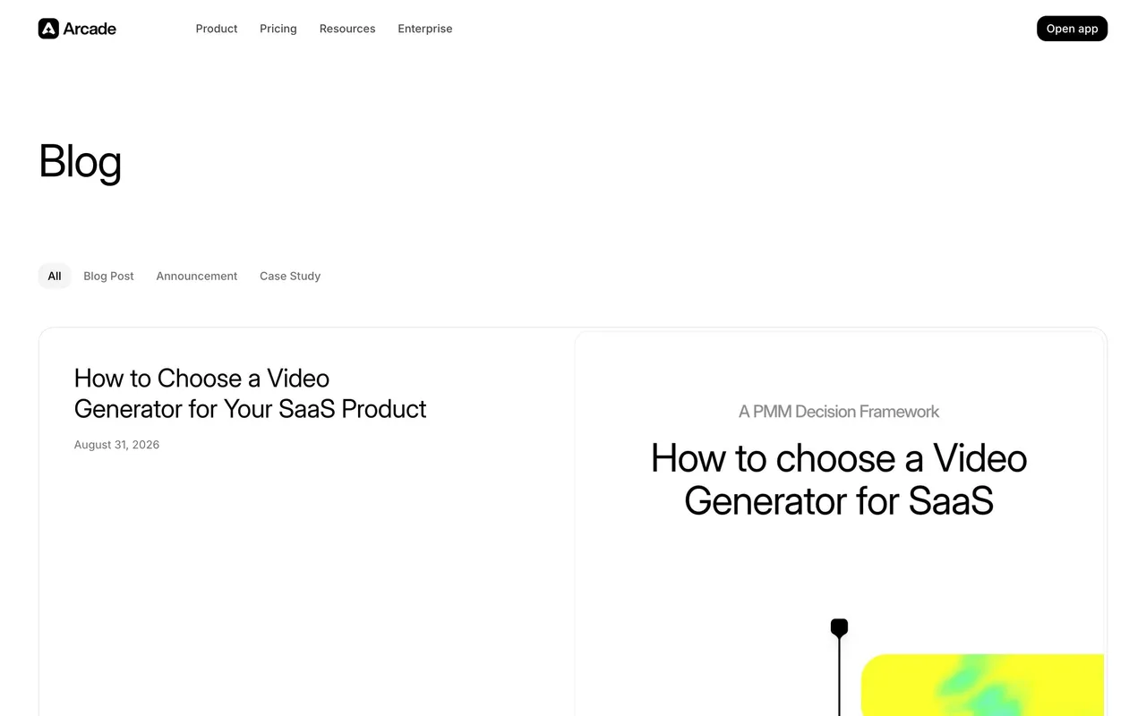
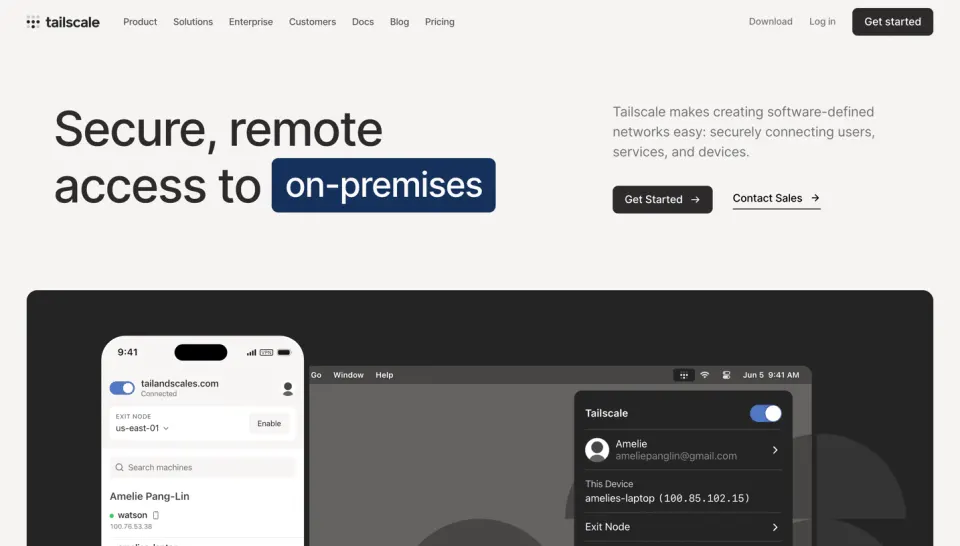
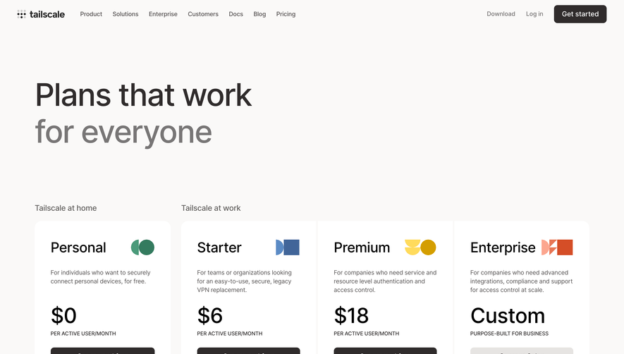
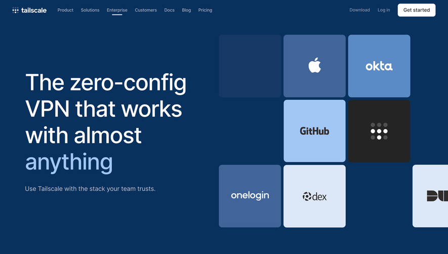
Tailscale’s blog exemplifies minimalist modernism, channeling a clean, tech-forward style that balances professionalism with a touch of playfulness. The use of white space and subtle illustrations delivers an uncluttered feel, putting content and clarity at the forefront while evoking a sense of trust and innovation.
Layout and Structure
The page opens with a straightforward, keyword-rich headline and elegantly grouped featured articles, forgoing a traditional hero image to spotlight thought leadership. Content is modular—blogs are presented in card-like lists with ample padding, making browsing effortless. There’s no invasive clutter: navigation is pinned to the top, and a concise footer wraps up the experience with key links.
Visual Elements
Iconography is crisp and consistent, using flat, geometric illustrations that subtly reinforce product themes without distracting from the writing. Profile icons for authors humanize the tech-centric subject matter. Occasional, gentle color accents enliven the textual layout, maintaining focus without overwhelming the senses.
Color Palette and Typography
The palette is dominated by cool white and soft gray backgrounds, punctuated by the Tailscale blue and muted accent hues. Typography uses a modern sans-serif stack—readable, approachable, and well-organized. Headings and metadata are visually distinct, guiding the visitor’s eye and enhancing navigability.
User Experience Patterns
Sticky navigation, predictable link behavior, and thoughtful categorization make for seamless discovery and exploration. Primary CTAs are understated yet clear, encouraging dives into individual posts. The overall tone is confident and inviting—reflecting a SaaS brand that is both authoritative and approachable.
 SaaSFrame