
Thank you! Your submission has been received!
Oops! Something went wrong while submitting the form.
Get SaaSFrame Pro
Monthly
$18
Quarterly
$48
Yearly
$180
Upgrade to access this feature
Browse all screens & flows
Filter and search screens & flows
Access Figma files
Access mobile versions
Bookmark screens & flows
Join now


Tailscale Pricing Page

Tailscale
Simple, secure networks for teams of any scale
Designed by


Bookmark
Bookmark

Design with AI
Thank you! Your submission has been received!
Oops! Something went wrong while submitting the form.
# Design from Reference: Tailscale Pricing Page
Create an original, high-fidelity visual design inspired by the reference. Prioritize composition, typography, colors, spacing, and component styling over technical implementation.
## Reference
- **Product:** Tailscale
- **Category:** Pricing Page
- **Screenshot:** https://cdn.prod.website-files.com/5e9dc792e1210c5325f7ebbc/6acad4ca1025e911ae518530_6acad3e194a3e7e28a4bf3d9_cms-87acfbe87f15df3a4637bba2.webp
Analyze the screenshot first. If inaccessible, request it rather than guessing.
## Content
{{content.instructions}}
{{content.data}}
Preserve essential messaging and factual accuracy. Adapt structure and copy length for visual balance; never invent product claims.
## Visual Design
### Overall aesthetic
- **Character:** A long pricing page uses warm off-white, white comparison surfaces, charcoal actions and small geometric plan symbols.
- **Capture evidence:** The image measures 2880 × 18664 pixels and was inspected in seven readable portions through the footer. Approximate CSS dimensions assume a 1440px viewport at 2× density; this is unverified.
- **Tone:** Large plain typography and an extensive feature matrix emphasize practical plan comparison over decorative marketing.
### Page composition
- **Navigation:** Brand and primary links align left, with download/login/get-started controls right.
- **Hero:** A large two-line heading sits above a four-plan row, separated into home and work groupings.
- **Plan cards:** Personal is a separate rounded card; Starter, Premium and Enterprise form a connected white group.
- **Add-ons:** A broad white panel contains two side-by-side offers, followed by a gray help-link strip.
- **Comparison:** A long full-width matrix compares four plans across users/devices, networking, access control, application networking, user management, posture, device policies, monitoring, interfaces, support and payment.
- **FAQ:** A large left title sits beside ten collapsed questions with circular plus controls.
- **Closing:** Two ochre conversion/image panels precede customer logos and a six-column footer.
### Information hierarchy
- **Hero:** The first headline line is dark, while the second is lighter gray.
- **Plans:** Large names and prices precede actions, then grouped feature lists.
- **Plan symbols:** Small green, blue, yellow and coral geometric marks distinguish tiers.
- **Matrix:** Category headings break the long table; row labels are often underlined, while values use checks, dashes or short text.
- **FAQ:** Questions are prominent and all appear collapsed in the capture.
- **Commercial scope:** Rates, feature availability and terms are captured content, not verified current offerings.
### Typography
- **Family:** A clean neutral sans-serif is visible; exact identity is unverified.
- **Hero:** Approximately 72px CSS, medium weight, around 84px line-height and slightly tight tracking.
- **Plan titles:** Approximately 32px; prices around 48px.
- **Plan body:** Approximately 14px with 20px line-height.
- **Comparison:** Section headings around 20px, row labels/values around 16px with generous row height.
- **FAQ:** Large title around 72px; questions around 26px with 34px line-height.
- **Footer:** Approximately 14–16px muted links.
### Colors & surfaces
- **Base:** Sampled #FFFFFF supplies cards and comparison.
- **Warm surround:** Sampled #FAF9F8 supplies the hero and add-on region.
- **Ink:** Sampled #302C2C supplies charcoal text/actions.
- **Rules:** Sampled #E3E7EB and #E6E4E2 supply light table boundaries and neutral fills.
- **Closing panels:** Sampled #D49E00 and #895200 supply mustard and dark ochre surfaces.
- **Plan accents:** Green, blue, yellow and coral appear in small geometric tier marks.
### Components
- **Plan cards:** Tall white surfaces use approximately 16px radii, around 36px padding and thin internal separators for the work-plan group.
- **Actions:** Wide charcoal rectangles around 42px high use white text and 8px radii; enterprise uses a pale-gray sales action.
- **Add-on cards:** Two pale inset rectangles pair explanatory copy with price and dark action.
- **Comparison table:** One broad descriptive column and four equal plan columns use thin horizontal rules and centered availability marks.
- **Category groups:** Large vertical gaps precede each table heading, with a stronger rule below.
- **FAQ controls:** Small gray circles contain plus signs beside multiline questions.
- **Closing panels:** A left split-color CTA surface pairs with a mustard panel containing a cropped phone mockup.
- **Footer:** Six link columns precede a fine rule, brand, policies and small circular social actions.
### Visual rhythm
- **Outer gutters:** Approximately 80px CSS side margins frame most content.
- **Plan spacing:** Personal is separated from the work-plan group by a roughly 24px gap.
- **Table cadence:** Rows are around 52px high, expanding for longer labels.
- **Long-form structure:** Larger gaps between categories prevent the extensive matrix from becoming visually continuous.
- **Closing contrast:** Warm ochre blocks provide a strong break after the white comparison and FAQ.
### Responsive
- **Evidence limit:** Only desktop is observed; table help, FAQ and breakpoints are unverified.
- **Plans recommendation:** Stack cards while retaining home/work group labels.
- **Matrix recommendation:** Use accessible horizontal scrolling or explicit plan selection, preserving row-header relationships.
- **FAQ recommendation:** Stack title above questions and maintain large disclosure targets.
- **Footer recommendation:** Collapse link columns into a readable narrow-screen structure.
### Adaptation guidance
- **Data consistency:** Drive plan cards and matrix from the same maintained feature/pricing source.
- **Table semantics:** Use proper row/column headers and text alternatives for checks/dashes.
- **Tier recognition:** Keep geometric symbols paired with names rather than using color alone.
- **Accessibility:** Expose FAQ expanded states and provide visible focus on underlined feature links.
- **Asset scope:** Treat the closing phone view as an illustration, not evidence of current app behavior.
Use this context to reproduce the reference's visual language: layout, typography, colors, spacing, borders, radii, and distinctive elements. The screenshot takes priority if descriptions conflict.
## Direction
{{preferences.fidelityInstructions}}
## Output
{{output.instructions}}
Deliver a polished, cohesive design with precise alignment, hierarchy, and spacing. Produce the requested visual artifact, not just a description. If unsupported, explain the limitation.


Category
Patterns
No items found.
Tech Stack

Added on
March 19, 2024
Similar screens
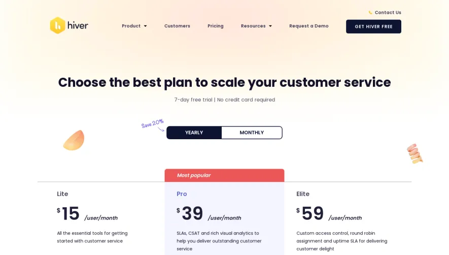


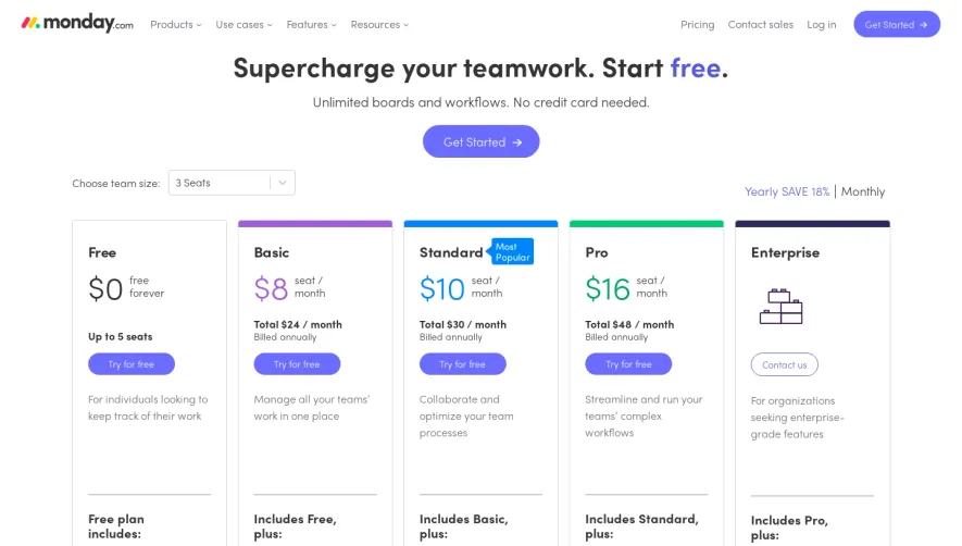

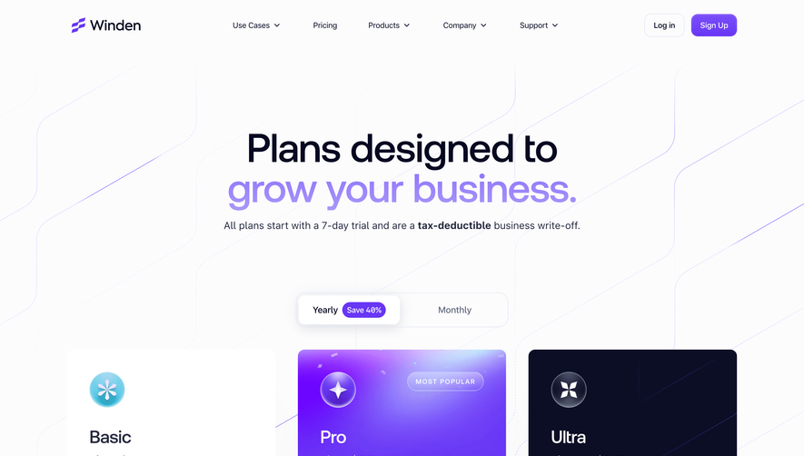

Upgrade to SaaSFrame Pro now to see similar examples.
Monthly
$18 /month
Billed $18 monthly
Browse all screens & flows
Filter and search screens & flows
Search text in screenshots
Access Figma files
Access mobile versions
Join now
Quarterly
$16 /month
Billed $48 quarterly
Browse all screens & flows
Filter and search screens & flows
Search text in screenshots
Access Figma files
Access mobile versions
Join now
Yearly
$15 /month
Billed $180 yearly
Browse all screens & flows
Filter and search screens & flows
Search text in screenshots
Access Figma files
Access mobile versions
Join now