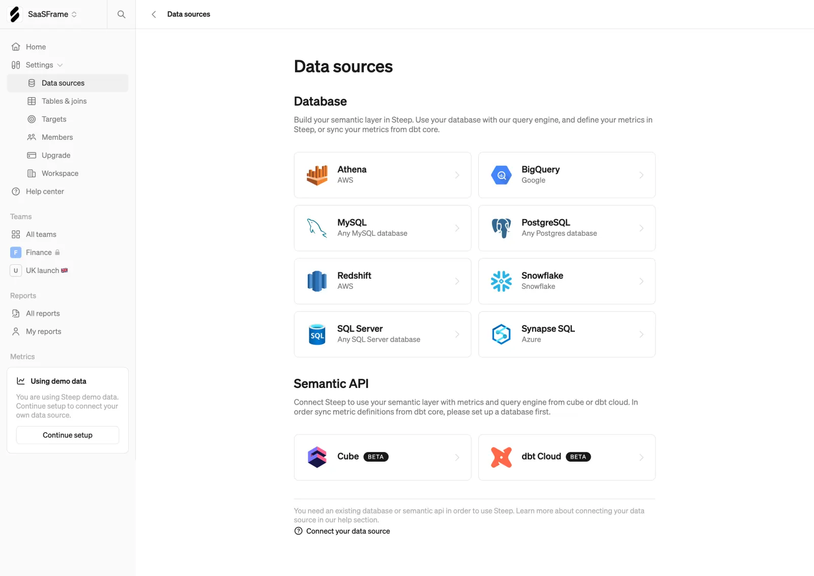
This is Steep's data sources settings page and it nails the "pick your connector" pattern. The layout is dead simple. Two-column card grid, each option showing a logo, name, and provider. Athena, BigQuery, MySQL, Snowflake, the usual suspects. Every card has a subtle right arrow that whispers "click me" without screaming. The visual hierarchy here is tight.
Restraint Is the Move
Almost no color on the page. The logos do all the heavy lifting for visual differentiation while everything else stays monochrome. That left sidebar uses soft gray text with a clean icon system. Notice the little lock icon on "Finance" and the flag emoji on "UK launch." Small details that add personality without clutter.
Smart Sectioning
The page splits into Database and Semantic API sections with clear headers and short descriptions. The bottom nudge about demo data sits in a card with a "Continue setup" CTA. It's contextual onboarding done right. Typography is minimal, likely a geometric sans. Nothing fancy, nothing distracting. Just structured and readable.
 SaaSFrame
 SteepModern analytics platform