
Thank you! Your submission has been received!
Oops! Something went wrong while submitting the form.
Get SaaSFrame Pro
Monthly
$18
Quarterly
$48
Yearly
$180
Upgrade to access this feature
Browse all screens & flows
Filter and search screens & flows
Access Figma files
Access mobile versions
Bookmark screens & flows
Join now
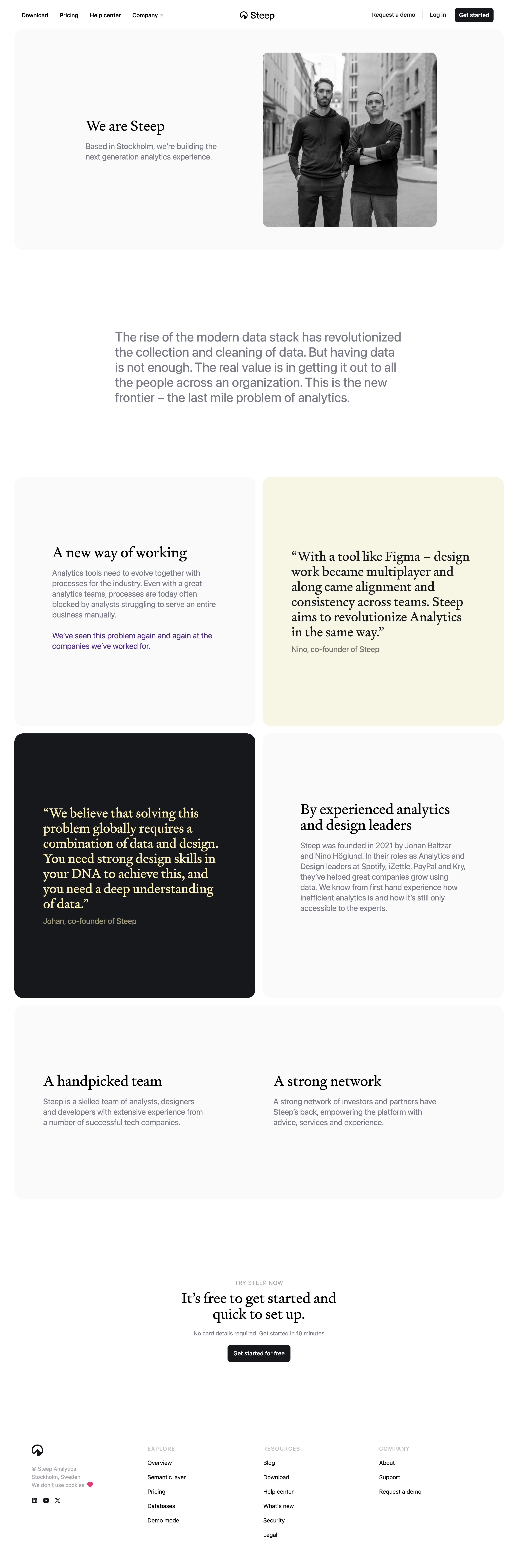

Steep About Page

Steep
Modern analytics platform
Designed by
No items found.

Bookmark
Bookmark

Design with AI
Thank you! Your submission has been received!
Oops! Something went wrong while submitting the form.
# Design from Reference: Steep About Page
Create an original, high-fidelity visual design inspired by the reference. Prioritize composition, typography, colors, spacing, and component styling over technical implementation.
## Reference
- **Product:** Steep
- **Category:** About Page
- **Screenshot:** https://cdn.prod.website-files.com/5e9dc792e1210c5325f7ebbc/6acad57386f1bee9c36507dc_6acad49e886583e9d96b7c76_cms-be85cfe5c9f7de4789c352ef.webp
Analyze the screenshot first. If inaccessible, request it rather than guessing.
## Content
{{content.instructions}}
{{content.data}}
Preserve essential messaging and factual accuracy. Adapt structure and copy length for visual balance; never invent product claims.
## Visual Design
### Overall aesthetic
- **Character:** A restrained company-about page combines monochrome photography, editorial serif headings and oversized pale rounded panels.
- **Capture evidence:** The image measures 2880 × 8710 pixels and was inspected in four portions through the footer. Approximate CSS dimensions assume a 1440px viewport at 2× density; this is unverified.
- **Tone:** Large whitespace, muted gray body copy and a small warm-yellow accent create a calm design-led presentation.
### Page composition
- **Navigation:** Links align left, the Steep brand is centered and demo/login/get-started actions align right.
- **Hero panel:** A broad pale rounded rectangle pairs a short company introduction left with a square black-and-white founders photograph right.
- **Manifesto:** A wide muted-gray paragraph sits alone in a narrower centered column.
- **Story grid:** Four large panels form a two-column grid: explanatory copy, a pale-yellow quote, a dark quote and founder-background copy.
- **Team/network:** A full-width pale panel contains two balanced text columns.
- **Conversion/footer:** A centered signup message and dark action precede a thin rule and four-column footer.
### Information hierarchy
- **Hero identity:** A serif heading introduces the company, followed by a muted sans-serif description.
- **Manifesto emphasis:** Large gray text communicates the analytics perspective without a card.
- **Quotes:** Large serif quotations contrast with surrounding sans-serif explanations; one uses pale yellow on dark.
- **Team context:** Separate headings distinguish team and network statements.
- **Conversion:** Small uppercase label, two-line serif headline, reassurance and one dark action form the closing hierarchy.
### Typography
- **Family pairing:** A refined serif serves headings and quotes; a neutral sans-serif serves body and navigation. Exact identities are unverified.
- **Hero/section headings:** Approximately 40px CSS regular serif with 46px line-height.
- **Manifesto:** Approximately 36px sans-serif with 42px line-height.
- **Panel body:** Approximately 22px with 29px line-height, muted gray.
- **Quotes:** Approximately 38–40px serif with 42px line-height.
- **Navigation/footer:** Approximately 16px; footer group labels are small uppercase gray.
- **Conversion:** Approximately 40px serif, centered across two lines.
### Colors & surfaces
- **Canvas:** Sampled #FFFFFF supplies the page.
- **Pale panels:** Sampled #FAFAFB supplies light neutral rounded regions.
- **Dark panel/actions:** Sampled #17191C supplies the dark quote card and buttons.
- **Warm quote:** Sampled #F7F5E0 supplies the pale-yellow quote panel.
- **Secondary text:** Sampled #767B87 supplies muted gray paragraphs.
- **Warm text:** Sampled #FFEEAD supplies yellow among the dark quote text tones.
- **Local accents:** A small purple sentence and a pink heart appear as restrained exceptions to the neutral palette.
### Components
- **Hero:** A nearly full-width rounded panel uses around 28px radii, generous padding and two equal content zones.
- **Photograph:** A roughly 484px square black-and-white portrait has around 16px corner rounding.
- **Story panels:** Large equal-width cards use around 28px radii and roughly 80px padding, with no strong outlines or shadows.
- **Quote cards:** Serif text and smaller attribution sit directly on pale-yellow or near-black fills.
- **Team/network panel:** A wide pale rectangle holds two inset text groups with ample blank space below.
- **Primary action:** A compact near-black rounded rectangle uses white semibold text.
- **Footer:** Brand/location/social details sit left of Explore, Resources and Company groups.
### Visual rhythm
- **Outer gutters:** Approximately 40px CSS margins frame the large panels.
- **Grid gaps:** Around 20px separates the paired story cards.
- **Major breaks:** Large 160–220px gaps isolate manifesto and conversion content.
- **Panel balance:** Spacious internal padding and similar panel heights create a deliberate editorial rhythm.
- **Type contrast:** Serif headings/quotes alternate with muted sans-serif paragraphs throughout.
### Responsive
- **Evidence limit:** Only one desktop layout is observed; navigation and mobile behavior are unverified.
- **Grid recommendation:** Stack all paired panels and team/network columns at narrow widths.
- **Typography recommendation:** Reduce large body/quote sizes while retaining comfortable line-height.
- **Hero recommendation:** Place introductory copy before the photograph and preserve its aspect ratio.
- **Footer recommendation:** Stack link groups with clear labels and adequate touch spacing.
### Adaptation guidance
- **Editorial system:** Define serif heading/quote roles separately from muted sans-serif body text.
- **Panel language:** Reuse large radii, pale fills and generous padding instead of adding decorative borders.
- **Photography:** Use a purposeful monochrome portrait with descriptive alternative text.
- **Content:** Treat company history and claims as captured page content, not independently verified current facts.
- **Accessibility:** Maintain readable gray-text contrast, semantic quotations and visible action/link focus.
Use this context to reproduce the reference's visual language: layout, typography, colors, spacing, borders, radii, and distinctive elements. The screenshot takes priority if descriptions conflict.
## Direction
{{preferences.fidelityInstructions}}
## Output
{{output.instructions}}
Deliver a polished, cohesive design with precise alignment, hierarchy, and spacing. Produce the requested visual artifact, not just a description. If unsupported, explain the limitation.


Category
Patterns
No items found.
Tech Stack
No items found.
Added on
January 4, 2024
Similar screens
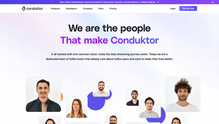


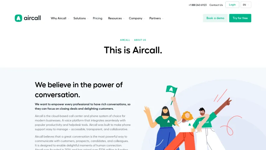

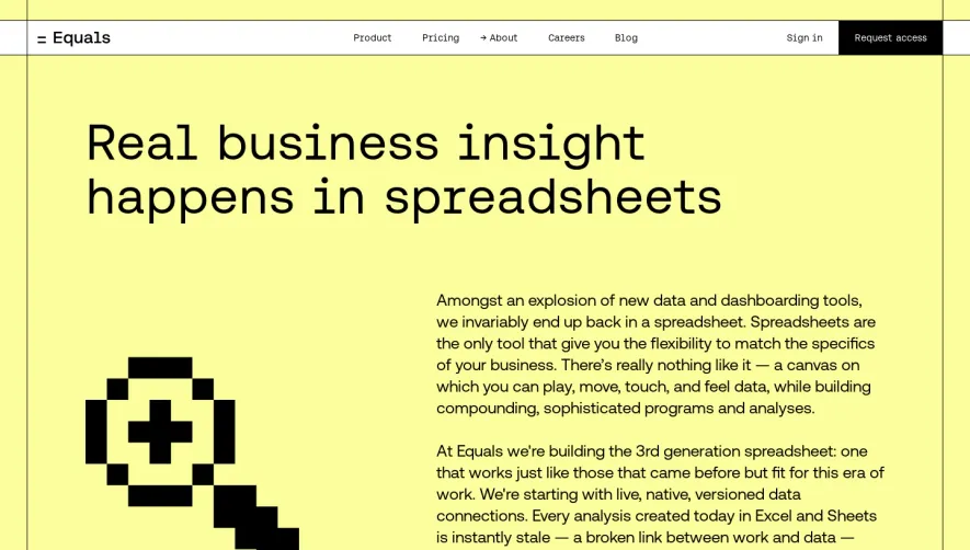

Upgrade to SaaSFrame Pro now to see similar examples.
Monthly
$18 /month
Billed $18 monthly
Browse all screens & flows
Filter and search screens & flows
Search text in screenshots
Access Figma files
Access mobile versions
Join now
Quarterly
$16 /month
Billed $48 quarterly
Browse all screens & flows
Filter and search screens & flows
Search text in screenshots
Access Figma files
Access mobile versions
Join now
Yearly
$15 /month
Billed $180 yearly
Browse all screens & flows
Filter and search screens & flows
Search text in screenshots
Access Figma files
Access mobile versions
Join now