Figma file available


Oku is a React progressive web app (PWA) bootstrapped with Create React App. It is served as a client-side SPA — the shell HTML includes a "You need to enable JavaScript to run this app" fallback confirming the CRA pattern. The viewport is locked (maximum-scale=1, user-scalable=no, viewport-fit=cover), signalling a mobile-first, app-like experience. Payments are handled via Paddle.
Oku uses a two-typeface system:
The pairing creates contrast between editorial warmth (Fabric Serif headlines) and functional clarity (Inter UI text). Base font size is 16px; the type scale follows a modular ratio roughly aligned to 12 / 14 / 16 / 20 / 24 / 32 / 48px steps.
Oku's palette is high-contrast and black-dominant. The marketing site and app shell use near-black backgrounds (#0A0A0A / #111111) with off-white text (#F5F5F5) for a premium, editorial feel that suits a book-culture product. Accent usage is intentionally minimal — a muted warm-neutral or a single brand accent is used for interactive states. The overall mood is restrained, letting book cover art provide colour.
Spacing follows an 8px base grid. Common values: 4px (xs), 8px (sm), 16px (md), 24px (lg), 32px (xl), 48px (2xl), 64px (3xl). The bento-grid marketing layout uses 16–20px gutters between cards. Component internal padding is typically 16px or 24px.
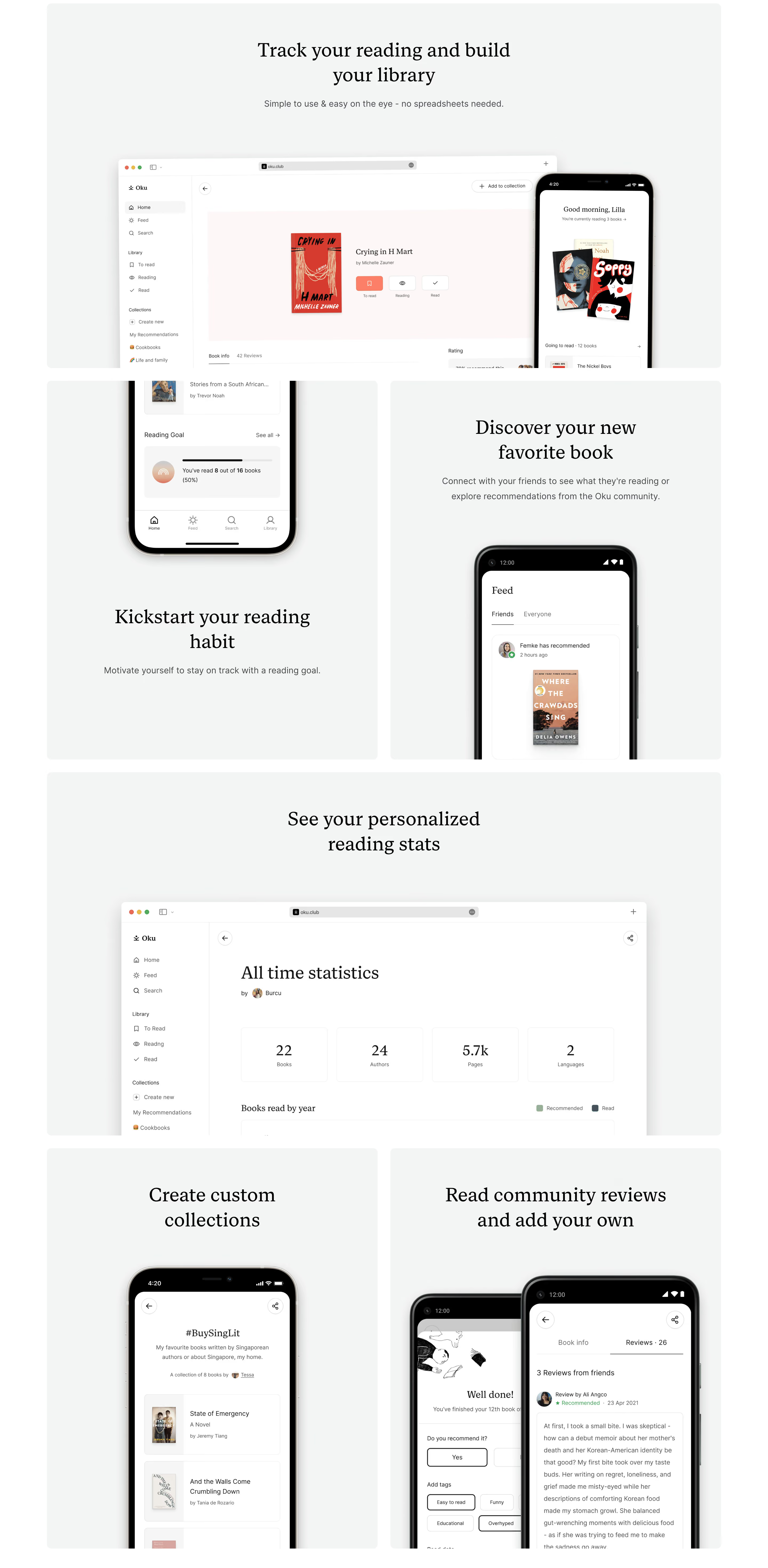
The marketing landing page uses a bento grid layout — asymmetric modular cards showcasing app features (reading lists, collections, stats, social feed). The app itself is a mobile-first single-column layout with a bottom navigation bar. Max content width on desktop is approximately 1200px with centred alignment and generous horizontal padding (24–40px).
/_ oku.club — inferred CSS custom properties _/
/\* Source: visual analysis, Lapa Ninja metadata (Inter + Fabric Serif, black palette),
   PWA shell inspection, and Fabric Serif foundry specs (Monokrom, 2020) \*/

:root {
  /_ ── Typography ── _/
  --font-sans: 'Inter', system-ui, -apple-system, BlinkMacSystemFont, 'Segoe UI', sans-serif;
  --font-serif: 'Fabric Serif', Georgia, 'Times New Roman', serif;
  --font-mono: ui-monospace, 'SFMono-Regular', Menlo, monospace;

  --font-size-xs:   0.75rem;   /_ 12px _/
  --font-size-sm:   0.875rem;  /_ 14px _/
  --font-size-base: 1rem;      /_ 16px _/
  --font-size-lg:   1.25rem;   /_ 20px _/
  --font-size-xl:   1.5rem;    /_ 24px _/
  --font-size-2xl:  2rem;      /_ 32px _/
  --font-size-3xl:  3rem;      /_ 48px _/

  --font-weight-regular: 400;
  --font-weight-medium:  500;
  --font-weight-bold:    700;

  --line-height-tight:  1.2;
  --line-height-snug:   1.375;
  --line-height-normal: 1.5;
  --line-height-relaxed:1.625;

  --letter-spacing-tight: -0.02em;
  --letter-spacing-normal: 0em;
  --letter-spacing-wide:   0.04em;

  /_ ── Colour — Dark (default) ── _/
  --color-bg-primary:    #0A0A0A;
  --color-bg-secondary:  #111111;
  --color-bg-elevated:   #1A1A1A;
  --color-bg-overlay:    #222222;

  --color-text-primary:   #F5F5F5;
  --color-text-secondary: #A3A3A3;
  --color-text-tertiary:  #6B6B6B;
  --color-text-disabled:  #4A4A4A;
  --color-text-inverse:   #0A0A0A;

  --color-border:         #2A2A2A;
  --color-border-subtle:  #1E1E1E;
  --color-border-strong:  #3A3A3A;

  --color-accent:         #F5F5F5;   /_ primary CTA — white on black _/
  --color-accent-hover:   #E0E0E0;
  --color-accent-muted:   #2A2A2A;

  --color-success:        #4CAF50;
  --color-warning:        #FF9800;
  --color-error:          #EF5350;

  /_ ── Spacing (8px grid) ── _/
  --space-1:  0.25rem;   /_ 4px  _/
  --space-2:  0.5rem;    /_ 8px  _/
  --space-3:  0.75rem;   /_ 12px _/
  --space-4:  1rem;      /_ 16px _/
  --space-5:  1.25rem;   /_ 20px _/
  --space-6:  1.5rem;    /_ 24px _/
  --space-8:  2rem;      /_ 32px _/
  --space-10: 2.5rem;    /_ 40px _/
  --space-12: 3rem;      /_ 48px _/
  --space-16: 4rem;      /_ 64px _/
  --space-20: 5rem;      /_ 80px _/
  --space-24: 6rem;      /_ 96px _/

  /_ ── Border Radius ── _/
  --radius-sm:   4px;
  --radius-md:   8px;
  --radius-lg:   12px;
  --radius-xl:   16px;
  --radius-full: 9999px;

  /_ ── Shadows (minimal in dark mode) ── _/
  --shadow-sm:  0 1px 2px rgba(0, 0, 0, 0.4);
  --shadow-md:  0 4px 12px rgba(0, 0, 0, 0.5);
  --shadow-lg:  0 8px 24px rgba(0, 0, 0, 0.6);

  /_ ── Layout ── _/
  --container-max: 1200px;
  --container-padding: 1.5rem;
  --bento-gap: 1rem;        /_ 16px card gutter _/
  --nav-height: 56px;
}

/_ ── Light mode overrides (if supported) ── _/
@media (prefers-color-scheme: light) {
  :root {
    --color-bg-primary:    #FFFFFF;
    --color-bg-secondary:  #F5F5F5;
    --color-bg-elevated:   #FAFAFA;
    --color-bg-overlay:    #EFEFEF;

    --color-text-primary:   #0A0A0A;
    --color-text-secondary: #4A4A4A;
    --color-text-tertiary:  #6B6B6B;
    --color-text-disabled:  #A3A3A3;
    --color-text-inverse:   #F5F5F5;

    --color-border:         #E0E0E0;
    --color-border-subtle:  #EFEFEF;
    --color-border-strong:  #CBCBCB;

    --color-accent:         #0A0A0A;
    --color-accent-hover:   #222222;
    --color-accent-muted:   #F0F0F0;

    --shadow-sm:  0 1px 2px rgba(0, 0, 0, 0.06);
    --shadow-md:  0 4px 12px rgba(0, 0, 0, 0.08);
    --shadow-lg:  0 8px 24px rgba(0, 0, 0, 0.12);
  }
}
| Token | Value | Usage |
|---|---|---|
--color-bg-primary | #0A0A0A | Page / app shell background |
--color-bg-secondary | #111111 | Card backgrounds, sidebars |
--color-bg-elevated | #1A1A1A | Modals, dropdowns, tooltips |
--color-text-primary | #F5F5F5 | Body copy, headings |
--color-text-secondary | #A3A3A3 | Subtext, metadata, placeholders |
--color-text-tertiary | #6B6B6B | Disabled labels, hints |
--color-border | #2A2A2A | Card borders, dividers |
--color-accent | #F5F5F5 | Primary CTA button fill |
--color-accent-hover | #E0E0E0 | CTA hover state |
--color-success | #4CAF50 | Success states, reading goal completion |
--color-error | #EF5350 | Error messages, destructive actions |
| Token | Value | Usage |
|---|---|---|
--space-1 | 4px | Icon gaps, micro nudges |
--space-2 | 8px | Inline spacing, tag padding |
--space-4 | 16px | Component internal padding, bento gutter |
--space-6 | 24px | Card padding, section spacing |
--space-8 | 32px | Between sections |
--space-12 | 48px | Large section gaps |
--space-16 | 64px | Hero / page-level vertical rhythm |
| Token | Value | Usage |
|---|---|---|
--font-sans | 'Inter', system-ui, sans-serif | UI text, labels, body copy, navigation |
--font-serif | 'Fabric Serif', Georgia, serif | Display headings, marketing headlines, editorial pull-quotes |
--font-size-sm | 14px | Captions, metadata, timestamps |
--font-size-base | 16px | Body text, form inputs |
--font-size-lg | 20px | Card titles, subheadings |
--font-size-xl | 24px | Section headings |
--font-size-2xl | 32px | Page-level headings |
--font-size-3xl | 48px | Hero display text (Fabric Serif) |
--font-weight-regular | 400 | Body text |
--font-weight-medium | 500 | Labels, navigation items |
--font-weight-bold | 700 | Headings, CTA text |
--line-height-normal | 1.5 | Body text default |
--line-height-tight | 1.2 | Display headings |
| Token | Value | Usage |
|---|---|---|
--radius-sm | 4px | Tags, chips, badges |
--radius-md | 8px | Buttons, input fields |
--radius-lg | 12px | Cards, bento grid tiles, modals |
--radius-xl | 16px | Large feature cards |
--radius-full | 9999px | Avatars, pill buttons, progress rings |
| Token | Value | Usage |
|---|---|---|
--shadow-sm | 0 1px 2px rgba(0,0,0,0.4) | Subtle elevation, hover states |
--shadow-md | 0 4px 12px rgba(0,0,0,0.5) | Floating cards, bottom nav |
--shadow-lg | 0 8px 24px rgba(0,0,0,0.6) | Modals, drawer overlays |
Framework & stack: Oku is a React PWA (Create React App pattern), confirmed by the JavaScript-required fallback, CRA-style static serving, and PWA meta tags (apple-mobile-web-app-capable, mobile-web-app-capable). The viewport is locked with user-scalable=no, maximum-scale=1, viewport-fit=cover, enforcing a native-app feel on mobile. Payments run through Paddle (confirmed by the founding team in Product Hunt comments).
Theme support: The site is natively dark — the marketing page and app shell both default to a black-dominant palette. Light mode support is likely provided via a prefers-color-scheme media query or a user toggle, though the primary brand expression is dark. No explicit color-scheme meta tag was observed in the HTML shell, suggesting the dark theme is baked into the CSS rather than declared at the document level.
Data confidence:
Notable design patterns: