Verification
70
Confirm identities with SaaS Verification patterns. Explore UI for email confirmation, phone verification, and identity checks that ensure a secure and trusted user base.

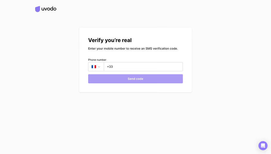
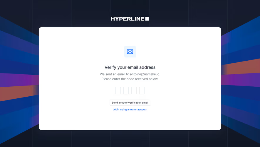
A verification screen asks someone to prove access to an email address, phone number, or other channel before a defined action can continue. In a SaaS product, it often sits between registration and onboarding, or between changing contact details and saving that change. The best verification UX explains what is being checked, where the proof was sent, and how to recover when delivery or entry fails.
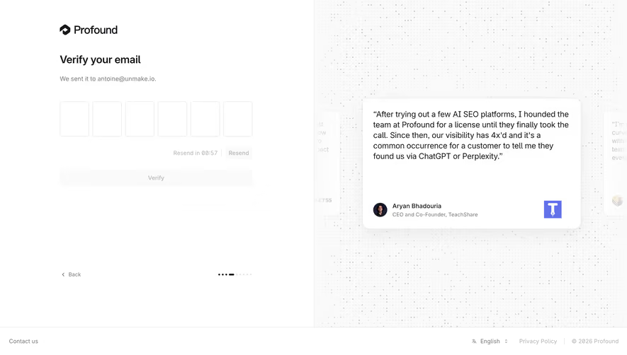
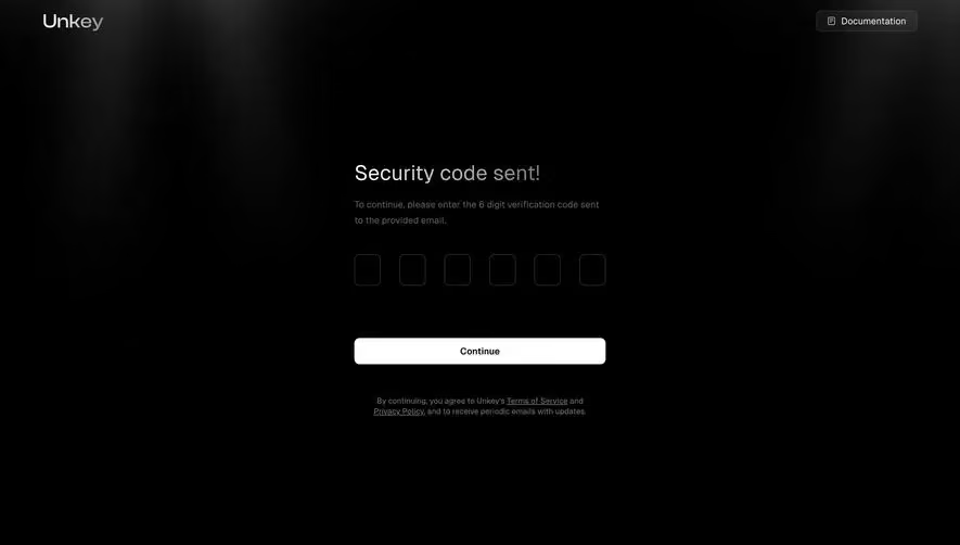
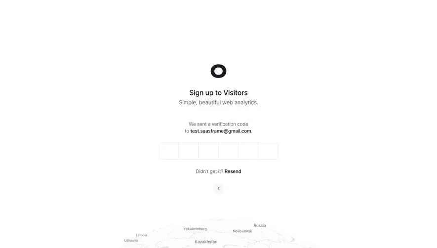
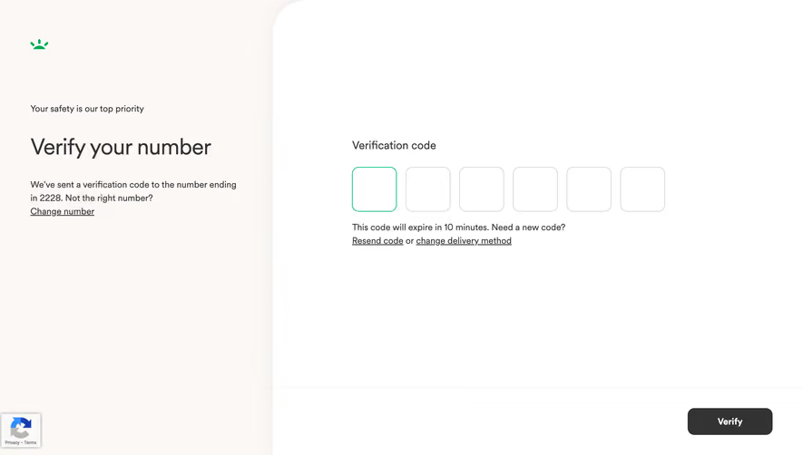
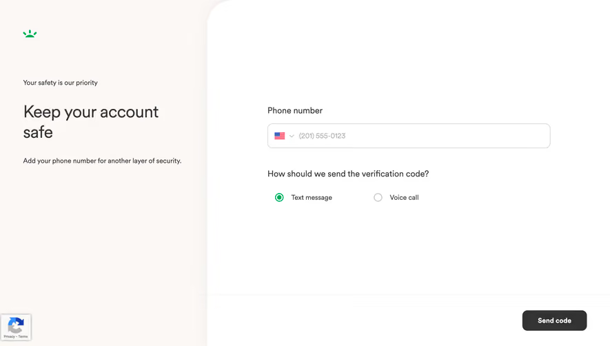
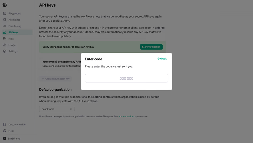
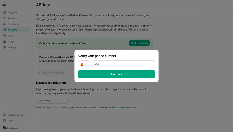
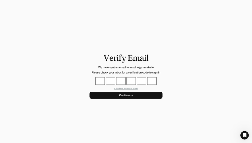
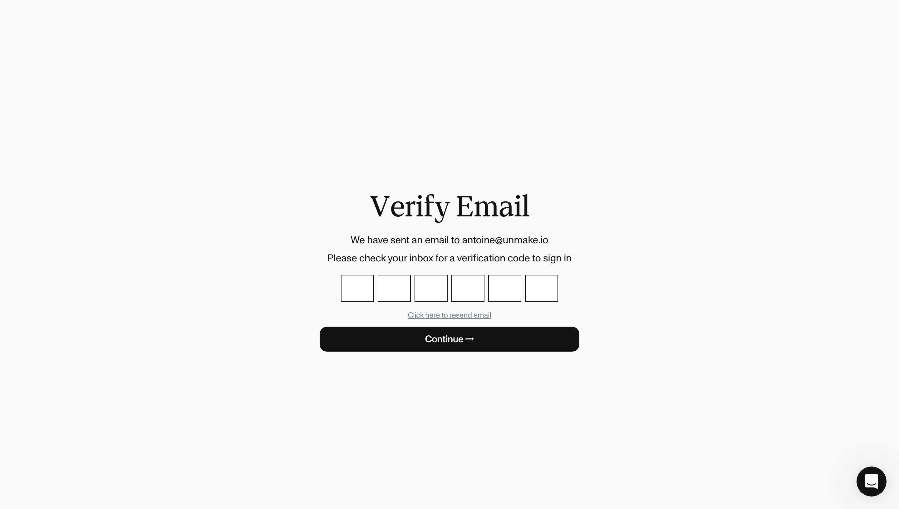
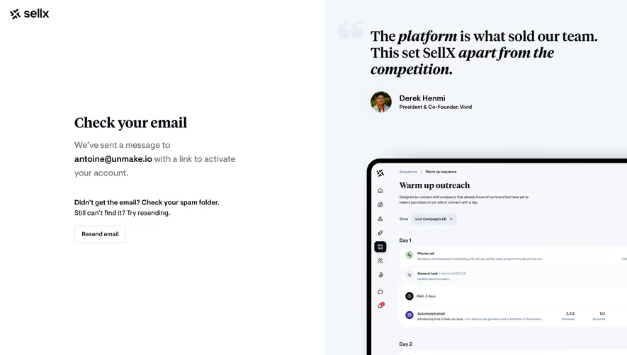
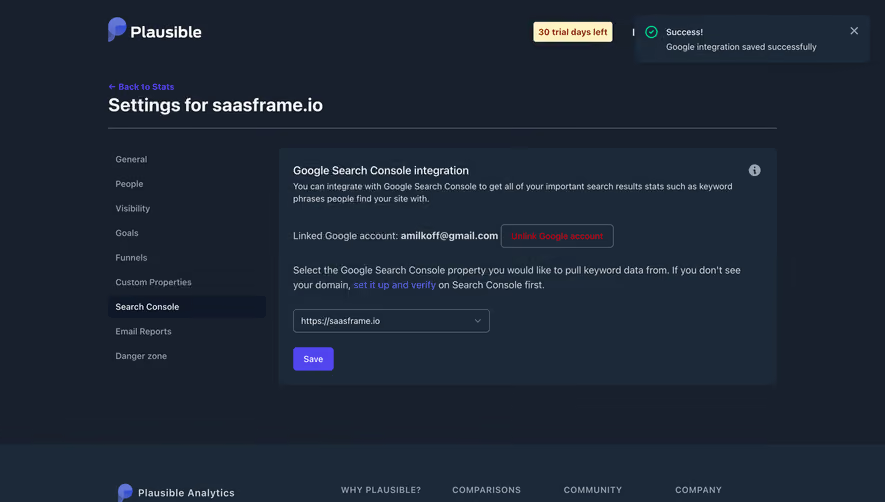
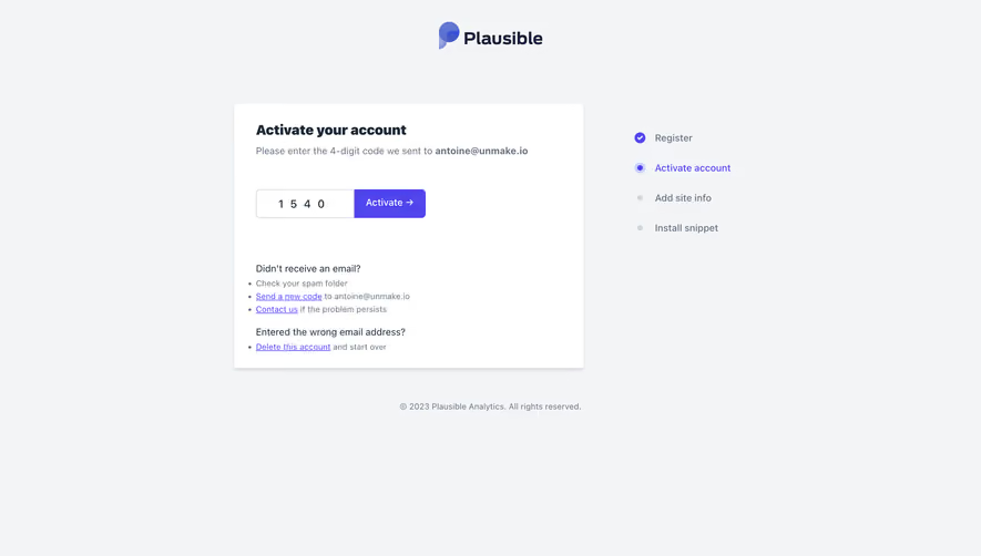
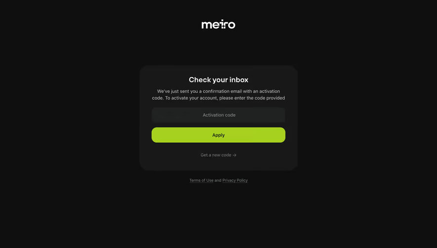
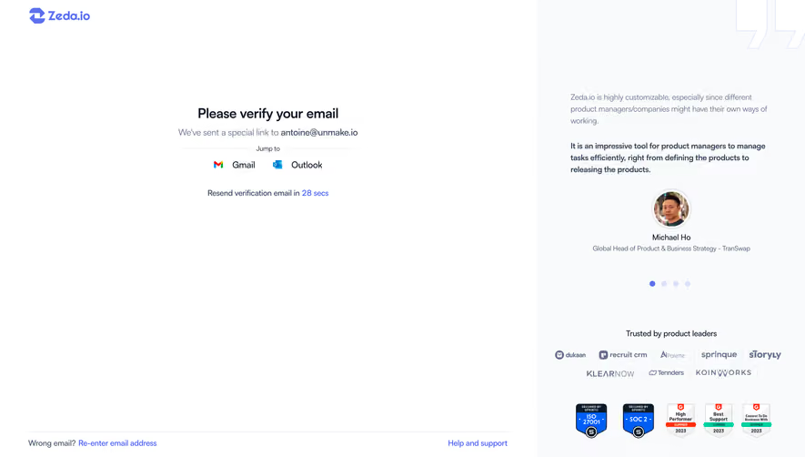
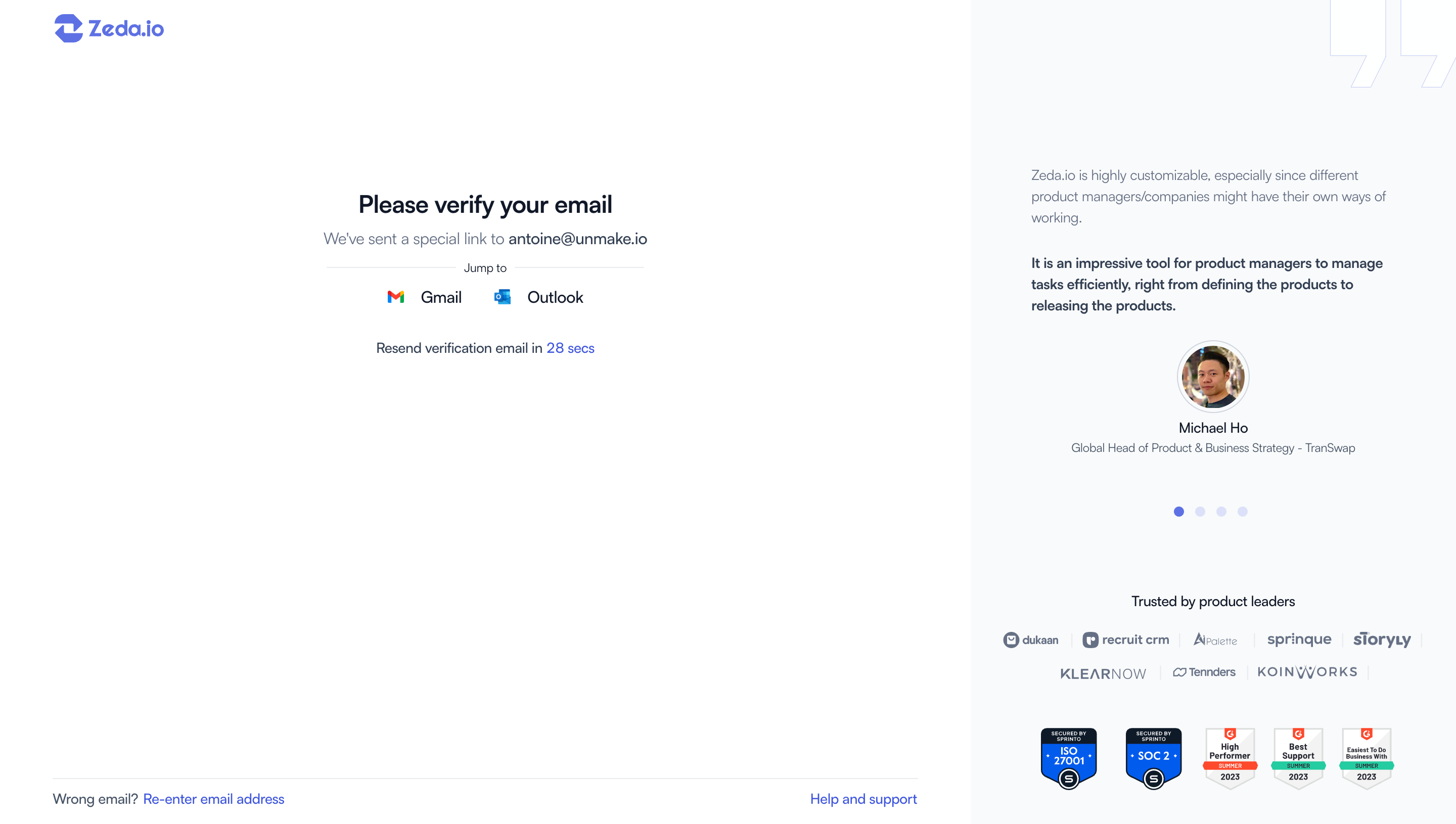
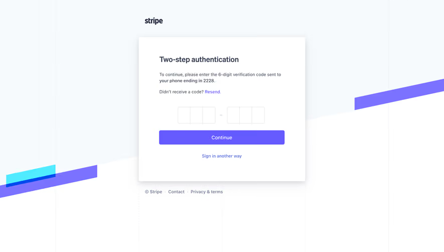
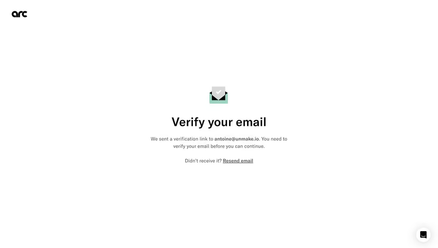
The examples here focus on email confirmation codes from Profound, Visitors, and Front. Their screenshots show three different treatments of the same handoff: a timed resend state, a minimal signup screen, and a modal that explains expiry and asks users to keep the window open. They provide visual design evidence, not proof of backend security or interaction behavior.
Start with the purpose. “Verify your email” explains the immediate action, but users also need to understand its consequence when that consequence is not obvious. Does confirmation complete registration, activate an invitation, enable notifications, or approve a new address? Those outcomes require different success messages and destinations.
Email confirmation establishes that someone can access the mailbox at that moment. It does not, on its own, establish their legal identity, employment, or permission to view a workspace. Keep those checks separate in both the product and the language. A verified email address should not be represented as a verified person unless a distinct identity process supports that claim.
Verification is also different from a magic link used for sign-in or an additional authentication factor. Similar-looking code fields can appear in all three journeys. Match the heading and instructions to the actual purpose so people do not confuse an onboarding check with a recurring login requirement.
A confirmation link lets a recipient act directly from the email. A code asks them to return to the original interface and enter a value. The decision is partly about context: which browser or app should contain the completed flow, and how likely is the email to be opened elsewhere?
A code can preserve an onboarding modal or a setup page while the person checks another application. It adds transcription work, so paste and autofill support matter. A link removes that entry step, but can open a new browser or tab and leave the original page waiting. Plan how both the return destination and the original page communicate completion.
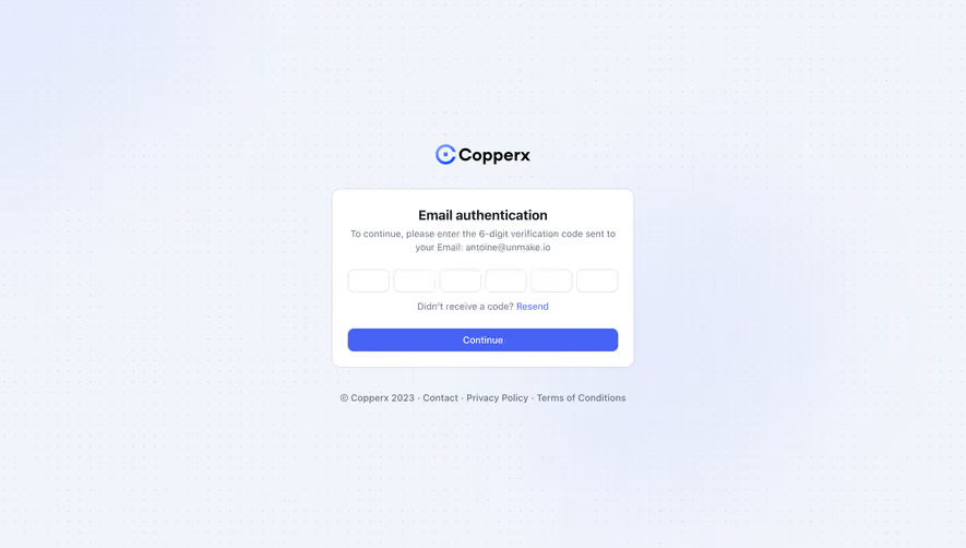
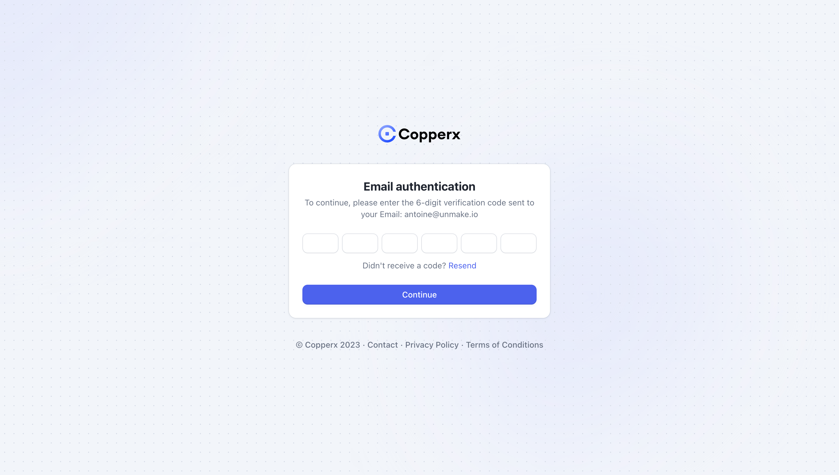
Do not select six separate boxes simply because the examples use them. The visual segmentation and the underlying input behavior are different decisions. A single input can be styled as several slots, while several real inputs can create additional keyboard and screen-reader work. Review the interaction before approving the visual treatment.
Profound places the destination email under the verification heading, followed by six empty code slots. That proximity helps people identify which inbox to open before they start entering a code. The page also includes a visible back action, which provides an orientation cue within the larger onboarding flow.
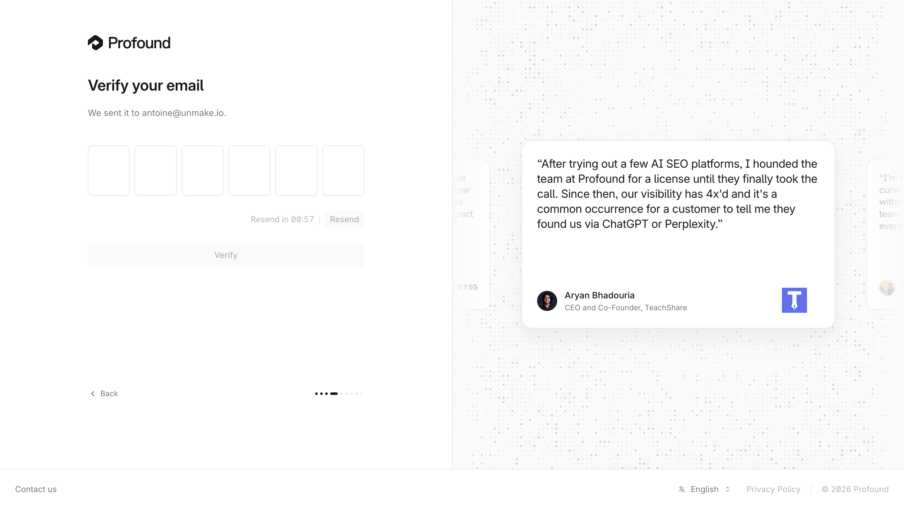
A destination label is useful for catching typos and distinguishing work and personal inboxes. If correction is possible through a back action, preserve the rest of the signup information where appropriate. A person should not have to recreate their account details just to change one character in an address.
Use disclosure appropriate to the setting. Showing an address the person just supplied can aid recognition; displaying a previously stored address on an unauthenticated screen raises different privacy questions. Do not make the interface reveal more account information than the task requires.
Profound shows a resend countdown beside its resend action. Front instead states that the confirmation code will expire in 30 minutes and places a resend option near the bottom of the modal. These are different clocks. One controls when another delivery request can be made; the other controls how long the existing code can be used.
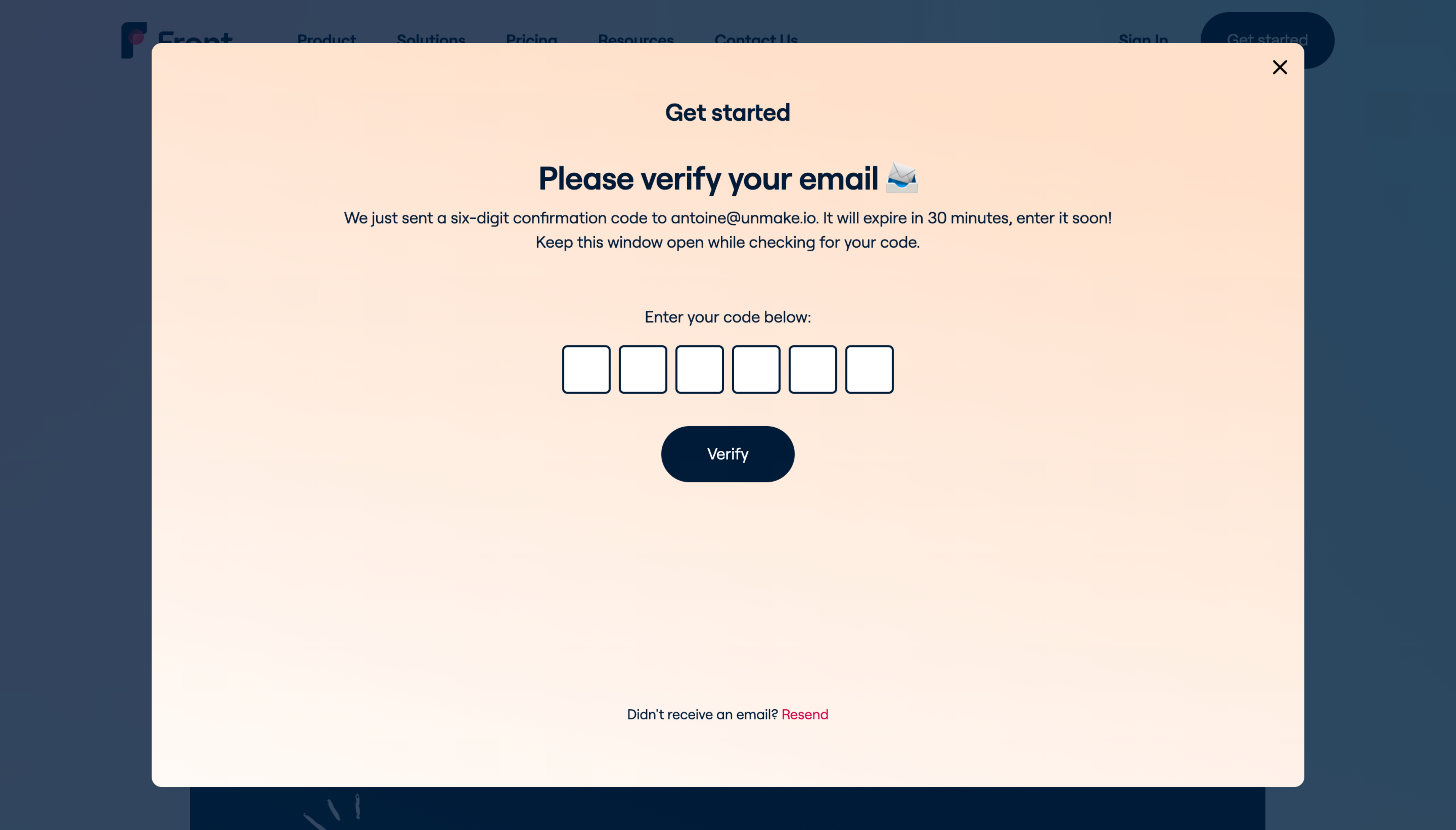
Do not use an unlabeled timer that could mean either one. If a resend action is disabled, explain its waiting period. If a code is close to expiring, show the relevant validity information without implying that resend availability extends its life. The displayed duration must match the actual server policy.
The 30-minute value in Front’s capture is an example of clear communication, not a universal recommendation for code validity. Select the validity period according to the use case and implementation, then design the expired state. Someone returning late should be able to request a usable code without reconstructing the entire signup process.
Visitors uses a compact central form with the destination address, six connected code slots, a resend action, and a back icon. It keeps the task visually focused, with little competing content. The screenshot cannot tell us whether those slots accept a pasted code, move focus correctly, or support autofill; those behaviors need direct testing.
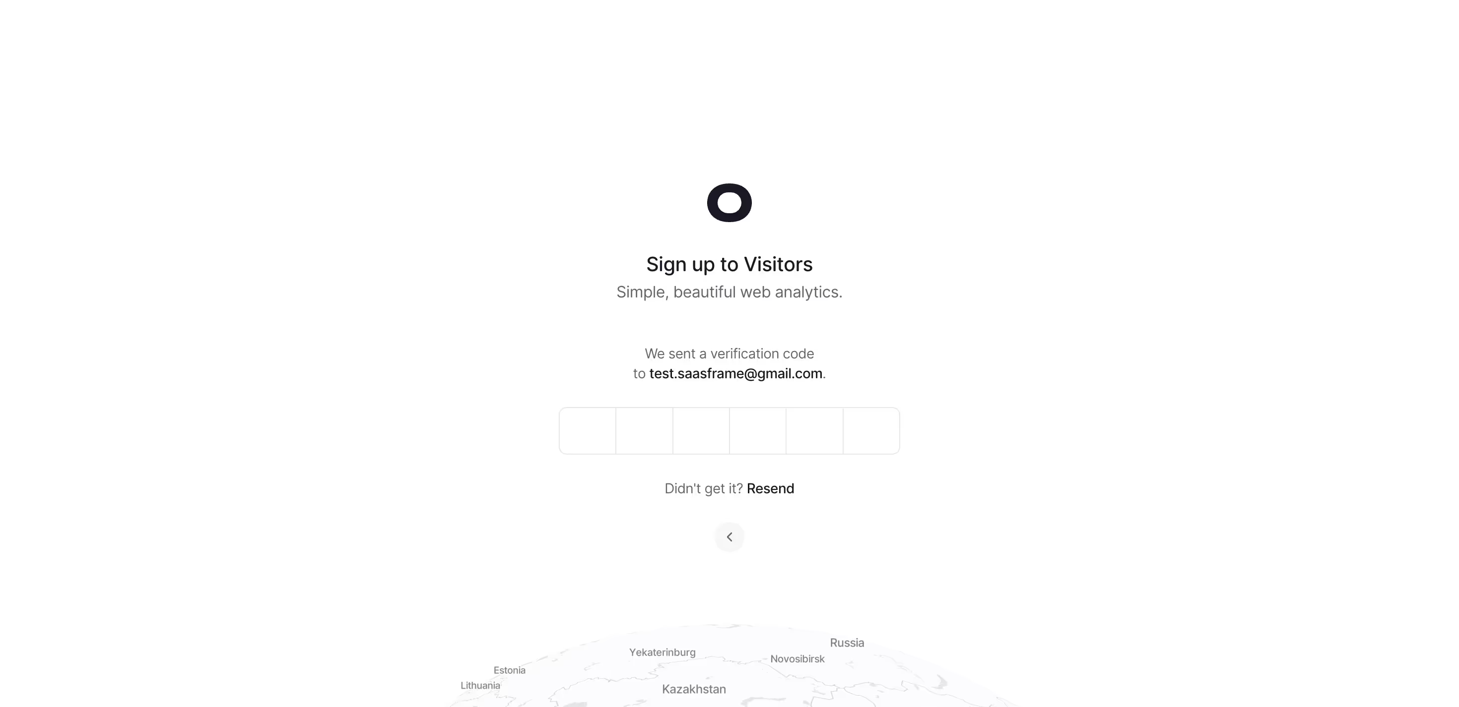
Accept a complete pasted code and handle common formatting, such as spaces introduced when copying, if the implementation permits it. Use the actual code format to choose the input behavior. A numeric keypad is helpful for a numeric code, but would block an alphanumeric one. Preserve leading zeros instead of treating a code as an ordinary number.
If focus advances between slots, support predictable deletion, replacement, and correction. Do not make people guess which box contains the mistake. Expose a coherent label and instructions to assistive technology. W3C’s accessible-authentication guidance discusses mechanisms such as copy and paste that reduce transcription burdens; apply that principle to the complete verification task.
Decide whether the completed code submits automatically or requires a Verify action. Automatic submission can remove a step, but needs a clear validating state and must not repeatedly submit incomplete edits. An explicit action gives the person control over timing. Neither interaction is established by the screenshots alone.
These states need different responses. An incorrect code may allow another attempt. An expired code needs a new request. A delivery failure may require checking or changing the destination. A temporary service problem should not be described as a user entry mistake.
Write the message beside the task it explains and provide the next available action. “That code could not be verified. Check it or request another” can be appropriate when the system deliberately avoids exposing a more precise reason. Where policy allows a specific explanation, an expired-code message can directly offer a replacement. Do not expose internal error codes as the only guidance.
Keep entered values available when that helps correction, and clear them when a new code makes them misleading. If resending invalidates an earlier code, tell people to use the latest message. Test delayed and reordered messages: a user may receive an old code after requesting a new one.
Address verification during signup and verification of a new address on an existing account should not be designed as interchangeable screens. In signup, a typo correction can return to the entered address. On an established account, changing contact details may require recent authentication and notifications according to the account’s security policy.
The interface should say which address will become active and when. Avoid a success message that implies the change is complete before confirmation has succeeded. If an old address remains active during the process, communicate that behavior where it affects the person’s expectations.
For people who cannot access the required mailbox, provide an appropriate recovery or support route. A resend button cannot solve permanent loss of inbox access. Do not turn that route into an unrestricted way to bypass verification.
After verification succeeds, the person should know what changed and what comes next. In signup, continue to the next necessary setup task. For an invitation, explain whether workspace access is now available or another approval is required. For a contact-detail change, confirm the resulting address state.
Front’s instruction to keep the window open makes the intended return context explicit. That choice creates an additional review question: what happens if the user closes the modal, reloads the page, or returns in a different tab? Preserve enough state to resume safely where the product supports it, and provide a clear restart where it does not.
A completion animation is optional; reliable orientation is not. Avoid showing a successful state solely because a delivery request was accepted. Sending proof and validating proof are separate events.
It confirms access to that email channel for the verification process. It does not automatically establish legal identity or workspace authorization.
They serve different purposes and may have different durations. Label each according to what it controls, and keep the copy consistent with the implementation.
The choice depends on the intended return context. Codes keep entry in the original interface but add transcription; links remove code entry but may open another browser or tab. Evaluate the whole handoff.
Explore Sign Up for the surrounding registration flow, Magic Link Authentication for email-based sign-in, and Multi-Factor Authentication for additional factors. Error State and Success Notification help compare the messages around verification.
Use the gallery to compare instructions, correction routes, and state visibility. The most useful reference is the one whose journey matches your product’s purpose, rather than the one with the most attractive code boxes.
For implementation review, see OWASP’s email validation and verification guidance. For accessible authentication and input support, see W3C’s accessible-authentication guidance.