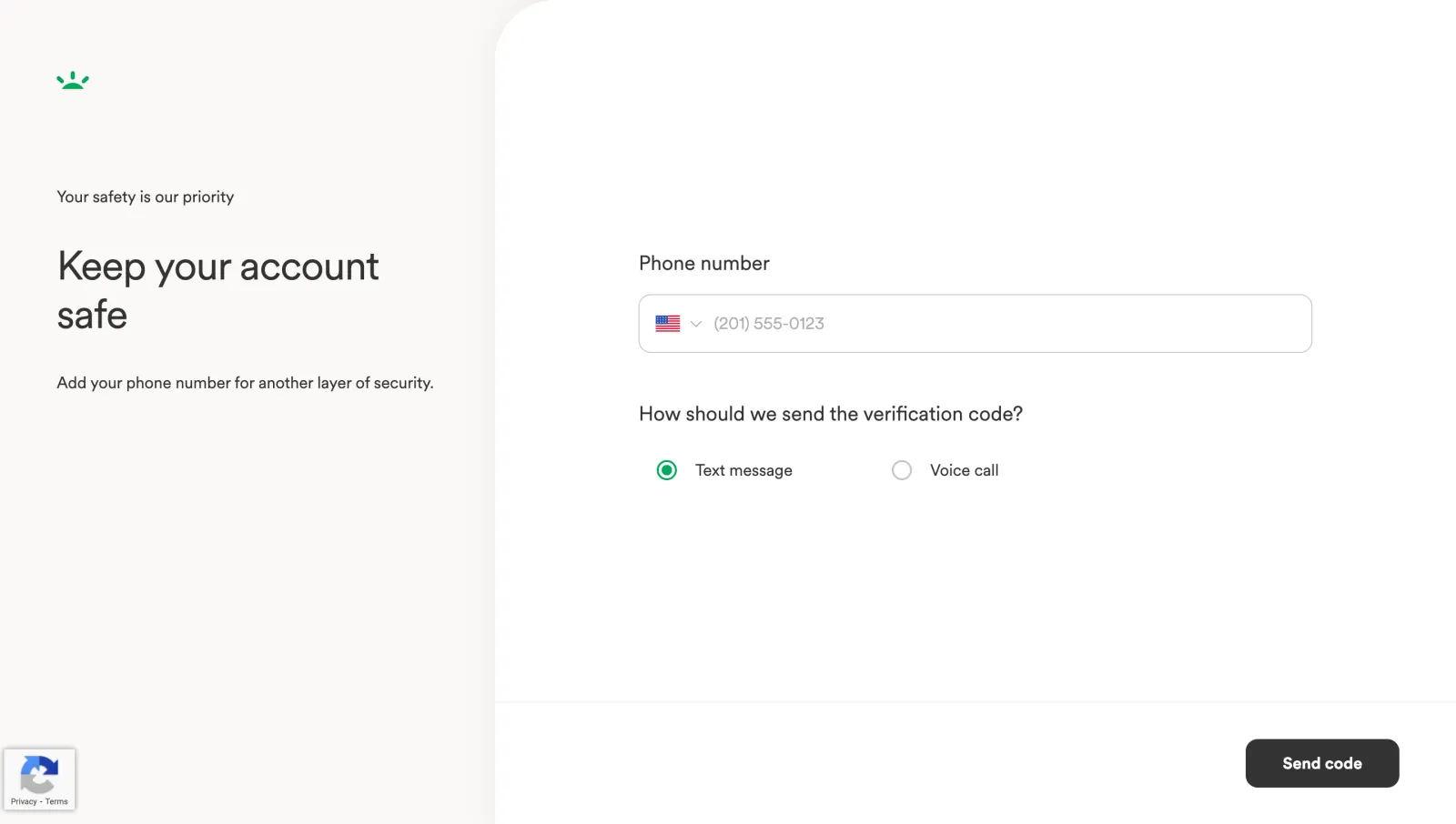
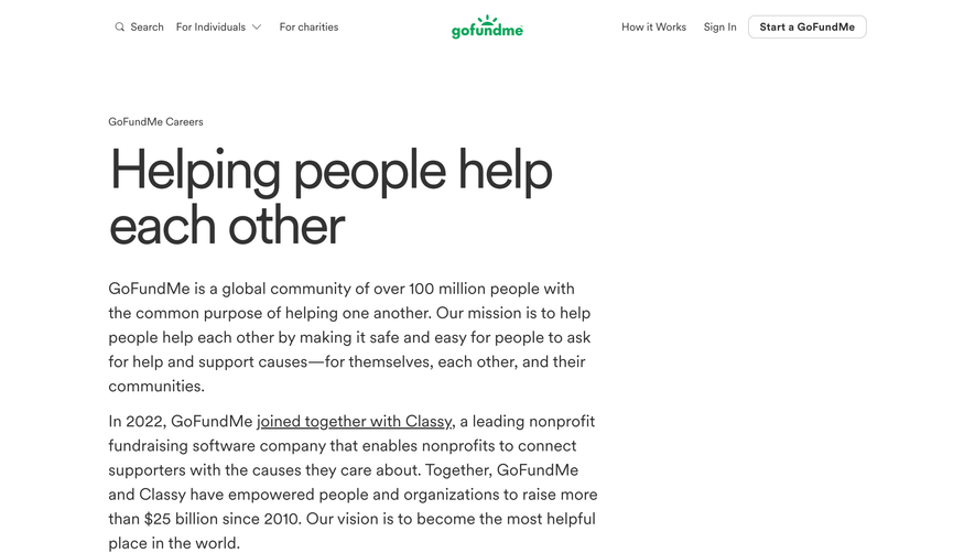
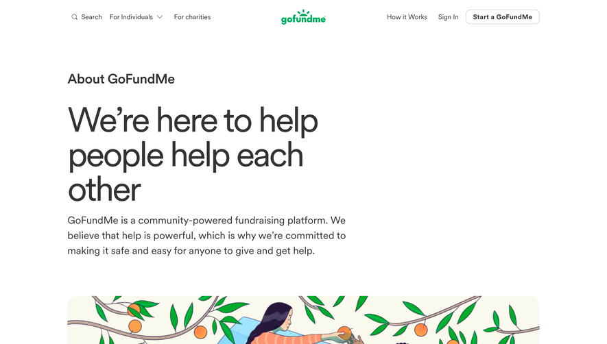
The two-panel design here is doing a lot of heavy lifting. Left side is pure reassurance copy on a warm cream background. Right side is all business with the actual form. That separation makes the whole thing feel less intimidating than a typical security setup screen.
Typography That Stays Out of the Way
"Keep your account safe" is set big and bold without screaming at you. The subtext underneath is small, quiet, almost conversational. It's the kind of hierarchy that lets you scan in under two seconds. The green sprout logo up top is tiny but memorable. Feels human.
The Details That Elevate It
Love how minimal the form is. One phone input with a flag dropdown, two radio buttons, one CTA. That's it. No clutter. The "Send code" button sits in dark charcoal at the bottom right, anchoring the whole page. The radio buttons use a subtle green fill that ties back to the brand mark. Even the reCAPTCHA badge is tucked away in the corner where it belongs. This is a page that respects your time and attention.
 SaaSFrame