Empty State
217
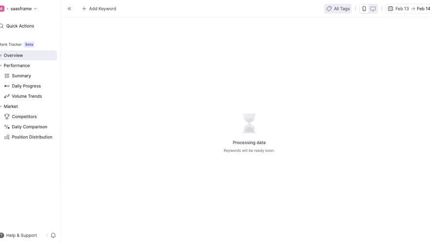
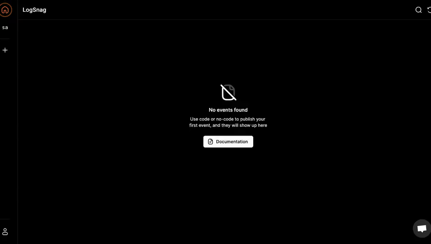
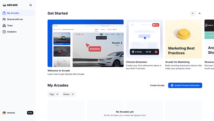
Guide new users with strategic SaaS Empty State patterns. Discover how to use illustrations and clear 'Call to Action' buttons to turn blank screens into helpful onboarding moments.

An empty state explains why an interface has no content to display and helps users understand what to do next. In SaaS products, it can appear before the first resource is created, before a search begins, after a queue is cleared, or when filters remove every visible item. The absence of content is only the starting condition; the design must identify its actual cause.
A useful empty state provides orientation without inventing a problem or pushing an irrelevant action. This guide analyzes captured interfaces from Context.dev, Oku, and Zeda.io. They show a first-resource creation state, an initial search surface, and a notification panel with nothing received yet. None of these captures proves a failed query or completed queue, so those situations are addressed as separate design requirements rather than attributed to the examples.
No content can mean several things. The user may not have created anything, the product may be waiting for a query, a selected filter may exclude available records, or there may genuinely be nothing requiring attention. A network failure, missing permission, or delayed integration can also leave a region blank, but those are not the same as an intentional empty state.
Define the state with the product team before drafting copy. Ask what is known about the collection, the user's access, the current filters, and the loading status. Do not display No items until the application has enough information to distinguish absence from a failed fetch.
The correct next action follows from that cause. First-use emptiness may need creation or import. An initial search may simply need input. A filtered empty list may need a reset. A successfully cleared queue may need no action at all. One generic illustration and a Create button cannot serve all of these purposes.
The Context.dev Batch scraping empty state capture has Batches selected in the sidebar. The central message describes scraping many pages together and explains creating a first batch from a list of URLs or by crawling a site, with Markdown or HTML mentioned as outputs. Create Batch is the primary action, and Read Docs is a secondary action. A batch-concurrency value and an Increase limit link appear below.
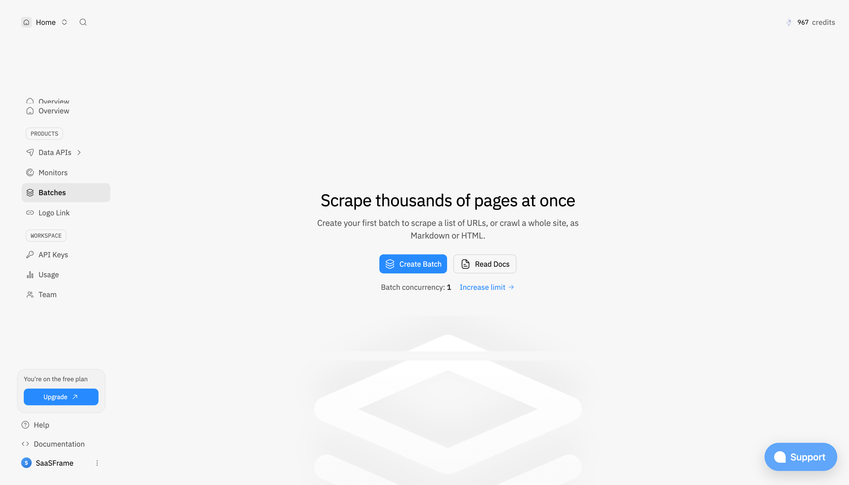
The useful decision is to explain what a batch enables rather than merely state that there are zero batches. A new user may understand the desired outcome without yet knowing the product's object terminology. The supporting sentence connects the object to inputs and outputs, helping someone judge whether this is the right area.
The two actions address different readiness levels. A user who already has a list of URLs can begin, while someone needing preparation can read documentation. The concurrency information may influence later planning, but it does not need to replace the immediate creation action. When adapting this layout, avoid allowing upgrade messaging to dominate before the user understands the capability.
The screenshot does not establish the batch limits, processing behavior, or contents of the creation flow. Keep those claims in the appropriate operational interface. The empty state should help users begin with accurate expectations rather than act as a complete technical specification.
The captured Oku Empty Search screen has Members selected beside a Books tab. Its input invites a search for Oku members. The central area says Search Oku and explains finding people in the community, with a reading-themed illustration lower down. No query is entered and no results are shown.
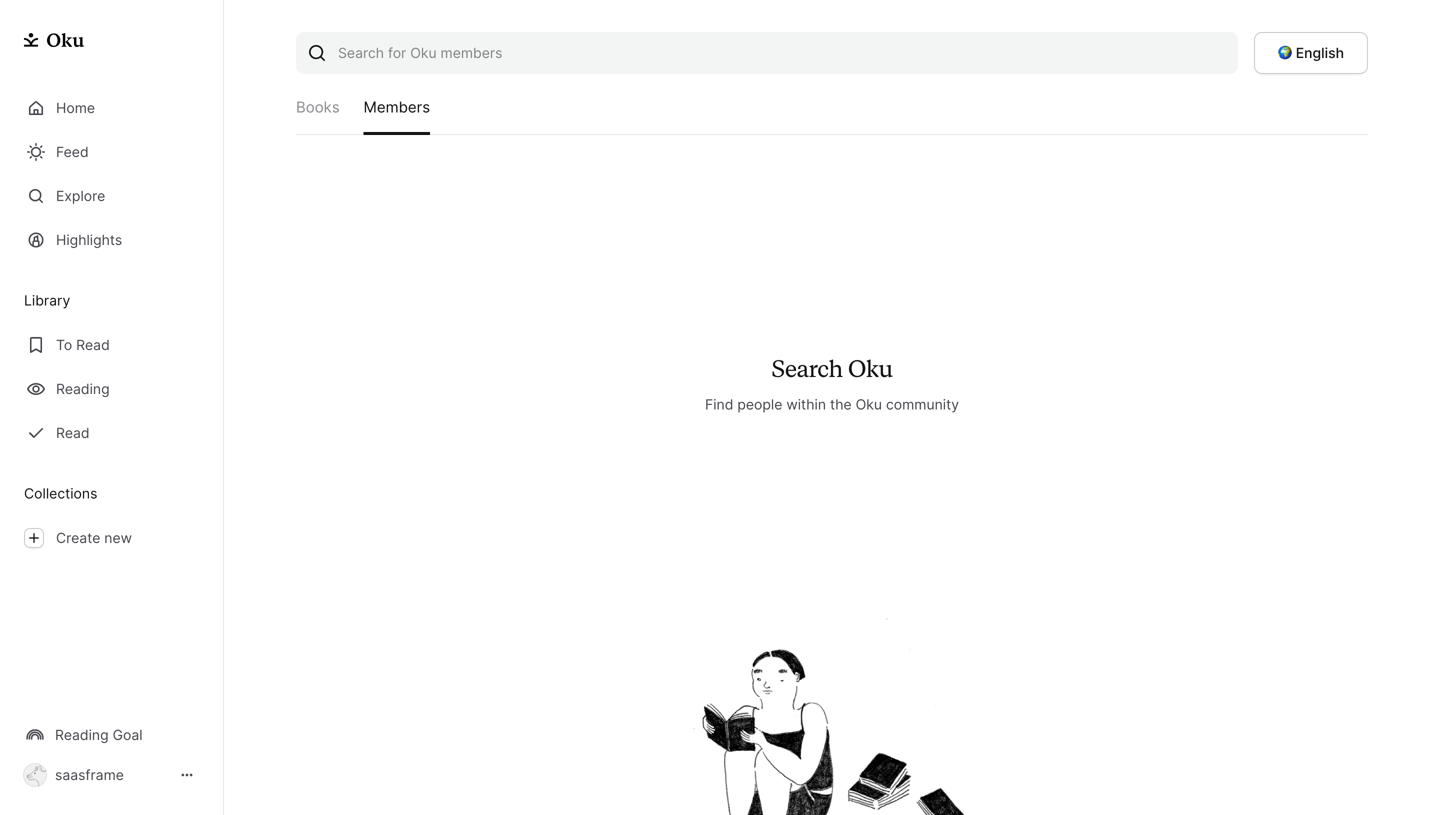
This is an input-waiting state. Its purpose is to explain the search scope and invite the first query. There is no reason to offer a retry, report an error, or suggest that the community has no members. The selected tab and field wording together identify what will be searched.
When designing a similar state, consider whether a simple instruction is enough or whether examples would help. A specialized database may need a sample identifier or supported query type. A familiar member search may need only a clear label. Keep the guidance proportional to the uncertainty rather than filling the space with unrelated promotional content.
After the user enters a query, the message should change to reflect the result. Preserve the query and explain whether there are no matches or whether a filter restricts the search. The selected capture does not demonstrate that later state. See Search for the result and recovery decisions that follow this initial screen.
The Zeda.io Empty Notifications Modal capture shows a Notifications panel with Important, All, and Archived tabs. All is selected. Its central message says there are no new notifications, and supporting text specifies that the user has not received a notification yet. An illustration occupies much of the panel, while the feedback screen remains visible behind it.
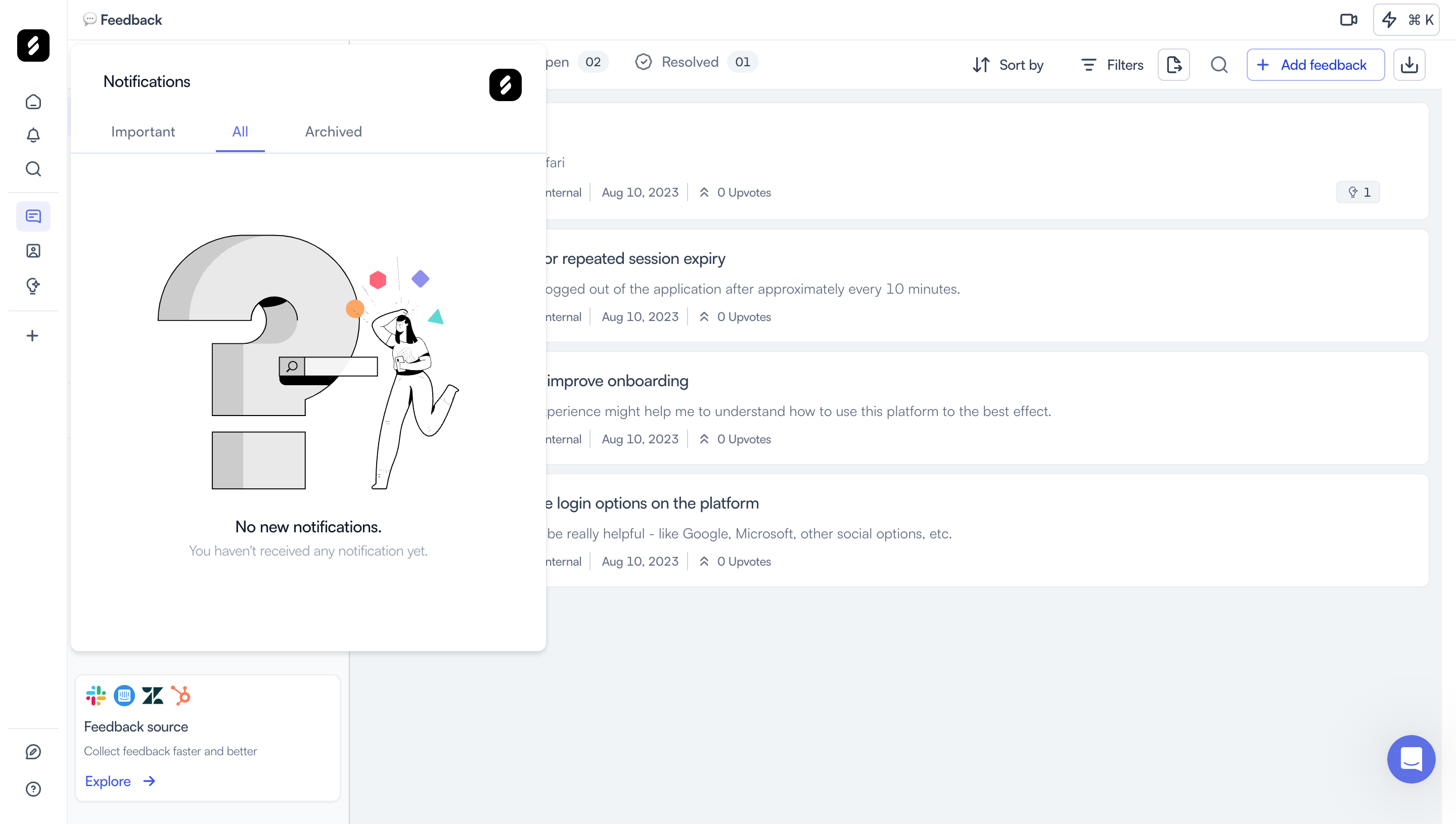
The second sentence supplies a more precise cause than the heading alone. No new notifications could otherwise mean that earlier items have been read or archived. Specifying that nothing has been received yet helps establish the current situation.
This state does not need to manufacture a task solely to fill the panel. Users may simply return to their work. An implementation could explain which events will appear if that information is useful, but it should not require people to generate notifications for their own sake. For the attention-management rules around received items, compare Notification Center.
A headline should identify the state or opportunity in familiar language. Supporting text can explain the cause, prerequisite, or expected next step. An action should let the user change that state when doing so supports their goal. These elements do not all have to appear in every empty region.
A first-use dashboard often benefits from a concrete creation action. A compact empty subpanel may need only a sentence. A completed queue can acknowledge the absence of remaining work without a button. Avoid forcing every empty state into a large illustration, two paragraphs, and several competing calls to action.
Prefer action labels that name the operation and object. Create Batch is more informative than Get started because it predicts the next task. If the user must connect a source before content can appear, name that connection rather than offer an unrelated manual creation path.
Explain prerequisites before the click when they affect readiness. A user may need a file, administrator access, a connected account, or another team member's input. Do not send them into an empty creation flow merely to reveal an avoidable blocker.
A filtered list can show zero rows even though the workspace contains many records. Retain the filters and explain that no items match the current view. Provide a clear way to remove constraints. A generic No records message can make users believe their data disappeared.
Scope matters too. An empty project is different from an empty organization. Show the current resource context and avoid suggesting cross-workspace absence unless the product actually knows it. If content exists elsewhere, a permitted route to the relevant context may be more useful than creating a duplicate.
For date-based dashboards, identify the selected period. No activity this week can be entirely expected even when historical activity exists. Encourage changing the range when appropriate, while preserving the user's choice if the purpose is to inspect a genuinely quiet period.
Search and filtering should not become automatic excuses to recommend creation. Before offering Add new, help users broaden the view or inspect their constraints. The right recovery action addresses why existing content is absent from this particular screen.
Loading means the product does not yet know what to display. An error means it could not establish the result. Restricted access means the user cannot see or perform something. These states can occupy the same area as empty content, but their messages and recovery routes must differ.
Do not show an empty success state while a request is still pending. A brief incorrect flash can suggest lost data before the real list arrives. If cached content is available, explain freshness where relevant rather than replacing it with an optimistic blank state.
A failed integration may need reconnection or a status check. An unavailable permission may need an administrator route. An ineligible plan may need an explanation of the capability boundary. Avoid hiding those causes behind an illustration and a disabled Create button.
Also avoid revealing unauthorized resource existence through overly specific empty-state messages. Describe the user's available scope and permitted next step. The state should be accurate without becoming a separate source of information that bypasses the product's access rules.
A sample can explain the shape of future content, especially in an analytics dashboard or unfamiliar resource type. Label it clearly and keep it separate from live records. Users should not mistake sample metrics, placeholder tasks, or fabricated customers for their own workspace data.
If a demo can be removed or replaced with real content, make that transition predictable. A sample should help users understand the next action, not leave them cleaning up records that were created without a clear choice.
Illustrations can make a sparse screen feel intentional, but the message must remain understandable without the image. Match the tone to the situation. A celebratory picture may suit a cleared queue; it is misleading when the system failed to load a critical report. Oku's reading illustration supports the surrounding product context while the text carries the search instruction.
Check whether large artwork pushes the useful action below the fold on smaller screens. The visual should support orientation rather than consume the only space where the user could find a creation or recovery control.
The first successful action should replace the introductory state with the appropriate content and feedback. Show the created object or processing state rather than leaving an outdated invitation to create the first item. If creation is asynchronous, distinguish acceptance from readiness.
When users delete the last item, they are no longer first-time users. They may need a neutral message and a creation route, not the full introduction again. When a queue is cleared, acknowledge the actual achievement only if the product can establish it. Zero visible items under a filter is not proof that every task is complete.
Keep returning users in mind. An empty area may represent a deliberate choice, such as an unused optional feature. Avoid repeatedly treating that choice as a defect or reopening onboarding prompts. Provide help when needed without insisting that every module must contain data.
Use readable text, meaningful action labels, and an appropriate heading structure. Keep essential information out of decorative images. If an illustration adds no information beyond the adjacent copy, handle its alternative text accordingly rather than repeating the full message.
When a region changes after a filter, deletion, or creation, preserve a logical focus position and communicate the outcome where needed. W3C's user notification guidance is a useful reference for clear success and error feedback. Do not use an intrusive announcement for every routine empty region if it disrupts the user's task.
Test keyboard access to primary and secondary actions, large text, translation, and narrow layouts. A concise empty state should remain useful when artwork is hidden or the page is zoomed. The selected screenshots show visual layouts and do not establish the accessibility of their implementations.
Test a new workspace, a filter that excludes all records, deletion of the final item, an unavailable connection, and a successful first creation. Ask users to explain the absence and choose a next step. If they believe the product is broken when it is waiting for input, or believe no data exists when a filter is active, the diagnosis needs revision.
No. Add an action when it helps the user reach a relevant outcome. Context.dev's first-batch state benefits from creation and documentation routes. An empty notification panel may simply confirm that there is nothing to review.
An empty state describes a known absence of content. A loading state indicates that the product is still establishing what exists. Keep them distinct so users do not mistake a pending request or failure for a genuinely empty collection.
Before a query, explain the scope and invite input, as Oku's capture does. After a query, preserve the search and describe the absence of matches or active constraints. A failure needs a separate explanation and recovery route.
Samples can explain an unfamiliar result, but label them clearly and keep them separate from real records. Provide a predictable route to connect or create actual content. Avoid using plausible-looking numbers that users may interpret as their own performance.
It can explain the value of a resource and offer the first relevant action at the moment the user reaches that area. Keep the message tied to the local task rather than turning every empty panel into a general product pitch.
Compare Context.dev, Oku, and Zeda.io according to the reason each area is empty. The strongest design explains that reason accurately and supports the next useful decision, even when the right decision is simply to return to existing work.