 SaaSFrame
 Cloudflare
 Webflow
Websites 6
All websites
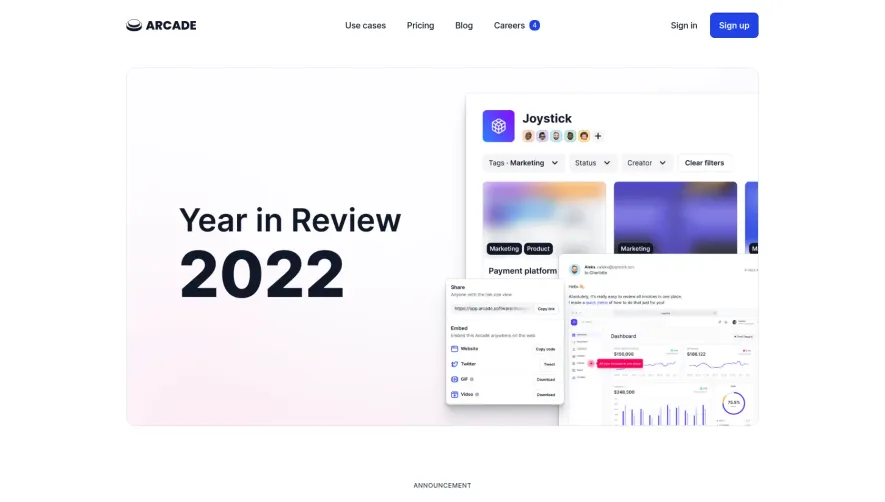
Index of all 6 Arcade websites examples
Products 12
All products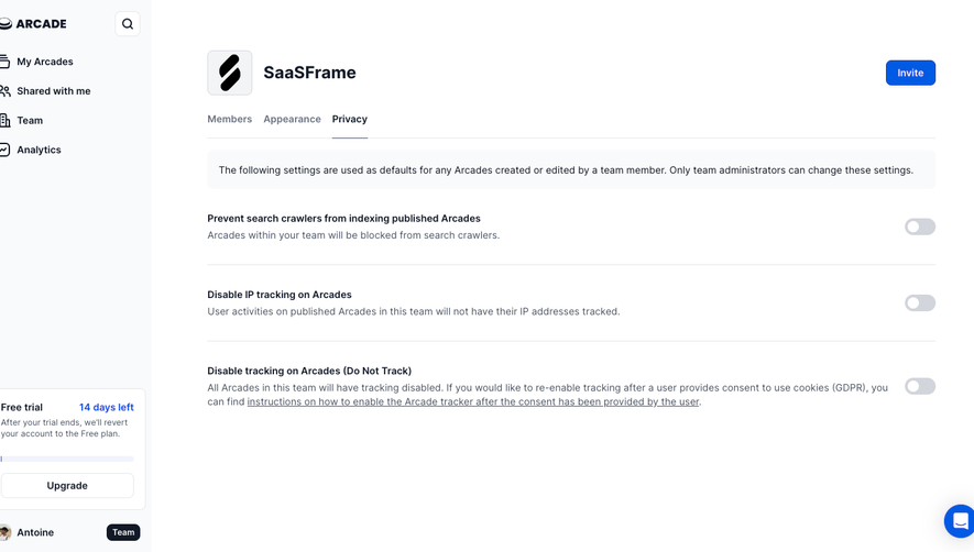
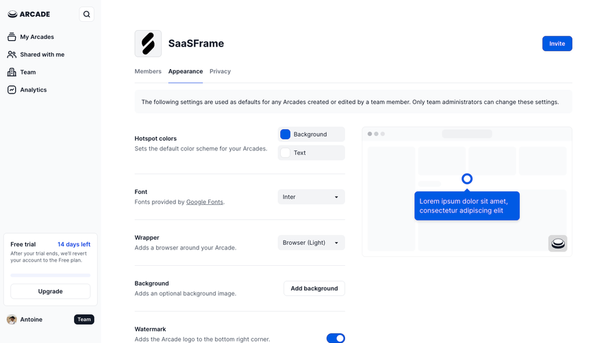
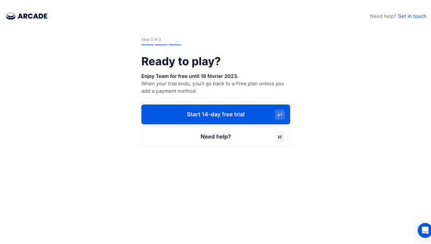
Website sections 1
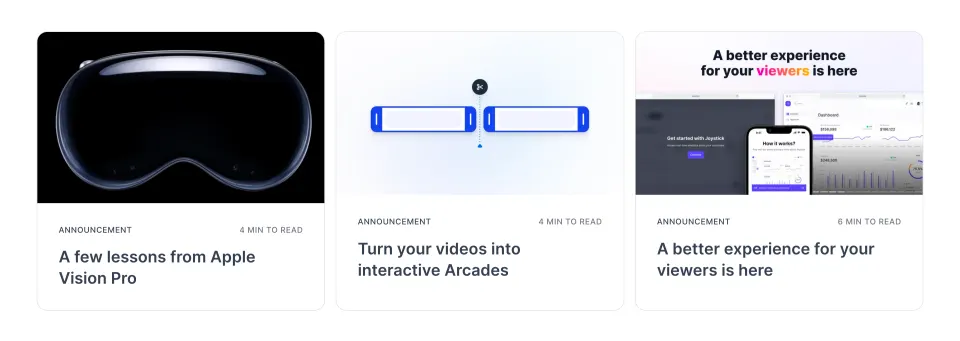
Design reference
Arcade — design reference
Source: https://www.arcade.software/. Extracted 2026-10-14. Scope: public marketing website CSS; declared styles, not computed browser values. This is an observed inventory, not an official internal design system.
Typography
font-family: Arial,sans-serif— selectorbodyfont-family: Inter Variable,Arial,sans-serif— selectorbodyfont-family: Geist Mono Variable,Arial,sans-serif— selector.text-block-56font-family: var(--_new-brand---content)— selector.btnfont-family: var(--_new-brand---heading)— selector.heading-1font-size: 2em— selectorh1font-size: 14px— selectorbodyfont-size: 38px— selectorh1font-size: 32px— selectorh2font-size: 24px— selectorh3font-size: 18px— selectorh4font-size: 12px— selectorh6font-weight: 700— selectorh1,h2,h3,h4,h5,h6font-weight: 600— selectorh1font-weight: 500— selectorh2font-weight: 900— selector.title-2line-height: 20px— selectorbodyline-height: 44px— selectorh1line-height: 36px— selectorh2line-height: 30px— selectorh3line-height: 24px— selectorh4line-height: 18px— selectorh6line-height: 1.4— selectorbodyletter-spacing: -0.02em— selectorh1letter-spacing: -0.015em— selectorh2letter-spacing: -0.01em— selectorh3, h4, h5letter-spacing: -0.0075em— selectorh4letter-spacing: -0.005em— selectorh5letter-spacing: 0— selector.text-2xlletter-spacing: .5px— selector.blog-card_timeletter-spacing: -.01em— selector.customer-card_link
Colors and surfaces
color: unset— selector.text-gradientcolor: hsla(221, 41%, 20%, 0.9)— selector.hero-heading.typing-animcolor: #333— selectorbodycolor: var(--new-text-dim-black)— selectorbodybackground-color: white— selector#navbar.navbar-scrolledbackground-color: #2142E7— selector.url-to-demo-buttonbackground-color: #4460ED !important— selector.url-to-demo-button:hover, .url-to-demo-button:focus, .url-to-demo-button:focus-visiblebackground-color: #fff— selector.nav-link > .sub-nav-container .menu-dropbackground-color: #F9F9FB— selector.sub-nav-item:hoverbackground-color: rgba(17, 24, 39, 0.06)— selector.sub-nav-item:hover .nav-icon-parentbackground-color: #0000— selectora
Components and layout
border-radius: 16px— selector.blog-card\_img:beforeborder-radius: 50%— selector.video-play-button, .video-gen-playborder-radius: 72px— selector.url-to-demo-buttonborder-radius: 12px— selector.text-2xl.tool-openingborder-radius: 94px— selector.home-tabs_buttonborder-radius: 8px— selector.casestudy-logos_cardborder-radius: 19.4px— selector.aboutpage-title-wrapperbox-shadow: none— selector#navbarbox-shadow: 0 1px 0 rgba(0,0,0,0.1)— selector#navbar.navbar-scrolledbox-shadow: 0 0 0 1px rgba(17, 24, 39, 0.12), 0 2px 2px -2px rgba(17, 24, 39, 0.03), 0 4px 4px 0 rgba(17, 24, 39, 0.03), 0 8px 8px 0 rgba(17, 24, 39, 0.03), 0 16px 16px 0 rgba(17, 24, 39, 0.03)— selector.video-play-button, .video-gen-playbox-shadow: 0 0 0 1px #182FA5, 0 2px 2px -2px rgba(17, 24, 39, 0.04), 0 4px 4px 0 rgba(17, 24, 39, 0.04), 0 8px 8px 0 rgba(17, 24, 39, 0.04), 0 16px 16px 0 rgba(17, 24, 39, 0.04), 0 32px 32px 0 rgba(17, 24, 39, 0.04)— selector.url-to-demo-buttonbox-shadow: 0 0 0 1px #2142E7, 0 2px 2px -2px rgba(17, 24, 39, 0.04), 0 4px 4px 0 rgba(17, 24, 39, 0.04), 0 8px 8px 0 rgba(17, 24, 39, 0.04), 0 16px 16px 0 rgba(17, 24, 39, 0.04), 0 32px 32px 0 rgba(17, 24, 39, 0.04) !important— selector.url-to-demo-button:hover, .url-to-demo-button:focus, .url-to-demo-button:focus-visiblebox-shadow: 0px 16px 16px 0px rgba(17, 24, 39, 0.03), 0px 8px 8px 0px rgba(17, 24, 39, 0.03), 0px 4px 4px 0px rgba(17, 24, 39, 0.03), 0px 2px 2px -2px rgba(17, 24, 39, 0.03), 0px 0px 0px 1px rgba(17, 24, 39, 0.12)— selector.nav-link > .sub-nav-container .menu-dropbox-shadow: 0 32px 32px #1118270a,0 16px 16px #1118270a,0 8px 8px #1118270a,0 4px 4px -2px #1118270a,0 2px 2px -1px #1118270a,0 0 0 1px #182fa5— selector.buttonbox-shadow: 0 32px 32px #11182700,0 16px 16px #11182700,0 8px 8px -4px #1118270a,0 4px 4px -2px #1118270a,0 2px 2px -1px #1118270a,0 0 0 1px #2142e7— selector.button:hovermax-width: 90%— selector.text-2xl.mb-0.sub-adventure.anim-slidefade-speed-2max-width: 1330px— selector.big-containermax-width: 580px— selector.hero-contentmax-width: 600px— selector.hero-content.cc-blogpadding: 0— selector.url-to-demo-buttonpadding: 4px— selector.nav-link > .sub-nav-container .menu-droppadding: 0 1rem— selector.buttonpadding: 0 24px— selector.button.button-linkgap: 0rem !important— selector.logo-context-menu .sub-nav-itemtransition: background-color 150ms ease-in— selector#navbartransition: all 0.2s cubic-bezier(0.6, 0.6, 0, 1)— selector.nav-arrowtransition: all 0.3s cubic-bezier(0.6, 0.6, 0, 1)— selector.type-icon-wrapper svg pathtransition: opacity 0.3s ease— selector.video-play-button, .video-gen-playtransition: all 0.2s cubic-bezier(0.16, 1, 0.3, 1)— selector.url-to-demo-buttontransition: all 260ms cubic-bezier(0.175, 0.885, 0.32, 1.275)— selector.url-to-demo-button-icontransition: all 200ms ease-out— selector.logo-context-menutransition: all 240ms ease— selector.sub-nav-item, .sub-nav-item .nav-icon-parent
Responsive rules
screen and (min-width: 991px)
screen and (max-width: 991px)
screen and (max-width: 1240px)
screen and (max-width: 1040px)
(min-width: 991px)
(max-width: 991px)
screen and (max-width:991px)
screen and (max-width:767px)
screen and (max-width:479px)
(min-width:768px)