Generate a new design based on this screen, using your own content.
Preview the prompt
# Design from Reference: Campsite User Onboarding

Create an original, high-fidelity visual design inspired by the reference. Prioritize composition, typography, colors, spacing and component styling over technical implementation.

## Reference

- **Product:** Campsite
- **Category:** User Onboarding
- **Screenshot:** https://media.saasframe.io/o/d15f994b6f52cbb5812e.webp

Analyze the screenshot first. If you can’t access it, ask me for it rather than guessing.

## Content

Write realistic placeholder content for a fictional SaaS product in the same category (no lorem ipsum).

Preserve essential messaging and factual accuracy. Adapt structure and copy length for visual balance; never invent product claims.

## Visual design

Use this context to reproduce the reference’s visual language: layout, typography, colors, spacing, borders, radii and distinctive elements. The screenshot takes priority if descriptions conflict.

### Overall aesthetic

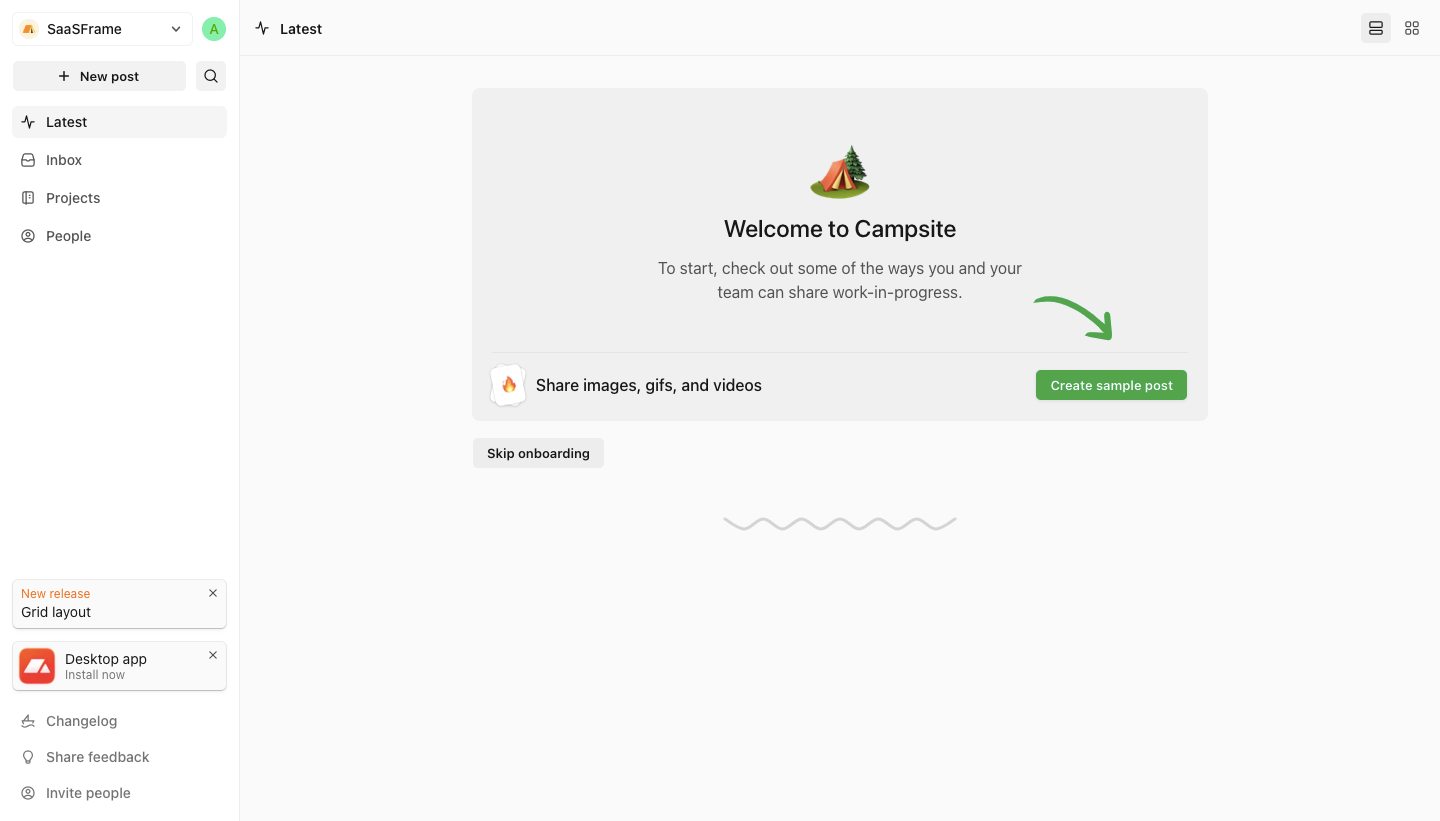
- **Style:** A light collaboration workspace uses near-white surfaces, gray navigation and a friendly green onboarding action.
- **Character:** Emoji imagery, a hand-drawn arrow and a small wavy divider soften the otherwise minimal application shell.

### Page composition

- **Capture:** The source measures 1440 × 821 pixels. Dimensions below approximate image pixels; CSS scale is unverified.
- **Sidebar:** A roughly 240-pixel white rail contains workspace selector, New post/search, four navigation rows and lower announcements/utilities.
- **Top bar:** Latest labels the main view, with two view-mode icons at right.
- **Onboarding panel:** A broad pale-gray rounded panel around 735 × 330 pixels sits centered in the upper main area.
- **Panel content:** Tent emoji, welcome title and short instruction appear above a divider; a media-sharing row and green sample-post action sit beneath.
- **Below:** Skip onboarding aligns left below the panel; a centered gray wave appears further down.

### Information hierarchy

- **Welcome:** A centered title and emoji introduce the onboarding task.
- **Instruction:** Two muted lines describe sharing work in progress.
- **Action row:** Media-sharing label left and green Create sample post button right form the main task.
- **Secondary route:** Skip onboarding is a smaller gray button outside the panel.
- **Utilities:** Small release/install notices and sidebar links remain peripheral.

### Typography

- **Family:** Neutral sans serif; exact identity is unverified.
- **Welcome:** Approximately 24 pixels, medium weight.
- **Instructions:** Around 16 pixels with 23-pixel leading.
- **Action row:** Around 16 pixels; button label around 13 pixels semibold.
- **Navigation:** Around 14 pixels; notice copy around 12–14 pixels.

### Colors & surfaces

- **Measured base:** Near-white #FAFAFA, white #FFFFFF and light gray #F0F0F0 define the shell.
- **Variants:** #F5F5F5 and #EDEDED appear in subtle controls/boundaries.
- **Action:** Muted green fills the sample-post button and arrow; exact hex is unverified.
- **Ink:** Dark headings contrast with medium-gray helper/navigation text.
- **Depth:** Small notice cards have faint borders/shadows; the onboarding panel is flat.

### Components

- **Onboarding shell:** Pale-gray rounded rectangle with about 20-pixel inner side padding.
- **Media row:** Small flame/sticker icon, text and compact green action follow a thin horizontal divider.
- **Arrow:** A curved green hand-drawn arrow points toward the action.
- **Skip:** Small light-gray rounded rectangle.
- **Sidebar notices:** Two compact dismissible cards advertise release/install information.
- **Navigation:** Icon-led rows use a pale selected highlight for Latest.

### Visual rhythm

- **Spacing:** Broad vertical whitespace surrounds the panel.
- **Centering:** Welcome content is centered; lower action content uses opposing left/right alignment.
- **Density:** Compact sidebar content contrasts with the open main canvas.

### Responsive

- **Evidence:** Only desktop is shown; sample creation and mobile behavior are unverified.
- **Recommended shell:** Collapse sidebar navigation on narrow screens.
- **Panel:** Stack the media row and action when needed, keeping the arrow decorative.
- **Accessibility:** Preserve focus and clear labels for skip, dismiss and view controls.

### Adaptation guidance

- **Preserve:** Keep the quiet shell, friendly onboarding panel and single green action.
- **Implementation:** Separate onboarding, sample creation and persistent navigation.
- **Scope:** No sample post has been created in the image.
- **Behavior:** Define progression and skip states explicitly.

## Direction

Keep the reference’s visual language (type, color, spacing, radii) but adapt the layout freely to the content.

## Output

Produce a high-fidelity static visual mockup of the full screen.

Deliver a polished, cohesive design with precise alignment, hierarchy and spacing. Produce the requested visual artifact, not just a description. If unsupported, explain the limitation.
 SaaSFrame