
Thank you! Your submission has been received!
Oops! Something went wrong while submitting the form.
Get SaaSFrame Pro
Monthly
$18
Quarterly
$48
Yearly
$180
Upgrade to access this feature
Browse all screens & flows
Filter and search screens & flows
Access Figma files
Access mobile versions
Bookmark screens & flows
Join now
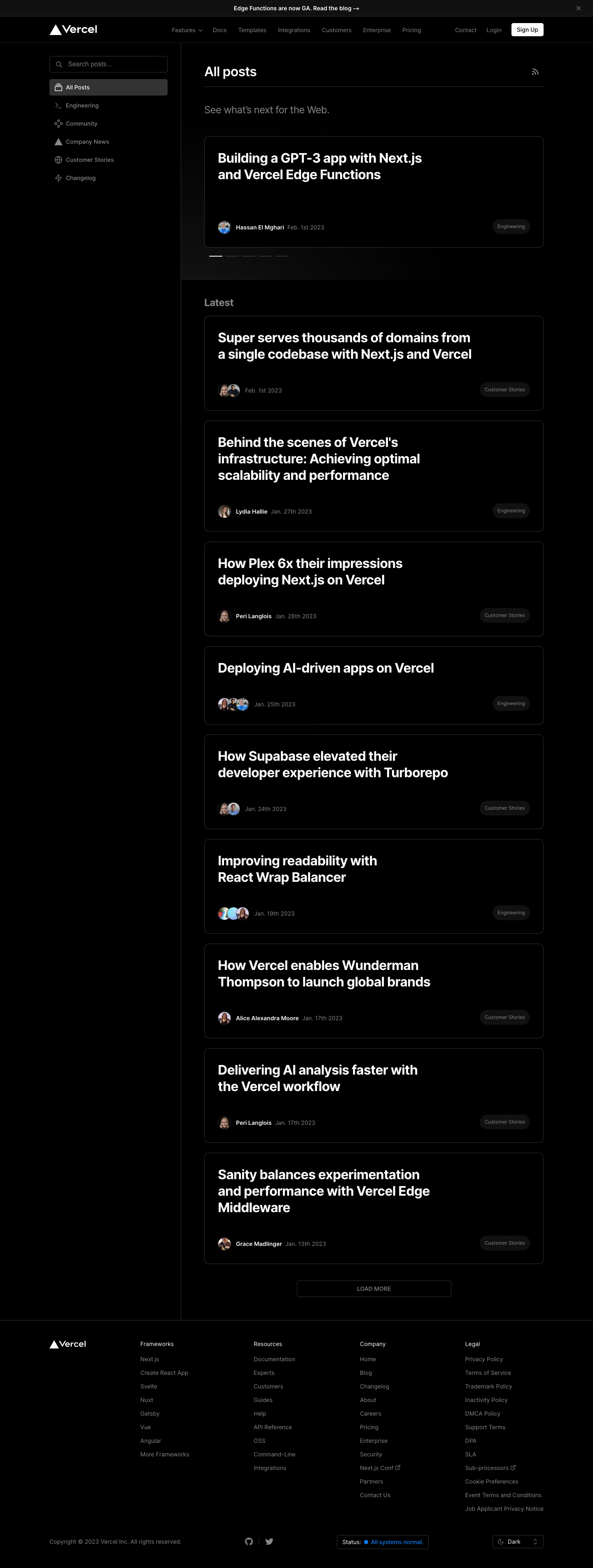

Vercel Blog Feed

Vercel
Build Fast and Reliable Sites
Designed by
No items found.

Bookmark
Bookmark

Design with AI
Thank you! Your submission has been received!
Oops! Something went wrong while submitting the form.
# Design from Reference: Vercel Blog Feed
Create an original, high-fidelity visual design inspired by the reference. Prioritize composition, typography, colors, spacing, and component styling over technical implementation.
## Reference
- **Product:** Vercel
- **Category:** Blog Feed
- **Screenshot:** https://cdn.prod.website-files.com/5e9dc792e1210c5325f7ebbc/6acbbebd39e7f22db4028825_6acbbdfeaa23dc1cf5a92b89_cms-2454363200ab6d3ceb4f6acd.webp
Analyze the screenshot first. If inaccessible, request it rather than guessing.
## Content
{{content.instructions}}
{{content.data}}
Preserve essential messaging and factual accuracy. Adapt structure and copy length for visual balance; never invent product claims.
## Visual Design
### Overall aesthetic
- **Style:** Minimal dark developer-publication interface with stark white article titles and almost entirely black surfaces.
- **Character:** Sparse imagery, thin outlines, subdued metadata, and broad empty spaces give the feed a technical editorial tone.
- **Decoration:** Small avatars, category icons, a restrained spotlight-like glow behind the featured region, and a blue system-status accent supply limited visual variation.
### Page composition
- **Capture and scale:** 1440 × 3807 image px. Estimated CSS dimensions assume a roughly 1× capture; this scale is unverified.
- **Top bars:** Slim announcement band above a horizontal brand/navigation row, separated by fine dark-gray rules.
- **Main container:** Approximately 1200px wide, centered with about 120px side margins.
- **Sidebar:** Roughly 320px wide with search field and six category rows. A vertical rule separates it from the feed and continues down to the footer.
- **Feed:** Approximately 824px wide with an inset near 56px from the separator. Heading and RSS icon sit above a rule and muted introductory sentence.
- **Featured region:** One tall outlined article card followed by five short carousel indicators. A broad band separates this region from Latest.
- **Article list:** Single column of outlined cards with large titles, lower-left author/date metadata, and lower-right category pills.
- **Footer:** Full-width top rule; brand plus four link columns, then copyright, social icons, a status control, and a dark-theme selector along the bottom.
### Information hierarchy
- **Page identity:** White All posts heading is the primary section label; the active sidebar category repeats that state.
- **Article emphasis:** Bold titles dominate every card. Thumbnail photography is absent from the card bodies.
- **Metadata priority:** Small circular avatars and dates remain secondary, with category pills pushed to the opposite corner.
- **Feed progression:** Featured story and carousel markers precede the Latest list, ending in a centered outlined Load more control.
- **Global actions:** The white signup button contrasts strongly with quieter contact and login links in the header.
### Typography
- **Family:** Neutral proportional sans serif; exact font family is unverified.
- **Page and article headings:** Approximately 32px bold with 40px line-height and slightly negative tracking; longer titles wrap over two or three lines.
- **Introductory sentence:** Approximately 24px regular in muted gray.
- **Latest label:** Approximately 24px semibold, with less contrast than the article titles.
- **Navigation and metadata:** Approximately 14px regular; author labels use stronger white or semibold emphasis.
- **Pills and footer:** Category labels approximately 12px; footer links around 14px with roughly 32px vertical pitch.
- **Precision:** Font sizes, weights, and spacing are reconstruction estimates based on pixels, not verified CSS declarations.
### Colors & surfaces
- **Page and card canvas:** Sampled #000000; cards are distinguished primarily by outlines.
- **Secondary dark fill:** Sampled #111111 in low-contrast interface surfaces such as category pills and the top announcement area.
- **Selected category:** Sampled #333333, noticeably lighter than the surrounding black.
- **Headings and primary action:** Sampled #FFFFFF on text and the signup button.
- **Borders and muted roles:** Dark-gray outlines and medium-gray navigation/metadata create a restrained contrast ladder.
- **Status accent:** Sampled #127CEF appears in the small blue footer-status treatment, contrasting with the otherwise neutral interface.
- **Sampling:** Listed hex values are measured screenshot colors; antialiased text and the subtle featured glow produce additional nearby shades.
### Components
- **Search field:** Approximately 288 × 40px, black fill, thin gray border, small radius, leading magnifier, and muted placeholder.
- **Category rows:** Roughly 40px high with leading line icons and about 12px horizontal padding. The active row has a filled gray rounded rectangle.
- **Featured card:** About 824 × 270px with a 1px outline, approximately 12px radius, and 32px inner padding.
- **Feed cards:** Similar width and treatment, generally about 190–270px tall depending on title wrapping; metadata anchors their bottom edge.
- **Avatar groups:** Small circular photos around 28–32px, sometimes overlapping for multiple authors.
- **Category pills:** Dark fill, fully rounded ends, small muted labels, approximately 36px height.
- **Carousel markers:** Five short horizontal strokes; the first is white and the others dark gray. Only the captured selection is evidenced.
- **Load more:** Centered outlined rectangle about 375px wide and 40px tall with small uppercase muted label.
- **Footer controls:** Outlined system-status capsule and compact theme selector; no open selector or alternate theme is shown.
### Visual rhythm
- **List spacing:** Approximately 24px gaps separate cards; consistent left padding aligns all titles and metadata.
- **Internal whitespace:** Large blank areas between title and metadata keep the article units spacious despite their repeated structure.
- **Column contrast:** A compact category list balances the broad, vertically extended feed.
- **Featured separation:** Carousel strokes and a larger gap clearly distinguish the featured item from chronological content.
- **Footer spacing:** Large top/bottom padding and evenly spaced link columns continue the open layout.
### Responsive
- **Observed state:** Desktop dark theme only; mobile and interaction behavior are unverified.
- **Navigation recommendation:** Collapse global navigation and convert sidebar categories into an accessible filter menu or wrapping tabs.
- **Feed recommendation:** Use a single fluid column with 20–24px side padding; reduce large titles toward 24–28px.
- **Metadata recommendation:** Allow category pills to move below author/date details rather than overlap on narrow cards.
- **Footer recommendation:** Wrap columns and stack status/theme controls while maintaining legible contrast.
### Adaptation guidance
- **Preserve:** Black canvas, strong white title hierarchy, outlined text-led cards, quiet metadata, and explicit category selection.
- **Starting dimensions:** Approximately 1200px overall width, 824px feed, 32px card padding, 12px radii, and 24px list gaps under the unverified 1× assumption.
- **Content fidelity:** Populate titles, authors, dates, and categories from supplied editorial data; keep avatars as supporting identity.
- **Contrast refinement:** Maintain the subdued hierarchy while testing muted text and outlines for practical readability.
- **Interaction recommendation:** Implement search, filters, carousel indicators, pagination, and theme selection with keyboard focus and accessible labels; the screenshot alone does not verify their operation.
Use this context to reproduce the reference's visual language: layout, typography, colors, spacing, borders, radii, and distinctive elements. The screenshot takes priority if descriptions conflict.
## Direction
{{preferences.fidelityInstructions}}
## Output
{{output.instructions}}
Deliver a polished, cohesive design with precise alignment, hierarchy, and spacing. Produce the requested visual artifact, not just a description. If unsupported, explain the limitation.


Category
Patterns
No items found.
Tech Stack




Added on
February 5, 2023
Similar screens
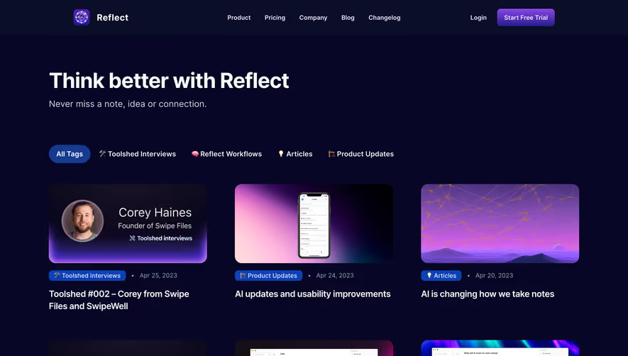




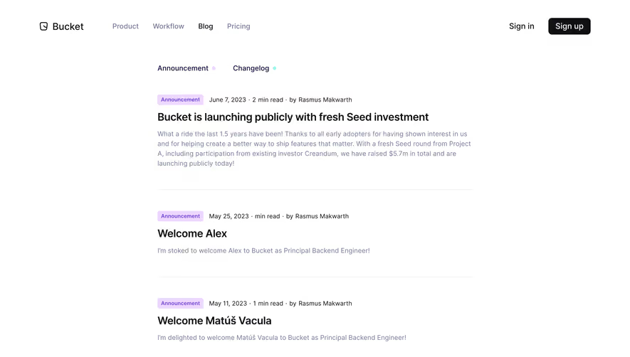

Upgrade to SaaSFrame Pro now to see similar examples.
Monthly
$18 /month
Billed $18 monthly
Browse all screens & flows
Filter and search screens & flows
Search text in screenshots
Access Figma files
Access mobile versions
Join now
Quarterly
$16 /month
Billed $48 quarterly
Browse all screens & flows
Filter and search screens & flows
Search text in screenshots
Access Figma files
Access mobile versions
Join now
Yearly
$15 /month
Billed $180 yearly
Browse all screens & flows
Filter and search screens & flows
Search text in screenshots
Access Figma files
Access mobile versions
Join now