Generate a new design based on this screen using your own content.
Thank you! Your submission has been received!
Oops! Something went wrong while submitting the form.
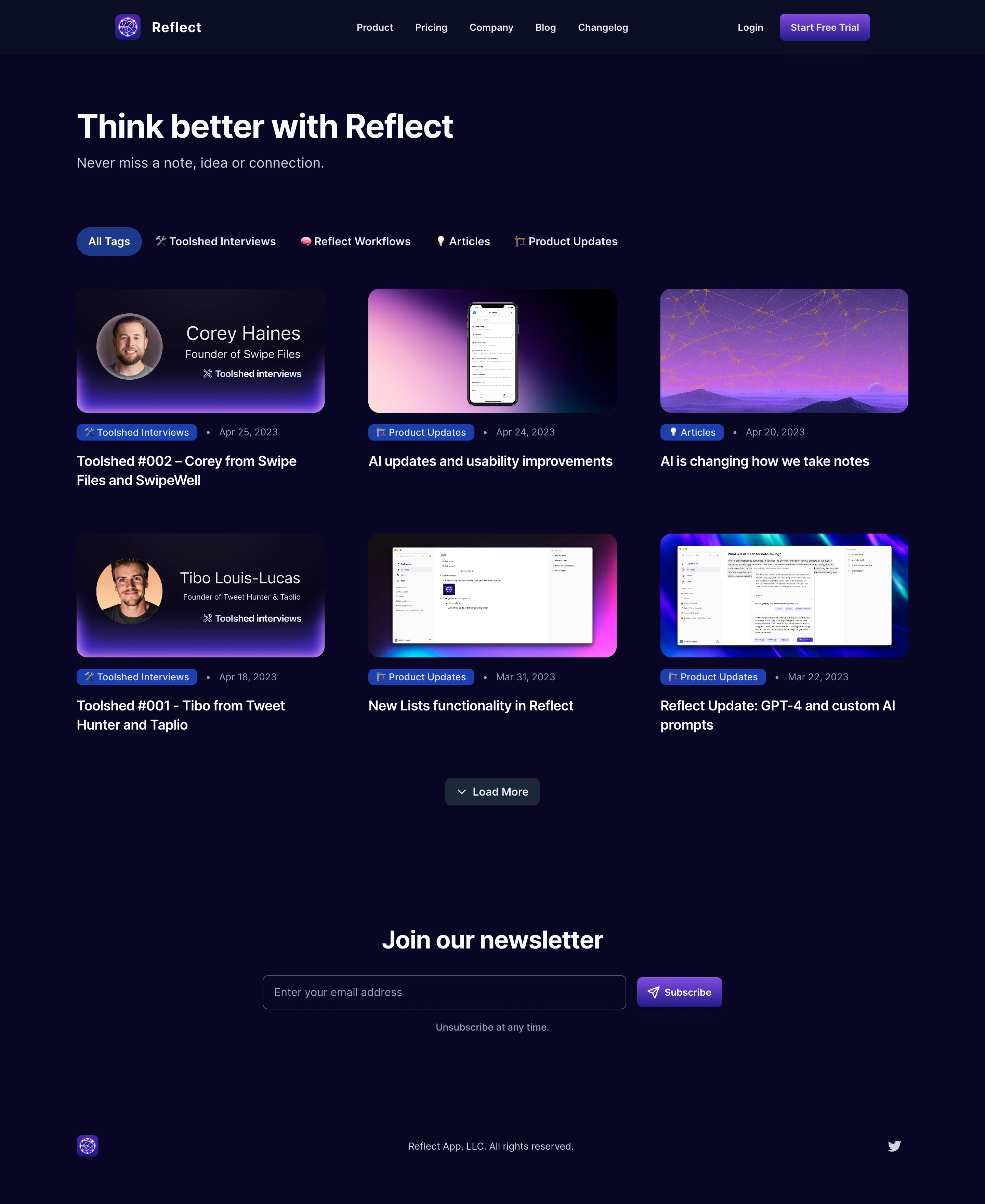
# Design from Reference: Reflect Blog Feed
Create an original, high-fidelity visual design inspired by the reference. Prioritize composition, typography, colors, spacing, and component styling over technical implementation.
## Reference
- **Product:** Reflect
- **Category:** Blog Feed
- **Screenshot:** https://cdn.prod.website-files.com/5e9dc792e1210c5325f7ebbc/6acb6d8bb206c0d3f8f3a085_6acb6b9d834771b57d155247_cms-e43d28b98fb3d3dabc74617e.webp
Analyze the screenshot first. If inaccessible, request it rather than guessing.
## Content
{{content.instructions}}
{{content.data}}
Preserve essential messaging and factual accuracy. Adapt structure and copy length for visual balance; never invent product claims.
## Visual Design
Use this context to reproduce the reference's visual language: layout, typography, colors, spacing, borders, radii, and distinctive elements. The screenshot takes priority if descriptions conflict.
## Direction
{{preferences.fidelityInstructions}}
## Output
{{output.instructions}}
Deliver a polished, cohesive design with precise alignment, hierarchy, and spacing. Produce the requested visual artifact, not just a description. If unsupported, explain the limitation.
Reflect’s blog page embodies a beautifully minimalist and modern aesthetic, prioritizing clarity and breathing room. The interface feels professional yet approachable—crafted for focused reading, with an understated elegance that highlights content over decoration.
Layout and Structure
This page adopts a simple grid layout with a clean header, featuring a sticky navigation bar that reinforces brand presence. A prominent headline introduces the blog, immediately followed by a grid of article cards. Each card uses clear visual separation, concise text previews, and subtle hover states to guide users intuitively. There’s no intrusive hero section or salesy distractions—the content takes center stage.
Visual Elements
Visual cues are delivered through custom monochrome illustrations that bring warmth and personality without overwhelming. Compact author avatars and date stamps lend credibility, while elegant card shadows add depth. No animations or videos divert attention; instead, subtle iconography and whitespace provide structure and visual relief.
Color Palette and Typography
The palette is soothingly neutral—predominantly soft whites and cool grays, punctuated by trademark blue accents for highlights and CTAs. Typography is crisp and contemporary, leveraging a high-contrast sans-serif for headlines and comfortable line heights for legibility. Hierarchy is clear yet gentle, with careful sizing and weight distinctions.
User Experience Patterns
Navigation is frictionless thanks to a sticky header and a simple, uncluttered menu. Calls-to-action are rare and intentionally non-disruptive, respecting the reader’s purpose. Article cards act as large, clickable areas, enhancing accessibility and mobile usability.
Unique or Notable Design Choices
Standouts include the restraint in visual elements—choosing monochrome illustrations over stock photos showcases brand personality and intentionality. The overall tone exudes trustworthiness, innovation, and a mindful, focused energy—ideal inspiration for SaaS products valuing both beauty and utility.