Prompt 1,192 words Copy
# Design from Reference: Hiver Pricing Page

Create an original, high-fidelity visual design inspired by the reference. Prioritize composition, typography, colors, spacing, and component styling over technical implementation.

## Reference

- **Product:** Hiver
- **Category:** Pricing Page
- **Screenshot:** attached to this message (also available at https://media.saasframe.io/o/af761c2f8b5902bf7a88.webp)
- **Source:** https://hiverhq.com/pricing

Analyze the attached screenshot first. If no image is attached, open the screenshot link; if neither is accessible, ask for it rather than guessing.

## Visual Design Context

### Overall aesthetic

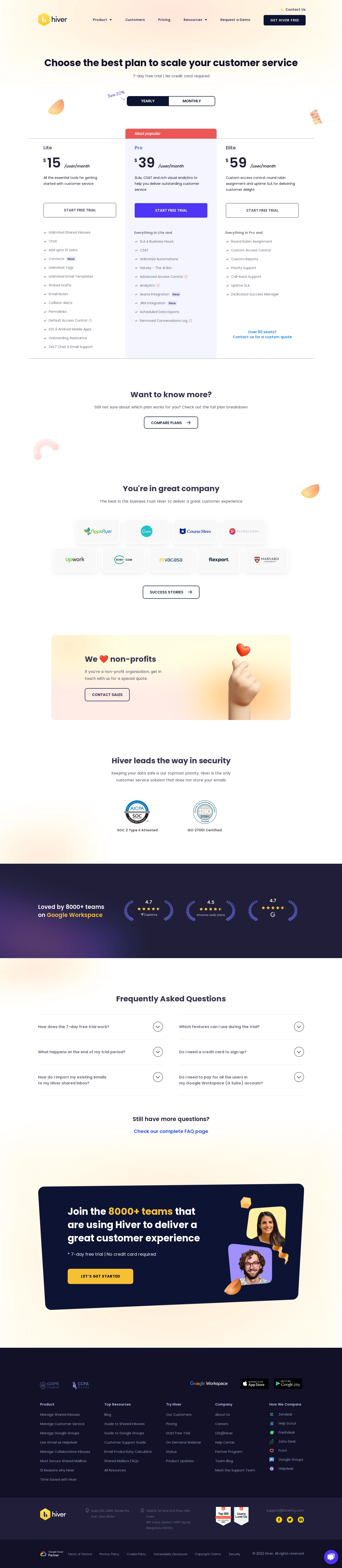
- **Character:** A spacious pricing page blends dark navy typography, purple conversion accents and warm peach/yellow decorative gradients.
- **Personality:** Small glossy three-dimensional shapes and a nonprofit hand/heart illustration soften an otherwise structured plan comparison.

### Page composition

- **Capture:** The original is 1440 × 6592 image pixels, inspected through the footer. Dimensions below approximate image pixels; CSS scale is unverified.
- **Opening:** A brand/navigation header sits over a pale warm glow. A centered headline and trial note lead to a yearly/monthly segmented control.
- **Plans:** Three equal columns present Lite, Pro and Elite; the middle Pro column has a pale lavender background and coral popular-plan ribbon.
- **Supporting sections:** A comparison prompt precedes a two-row customer-logo grid, a warm nonprofit banner and a centered security-badge section.
- **Trust and questions:** A full-width dark ratings band leads into six collapsed FAQ rows arranged in two columns and a link to further questions.
- **Closing:** A large slightly tilted navy signup panel combines text, yellow CTA and two portrait tiles. A dense dark footer follows in several horizontal bands.

### Information hierarchy

- **Plan choice:** The centered headline and billing switch establish the task before large per-user prices.
- **Recommended tier:** Pro receives a colored column, ribbon and filled purple button, while neighboring plan buttons remain outlined.
- **Feature scanning:** Checkmark lists descend beneath aligned descriptions and actions; small New badges and information icons mark selected entries.
- **Trust sequence:** Customer logos, nonprofit offer, security badges and ratings build distinct evidence layers before FAQs and final signup.

### Typography

- **Family:** Rounded geometric sans-serif forms appear throughout; exact identity is unverified.
- **Headings:** Opening headline is approximately 40 pixels and bold; section headings are around 32 pixels with compact leading.
- **Prices:** Large roughly 56-pixel bold numerals pair with much smaller currency marks and italic per-user/month notation.
- **Reading text:** Plan descriptions and body copy are around 15–17 pixels with 25-pixel leading; feature lists use approximately 14–15 pixels.
- **Controls:** Uppercase CTA labels are around 14 pixels, semibold with expanded tracking. Footer headings are small and stronger than muted links.

### Colors & surfaces

- **Measured base:** White #FFFFFF dominates the main page; the highlighted plan uses pale lavender #F4F5FF.
- **Measured dark palette:** #121128, #201E38 and #0D1333 appear in navy text, ratings, closing and footer regions.
- **Measured soft neutral:** #F8F8F8 supports pale logo-card surfaces.
- **Accent relationships:** Purple marks the recommended-plan action, coral marks its ribbon and yellow emphasizes brand/closing actions. Warm blurred glows and peach shapes decorate white sections.

### Components

- **Billing switch:** An approximately 370 × 42-pixel outlined segmented control has a navy selected half, rounded outer corners and a handwritten savings annotation.
- **Plan columns:** Three approximately 385-pixel columns share title, price, description and CTA baselines; the middle column extends a ribbon above the top divider.
- **Trial buttons:** Approximately 305 × 61 pixels with small radii; two outlined variants flank a filled purple variant.
- **Logo cards:** Nine pale rounded tiles form a centered four-plus-five arrangement with soft shadows.
- **Nonprofit banner:** A broad rounded warm-gradient rectangle places text/action left and a large hand/heart illustration right.
- **FAQ rows:** Thin horizontal separators and circular chevron controls define six closed items; no answer content is visible.
- **Closing CTA:** A large rounded navy panel is slightly rotated, with bold multiline white/yellow copy, a yellow button and overlapping portrait tiles.
- **Footer:** Five link columns sit beneath compliance/platform badges; lower bands contain brand, locations, review badges, social icons and legal links.

### Visual rhythm

- **Container:** Main plan content spans roughly 1200 pixels with about 120-pixel side margins.
- **Vertical pacing:** Large 120–180-pixel pauses separate comparison, logo, nonprofit and security groups.
- **List rhythm:** Plan features use consistent checkmark offsets and approximately 36-pixel line intervals; the FAQ uses much taller rows.
- **Color cadence:** White explanatory areas alternate with warm banners and dark trust/conversion bands.

### Responsive

- **Observed state:** Only a desktop pricing page is shown; responsive behavior is unverified.
- **Recommended plans:** Stack pricing columns while retaining the recommended-tier cue and clear billing state.
- **Recommended supporting areas:** Wrap logos, stack FAQ columns and simplify the rotated closing panel so portraits do not obstruct copy.
- **Recommended footer:** Collapse or stack link groups and keep small legal text readable.

### Adaptation guidance

- **Preserve comparison logic:** Align equivalent plan elements and maintain a distinct but readable middle-tier highlight.
- **Control decoration:** Keep glossy shapes away from prices and feature text; use gradients as quiet background atmosphere.
- **State fidelity:** Treat prices, ratings and badge text as captured content, not independently verified current commercial or security claims.
- **Implementation estimates:** Begin with a 1200-pixel container, 40-pixel main heading, 56-pixel price numerals and 60-pixel trial controls, then match the source.
- **Accessibility:** Expose billing selection and FAQ state semantically, retain visible focus and avoid relying on color alone for the recommended tier.

## Content

**Instructions:**

Generate realistic example content that fits the selected design reference.

Create appropriate headlines, descriptions, labels, buttons, and supporting copy based on the type of interface being designed.

If a product or business description is provided, use it to guide the content.

Otherwise, invent a plausible fictional SaaS product appropriate for the reference.

Keep the content concise, coherent, and visually balanced.

Do not present fictional statistics, customer names, or testimonials as verified facts.

## Design Direction

**Instructions:**

Use the reference screenshot as the main source of visual inspiration rather than a strict layout template.

Preserve its most distinctive design characteristics, such as typography, visual rhythm, color relationships, component treatments, and overall aesthetic.

Feel free to modify section arrangements, proportions, spacing, and individual components to better suit my content.

Introduce original design decisions where they improve usability, composition, or brand consistency.

The result should clearly reflect the reference's visual language without looking like a direct reproduction.

Follow the visual identity of the reference design.

Use its typography, color palette, component styling, and overall aesthetic as the primary design direction.

Do not introduce an unrelated visual identity.

## Output

**Instructions:**

Generate a high-fidelity visual mockup of the requested interface.

Present the design as a polished, realistic website or product UI screenshot.

Prioritize visual composition, typography, spacing, colors, alignment, and component details.

Use the available image-generation or visual-design capabilities.

Do not replace the mockup with source code, a written design specification, or a textual description.

If direct visual generation is unavailable, clearly explain the limitation.

## Constraints

- Use the actual screenshot as the primary visual reference.
- Preserve essential messaging and factual accuracy.
- Prioritize visual quality and consistency.
- Do not invent unsupported product claims.
- Adapt structure and copy length for visual balance.
Reference image Attach it to your message: assistants can’t open image links. Open in ChatGPT ↗ Open in Claude ↗
Build it in Lovable ↗ v0 ↗ Figma Make ↗
Opening a tool copies the screenshot so you can paste it with your prompt.
 SaaSFrame