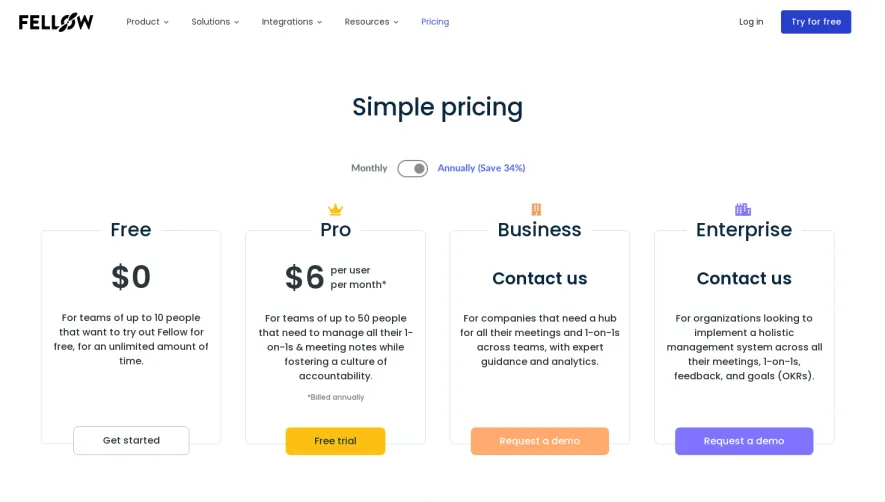
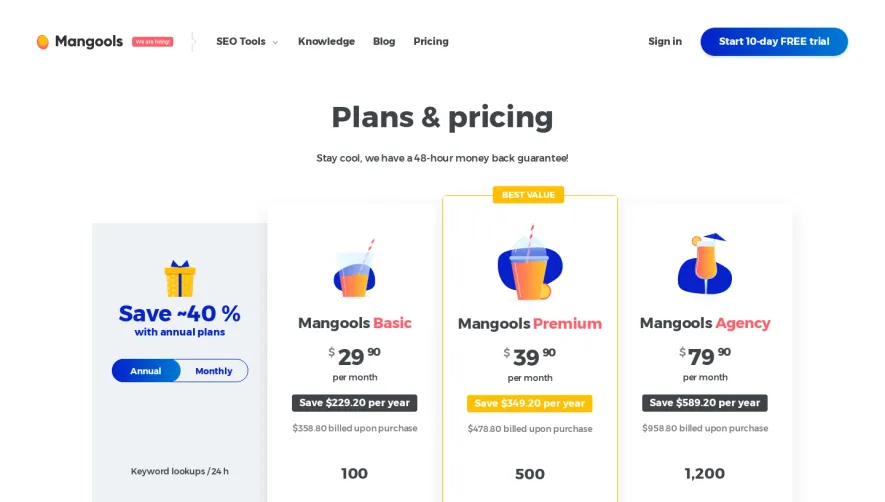
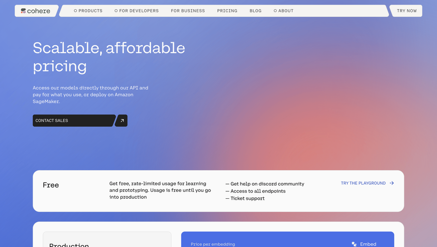
Generate a new design based on this screen using your own content.
Thank you! Your submission has been received!
Oops! Something went wrong while submitting the form.
# Design from Reference: Winden Pricing Page
Create an original, high-fidelity visual design inspired by the reference. Prioritize composition, typography, colors, spacing, and component styling over technical implementation.
## Reference
- **Product:** Winden
- **Category:** Pricing Page
- **Screenshot:** https://cdn.prod.website-files.com/5e9dc792e1210c5325f7ebbc/6acad91581d0b61fedf68dca_6acad88353d9f68d7c3857ab_cms-e45027ac836bdbc0b4c84f52.webp
Analyze the screenshot first. If inaccessible, request it rather than guessing.
## Content
{{content.instructions}}
{{content.data}}
Preserve essential messaging and factual accuracy. Adapt structure and copy length for visual balance; never invent product claims.
## Visual Design
Use this context to reproduce the reference's visual language: layout, typography, colors, spacing, borders, radii, and distinctive elements. The screenshot takes priority if descriptions conflict.
## Direction
{{preferences.fidelityInstructions}}
## Output
{{output.instructions}}
Deliver a polished, cohesive design with precise alignment, hierarchy, and spacing. Produce the requested visual artifact, not just a description. If unsupported, explain the limitation.
Winden’s pricing page embodies a distinctly minimalist and modern vibe, blending crisp whitespace with sharp edges to craft a professional and approachable SaaS presence. The restrained layout feels meticulously structured, inviting users to easily digest information without distraction.
Layout and Structure
The page opens with a bold, reassuring headline and succinct explanatory text, setting a confident tone above the fold. The pricing options are organized into visually separated cards, aligned horizontally for quick comparison. Below, a compact FAQ section anticipates objections and a seamless footer delivers secondary navigation and crucial links.
Visual Elements
A limited but purposeful use of icons provides visual cues, especially within the pricing cards—think minimal linework that supports rather than overshadows content. No clutter: the focus remains on clarity, enhanced with soft drop shadows and gentle hover states.
Color Palette and Typography
A cool, pale background paired with bold, punchy accent colors (such as teal and purple) carves out hierarchy and draws the eye to calls to action. Typography is clean and sans-serif, leveraging weight and size variations to guide the scan—headlines are spacious and product features are understated yet legible.
User Experience Patterns
Navigation is sticky and ultra-simplified, making it effortless to act or explore elsewhere. Primary CTAs (“Start Free” or “Upgrade”) pop amid the reserved color palette. Interaction cues—subtle shadows, micro-animations—confirm actions and add a tactile feel without gimmick.
Unique or Notable Design Choices
The transparent “Current Plan” tag on pricing cards personalizes the experience. The lack of unnecessary graphics or dense detail sets the stage for quick, confident decisions—a design choice illustrating Winden’s focus on product value and user trust, wrapped in modern SaaS elegance.