Overall Style and Aesthetic
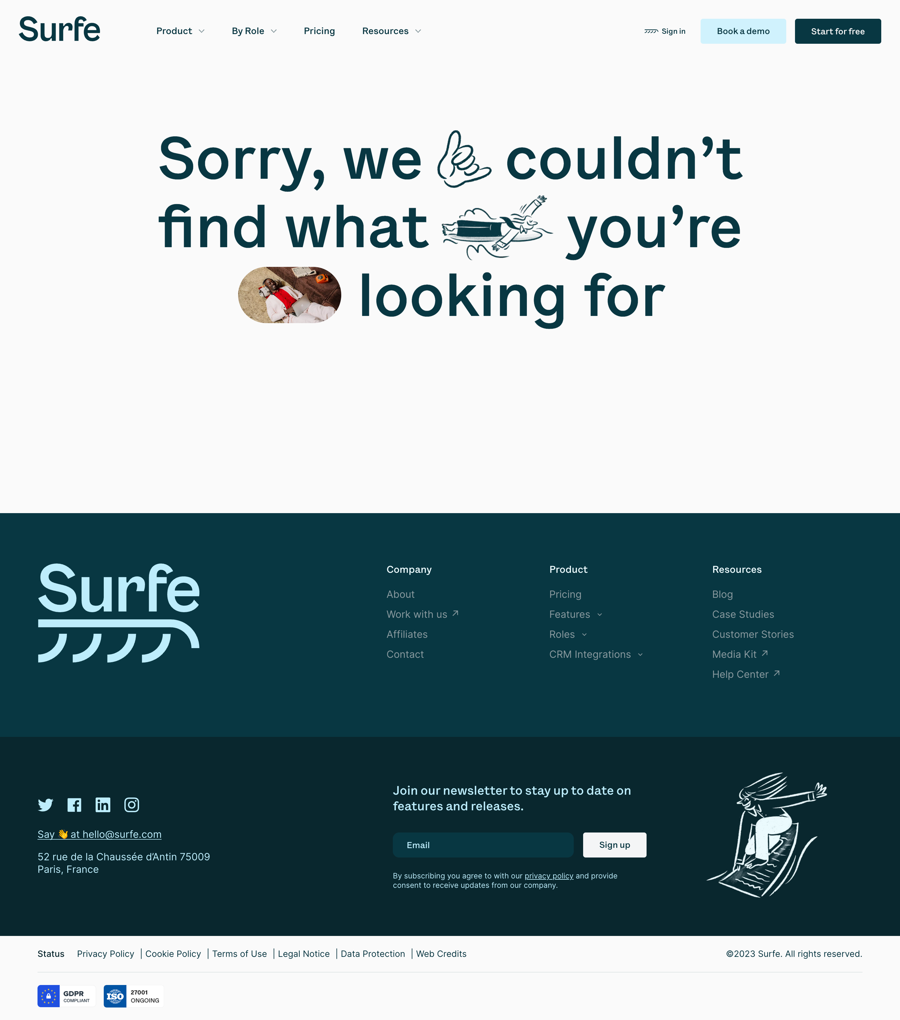
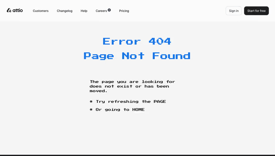
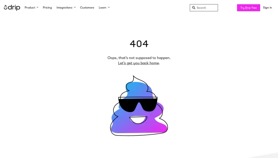
Surfe’s 404 page embodies a clean, modern, and playful aesthetic—delivering a strong impression of both professionalism and approachability. A spacious, uncluttered layout puts emphasis on brand elements and witty visual cues, breaking the monotony often associated with error pages. Layout and Structure
The structure is exceptionally streamlined with a minimalist hero section as the focal point. At the top, a compact navigation bar keeps users oriented and provides easy escape routes. The absence of secondary sections (features, testimonials, pricing) focuses attention entirely on the friendly “lost” messaging and action paths. A simple, discrete footer grounds the page. Visual Elements
A whimsical custom illustration anchors the design: a stylized character seemingly “lost” in a digital world, instantly reinforcing the 404 context. Smoothly animated elements add life without distracting from the main message. Subtle iconography enhances interaction points, while micro-animations give a delightful, dynamic touch. Color Palette and Typography
A lively, brand-centric palette of cobalt blue, soft violet, and pops of yellow injects energy, while abundant white space keeps the look fresh. Rounded sans-serif fonts communicate friendliness and tech-savvy confidence, with deliberate font-weight contrasts used to create clear hierarchy between headline, message, and CTAs. User Experience Patterns
Direct, intuitive navigation ensures no user feels stranded—clear CTAs (like “Go Home”) offer instant recourse. Responsive design and a strong focus on mobile usability showcase thoughtful UX. Animations guide attention without impeding interaction, making the “error” moment memorable but never frustrating. Unique or Notable Design Choices
The blend of humor, illustration, and animation transforms a potential friction point into a delightful brand touch. Personality shines through, providing reassurance and a seamless path back to value—an inspired take for turning errors into engagement opportunities.